Frequent readers will have noticed our enduring interest in electricity demand at WattClarity (including, importantly, the various measures for it).
In some prior years we have given away a BBQ for the “best demand forecaster in the NEM”, but (more seriously) we recognise that the shape and nature of electricity demand is one of the most significant contributors to price outcomes in the wholesale market – which affect all energy users (directly or indirectly).
(a) In past years the focus might have been primarily on peak demand,
(b) and to a lesser extent load factor –
(c) whereas with the snowballing energy transition, we’re entering an environment where other parameters (such as the rate of change in demand) are going to be increasingly important.
Since 2000, when our company started, we have received a large number of questions about electricity demand – how it’s measured, the different metrics, what it all means, and so on… The rate of these questions has even been increasing in recent times.
In the interests of better answering these questions (including for those who have not yet asked) we’re posting this article in our “Energy Literacy” section of the WattClarity energy sector insight and commentary service.
About “Take 1” of this explainer
This edition of an explainer about electricity demand (posted in April 2018) is the first of what might end up being several iterations, spaced over time, with each successive iteration refined with the help of feedback from readers such as yourself – particularly in relation to:
(a) Any factual errors made in the following; and
(b) Importantly, the extent to which this helps you understand the data provided through our various products, such as in the Live Supply & Demand Widget we are please to provide with the support of RenewEconomy.
We thank those who have provided input already, but make it clear that any errors (and other shortcomings) are entirely our fault.
With that in mind, we hope you will find the following useful:
(A) The difference between a MW and a MWh
[PS in October 2022 we lifted out this initial part from this article and copied it over to a stand-alone article ‘Analytical challenge (or beginner mistake!) – understanding the difference between a MW and a MWh’ here]
Given the number of times we’ve seen people confused about this over the years, we thought we’d start by explaining the difference between the two fundamental metrics:
1) a megawatt-hour (MWh), which is a measure of volume/quantity; and
2) megawatt (MW), which is a rate (or a volume over a time).
To help readers visualise the difference, we’ve included the following animated image showing the analogy of flow into a bucket of water:
Image #1 – A megawatt measures the rate of energy supply (or consumption)
Does this help to clarify the difference?
.
(B) Different measures of rate, and volume, of energy delivered/consumed
Since 2000 we’ve been striving to make the energy sector more understandable to a diverse range of people. This has been primarily in Australia’s National Electricity Market – but has also been in a range of other locations.
Across the world there are a couple different units used to describe the same volume of energy, summed up in the following table:
| Table 1 – different units of measurement | |||
| Measures of volume/quantity | Measures of rate | ||
| 1MWh | 1 MWh = 1,000,000Wh
The “watt-hour” (symbolised Wh) is a unit of energy commonly used in the electricity sector. |
1MW | A megawatt is the rate at which energy would need to be supplied/consumed on average over an hour to deliver/consume a quantity of 1MWh. |
| 3,600MJ | 1MWh of energy is the same quantity as 3,600MJ (or 3.6GJ)
3.6GJ The “joule” is the SI unit (i.e. International System of Unit) used across many countries for energy more broadly (i.e. not so much in describing electricity). |
3,600 MJ/h | A rate of 1MW is equivalent to 3,600MJ/h (just expressed in different units).
3,600MJ/h In SI units, it is more common to see rates of energy expressed in “joules per second”. One watt is just an energy delivery/consumption rate of one joule per second. |
| ~3.4MMBtu | 1MWh of energy is the same quantity as 3,412,141 Btu
The Btu (British thermal unit) is used in a number of countries for energy more broadly where they do not follow the SI units– most notably including the USA. An added point of confusion here is that the “M” in this unit represents the Roman Numeral “M” (i.e. 1000) and not the more widely used descriptor of 1 million (i.e. 1,000,000) with SI units. |
~3.4MMBtu/h | 1MW of energy is the same rate as 3,412,141 Btu per hour |
Please do point out any errors I have made in the table above.
.
(C) Understanding the difference between Dispatch, and Settlement
Using terminology that’s specific for the NEM (but which has underlying parallels in most other locations) it’s important to understand that there are a number of different time frames relevant to measuring how much electricity is produced, or consumed:
#1) real-time operations (which includes Dispatch) and
#2) after-the-fact Settlement.
Different data sources are used in real-time operations than in settlement, for a number of reasons (including cost and complexity).
This is illustrated as follows:
Image #2 – Dispatch works differently than Settlement
Currently we (as a company) are focused specifically on real-time operations (i.e. revolving around dispatch, and planning for dispatch), and the different types of visualisation tools we provide (including the numbers they quote/publish) are published with respect to the real-time operations paradigm.
.
(D) Especially in real time, “demand” is measured at the supply-side end
To an outsider it would seem logical that, to measure electricity demand in certain location, one would take all of the individual electricity meters at each customer connection point and add them up. However from a macro perspective (i.e. for a whole region/state/province) that’s proved to not be the most effective, or efficient mechanism for doing this (partly because of the delay in accessing settlement data, noted above).
Rather, because electricity must be produced at exactly the same rate it’s being consumed instantaneously, we can start from the supply end and work downwards – knowing that the rate of energy addition at the supply-side end will match, in real time, the rate of energy consumption at the demand-side end.
This is illustrated in the following image:
Image #3 – Measuring Supply, as a proxy for Demand
For those who want to know more here’s two other resources:
(1) In March 2017 one of our guest authors (Jonathan Dyson) put together this 2017 explainer on about the role of the FCAS market in keeping the system frequency close to 50Hz (with several more detailed articles on system frequency, and FCAS in particular, also here).
(2) For a more detailed view of the electricity supply chain we periodically update the detailed “Power Supply Schematic” wall chart, to illustrate the various organisations involved in connecting the supply side and the demand side of the electricity sector.
.
(E) However there are complexities…
In the 3rd image above, we represent what would be effectively a totally closed system, where 100% of what is supplied at one end is consumed at the other end (which assumes, of course, linear flow path).
As always, reality turns out to be more complicated than simple models. As I have noted before – any model’s just a model, it’s not reality – though they can be useful sometimes (I hope the simplistic model above has helped some users).
There are many complications involved in measuring rate of supply at one end as a proxy for the rate of consumption – though it remains (at least for now) the best method available. We’ll list some of the complexities here, but note that it is not a comprehensive list:
Complexity E1) Dealing with interconnector flow
The model above assumes there is just one “zone” within the grid or market that’s in focus – but this is very seldom the case:
1) Looking at the entirety of demand across the whole NEM would be one such rare instance, but at WattClarity we seem to be one of the few who do this. The vast majority of AEMO metrics relate to supply and demand in particular regions;
2) In the more interconnected electricity grids (across North America, Europe and parts of Asia, for instance) there are always the effects of interconnector flows that need to be taken in consideration – both in terms of raw energy flows, but also in terms of ability to share reserves and so on (though that’s something best reserved to a different article).
Continuing the bathtub analogy, we can see how the rate of energy transfer across interconnectors needs to be taken into account to calculate the rate of electricity consumption in all regions.
Image #4 – Calculating Demand by including flow across Zonal Boundaries
The network topology across the NEM can be described in terms of interconnections between a number of different zones:
1) Our ez2view software describes supply and demand in terms of 27 zones across the NEM, and includes (optional) access to live inter-zonal flows within some regions, and live zonal demand;
2) The rules of the NEM currently provide for 5 regions, which are a special form of zone that supports region-level pricing outcomes;
3) The RenewEconomy-sponsored NEMwatch Supply & Demand widget currently utilises these 5 regions and adds in the “South-West Interconnected System (SWIS)” of Western Australia to show supply and demand for 6 zones in total (5 of which are interconnected).
Our other products also deal with demand at a regional level, and hence the effect of interconnector flows.
Complexity E2) The supply chain is not linear
Our simple model above also assumes that generators are large and centralised – being conceptually located at one end of the “supply chain”, with consumption occurring wholly at the other end.
In reality this is not the case. It never has been, but the significance of this simplifying assumption is becoming more important with the rise of distributed energy resources. What follows are three specific examples of how reality is more complex than this simplistic model – but note, again, that even these three examples don’t address all of the complexities involved.
Example E2a) The rise of distributed solar PV
Australia, moreso than any other location we know of across the world, has seen an exceptional uptake of distributed solar PV capacity. This has been driven by a confluence of environmental advantages, commercial considerations, and government policy. Whilst the growth has been subject to its own idiosyncrasies, the net result is that distributed PV provides a significant contribution to electricity supplies.
This is not without its own challenges from a measurement and management point of view (as discussed before). In the following image, we explain how this makes it more difficult to understand the rate of total electricity consumption:
Image #5 – The opacity of Embedded Solar PV brings with it a growing challenge of understanding total consumption
It’s important that readers understand that, whether the objective is to understand the rate of total consumption, or the requirements for upstream supply, it does not matter whether energy from rooftop PV is totally consumed at the home, or whether some spills onto the local network to be consumed at neighbouring homes. From the perspective of the upstream high voltage grid, this embedded energy production simply reduces the demand to be met from centralised large supply sources. From the perspective of total consumption, all the production from rooftop PV plus all supply from the wider grid get added together.
From the perspective of the market operator (AEMO, in the case of Australia) these injections of electricity from rooftop PV are effectively “invisible” and their real time (supply-side) measurements of “demand” are correspondingly lower than total consumption. However this reduced demand is the appropriate level for the market operator to use in scheduling delivery from large scale sources.
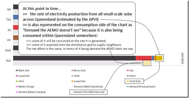
In our Supply & Demand Widget, we address this difference between large scale supply and total consumption by showing the estimated injections from small-scale PV in terms of both supply and demand within each region:
Image #6 – Ensuring the numbers add up by ensuring estimated supply from small-scale PV is shown on both the supply side and the demand side
This is something we must do, for the numbers to add up.
Readers should be aware that the numbers published by the APVI have a number of imperfections which result in the numbers being different than what is actually happening – with some factors suggesting under-estimation, whilst other factors suggesting over-estimation (as discussed before). That should not be read as a negative on the APVI and their method – every forecast contains imperfections (as noted before)
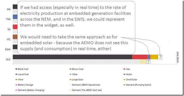
Example E2b) Other embedded generation
Embedded solar PV is not the only example of cases where embedded generation (that’s invisible to the market operator in real time) leads to an underestimated level of total electricity consumption.
For decades, a number of commercial and industrial sites have utilised embedded generation facilities in order to supply a portion of their own consumption on site. Most of this has been (and remains) invisible to the market operator in real time:
Image #7 – Embedded Generation at Commercial & Industrial sites has long been invisible to the market operator in real time
While estimates of annual levels of energy produced by some of this embedded generation exist, unfortunately we have not (to this point) identified a way in which we could include some measure of this C&I self-generation to deliver a more accurate picture of real-time Supply & Demand in the Widget.
Image #8 – The effect of other embedded generation can’t currently be shown in the Widget
Example E2c) Auxiliary Energy Usage
The complications for our simple model don’t end with generation that we can’t see in real time, however.
There’s also a matter that most generation plant self-consume some of the electricity that they generate before it’s exported to the grid:
Image #9 – Self-Consumption of “Auxiliary Energy” at Generation Sites
All generators self-consume a small amount of energy before its exported to the grid:
(a) In some cases, like solar and wind, the self-consumption is so small as to be negligible
(b) Generation involving a steam cycle (i.e. boiling pressurised water to spin a turbine) require a non-trivial amount of auxiliary energy in order to power the pumps and motors required for water and air flow, etc…
To explain the difference between the two numbers, the industry commonly uses the following terms:
| Table 2 – Different terminology used with respect to supply/demand | |
| “As Generated” | The measure that represents the total production of electricity at a particular generator, before accounting for Auxiliary Energy usage
This is sometimes also referred to as “At the Generator Terminals” or “Gross”. |
| “Auxiliary Energy” | A measure of how much energy is consumed on the generator site before it leaves the station “gate”. |
| “Auxiliary Factor” | The percentage of energy rate (or volume) self-consumed as Auxiliary Energy, relative to the As-Generated energy rate (or volume).
It’s important to note that (in the NEM, as in many markets) a generator’s Auxiliary Factor is confidential to that particular participant. Our NEMreview product utilises an in-built Generator Catalog containing estimates for Auxiliary Factors for the NEM stations for which the AEMO publishes data. We are in the process of expanding and enhancing this Generator Catalog such that: 1) It can be utilised in our other products; and 2) Such that it can be accessed directly, by those who just wish to subscribe to this service. |
| “Sent-Out Energy” | “Sent-Out Energy” is the rate/volume of electrical energy that makes its way onto the grid at the generator’s connection point “at the station gate”.
Hence, if we’re talking rate of production, then Rate of Generation Sent-Out (in MW) = Hence, if we’re talking volume of production, then Volume of Generation Sent-Out (in MWh) = As with the Auxiliary Factor, the Sent-Out Energy (rate/volume) is confidential to the market participant. This is just the same as an individual energy user’s rate/volume of consumption being confidential to them. Remembering the distinction between Dispatch and Settlement (section C above) it is important to understand that · the NEM is dispatched on an As-Generated basis; whereas · the NEM is settled on a Sent-Out basis. This means that any figure quoted for rate of electricity consumption (i.e. demand) is highly likely to be on an As-Generated basis – though we note that the AEMO has started to use Sent-Out basis in some instances, like with the consumption and demand forecasts in the 2017 Electricity Forecasting Insights (see footnote 1 on p3) to keep everyone on their toes. |
.
Complexity E3) There is energy “lost” in the supply chain
We wanted to highlight a third area of complexity (noting that there are more than these three) that has to do with energy being “lost” through the transmission and distribution grid, on the way to its final point of consumption.
Now the first point to note is that calling this energy “lost” is not meant to imply that we don’t know where it’s gone. A high proportion of the energy “lost” is converted to heat in the transmission and distribution networks.
Rather, we use the term “energy lost” to imply that it a percentage of the energy generated does not get to do “useful work” at the energy user’s site, because it is used up in the process of delivering it to that end.
Image #10 – Energy “Losses” enroute to final consumption
Losses are typically a function of factors like the size of the conductor, the voltage, and the distance over which it travels.
Reducing losses is one of the main reasons why high voltages are used in delivering electricity over long distances (like using high pressure in pumping fluids over long distances in pipes).
Again, from the point of the Supply & Demand Widget (and remembering that the NEM is dispatched on an “As-Generated basis” we see that the energy “lost” in delivery forms a component of the total demand number.
Complexity E4) Time-points associated with the data
Based on questions we’ve been asked over the years, and clarifications we’ve needed to make in relation to our products (particularly the very widely consumed NEMwatch Widget on RenewEconomy), we know we need to add in some clarification of the different time points that apply in relation to data published by the AEMO (and others, like the TNSPs through ez2view).
One of AEMO’s key tasks is to schedule the dispatch of large scale, controllable supply and demand sources. “Scheduling dispatch” means to send each of these sources, at regular intervals, individual production/consumption target levels that in aggregate meet the demand level that AEMO sees (“scheduled demand”), and are consistent with the market offers made by each source. In the NEM this happens on a 5-minute “look-ahead” (“ex-ante”) basis. AEMO must forecast where demand will be in 5 minutes and schedule the market accordingly. To do this AEMO uses real-time supply-side measurements from operational SCADA metering to calculate current demand, so that the only true forecast required is the change in demand over the next 5 minutes.
This gives rise to a difference between metered and target measures of demand. Metered (or Initial) demand is what’s measured using SCADA metering at the start of every 5-minute dispatch interval, while Target demand is the forecast level at the end of the same interval. In a perfect world, one dispatch interval’s Target demand would be the next interval’s Metered demand, but even over 5 minutes there can be significant deviations away from forecasts (one of the reasons that FCAS services are needed to keep things in balance).
| Table 3 – Understanding the time points associated with the data | ||
| Metered | Target | |
| Dispatch | Through their MMS, the AEMO publishes a number of measures that are metered numbers taken at the start of each dispatch interval.
These measures include Initial Supply (for a region), and Initial MW (for relevant generators). It is the Initial MW numbers that we use heavily in the NEMwatch Widget for a number of reasons, including: 1) Initial MW is available in real time, whereas other metrics (such as Dispatch Targets) and deemed confidential in real time and only published on a next day basis. 2) Data is also supplied for Initial MW for a greater range of generators (including some that are not scheduled, so do not receive dispatch instructions from the AEMO). Hence using these provides a broader visibility of the fuel type mix supplying the NEM (though there has been some confusion so caused because the AEMO’s data dashboard currently provides data for only a smaller list of generators). |
The NEM is dispatched on a 5 minute basis and (until 1st July 2021) settled on a half-hour basis.
Targets are effectively forecasts made, at the start of the (5-min) dispatch interval, for the rate expected at the end of the dispatch interval – such as: The Dispatch Demand Target for each region was one of the few metrics available back when the NEM started. At that time, there was a singular focus on Scheduled Demand, as well. It remains one of the key metrics, as it has a direct bearing on what the price outcomes are for the dispatch interval. For instance, in our “Best demand forecaster in the NEM” competition which we have run for a number of years, we tend to focus on the “Scheduled Demand” Dispatch Target in order to maintain a direct connection with the basis of the prior year results. |
| Trading
(until 1 July 2021, when the NEM moves to 5-minute settlement) |
When the AEMO issues reports on new peaks in electricity demand (which tends to be each summer and winter), they tend to do this on the basis of metered data for a half hour. | Because dispatch works on a five minute basis, there is no real need for target values to be provided on a half-hour basis.
In some respects (such as generation production) a time-weighted average might still be credible – however in other cases (such as with respect to transmission limits), a half-hourly average of 6 x 5-minute limit numbers does not make a whole lot of sense. |
.
(F) Some other terminology used to describe Demand
As you’ll see from the above, the simplistic model that I started by drawing needs to be layered with different types of complexities in order to arrive at something better reflecting reality.
| Table 4 – Three difference definitions of demand used by AEMO, plus one we’ll be using more often | |
| A layperson’s idea of “rate of aggregate consumption supplied from all sources” | It may surprise some readers that there is not even terminology defined to describe what a layperson might think of as “rate of aggregate consumption supplied from all sources”.
We know of some industry participants who refer to this as “Native Consumption” to differentiate it from AEMO’s term “Native Demand” (below) – but it is highly likely that there are other terms also in use to describe the same thing. In particular, note that “Native Demand” (i.e. AEMO’s term) excludes both: It’s this data “missing” from AEMO’s Native Demand numbers that is the reason why others try to create their own view of “Native Consumption” – it’s also why we try to do the same in our Supply & Demand widget, notwithstanding that we know the picture is incomplete because of missing data about various electricity supply sources, such as: 1) solar production at the growing number of medium-scale facilities above the 100kW SRES cut-off, but below the (at least 5MW) level where the AEMO will take an interest in accessing meter data in real time; and 2) the large number of embedded generation facilities installed in commercial and industrial sites across the NEM. |
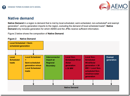
| AEMO term “Native Demand” | AEMO defines here the term “Native Demand” as follows:
For a number of reasons (included those alluded to above) it is not practical to calculate, in real time, a 100% accurate picture about the magnitude of Native Demand. For practical reasons, the AEMO chooses to focus much more on Operational Demand (below). |
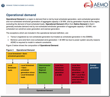
| AEMO term “Operational Demand” | Increasingly as this energy transition picks up pace, the AEMO is using “Operational Demand” as the metric they speak about in more public forums.
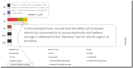
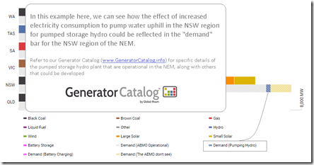
AEMO defines here the term “Operational Demand” as follows: I think about “Operational Demand” as “Demand the AEMO can see” – which includes Scheduled Demand (below) but also demand met by larger scale intermittent (but non-scheduled) generators that they can “see” because they have access to SCADA generation data in real time. The AEMO MMS data field “Demand and Non-Scheduled Generation” most closely matches their definition of “Operational Demand” in real time: 1) It’s this data that is shown in our “ECA Widget”, for instance; 2) But we should not that it does not perfectly equate to “Operational Demand” – which is the reason why we have calculated it ourselves from raw unit-level data in the “RenewEconomy widget”. This also enables us to explicitly show electricity demand used to charge storage – either in the form of: 2a) Electricity stored in batteries – as shown here: Image #11 – Energy storage to battery 2b) Electricity converted to potential energy in pumped storage hydro facilities – as shown here: Image #12 – Energy storage to pumped hydro Separately, the AEMO publishes an Operational Demand metric on a half-hourly basis, and we include this as an additional data series for each region in NEMreview v7. |
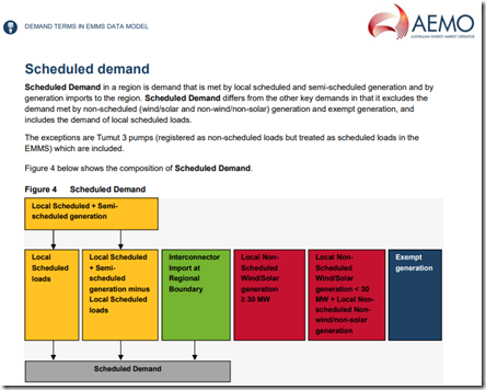
| AEMO term “Scheduled Demand” | AEMO defines here the term “Scheduled Demand” as follows:
When the NEM started back at the end of 1998, this was the only measure of demand that existed. “Scheduled Demand” is still a centrally important metric within the NEM – as it is the demand against which AEMO dispatches controllable sources in order to balance the system and to clear the electricity spot market. In other words, it produces the prices we all pay. We just need to keep in mind that Scheduled Demand is |
| Our term “Demand met by fully dispatchable supply” | This is a bit of a long-winded term, but one we will be using increasingly in future – as it represents one of the challenges the NEM (and most other grids) will have to manage increasingly in future.
It subtracts from Scheduled Demand the contribution of sources that are not fully controllable – the so called “Semi-Scheduled” large scale wind and solar PV generators, which can reduce output if requested by AEMO, but whose maximum output fluctuates with wind and sunlight conditions. When I spoke at All Energy in 2015, presenting some analysis of what the NEM would look like with a 10x increase in intermittent supplies, I used the term “Energy Unserved by Wind and Solar” to describe this metric. |
.
(G) Some other light reading…
For those who are seeking more of the gory details, the AEMO has produced a number of useful reference guides over the
| Table 5 – other references you might like to read, about electricity demand | |
| Sometime 2016 | The AEMO also published a short explanation of what they mean by “operational” which we found of use.
Here’s a version of this document we saved ourselves sometime during 2016. |
| Sept 2016 | This AEMO document “Demand Terms in EMMS Data Model” from September 2016 can help. It’s a document that has been through a number of revisions over the years.
I find v7 from Sept 2016 much clearer than some prior issues. |
Please note that any errors made in translating from these more “industry-speak” documents to something that hopefully is more widely understandable above are entirely mine.
I would be delighted if you could point out any errors I have made, along with anything you think I could clarify even further – either in comments below, or direct with me (please call +61 7 3368 4064 or drop us a line). Just note that I might be slow to respond, given the diverse nature of customer demands on our business.
.
(H) A different view of Electricity Demand (another Widget)
The Supply & Demand Widget, which we provide with the sponsorship of RenewEconomy, is one of our widgets that we’re pleased to provide freely accessible on the web, with the help of our sponsors.
We have another widget that is consumption-focused, so is worth mentioning here. In mid-2016 we were pleased to be able to introduce this geographical view of Operational Demand in “the ECA Widget” and how it relates to local temperatures at population centres across the country:
Image #13 – The ECA Widget, which you can also find here and here and other locations as well (and are able to embed on your own website too)
.
(I) Seeking your feedback on this explainer
Thanks for making your way all the way to the bottom of this article – we realise that it’s a fair bit normal than a typical blog post. But (at least for us) the topic of electricity demand is an important one, and we see that it will become increasingly important into the future as this energy transition gathers pace.
For that reason, we’re keen on your feedback in terms of how helpful you found this (and in particular any errors you have seen in the above):
Option 1 = if you’re happy to have your comments visible to all readers (some of whom might also help answer any questions you have), please just leave a question or comment below the article.
Option 2 = if you’d like to share your feedback privately with us, please use this feedback form here (which will protect your email address, as it will protect ours).
Option 3 = of course, you can always just call us direct on +61 (0)7 3368 4064.
Thanks for your time.



Thanks Paul. This is all excellent but even exceeds my nerd quotient. I do generally find the water analogy helpful. But one nit picky thing is that Image #2 refers to “electrons delivered down the pipe”. It is an interesting fact that in a 50 Hz AC circuit electrons don’t actually travel very far. Energy is transferred at the speed of light despite that fact that individual electrons only jiggle back and forth a short distance along the conductor.
In G) the first sentence isn’t finished.
Three paras up there is another unfinished sentence “We just need to keep in mind that Scheduled Demand is”
PS this article says “The truth is way more spectacular: the energy doesn’t travel through the wires at all — it shoots through the space around them, at the speed of light.”
http://www.abc.net.au/science/articles/2014/02/05/3937083.htm
Not sure I can get my head around that!
Thanks for your time in putting together this insightful article.
I would love to know more about how the different States are using electricity, for example, why does QLD sometimes use more electricity than NSW, when they have a much lower level of population? Is it due to Aircon usage, or industry?
Thanks.
The NEM has high business electricity use, as noted here:
https://wattclarity.com.au/2017/08/in-the-nem-at-least-business-consumption-of-electricity-dwarfs-residential-consumption-of-electricity/
The ratio is higher in QLD than in other parts.
Thanks Paul, very useful article in explaining some of the more abstract concepts.
Just picked up on one thing; in section B, the units of the last two lines below should be watt and megawatt?
3,600MJ/h
= 3,600,000,000 J/h
= 1,000,000w
= 1MW
Thanks Pei
1J/s = 1W (that’s the definition of a Watt) . I have added 2 rows in the table to clarify.
Paul
Paul,
I have just come across this article and noted the remarks about demand in some places being characterised by higher proportions of industrial demand relative to domestic. Many years ago I used to predict daily demand for SA and it was pointed out to me that our demand was relatively lightly affected by industrial load, despite having the car industry and its ancillaries, because gas was such a large contributor to energy usage by industry. Adelaide was the first to take gas from the Moomba gas field and its development was enabled by Torrens Island PS taking 2/3 of the gas from Moomba in the 1960 – 70s; the rest being taken by industry, commercial and domestic.
When predicting demand the major impact was due to air-conditioning so demand was highly correlated with temperature since there was a small industrial base load for electricity and we became quite adept at ‘adjusting’ for number of days of high temperatures preceding, overnight temperatures etc.
It was also necessary to take account of school holidays, Christmas and Easter as domestic, school and commercial air-conditioning all had varying effects.
It was apparently quite a different process with unique considerations compared to the Eastern states.