As noted on the weekend, I was invited to speak at the ‘Smart Energy Queensland’ conference today in Brisbane. I promised to the audience today that I would share aspects of the presentation progressively via WattClarity … so this article is a start
(A) The supply mix in MWh (or average MW)
Firstly, it’s worth remembering that:
(a) We use ‘megawatt hours’ (i.e. MWh) to measure a volume of energy; whereas
(b) We use ‘megawatt’ (i.e. MW) to represent a rate of energy supply (or consumption) – as illustrated at the top of this explanatory page here.
—
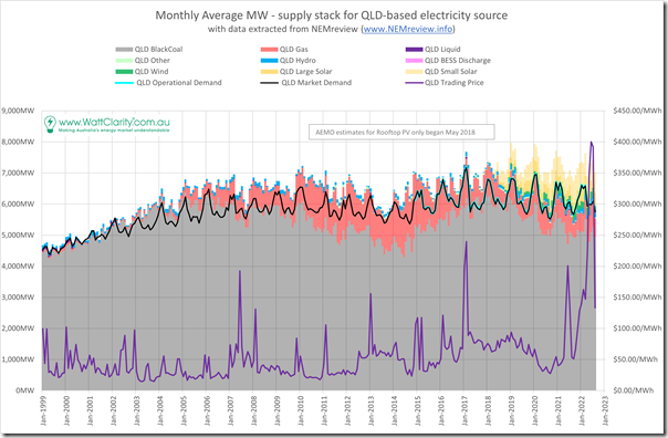
With this background in mind, the following chart shows the monthly average rate of energy produced in Queensland from all visible generation sources since the start of the NEM:
As we try to do with all of our articles, if you click on the image it will open a larger view.
For those with their own licence to our NEMreview v7 software, they can open their own copy of this query here.
As noted during the presentation:
1) Fuel Mix:
The chart is dominated by production from coal and gas (with gas initially supported by the state government’s 13% gas-fired certificate scheme, which achieved its stated objective and hence was since removed).
In more recent years we’ve seen the contribution from solar grow … particularly rooftop PV.
2) Demand:
Also on the chart are two lines, which run pretty much on top of each other at this scale, representing different measures of average consumption in the market/grid:
(a) Since the start of the NEM, AEMO (initially NEMMCO) has been reporting on ‘Market Demand’ … which is the measure participants refer to when wanting to understand impact on price outcomes.
(b) In more recent years, the AEMO has been increasingly focused on ‘Operational Demand’ … which is typically a bit larger than ‘Market Demand’ and represents all the consumption they can ‘see’ in real time on the grid (sometimes also called ‘Grid Demand’.
3) Exports and Imports*:
* Talk of Exports and Imports is topical, given AEMO’s published Market Notice 100238 today noting the next steps in the upgrade of the QNI interconnector (now with the SVCs having finished testing and commissioning, and being operational), which would allow for increased flows in either direction.
In months where the coloured bars stick above the level of demand this represents QLD exporting south to NSW – whereas in the (less frequent) months where the reverse occurred, QLD would have been a net importer from NSW for the month.
Readers should use caution, however, and:
(a) Not include that the light yellow (i.e. rooftop PV) stack in this ‘unders and overs’ calculation when comparing to ‘Operational Demand’;
(b) Because the corresponding ‘Demand the AEMO does not see in Real Time’ metric would need to be added to ‘Operational Demand’ to approximate an ‘Underlying Demand’ for that to be true.
The NEM is full of complexities like this!
4) Spot prices:
Also shown on the chart is the monthly average spot prices, with the clear stand-out being the extreme volatility seen in Q2 2022.
(B) The supply mix in percentage terms
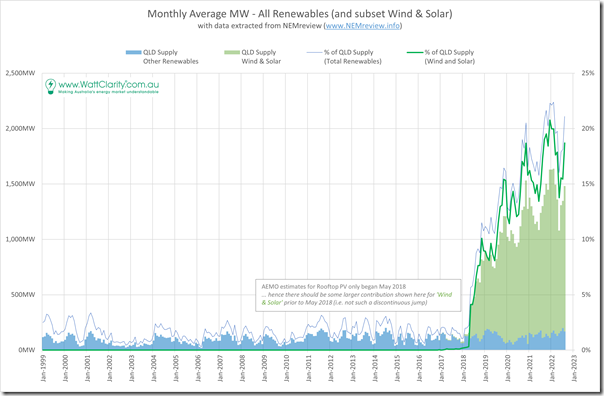
Especially given the audience, I thought it would be useful to represent those numbers in percentage terms:
Given the lack of AEMO published estimates for rooftop PV prior to May 2018 there’s a step change discontinuity in the chart that would not have existed in reality (though the contribution from rooftop PV was growing quickly at that time).
We do have a history of the APVI’s estimates, which do go back a while longer – but as discussed here they are not the same as the AEMO’s estimates (slightly different method of estimation, with a method that has changed over the years), so I did not think it was worth the added confusion to add them in prior to May 2018.
With respect to this chart:
1) Regional Metrics risk becoming ‘Vanity Metrics’:
I noted my concern today about the risk that region-specific metrics risk becoming ‘vanity metrics’ – given that the NEM is one large integrated grid, the only true measure of performance that takes account of all the challenges of this energy transition will be measures calculated on a NEM-wide basis.
For interest sake, however, we see:
(a) An increasing trend over time; and
(b) A distinct seasonal pattern, with ‘% of QLD Supply (Total Renewables)’ reaching 22% in February 2022.
2) A better metric would be ‘% of Supply (Wind and Solar):
Remembering the adage ‘you manage what you measure’ I also noted my view that a better metric would be using would be ‘‘% of Supply (Wind and Solar)’, because it better reflects the fact that Wind and Solar are very different from the other sources of renewable supply shown in the blue bars at the bottom of the chart (i.e. mostly hydro with a small addition from production from sugar cane).
This was a point I made, for instance, in this quick review of the ESOO 2022 a few weeks ago (see C6).
These differences include:
(a) The underlying intermittency of the Wind & Solar resources;
(b) The non-synchronous nature of the connection to the grid; and
(c) The Semi-Scheduled nature of they way they are allowed to operate in the NEM
… on that last point, readers might remember us asking ‘Is the Semi-Scheduled Category Sustainable or Scalable’ via Key Observation #13 in GenInsights21, for instance
I’ll share more of the presentation here as time permits, but wanted to get started with this…


I think its somewhat accepted now that the term for wind and solar combined is variable renewable energy [VRE]
More contentiously given inter state contstraints there is still value to be had in understanding the position of each region individually.This comment applies as much to Tasmania and Victoria as to Queensland.
Even leaving aside the interconnection limits issue it remains the case that each State has its own policy, for instance QLD has of course 50% renewable by 2030 and this will/should/might impact on investment decisions.
Too many acronyms, David – had a mental blank and forgot about calling Wind and Solar VRE.
Understand your defence of region-based metrics. They have a place, but some overuse/misuse is why I noted “risks becoming…”.