
At the end of November 2023 we released GenInsights Quarterly Update for 2023 Q3.
As part of the compilation of this report, we examined many different metrics that point to different aspects of this energy transition – through a number of these metrics, the first week of July 2023 really stood out.
On Monday 6th November, Paul published Part 1 of this ongoing Case Study examining sustained low levels of VRE (Variable Renewable Energy) spanning July 3rd and 4th 2023.
———–
It wasn’t just Paul that found these days of keen interest – those who’ve been following his weekly simulations might have noted the interest from David Osmond as well – who, over on X (formerly Twitter), noted:
‘Those 2 days represented the most challenging days in the 2+ years of my simulations so far. ‘
———–
Hence, we’re undertaking to focus particular attention on this first week in July 2023 to unpick the details of what happened – and its implications for the energy transition.
In this article (Part 2), I am taking the next step in this evolving Case Study – but readers should note that there might be subsequent articles added later, as time permits. We particularly appreciate the suggestions we receive from readers – either in comments below, on social media (e.g. LinkedIn), or one-on-one.
To recap, Paul noted that during this two-day period, we saw:
- A sustained low percentage of supply from Variable Renewable Energy (VRE). VRE penetration was below 10% of total supply more than half of the time during this period, noting:
- This was mainly due to low absolute levels of VRE.
- But there was also somewhat higher underlying demand (i.e demand including DER such as rooftop solar). Where low production from rooftop solar production occurred simultaneously with low production from large-scale solar farms.
- Monday 3rd July 2023 also saw lowest incidence of IRPM (Instantaneous Reserve Plant Margin) for the quarter:
- Down at 15.6% (discussed below).
- Remembering this is a NEM-wide measure of the balance between supply and demand
- Only one large price spike across the five NEM regions in the two days. Apart from that one-interval price spike (where the SA RRP hit $1,500.94/MWh at 11:40am NEM time on July 3), spot prices did not go above $500/MWh in any region for any interval over the two days.
In this second part of the case study, I’m going to take a closer look at the supply-demand balance, and the factors that were driving low VRE production for this prolonged period. As this case study presents a real-world example of the ‘Dunkelflaute‘ problem, I will be analysing the events from a NEM-wide perspective (i.e. ignoring the complexities of transmission and interconnection) in order to dig a bit deeper into the underlying VRE generation fleet – this may help pose some questions for readers who are puzzling over how an ‘energy transition-proof’ system may look.
A tighter supply-demand balance through two successive days
In the image below I’ve charted NEM-wide Instantaneous Reserve Plant Margin (IRPM) on a five-minute basis for July 3 (in orange) and July 4 (in red). I’ve also included the previous day and the successive day in green and blue, respectively, for reference. As we’ve previously explained, IRPM is a real-time indicator of available surplus generation in relation to total demand. A low percentage of IRPM generally signifies a tight supply-demand balance.
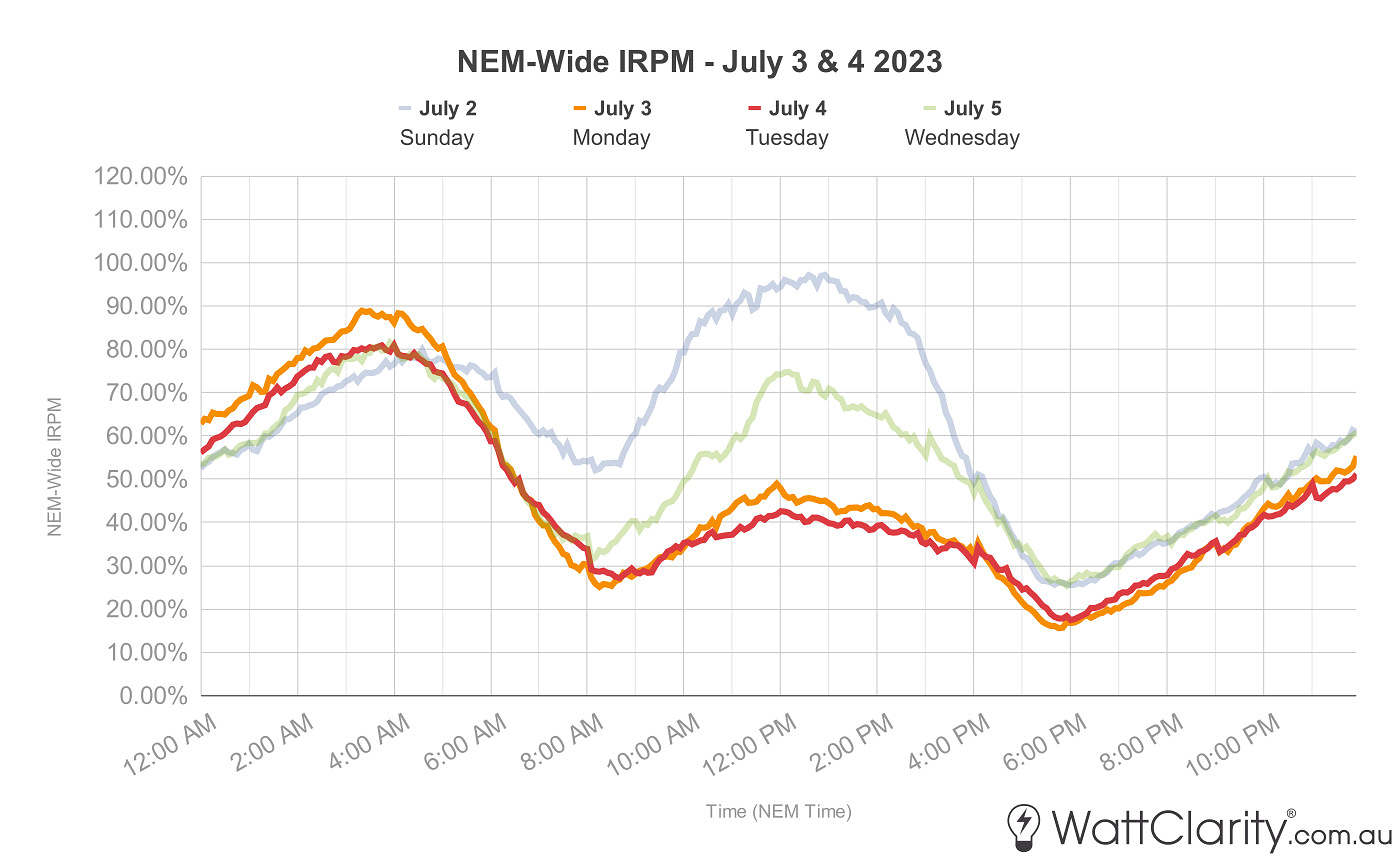
Over the course of the two days, NEM-wide IRPM reached a low of 15.6% at 5:45 pm NEM time on July 3rd.
Source: Global-Roam
Compared to the two reference days, we can see NEM-wide IRPM was significantly lower during daylight hours on July 3 and 4, but also, especially low during the sunrise and sunset hours on these days. NEM-wide IRPM hit a minimum of 15.6% on July 3 (at 5:45pm NEM time) and 17.4% on July 4 (at 6:00pm NEM time).
Now, as IRPM is a metric that takes account of both Available Generation and Market Demand.. let’s have a look at both sides of the formula:
Market Demand elevated over 3rd and 4th July 2023
Below we can see how elevated ‘Market Demand’ (i.e. using AEMO TotalDemand number) for these two days played a role in these low IRPM figures.
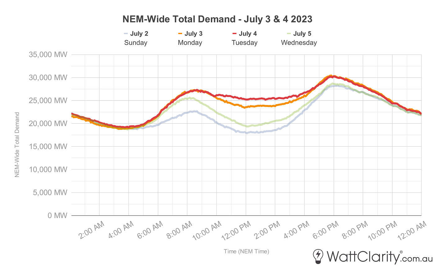
Poor performance of rooftop solar was contributing to relatively high daytime total demand across the NEM.
Source: Global-Roam
It’s significant to note that in relation to the reference days, we can see that on July 3 and 4:
1) Market Demand was higher during daylight hours at least in part because of lower rooftop PV yield.
2) However readers should also note that Market Demand is also higher in the evening, when solar yield is zero anyway.
Available Generation over 3rd and 4th July 2023
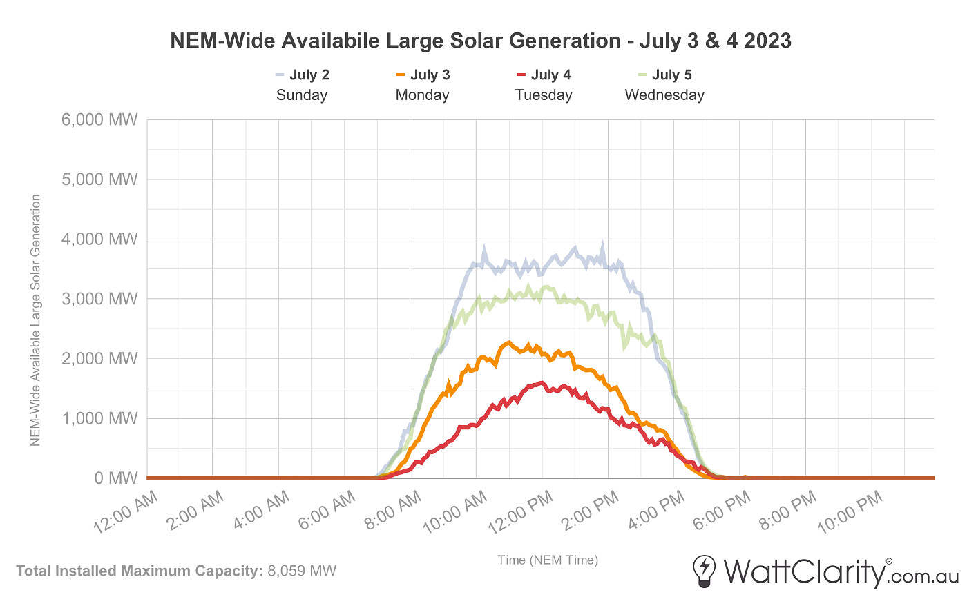
The charts shown in the image below hould provide some insight into available generation (the other variable that goes into IRPM) over the two days, highlighting levels of availability amongst each fuel type.
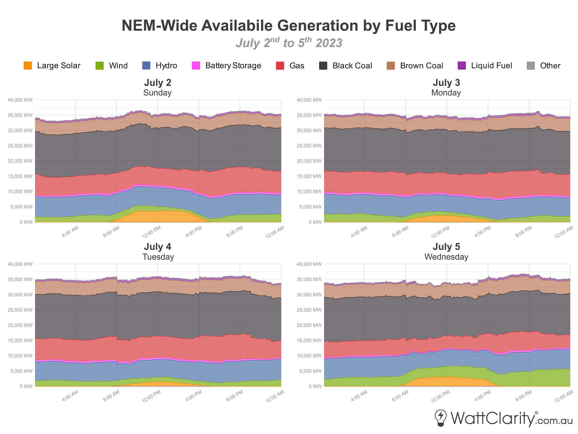
Very low available generation from solar and wind across the NEM was evident on both the 3rd and 4th of July 2023.
Source: ez2view Trend Editor
If time permits, we hope to publish a further extension of this case study that would focus on availability amongst non-VRE generation, but here I will dig deeper into solar and wind generation over these days.
When the sun doesn’t shine
The low production from solar (and somewhat higher underlying demand) can be attributed to a large spread of cloud cover that was hovering above the eastern part of the country during this period. The satellite image below, taken on the late afternoon of July 3rd, highlights the extent to which this cloud cover impacted a very large portion of the NEM’s physical network.
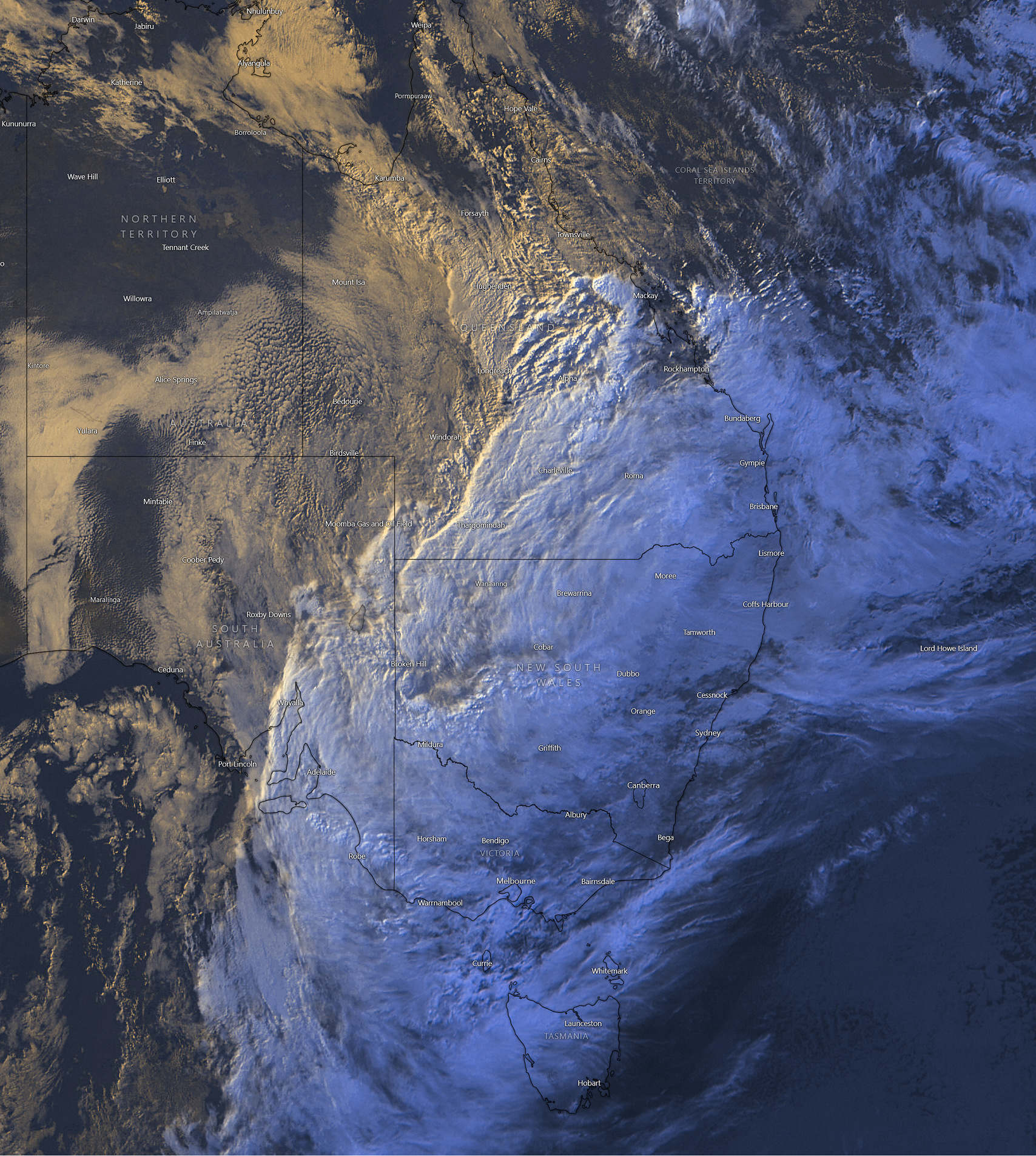
Satellite image from 5:45pm AEST July 3rd 2023 shows extended cloud cover across Eastern Australia.
Source: Windy
The animation below from Solcast demonstrates the effect of this cloud cover on GHI solar irradiance levels the following day (on July 4th). The images in the animation show see very little solar irradiance particularly in the three largest capital cities (Brisbane, Melbourne, and Sydney).
The cloud cover resulted in very low levels of Global Horizontal Irradiance (GHI) on July 3rd and 4th.
Source: Solcast
This low GHI had a significant impact on rooftop and large-scale solar PV production. From the market-side, it resulted in poor solar availability (and hence production) for NEM-connected solar farms on July 3 and 4, but particularly on the latter.
Over the four days, available solar generation was lowest on July 4th
Source: ez2view Trend Editor
What were forecasts predicting before the fact?
The AEMO publishes an Unconstrained Intermittent Generation Forecast (UIGF) for registered wind and solar farms (or aggregations of these) which captures the projected generation predicted to be available at a given point in time. By using our ‘Forecast Convergence’ widget in ez2view I can examine how the actual outcome of available generation converged on earlier forecasts (i.e. looking at that ‘other dimension of time‘).
The screenshot below shows how prior forecasts of the total availability of semi-scheduled solar generation converged on the actual outcome for 1:00PM (NEM time) on July 4th. We can see that the accuracy of forecast compared to the actual outcome did not improve substantially until the days immediately prior to the event – with ‘T-minus 7 day’ forecast substantially higher than the final actual outcome.
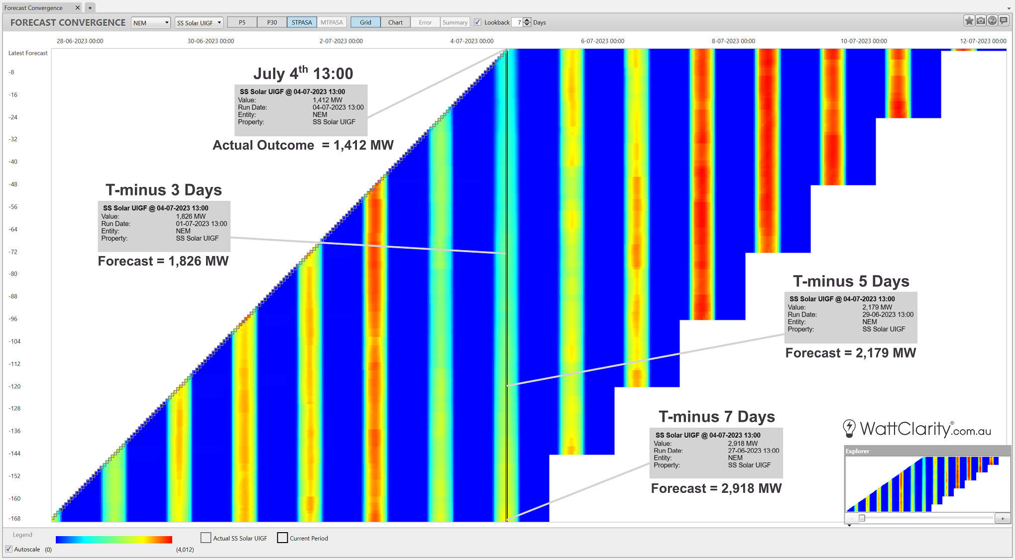
The actual outcome of available large solar generation at 1:00pm July 4th was -51.61% off the forecast from 7 days prior.
Source: ez2view’s Forecast Convergence Widget
And the wind doesn’t blow
Meanwhile, wind speeds across a similar area were subdued, impacting areas that currently house the highest concentration of wind farms.
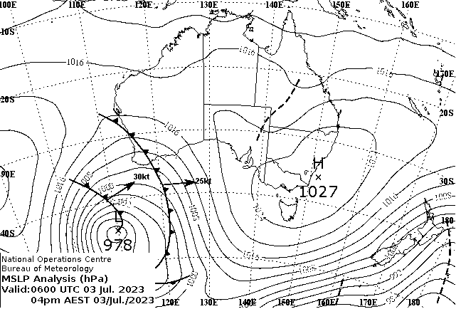
A high-pressure system over the south-east of the mainland contributed to relatively low wind speeds across the areas on the NEM with the highest concentration of wind farms.
Source: Bureau of Meteorology (BOM)
To show the impact of this weather system, below I’ve mapped available generation for each semi-scheduled wind unit in the NEM for 5:45pm NEM time on July 3rd (the dispatch interval in which the IRPM low point occurred) on the right of the image. For comparison, I’ve included the maximum capacity for each of these units on the left. You can enlarge this image on your browser by right-clicking “Open Image in New Tab”.
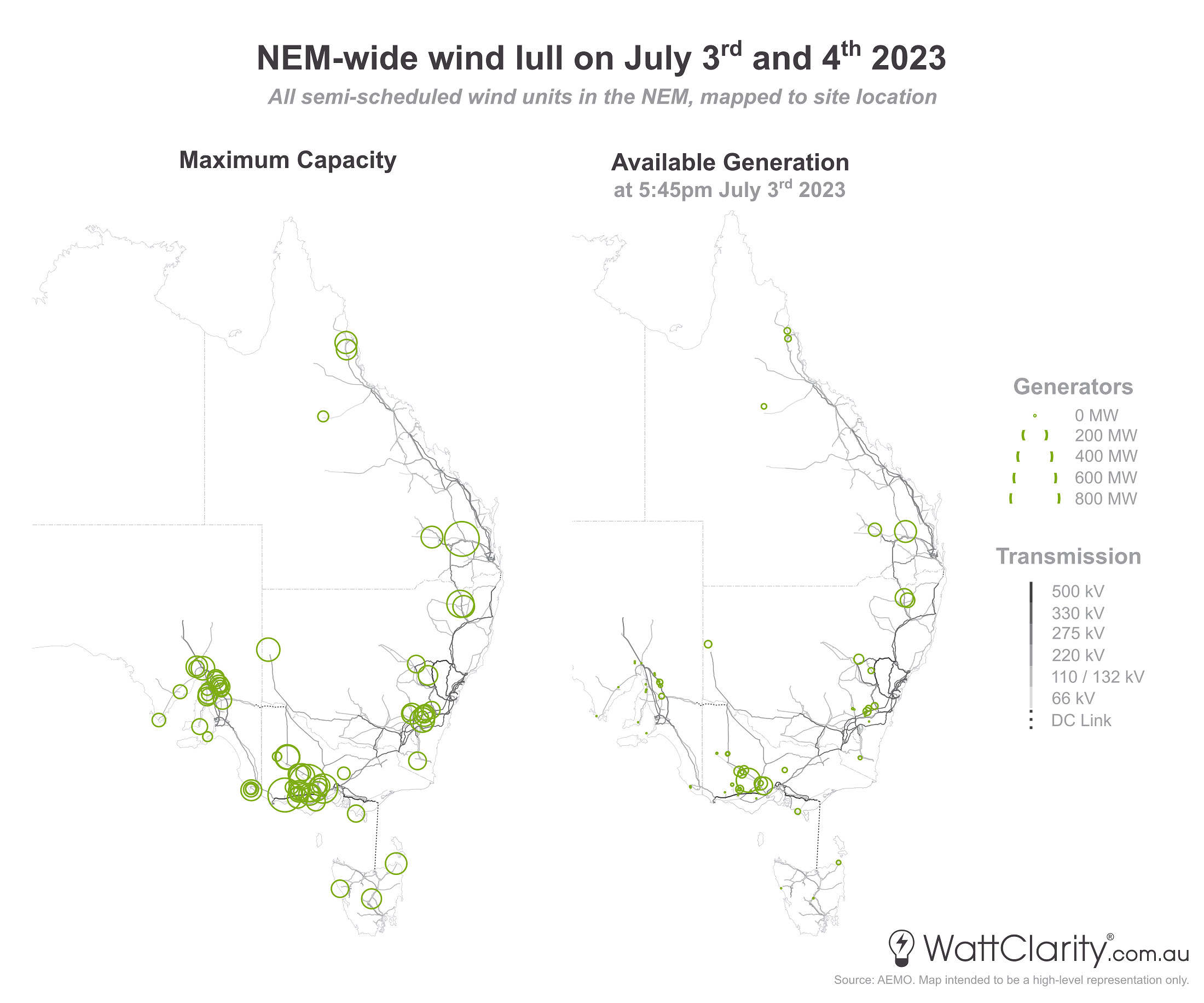
Low wind speeds were affecting wind farms across a diverse range of wind farm locations near the south and eastern coastlines. The point in time examined in the data map above focuses on the 17:45 dispatch interval in which the IRPM low point occurred.
Source: NEMreview
For this specific point in time we can see either low or very low levels of wind availability (and hence wind generation) in the following areas:
- All of SA
- All of TAS
- Most of VIC, with the notable exception of Stockyard Hill Wind Farm
- Southern NSW
- Northern QLD
There were slightly higher levels of availability in Northern NSW and Southern QLD, but it must be noted that these areas currently consist of a much smaller concentration of wind farms. The map should help demonstrate the widespread nature of this wind lull and how north-south wind diversity did not provide strong anti-correlation at the point in time examined.
The chart below shows the trended total available wind generation NEM-wide for July 2 to 5.
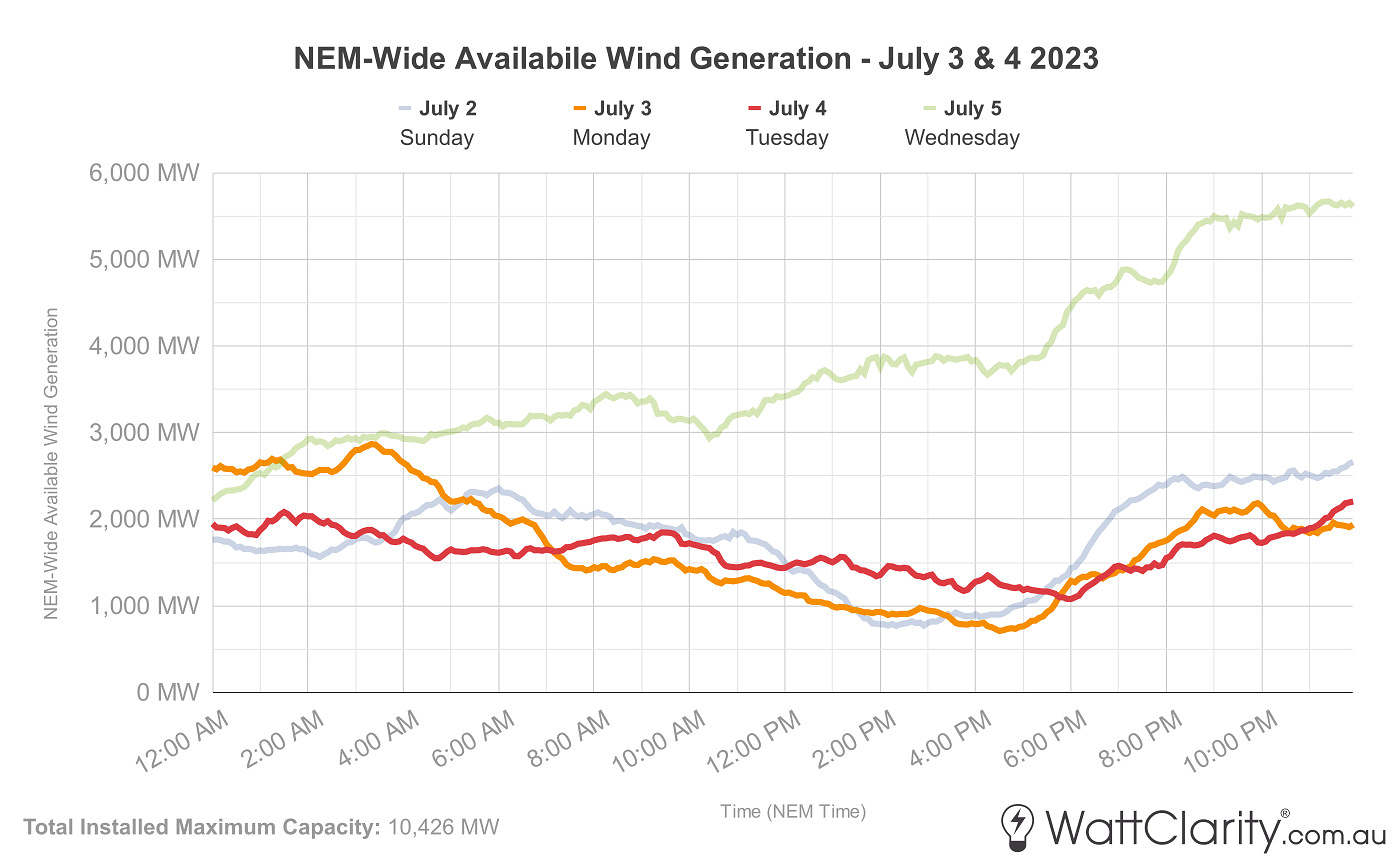
Unfortunately, the wind-lull coincided with early evening demand peaks on July 3 and 4
Source: ez2view Trend Editor
Could this low wind generation period have been planned for before the fact?
Like the forecast convergence chart shown above for solar, I have similarly collated the image below to show the evolution of the Wind UIGF forecast and the actual outcome for July 3rd at 6:00 pm (NEM time). We can see that the 7 and 5-day ahead forecasts deviated even more substantially for wind availability.
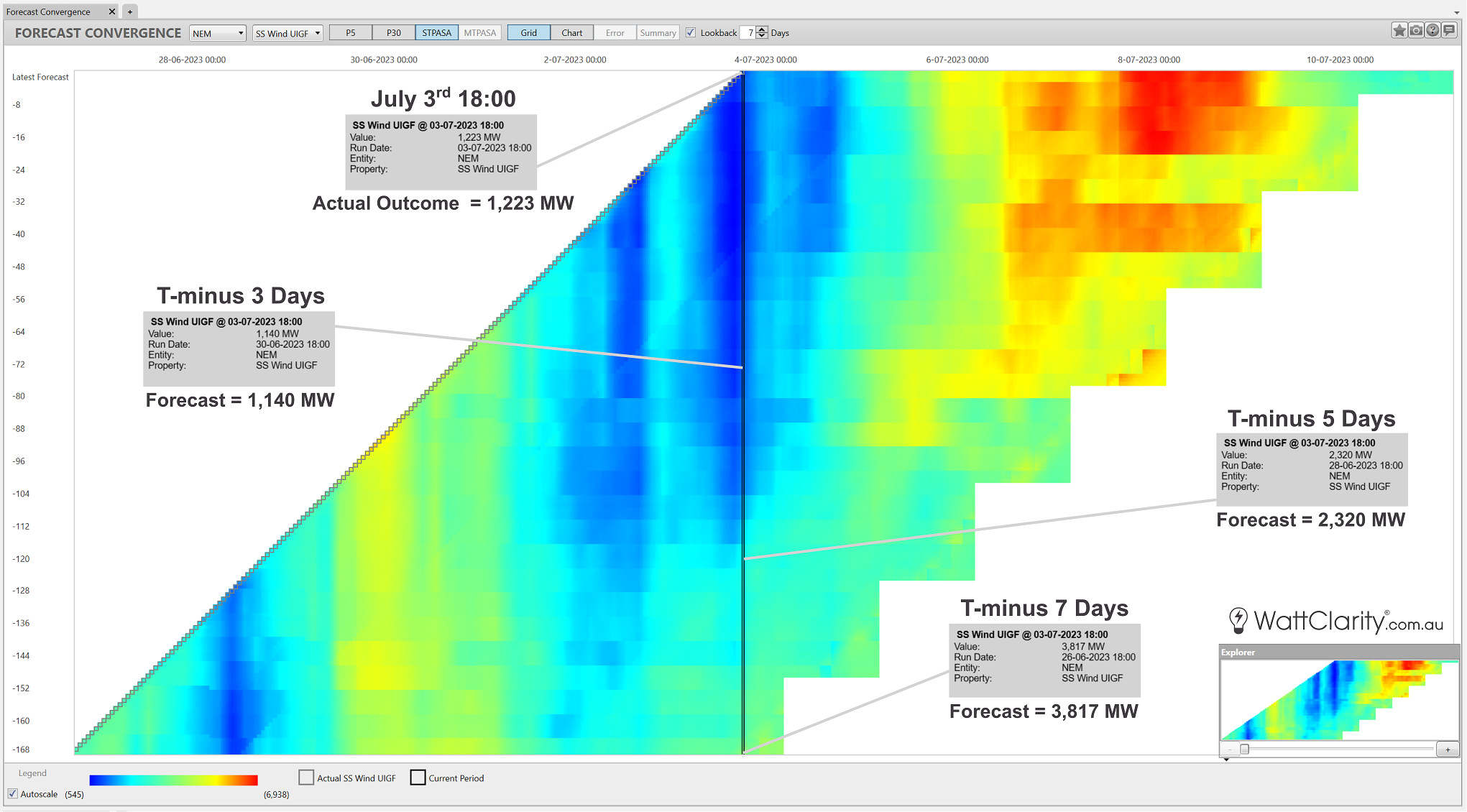
The actual outcome of available wind generation at 6:00pm July 3rd was -67.96% off the forecast from 7 days prior.
Source: ez2view’s Forecast Convergence Widget
Key Takeaways
This case study has presented a real-world example of the ‘Dunkelflaute‘ problem that system planners and market designers will need to plan for. My two key takeaways from this part of the analysis are:
- Dunkelflaute should be seen as an unexpected (but troublesome) guest. The amount of time we will have to plan and act on incoming ‘Dunkelflaute’ periods won’t always be long.
- VRE resource diversity isn’t always going to save us. It’s not a simple case that somewhere the sun is always shining and the wind is always blowing – or as Paul has previously put it “Diversity is not a magic wand“.
If time permits, we hope to continue this case study to examine:
- The availability of non-VRE generators
- How a grid running on just VRE and Storage would have fared during this event
- The duration of storage needed to overcome this solar and wind lull
Hi Dan: I have done some simple modelling using the Griffith University 42 year historical wind and solar production work versus the ISP 2022 Plan and the CSIRO and for storage requirements.
I found the ISP 2022 storage requirements more reasonable but still only just (my finding it covers up to 1 in 20 year events). Thank you for your analysis – very interesting. I looked at Figure 14 in the Griffith Study and it appears this event is less than the worst “1 in 42 year event” for 2 days of low VRE output. Figure 14 compares % output to average VRE output.