
The year 2020-21 saw its fair share of market reform proposals, initiatives, and implementation. One of the persistent themes as we look to the ESB’s Post 2025 market design work was and continues to be the creation of some form of ‘Ahead Market’. Depending on the design, the benefits would include the opportunity to trade energy and system services ahead of real-time and potentially even co-optimising the scheduling of energy and system services ahead of time, all with intent of increasing efficiency for consumers and lowering price and scheduling risk for participants.
It goes without saying, therefore, that a key input to the process will be the demand forecast.
As part of a broader analytical project we’re completing for the compilation of GenInsights21, we’ve analysed AEMO’s past demand forecasts to review accuracy and changes therein, over time. The findings, at the aggregate-NEM level are encouraging.
We’ve used region-totals of demand and non-scheduled generation, aggregated to the NEM. This measure includes all scheduled generation, semi-scheduled generation, and significant non-scheduled generation.
For those who are not aware of the complexities in measuring demand, Paul’s explanation from April 2018 will be of use.
Figure 1 summarises the (30-minute predispatch) demand forecasts from the period April 2020 to March 2021. Of note:
- Each forecast was grouped by how many 30-minute periods ahead it was made and then compared to the actual.
- The ‘Error’, defined as Actual – Forecast, was summarised into quantiles ranging between 5% and 95%.
- Readers should remember the caution posted earlier about why a forecast ‘error’ does not necessarily mean a forecast ‘mistake’.

Figure 1
Observation 1) Forecast ‘Error’ sharply declines from 5 hours ahead
Figure 1 and the data suggests that forecasts less than 5 hours ahead see the most gains in accuracy as time reduces. At the other end of the chart, at 24 hours (one day) ahead, we can see that accuracy isn’t exploding as the forecasts extend further into the future. In fact, the error range mostly remains steady from the five hours ahead point to the 15 hours-ahead point. A slight increase in error is detected in forecasts made beyond the 15-hour mark (out to 24 hours ahead).
Observation 2) There is a positive bias in ‘Error’
The positive bias in errors (as indicated by the 50% line being higher than 0) indicates actual demand tends to be higher than what was forecast. In other words there appears to be a bias towards forecasts that underestimate demand.
Upon further analysis the bias appears to be driven, mostly, by forecasts for the QLD region. At this point we should note that the forecasts as documented in the Demand Terms in the EMMS do not include the component for non-scheduled non-wind/non-solar or non-scheduled wind/solar <=30 and therefore this may also be contributing to the bias.
Observation 3) Has the ‘Day Ahead’ forecast ‘Error’ been improving through the years?
Considering forecast accuracy from another angle, we can inspect the range between the 5th percentile and the 95th percentile of the ‘errors’ which covers the best 90% of forecasts made at each period ahead. In figure 1, at one day ahead, the 5% -95% range is 1,345 MW.
At 12 hours ahead the range reduces to 1280 MW and at 5 hours our it has reduced to 1240 MW. From this we might argue that forecasts made one day ahead aren’t materially worse than forecasts made 5 hours ahead.
To assess whether the ‘errors’ have deteriorated over time, as proxy indicator of what is in store in the future. Figure 2 charts the 5% – 95% range of Error from the one-day-ahead forecasts, by month. The Range series is the length of the vertical grey bar in Figure 1, but now presented monthly as a time series. Higher ranges indicate wider spread between the 5th percentile and the 95th percentile: larger ‘errors’. The underlying trend is that of a decreasing error range at a rate of about 15 MW/year. This might not appear as much of a but in the context of the recent increases in variable renewable energy generation, ongoing installations of rooftop PV, other technologies and weather predictability I’d say it’s a sturdy result just to be keeping up with those challenges.
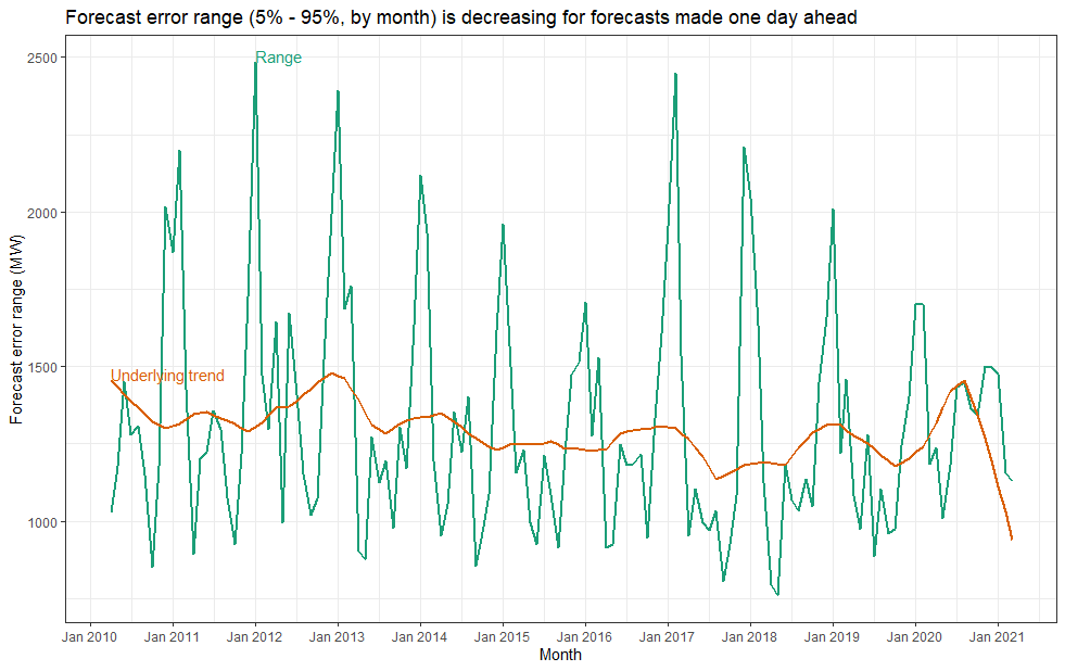
Figure 2
Observation 4) The errors are seasonal, but some seasons are tougher than others
Months January and February and sometimes December coincide with the largest error ranges for 24 hours ahead forecasts.
Using the time series of errors in January 2012, which saw the largest 24 hours-ahead error range, we reminded ourselves that it is not always hot weather that challenges demand forecasting systems. Often it’s the absence of hot weather or presence of atypical weather patterns. Along the east coast of Australia in January 2012 we generally saw below-average temperatures coupled to above-average rainfall in many places.
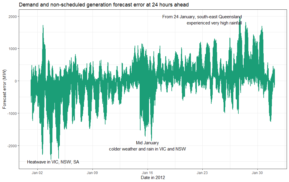
Figure 3
When we travel back in time to January 2012 long-time readers may recall the demand forecasting competitions held by Global-Roam. While the competition was running this article noted a heatwave in early January in SA, VIC and NSW didn’t coincide with high demand even though Melbourne saw temperatures above 40 °C near the start of the month. NSW experienced above average rainfall and below average maximum temperatures. By the end of the month flooding in QLD was widespread. By the time we got to February this article noted that the typical high demand of summer hadn’t yet arrived.
Where to from here? We can look forward to GenInsights21 to present deeper analysis on these aspects, regional differences and demand components targeting better understanding of the evolving predictability of demand.
Leave a comment