On Wednesday this week, the Queensland Government launched their much-awaited Energy Policy. In this ABC news article at the time of the launch, Kate McKenna included these paragraphs:
‘Ms Palaszczuk said the state could not reach net zero without storing renewable energy to make it reliable.
“And with climate change there will be more unseasonal rain and other weather events that impact on the reliability of renewables,” she said.
“These events can last for days — current battery technologies can’t at scale.
“That’s why more pumped hydro energy storage is needed.”’
Quite timely to read the Premier’s thoughts, given that we’d been finalising this article (in which we specifically look into how weather patterns in periods of Q2 2022 affected solar yield contributed to the extreme market outcomes) to publish this week.
—
(A) Background, with respect to Q2 2022
Over preceding months we’ve written numerous articles about the 2022 Energy Crisis, which:
1) was at its worst with these price outcomes through Q2 2022 (at least thus far);
2) culminating in the ‘never happened before’ Market-wide Suspension from 15th June 2022; and
3) and which Dan Lee estimated cost in excess of $6.5b just for the month of June 2022 (i.e. as much as some prior years had cost for the whole of a year!)
We remain very keen to understand the various contributing factors – but readers should note that:
1) Whilst we can understand that others might want to understand and rank the importance of the contributing factors in Q2 2022 so that they can apportion ’the finger of blame’;
2) Our interest is:
(a) not so much what happened in the past –
(b) but rather identifying clues that might help us understand what it might mean for the future, as the energy transition continues to snowball …
… such as in the QLD Government’s push for the development of pumped hydro, which Mark Ludlow.
It’s for this reason, in particular that:
1) We quickly scanned the AEMO’s QED for Q2 and identified eight different factors reported as contributing to the extreme outcomes in Q2; and
2) We also quickly scanned the AER’s Wholesale Markets Quarterly for Q2 and identified nine different factors reported as contributing to the Q2 outcomes.
… noting that the AEMO’s list and the AER’s list had some overlaps (particularly in terms of the big ticket items – like coal unit performance, and fuel pricing), but also had some differences.
The main take-away from this combined list of factors should be that it was a complex situation that evolved, with a number of different factors converging to produce the extreme outcomes.
(A1) Confluence of events
With our interest in Q2 as a background, there’s been a confluence of events in the weeks leading up to the current news-busy week:
1) On Tuesday 6th Sept 2022, I saw that the BOM had tweeted about Queensland experiencing ‘the wettest winter since 2016’:
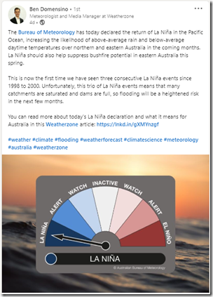
2) This was followed by the BOM’s official declaration of the return of La Niña in the Pacific Ocean, as Ben Domensino discussed here on LinkedIn … making it three years in a row:
3) Prior to my presentation at ‘Smart Energy Queensland’ on Wednesday 14th September on the topic of ‘Queensland’s changing grid’, I was sifting through the many different aspects of this changing grid/market I could speak about:
(a) Noting that the Sunday prior to the conference the QLD region hit a new low point for minimum demand;
(b) And with the events of Q2 2022 holding plenty of examples of how the grid (and the market) are changing!
(c) Plus, of course, ongoing interest in the changing fuel supply mix … albeit in QLD changing more slowly (at least to date) than in other regions … but that looks set to change.
(A2) The curious case of solar in Q2 2022
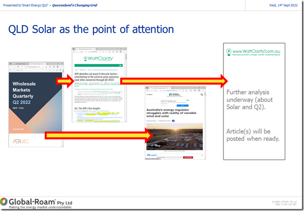
One other recent event stood out to me, as well – with the AER’s ‘Wholesale Markets Quarterly’ report for Q2 2022 leading to some pointed criticism – as flagged in this slide from my presentation:
After the AER published its Wholesale Markets Quarterly:
1) not only did we flag these nine factors …
2) also over on RenewEconomy, Giles Parkinson wrote how it appeared that ‘Australia’s energy regulator struggles with reality of variable wind and solar’.
So given that all of this has transpired within the same period, and our deep drive to understand as much as possible of the various drivers of outcomes like that, curiosity got the better of me and I extracted some data from NEMreview v7 in order that I could have more of a look, myself, at what happened through Q2:
1) With one eye on exploring the AER’s claims (and Giles’ criticisms of those);
2) But also with another eye to what this might mean in a La Niña period in 2030-31, say, after the energy transition has rolled through the coming years and the fuel mix has evolved further along the lines of the scenarios painted in documents like the 2022 ISP.
Unfortunately I ran out of time prior to the presentation* , so all I could do on that day was flag that more analysis would be published later.
* I was also acutely aware of the barriers a 10 minute time limit would impose on providing a clear explanation of a complex (and emotionally charged) topic, given what I had seen even in the early stages of some analysis…
Hence we start with this article (and those linked herein) I’m hopeful this will be of value to readers – as always, please do let me know where you think I’ve made errors.
(B) Giles’s criticisms of the AER’s analysis
For readers here it’s worth copying in the text of Giles’ comments specifically relating to what the AER reported below:
‘…
The AER points to the impact of large scale solar in Queensland – one of the states most affected by the soaring price of gas and the lack of reliability of its coal fleets – and of wind in South Australia, the state with the world’s highest share of variable renewables (64 per cent in the last 12 months) in a gigawatt scale grid.
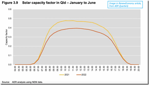
But here’s the problem. It appears to have gotten the data in Queensland badly wrong. The AER cites the lower capacity factor of Queensland solar farms as a significant factor in the supply and price issues.
“Figure 3.9 clearly illustrates that on average, there was less solar electricity generated per MW of capacity in 2022 than 2021,” the AER report says.
“This pattern is consistent with impacts in other regions. This not only impacts large scale solar generation but also rooftop solar generation (effectively increasing demand).
“This resulted in other generators needing to operate at higher levels than anticipated to meet demand.”
The graph above does look bad. So, exactly what sort of quantum of supply shortfall are we talking about here? The AER doesn’t say, but for context it should be noted that the maximum solar output in Queensland from its utility scale solar farms at the time was around 1,600MW.
So, assuming the AER data is right, the most it is suggesting that could have been lost with the lower capacity factor is around 150MW of solar capacity, a tiny fraction of the coal and gas capacity that went AWOL at the same time.
But here’s the thing: It looks like the AER solar data is very wrong.
For a start, it claims that 1,000MW of new solar capacity has been added to the Queensland grid over the last 12 months, which would be a 50 per cent increase in one year. It didn’t happen.
We checked with leading renewables analyst Rystad Energy, which follows the data closely, and its number is much different. In total, it says, 800MW was added, but it’s important to note that that figure reflects the nominal capacity of those solar plants once they are finished, not what has actually been built so far.
Three of those solar farms, Western Downs, BlueGrass and Woolooga, had been connected to the grid, but they were not and still are not producing anywhere near their rated capacity, because they haven’t been completed yet.
In the case of Western Downs, (pictured at top) which will be the country’s biggest solar farm when finished at 400MW, it has only recently reached a commissioned capacity of 100MW. Some of its modules have not been installed.
It appears that this confusion, between rated capacity when complete, and capacity available during construction, would explain the AER’s capacity factor assessments.
The AER appears to be counting the 400MW of Western Downs as the rated capacity and using that to tell us that Queensland solar farms produced less than was expected.
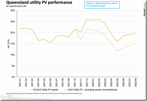
Rystad Energy have produced a chart (above) of the Queensland solar capacity factors showing the difference between the total capacity of those new projects assuming they were all complete (the bottom line which fits in with the AER view), and the capacity factor based on how much was actually built and commissioned at the time.
It shows that the capacity factor of solar farms in Queensland in the June quarter, in fact the whole of 2022 – based on what has actually been built – has been higher in 2022 than 2021, not lower as claimed by the regulator.
As for “less generation than anticipated”, it’s true to say that there is a fair bit of “hopium” about the renewables industry, but I’m not sure how many people – apart from maybe the AER – were reasonably expecting modules that hadn’t actually been connected to the grid to be supplying power.
And, just for the record, this is what the Australian Energy Market Operator said about average solar output in the June quarter in the two biggest solar markets, Queensland and NSW. They both went up. (See graph above).
The regulator really has to be doing better than this.
…’
To help me in reading the above (and with reference to what follows), I’ve highlighted a couple of comments.
My paraphrasing of Giles’ criticisms above, I’ve broken them into the following topics:
(B1) Relative significance of contributing factors
Giles writes ‘…a tiny fraction of the coal and gas capacity that went AWOL at the same time.’ in comparison with the contributions of the thermal fleet during Q2.
For the avoidance of doubt, I agree that the fossil-fuelled units (i.e. coal and gas) were the biggest contributors to the Q2 crisis in various ways.
Reiterating what I noted above, my interest in solar through Q2 2022 is in relation to finding clues to what might unfold in (say) 10 years time under similar (weather and other?) conditions, in an environment where solar is a much larger contributor to the energy mix and coal a much smaller contributor.
(B2) Specifically with respect to solar
So with the above caveat in mind, let’s look specifically at the criticisms levelled at the AER Analysis – we’ll list them here, and dive into some details further down…
B2a) That other dimension of time
Giles contrasts the approach taken by the AEMO and by the AER – which, to a large extent, relate to the different dimension of time chosen for their analysis.
See this related article about ‘Analytical Challenge – remember to consider the *other* dimension of time’ for some background.
With that background in mind, a key difference between what AEMO published (and which Giles has copied in) and what the AER was saying is that:
1) The AEMO chose to use the standard dimension of time, in comparing production levels (e.g. for solar, but also for other things) in Q2 2022 compared with those same production levels a year earlier in Q2 2021.
given the inherent subjectivity in assessing that other dimension of time to ‘look up a vertical’ I can completely understand why AEMO steers away from doing this in the vast majority of its analysis!
2) In contrast to the AEMO approach, my read is that the AER was talking about the actual performance of solar in Q2 2022 compared with how it had been expected to perform.
despite the inherent subjectivity in this analysis, it’s sometimes quite necessary to complete (i.e. in addition to, or perhaps even more importantly than, the standard dimension of time).
This, to me, is the main difference in the intent behind the different analytical approaches of the AEMO and the AER.
—
However putting that to one side, there are other criticisms about what the AER did in its analysis, which we will move onto below …
B2b) Growth in installed capacity
As already noted in highlighting 9 different factors they identified, in the AER report they write (with respect to Large Solar in Queensland) that:
‘… despite an increase in installed large scale solar capacity of around 1,000 MW Queensland, actual output in 2022 was similar to 2021. …’
… but Giles voiced concerns with this number, writing:
‘It didn’t happen. … We checked with leading renewables analyst Rystad Energy, which follows the data closely, and its number is much different. In total, it says, 800MW was added …’
A difference between 1000MW and 800MW is a 20% difference (or 25%, depending which way you look at it), which is a significant amount – especially if thinking that this type of metric should be easy to produce unambiguously?!
I wondered how two organisations I respect had come up with different numbers in the first place? So did a bit of digging … :
1) Because I expect it will be useful to reference in its own right, I’ve posted an article about ‘Analytical Challenge – choosing what measure to use, for ‘Installed Capacity’;
thanks for the various compliments that have been relayed to me from various people on that article.
2) For now, pay particular attention to section (A) in that article, where I write about ‘Choosing between Registered Capacity and Maximum Capacity’ to explain that:
(a) Both numbers can be useful in different circumstances;
(b) The usefulness varies by technology type; and that
(c) The more recent Large Solar Farms tend to oversize Registered Capacity compared to Maximum Capacity (but even amongst solar farms the pattern is not homogeneous).
So I wondered if those two different metrics might have been the source of the discrepancy between 1000MW and 800MW?
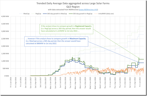
In the chart above I’ve trended the difference in both of these metrics for Large Solar Farms across Queensland, compared to that same metric 365 days earlier (i.e. to show the growth over a full year period). So in conclusion, thus far:
1) I can see one possible way AER might have concluded that there had been an increase of ‘around 1,000MW’ in Queensland …
(a) Choosing to look at Registered Capacity; and
(b) Rounding down from 1,123MW (if using end of Q2 reference);
2) But I can also see how Rystad had come up with ‘800MW was added’ :
(a) Choosing to look at Maximum Capacity; and
(b) Also rounding down from 886MW (if using end of Q2 reference);
3) Neither method is strictly incorrect:
(a) Just part of the inherent (and unfortunate) complexity of the NEM;
(b) Especially in cases like this, where it seems others might have gained the impression that the AER was blatantly incorrect;
(c) My personal preference would probably have been to choose growth in Maximum Capacity of Solar Farms for reasons discussed here.
4) Of course that excludes other potential permutations … such as comparing growth from 1st April 2021 to 30th June 2022 (wouldn’t be what I would choose to do, but should be flagged as a possibility).
So the AER and Rystad would seem to both be correct … just referencing different AEMO data?!
B2c) What number to use, as effective Installed Capacity?
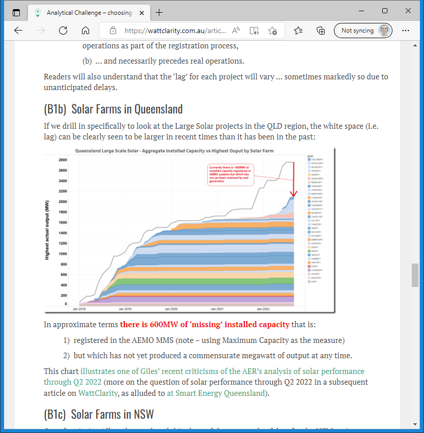
Leaving aside which AEMO data series is chosen, Giles also notes that the AER calculations are unfortunately skewed by a blow-out in construction/commissioning lag for Large Solar Farms in Queensland. The effect of this lag can be clearly seen in the chart that Allan O’Neil provided us for inclusion this earlier article about ‘Analytical Challenge – choosing what measure to use, for ‘Installed Capacity’:
1) Pay particular attention to section (B) with respect to ‘Discounting from AEMO’s published data for ‘effective’ Installed Capacity’.
2) Of particular interest to some will be the difference between two charts at the current point in time:
(a) The chart for the QLD region … where there is currently about 600MW of ‘missing’ capacity due to a current blow-out in the lag between AEMO registration systems and effective capacity; in contrast to
(b) The chart for the NSW region … where a similar blow-out occurred about 2 years ago, and has since been resolved.
Ordinarily an analyst might assume that the lag might be generally consistent one year to the next, so the effects would ‘even out in the wash’ (I have done this very thing as a short-cut, on occasion) … but Allan’s chart for QLD in that article illustrates that this would not have been the case for the QLD region in comparing Q2 2021 with Q2 2022.
B2d) Use of capacity factor as a comparator, over 6 months!
As already noted with respect to their section 3.4.1, in the AER report they write (with respect to Large Solar in Queensland) that:
‘… despite an increase in installed large scale solar capacity of around 1,000 MW Queensland, actual output in 2022 was similar to 2021. …’
… and go on to say
‘Figure 3.9 compares the solar capacity factor for Queensland in 2021 and 2022 from January to June. ’
Now keeping in mind the complexities flagged here with respect to choosing the measure of Installed Capacity as the denominator in a Capacity Factor calculation, more fundamentally I wondered …
Q1) Why the AER chose to illustrate how Output was lower than expected by using Capacity Factor (i.e. with all the added complexity) as a metric in the first place?
Whilst I understand why an analyst might have chosen to use capacity factor as a quick comparator (i.e. I’ve done so myself on other occasions), the criticisms in Giles’ article also reveal the inherent complexities taken on in performing such analysis accurately.
Q2) Why they chose to look at Capacity Factor over an entire 6-month range (i.e. January to June 2022) where their report was ostensibly just focused on Q2?
Having watched the performance of solar through our dashboard solar as Q2 evolved, and having remarked at times about how low the aggregate output has been (i.e. compared to expectations I’d formed by watching output on other occasions), I wondered if this could not have been explored, and illustrated, another way?!
We explore this further below…
(B3) Other criticisms of AER’s analysis (unrelated to Solar)
Readers here should note that Giles’ comments:
1) also cover other aspects of the AER’s report (like wind), and also
2) there are other comments about other aspects of the AER’s engagement in the NEM in recent times.
… but these are not my focus in this article.
(C) Our own analysis of Solar through Q2 2022
Longer-term readers will remember how I asked the question ‘where’s the wind gone?’ at the end of June 2017 as a result of our ongoing use of our dashboard-style displays (e.g. NEMwatch and ez2view) to watch the market as it unfolds in real time.
1) On that occasion, it turned out that output was startlingly low over both dimensions of time;
2) As updated on 5th September 2022, the low-point ‘wind drought’ of June 2017 is still a stand-out in the historical range.
3) So much so that it inspired analysis into wind diversity in Appendix 27 within GenInsights21 … which itself followed on from earlier analysis in the GRC2018.
What happened through Q2 2022 was a similar case for me, where I had been wondering about what seemed to me to be relatively poor output from Large Solar and Small Solar through Q2 2022.
1) So it was not really a surprise to see that the AER flagged this as one issue;
2) But with the subsequent criticisms spurring me to have a deeper look.
So with the above in this article as background/context, let’s continue to explore what happened with solar through Q2 2022.
(C1) Exploring criticism of the AER Analysis
With respect to the categorised criticisms above, and some other considerations as well, I have separated them apart in the table below. For each criticism and factor, in the second column I’ve included some notes, and will build on this below:
| Criticism (and Factor) | Exploration of Criticism (and Factor) |
|---|---|
|
What’s effective Installed Capacity … growth, and what to use in Capacity Factor |
This was all discussed above … and, to me, all the consternation unfortunately caused could possibly have all have been avoided had the AER just illustrated with reference to actual output. We’ll look further below. |
|
The time range chosen for the illustration |
The AER Wholesale Quarterly pertained to Q2 2022, but for some strange reason they chose to illustrate their conclusion (that solar production was lower than expected) by showing their calculation for solar capacity factor over Q1+Q2 2022, in comparison to Q1+Q2 2021. I also wonder (if the analyst is principally interested in the factors contributing to the 2022 Energy Crisis) whether even the full span of Q2 2022 is too much time range. We’ll explore this below. |
|
Geography |
Furthermore, whilst the AER chooses to compare a longer time range than the Q2 report would ostensibly cover, there’s also the inverse situation whereby the analysis in AER Wholesale Quarterly is focused just on the Queensland region … though they do write that: ‘This pattern is consistent with impacts in other regions’. Whilst the AEMO did highlight in the QED for Q2 2022 (though the AER did not) that congestion was one of the factors contributing to the extreme price outcomes, I was curious to understand: 1) what the situation would be looking at solar harvest across the NEM ; 2) At least in the first instance! So we will start with NEM-wide below. |
|
Not including Rooftop PV |
It’s also notable that the AER analysis focuses just on Large Solar (i.e. not considering Rooftop PV). now, because they chose to represent output via Capacity Factor, there might have been a reason they did that…. … but for me it seems most important to start on an ‘All Solar, Everywhere’ frame of reference, at least in the first instance. |
|
That other dimension of time |
Once again we reiterate that both dimensions can be important … but for me (in this instance) I am particularly interested in how solar actually performed compared to prior expectations for the quarter (or same periods inside the quarter). |
With all of these in mind, let’s continue…
(C2) Did solar production disappoint?
With the criticisms above in mind, but a driving interest to understand how solar performed through Q2 2022, we set about performing our own analysis.
In doing this I was conscious of the fact that the AEMO had already identified periods of low renewable generation as one of the contributing factors to extreme outcomes in Q2 2022. As noted in our summary here (point B3) …
On p17/66 the AEMO notes that one of the reasons why additional gas procurement was required at these high (internationally-influenced) price was:
‘due to periods of low wind and solar generation’
… with a reference to this Media Update from Energy Australia on 21st June 2022, which also notes (as one of ‘four key issues affecting electricity supply and prices’):
‘weather patterns that have meant lower generation of wind and solar’
So it seemed clear to conclude that the answer to the question ‘Did solar production disappoint?’ was ‘YES’ – though it was useful for us to explore the details. Our own analysis was not complete prior to my presentation on Wednesday 14th September, so instead I am sharing it with WattClarity® readers here today.
C2a) Aggregate Large+Small Solar, trended over time
Steering away from the added complication of calculating capacity factors (which was arguably not required in any case to ascertain the extent to which poor solar harvest in Q2 2022 was a contributing factor), I simply extracted data from NEMreview v7 for the daily average output from all solar sources for which we have data across the NEM.
Specifically this entailed:
1) Daily average aggregated Large Solar output by region (using ‘InitialMW’ for each DUID and aggregating to region) across all of the days in recent years; and also
2) Daily average aggregated estimated Small Solar output by region (using the AEMO’s own ‘Measurement’ estimate, remembering the considerations noted before about ‘The Ongoing opacity of Rooftop PV’);
3) Readers will understand that there’s a sizeable lump of ‘invisible’ contribution from Medium-Sized Solar facilities:
(a) Which are sized above 100kW (so don’t contribute to SRES, hence are not used in the AEMO’s ‘sample and extrapolate’ measure for Small Solar);
(b) But below the ~10MW threshold at which AEMO might deem real-time visibility necessary from a market/system operations perspective
(c) However this lack of data is consistent over the years in the study and, given the coverage of the other two sizes, is thought to not make a material difference in the overall conclusions in this analysis.
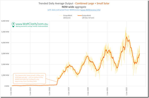
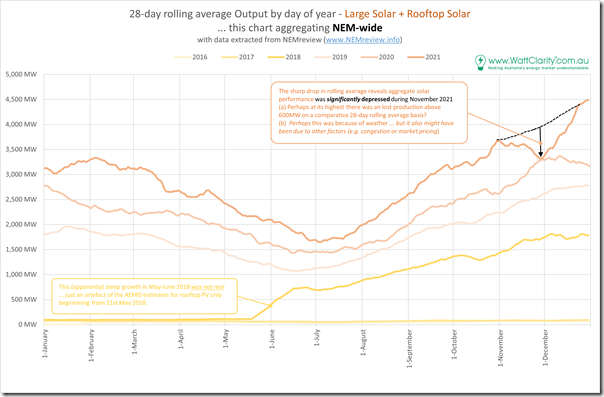
Comparing daily average data over many years provides charts that contain a large amount of noise (between one day and the next the output can be quite variable, due to weather and other conditions). For this reason we have aggregated the data up into 28-day trailing averages (as shown in this comparative trend here), eliminates much of the noise and allows the larger trends to become more visible:
Especially with the noise eliminated, we can make three big observations:
Observation #1) This analysis is only useful back to mid-2018, because that’s the extent to which AEMO has been publishing their estimates of rooftop PV:
prior to that time the APVI was publishing estimates, and we do make these available for client use in NEMreview … but the estimates are not directly comparable, and the APVI data feed has proved to be more prone to disruption than that from the AEMO.
Observation #2) There’s a clear pattern for year-on-year growth, which is expected due to the ongoing growth in capacity.
Observation #3) Overlaid on this is distinct seasonality (higher production in summer than winter);
Observation #4) Even looking past these underlying factors, there are some clear aberrations at times:
4a) which, for now, we will speculate are due to wet/cloudy weather patterns
4b) but which are explored further below.
Observation #5) It’s also important to note that, as the installed capacity growth, the absolute size of the dips during these periods of extensive cloud cover is growing larger:
5a) We’ve not looked here, but suspect that in relative terms the size of these dips is probably not growing larger – and indeed might be growing smaller;
5b) But readers should understand that it is the absolute size of these dips that is more important – because it’s this size relative to underlying demand which is most important.
So with this data, we’ll take the analysis further for a macro view…
C2b) Year-on-Year to end of 2021
I thought it would be useful to compare data up to the end of 2021 initially, in order to set the scene with data that’s not the focus of the contentious observation in the AER Wholesale Quarterly for Q2 2022.
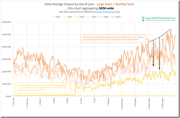
We start doing this via this comparison of Daily Average for days-of-the-year for almost four years:
(a) (partial) 2018,
(b) 2019,
(c) 2020, and
(d) 2021
With this comparison it is difficult to see past the ‘noisiness’ of the chart – but for illustration purposes I’ve sketched in a period through November 2021 where the aggregate daily output from solar NEM-wide was significantly depressed compared to expectation. Indeed, on those two periods highlighted, it might have been that the deficit on those two days was in excess of 2,000MW:
(a) Which represents ‘loss’ of expected average output over 24 hours
(b) So translating back to daylight hours would have represented a bigger number for a shorter time.
To see the net effect of this deficit more clearly I’ve flipped the chart above to comparisons of the 28-day trailing average, where the stand-out of November 2021 becomes clearer:
Apart from that one period in November 2021, we can see illustration of some of the Observations from above:
With respect to Observation #2 (annual growth) = by the reasonably smooth growth from one year to the next for any day of the year; and
With respect to Observations #3 (seasonality) = because growth from January-to-January is shown to be typically be higher than growth from June-to-June, for instance.
With respect to Observation #4 (large weather effects) = the presence of large weather effects is also illustrated by the drop in the rolling average for November 2021 down to what the result was for November 2000 (i.e. despite all that growth in capacity evidenced through the rest of the year).
Notes…
1) Without exploring the specific reasons for this drop, it seems clear to note that solar production through part of Q4 2021 underperformed what might have been expected of it (i.e. based on the clear growth in Q1-Q2-Q3 2021 compared to the prior year) through Q4.
2) I’ve annotated the chart to give some illustration to how that level of underperformance might be estimated … though note that there is bound to be an element of subjectivity in defining ‘what was expected of it’.
3) Keep in mind that these trends for each year are 28-day rolling averages, so be careful in reading too much into what it might seem to show in terms of the duration (i.e. number of days on the x-axis) of the depression.
4) The overall scale of the depression (in MWh) should be more truly reflected, however, given all trends are 28 day rolling average (i.e. if you measured the area under the curve).
If you’re with me thus far, let’s then take a step from 2021 into 2022 (to date) in order to see how this compares…
C2c) Year-on-Year from 2021 to 2022 (NEM-wide)
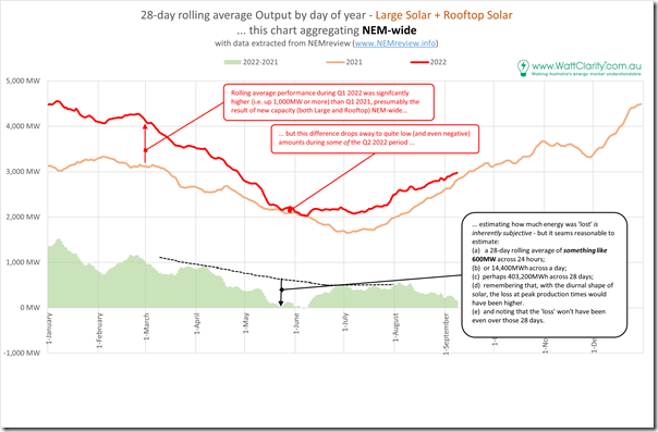
Skipping forward a year to compare just 2021 and 2022 (ytd) – and initially remaining with 28-day rolling average we can see that:
1) Production in Q1 2022 was well above production in Q1 2021, as would generally be expected given the year-on-year growth in installed PV; but
2) In contrast with Q1, solar production in Q2 2022 was significantly affected :
(a) through a large period during Q2 … but not for the whole quarter;
(b) due to reasons unknown at this point:
By comparing the two quarters we can clearly see the difference – even allowing for the smaller expected year-on-year growth from Q2 2021 to Q2 2022 (due to seasonal effects) the growth is quite clearly down … and even non-existent from mid May to early-to-mid June (i.e. for almost a month) on the basis of the 28-day trailing averages.
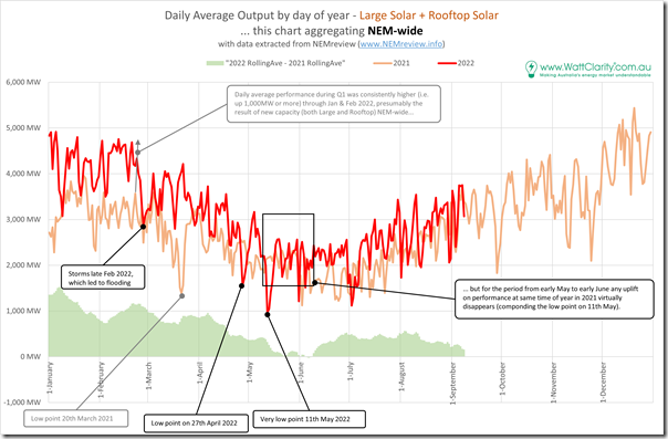
Remembering that the 28-day rolling average is useful for removing noise, but that this might be at the cost of skewed inferences, I’ve flipped back to the ‘raw’ daily average comparison here:
The picture here has more nuance than the smoothed chart above – but the underlying message seems to be the same.
Tellingly, this ‘worst’ period appears to follow 11th May 2022 for the next few weeks, which coincides with:
1) The ramp up of gas prices leading to price caps being applied:
(a) on 30th May we echoed Josh Stabler’s comments about the Victorian market hitting the Cumulative Price Threshold;
(b) but it’s notable that QLD and NSW saw their own price caps earlier.
2) A short time later, we then saw the QLD region reaching the Administered Price Cap on Sunday 12th June 2022, and NSW, SA and VIC the day after that.
3) Followed by the unprecedented NEM-wide Market Suspension on Wednesday 15th June 2022.
Hence I wonder about the extent to which the apparently poor solar yield through this period might have represented ‘the final nail in the coffin’ in the process above.
With this macro picture revealing that YES, it does appear that poorer-than-anticipated solar yield was a real contributing factor … so we delve into more detail in the days prior to Wednesday 15th June 2022 and the Market Suspension.
C2d) Year-on-Year from 2021 to 2022 (just in QLD)
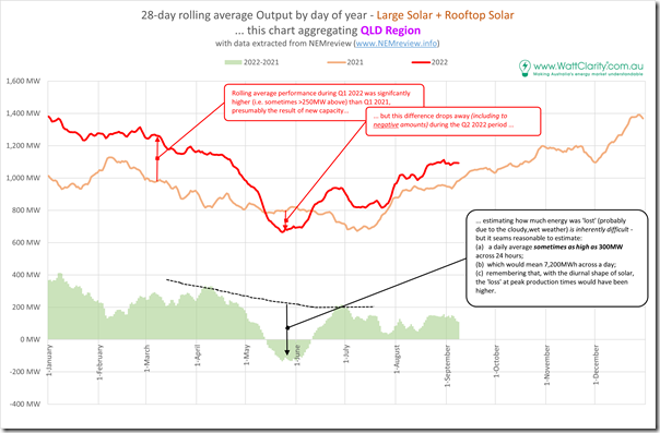
For comparison purposes here is the same chart as the smoothed (i.e. 28-rolling average) chart above, just for solar production in the Queensland region comparing 2021 with 2022 ytd:
We see here that the comparatively poor performance of solar through periods of Q2 2022 compared with Q2 2021 is even more pronounced (on occasions lower than a year before in absolute terms, despite the growth in capacity).
(C3) Why? What were the factors contributing to solar’s disappointing periods in key parts of Q2 2022?
I’m aware that this article is already quite long and I have only just answered the first question in the double-barrel question in the title of the article.
It’s already taken me longer than initially envisaged to get this far in the analysis – so rather than wait to finish the whole article (which would be even longer as a result) I thought it better to post this and leave this second question unanswered, for now.
Worth briefly flagging these four potential contributing factors …
Possible Contributing Factor #1 = Plant (physical) unavailability
In Giles’ criticism he flags construction/commissioning delays in Queensland Solar Farms (Western Downs SF, BlueGrass SF and Woolooga SF) meaning their performance is down on what would have been expected, if construction/commissioning had already been completed.
… but the (last) chart for QLD above shows aggregate solar production through Q1 2022 being significantly above the same for Q1 2021, so it seems to me that the disappearance of expected production in Q2 2022 is not due to late construction/commissioning.
However, it’s also possible that some other solar farms NEM-wide (remembering that this analysis above is mostly NEM-wide) might have been unavailable for various technical reasons … that’s not something I have looked at, yet.
Possible Contributing Factor #2 = Curtailment due to Congestion
Remembering what Marcelle had written before about ‘Estimating Curtailment – not as easy as it seems‘, I’ll flag here that network congestion might have been one contributing factor for the disappointing solar yield NEM-wide in Q2 2022 compared with Q1 2021.
However I have not yet looked.
Possible Contributing Factor #3 = Curtailment due to Low Prices
Ordinarily it would be the case that you could expect some curtailment of VRE production levels due to negative prices … but with this analysis of spot pricing patterns in Q2 2022 showing the incidence of negative prices in Q2 2022 being lower than Q2 2021 in four NEM regions (except SA), this seems unlikely to have been a reason for the disappointing output during Q2 2022.
However for completeness note that I have not looked.
Possible Contributing Factor #4 = Weather effects
After taking account of any contribution from the three factors above, that would leave weather effects (particularly the La Nina driven patterns of widespread cloud cover and rainfall) as the contributor to solar’s disappointing yield in Q2 2022.
Having watched in real time through our various dashboards as Q2 evolved, I’m confident that this was one of the contributing factors – but have not investigated systematically yet…
You’ll have to stay tuned for a follow-on article at some point in future…




Appreciate the careful analysis here Paul.
Very interesting and thorough analysis of contributing factors. I wonder if the prolonged period of low Solar generation prior to the June event, led to a draw-down of low marginal cost storage supply (ie. Big Batteries and Snowy 2.0), which then led to the perverse withdrawal of bidding to ensure a more ‘certain’ compensation regime when ‘directed’. This in turn led to profit maximising bid behaviour.
It seems that if we want to prevent further ‘inevitable’, but relatively unpredictable similar events. Considerable investment needs to be made in storage.
As a pro-sumer, it seems shocking to me that the regulatory agencies largely ignore Rooftop Solar DER in capacity planning, incentives, etc. and seem only to be considering ‘centralised’ options for planning, storage and transmission.
Further, this seems a perverse and unintended consequence of not pricing emissions, nor kWh, but only Watts.
It would seem to me that like the internet, a more distributed and standards based solution is the most economic, scaleable, resilient, and reliable. One might even argue it will be more scaleable and lower cost to build.