If you’re an outsider looking in on the NEM, you’d be forgiven for assuming that it’s a pretty simple matter of choosing what number to use to represent the ‘Installed Capacity’ of a unit.
Alas, no … the NEM is a complex place, even in terms of something as seemingly simple as ‘Installed Capacity’!
(A) Choosing between ‘Registered Capacity’ and ‘Maximum Capacity’
Starting with the data published by the AEMO in their MMS (historically known as InfoServer), it’s important to recognise that the AEMO publishes two different metrics:
(1) neither of which are perfect; and
(2) each of which has value in certain circumstances.
… where (as an added complication) the value of the two measures varies with plant type.
(A1) From the AEMO MMS
These measures are ‘Registered Capacity’ and ‘Maximum Capacity’…. which are described in the MMS Data Model report (v5.1) in table DUDETAIL as follows:
| Measure of ‘Installed Capacity’ | Description in the MMS Data Model |
|---|---|
|
Registered Capacity. |
The MMS Data Model says ‘Registered capacity for normal operations’ |
|
Maximum Capacity. |
The MMS Data Model says ‘Maximum Capacity as used for bid validation’ |
Clear as mud?
(A2) So what do the fields mean … practically?
I thought it might be useful to illustrate the difference with a few concrete examples…
(A2a) Large Solar Generators
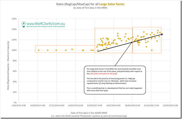
Let’s start with this chart, which maps the Ratio (of Registered Capacity to Maximum Capacity) against the registration date of the unit:
There’s a fair number of units (too many to identify individually) … but the important thing is to represent a distinct pattern over what might be three different phases:
| Phases of evolution in Solar Farms | Brief notes |
|---|---|
|
Phase 1 |
The first half-dozen-or-so projects were entered into AEMO systems with a ratio being very close to 100% (i.e. Registered Capacity = Maximum Capacity). |
|
Phase 2 |
From late in 2017 (i.e. after the initial bundle of projects) we began to see the ratio climb above 100% (meaning that Maximum Capacity is lower than the Registered Capacity of the plant). We’ll briefly explore why this is the case below. |
| Phase 3 | Perhaps there is a third stage emerging (from around mid-2020) whereby that ratio is not continuing to climb for all new Solar Farms being built and registered into the NEM: 1) For some it is continuing to climb 2) For others we see the ratio dropping back towards 100%Obviously each project has its own business drivers (and cost base), but it’s interesting to see at a macro level. |
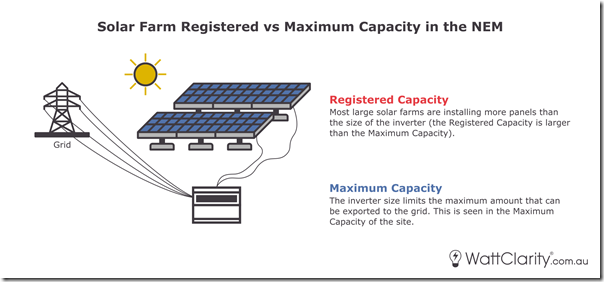
To explain why, we’ve drawn up the following two illustration of what typically (but not always) has been happening with respect to the Large Solar Farms registered with the AEMO:
As noted on the image:
1) The Registered Capacity tends to represent the aggregate capacity possible based on the number of solar panels installed on the site
… where, because the cost of panels has been falling, proponents have been choosing to ‘oversize’ panel installations, whereas
2) The Maximum Capacity (which represents what NEMDE sees as the maximum amount that can be accepted in the bids for a Semi-Scheduled or Scheduled unit) has remained lower
… which is, in part, reflective of the (relatively expensive) cost of connection to the grid.
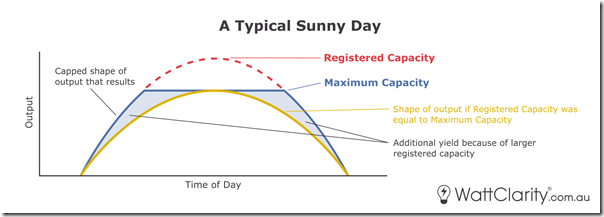
What that means in terms of production shape is illustrated as follows (remembering a bit of artistic licence to draw attention to a few things):
If you’re interested in peak output capability, then it’s clearer cut to use Maximum Capacity – but if you’re looking for volume produced, then both measures play a role.
1) In simple terms, with Registered Capacity larger than Maximum Capacity, the overall yield of a project is larger than it would otherwise be (i.e. if Registered Capacity was to be the same as Maximum Capacity).
2) That’s good news from a project proponent perspective, but could potentially cause confusion for outsiders comparing metrics like Capacity Factor (which might use either Maximum Capacity or Registered Capacity as the denominator) and not understanding all the details (hence whether it’s an apples-to-apples comparison).
this is one simple example of the complexity I had in mind when talking through performance ratios (including why Capacity Factor’s perhaps overly simplistic anyway) at CEC Large-Scale Solar Forum in May 2022.
3) With respect to Capacity Factor, I’ve probably seen more analysts use Maximum Capacity as the denominator .. though some use Registered Capacity.
(a) Fundamentally it’s more important to understand that neither is perfect.
(b) That’s especially the case if choosing a denominator for use across multiple technology types!
(A2b) For fossil-fired units
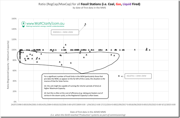
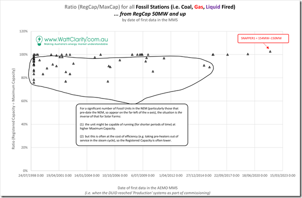
For instance, if we look at the same ratio for fossil-fired units, we see that the chart is quite different:
Specifically, there are many units with ratios under 100% (i.e. where Registered Capacity is under Installed Capacity – on some occasions significantly so).
Excluding the units that are under 50MW in Registered Capacity, we see a clearer picture:
Many of these units (particularly those with a steam cycle) have valid reasons whereby:
| Fossil unit characteristic | Brief Notes |
|---|---|
| Registered Capacity | This represents the design capacity of the unit (sometimes called Maximum Continuous Rating) to which the plant has been specified. |
|
Maximum Capacity |
On occasions the plant might be physically capable of producing ‘a few’ extra megawatts (the size of the plant might mean this is actually an uplift of 30, 40 or 50MW) by reconfiguring the plant in service to extract more output, though: 1) This might only be temporarily able to be sustained; and 2) Will come at the cost of lower efficiency.… so is generally not preferred by the operators (e.g. unless the price is very high, and other preconditions are met). |
For this reason we’ve typically chosen to use Registered Capacity as the measure of ‘Installed Capacity’ for coal-fired units in some of the analysis completed within GenInsights21 (and the Generator Report Card 2018 beforehand)…. and also in the filtered chart above.
(A2c) For Wind Farms
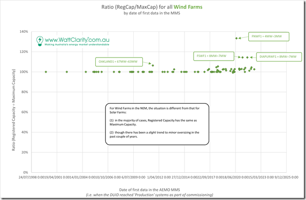
Taking the comparison further, here’s the same ratio representation for Wind Farms across the NEM:
Apart from a select few units (mostly smaller ones) the ratio has been at 100% for most of the time … but there have been a growing number in recent times where it has been slightly elevated.
Exploring why will have to come in some subsequent article!
(A2d) For Battery (Charge and Discharge)
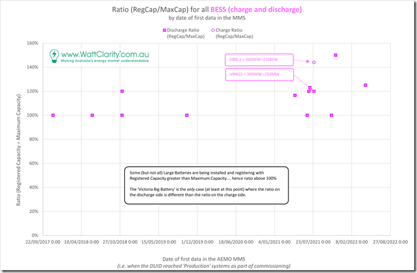
Finally here are the battery units currently registered into the NEM:
Both charge and discharge DUIDs are shown here, and they overlie each other – except in the case of the Tesla/Neoen Victoria Big Battery.
(B) Discounting from AEMO’s published data for ‘effective’ Installed Capacity
However even leaving aside the measure you choose from the AEMO data set in the MMS, the complications don’t end there. At both ends of the asset life cycle it might be that the numbers AEMO holds for it in the MMS don’t quite reflect what’s actually effective, in terms of what the project could potentially produce.
(B1) At the commencement of asset life
At the start of the assets life, the way in which project registration occurs means that there is a period of time in which:
1) A project might show (via Registered Capacity and Maximum Capacity) that the project might be notionally able to produce; but
2) The construction and commissioning process will mean that ‘actual’ capability will lag behind.
(B1a) Solar Farms across the NEM
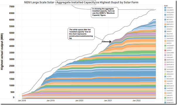
Looking just at Large Solar Farms on a NEM-wide basis (and with thanks to Allan O’Neil for his Tableau skills) we can illustrate this situation as follows:
With respect to this chart:
1) The grey line that trends upwards to the right is the aggregate installed capacity of all of the Large Solar Farms that are visible to the AEMO inside of the MMS. In this case, Allan has selected ‘Maximum Capacity’ to represent the installed capacity.
2) The coloured filled areas represent (for any vertical slice of time) the non-coincident ‘maximum ever’ output from each of the individual Large Solar Farms.
3) Hence we’ve highlighted the white space after the addition of new capacity (in the AEMO registration systems) and the ‘effective’ arrival of this capacity from a production point of view in the white space.
4) It’s important for readers to note that this has always been the case …
(a) In other words, entry of MaxCap and RegCap into the MMS is a precondition to operations as part of the registration process,
(b) … and necessarily precedes real operations.
Readers will also understand that the ‘lag’ for each project will vary … sometimes markedly so due to unanticipated delays.
(B1b) Solar Farms in Queensland
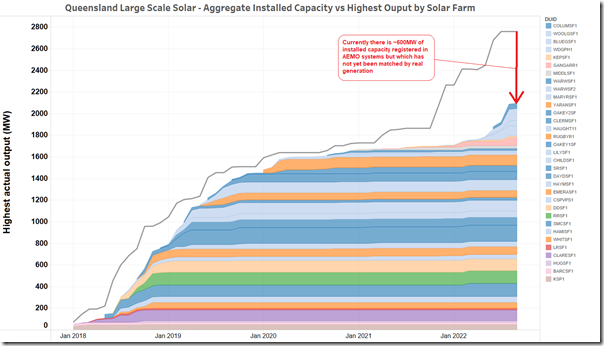
If we drill in specifically to look at the Large Solar projects in the QLD region, the white space (i.e. lag) can be clearly seen to be larger in recent times than it has been in the past:
In approximate terms there is 600MW of ‘missing’ installed capacity that is:
1) registered in the AEMO MMS (note – using Maximum Capacity as the measure)
2) but which has not yet produced a commensurate megawatt of output at any time.
This chart illustrates one of Giles’ recent criticisms of the AER’s analysis of solar performance through Q2 2022 (more on the question of solar performance through Q2 2022 in a subsequent article on WattClarity, as alluded to at Smart Energy Queensland).
(B1c) Solar Farms in NSW
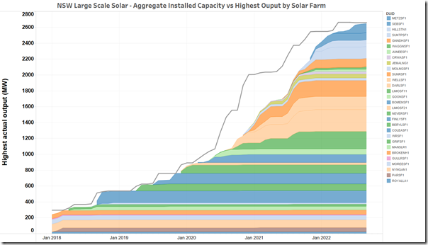
Out of curiosity, Allan also produced this chart of the same style of data for the NSW region:
In this case, the blow-out in the ‘output lag’ occurred earlier than in QLD (i.e. from mid 2020) but has since recovered.
(B2) Towards the conclusion of the asset life
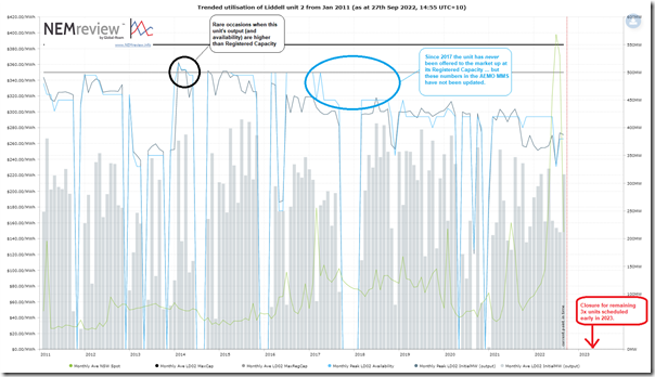
At the other end of an asset’s life a similar phenomenon occurs, in part because of the ‘bathtub curve’. We illustrate this via this trend of the Liddell unit 2 asset from NEMreview v7 here:
Those with a licence to the software can open up their own copy of this query here.
The sister unit at LD03 closed at the end of Q1 2022 (following a reshuffle with the AER), and the other 3 x units are scheduled to close at the end of Q1 2023. I randomly chose one of the remaining units. The chart above shows how the unit has effectively been de-rated by the operator since 2017 without the numbers for Maximum Capacity and Registered Capacity adjusting in the AEMO’s MMS.
(C) Analyst Beware!
So the central message really is for ‘analyst beware’, in terms of thinking about what the installed capacity of a particular unit might be!


One might also note, although I doubt if many readers here need the heads up, for solar farms the difference between AC (inverter) and DC (panel) capacity. Solar farms generally have an Inverter Load Factor [ILF] greater than 100% because it is better economics.
How does this affect the activation of RERT contracts?