Back on 17th June 2016 (42 months ago) I posted this article about “The opacity of distributed, small-scale solar PV output”.
In recent times there have been several different catalysts emerge to prompt me to provide this update to a challenge that is not going away – but instead might be (in some ways) becoming worse!
(A) Part of a broader Analytical Challenge
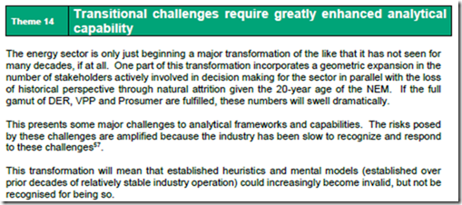
In our Generator Report Card 2018 we saw the opacity of small-scale PV as one manifestation of a broader challenge that is growing in scale and significance as the NEM evolution progresses – sufficient enough to specifically draw attention to this as Theme 14 within Part 2 in the broader analytical side of the report. In Theme 14, we explored a number of different examples where we have seen, and experienced, how “the transitional challenges require greatly enhanced Analytical Capability”:
In this theme we have explored a number of discrete examples which all (in our view) illustrate why the NEM is in urgent need of an upgraded analytical capability – and one we’re working busily to help to facilitate through our software tools (like the ez2view higher-end dashboard tool).
(B) Several aspects of Opacity
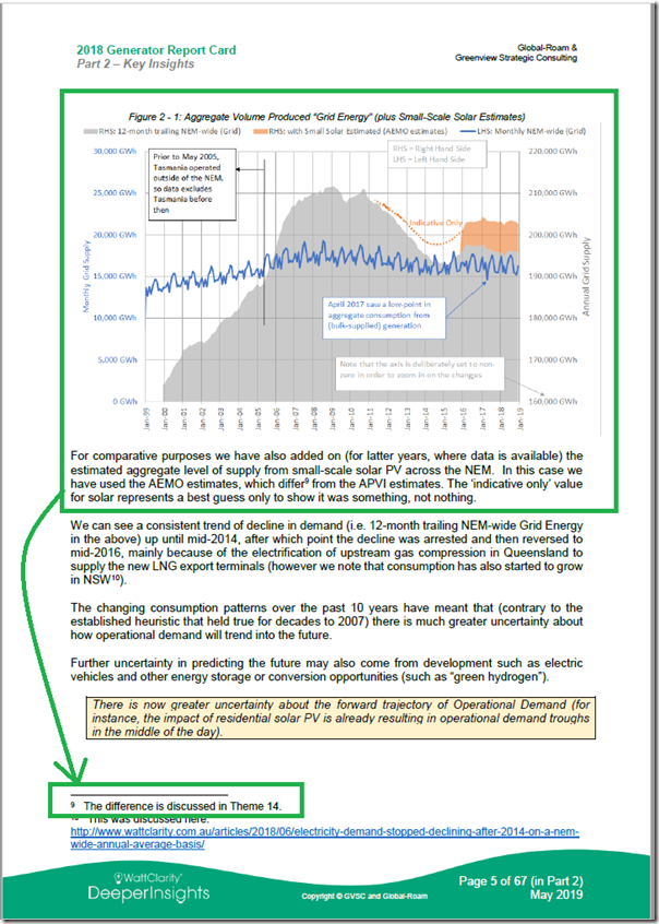
Throughout the Generator Report Card 2018, we came to the (necessarye) conclusion that we could only include a single illustration throughout all 530 pages that had anything to do with the contribution of rooftop PV – which was Figure 2-1 copied here:
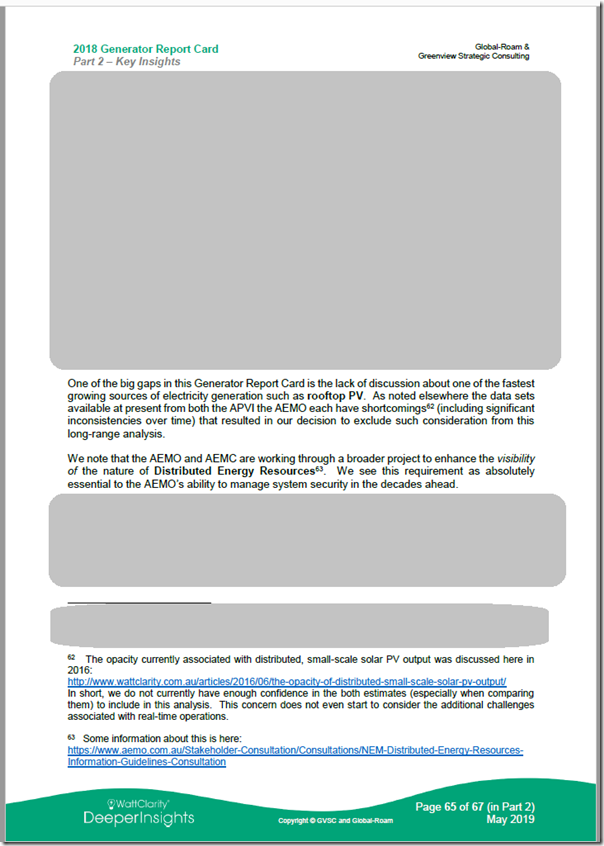
The reason why we had to (sadly) come to the conclusion that we had to omit consideration of rooftop PV was that we do not have sufficient confidence in the accuracy of the (various!) estimates widely available for the contributions for rooftop PV. This is (in our view) beginning to become a more serious consideration for the NEM moving forwards, which (in our view) needs to be addressed.
(B1) Questions
Two questions to sum up one of the reasons for our concern …
Q1) Hands up who knew…?
… that there were (back in June 2016) two different high-profile estimates available for contribution from rooftop PV, then there were four for a period of time, and now we are back to “only” three?
Q2) Hands up who also knew…?
… that these different estimates vary from each other by as much as 200%!
(B2) Huge differences …. which not many are even aware of!
To me the main story in the above is not that there are such large differences in these estimates – but moreso that most people are not even aware of the difficulties (and hence uncertainties) inherent in forming these estimates.
As a result of this we are concerned there are a growing number of people amongst energy sector stakeholders who are thinking with a false sense of accuracy that they ‘know’ how the level of contribution from rooftop PV at any given point in time. This (in our view) has increasing risk of making our energy sector transition harder to complete, unless we find ways of addressing this …
(B3) So it was a notable omission in the GRC2018 (we sadly felt we needed to make)
It was a conscious choice we needed to make to omit any data on the contribution of rooftop PV from our Generator Report Card 2018 – this was not a happy choice to make, but one we felt compelled to make as we (sadly) do not currently have a great deal of faith in the veracity of the various estimates for rooftop PV.
Given we had invested an enormous amount of time in ensuring that the insights shared through the Generator Report Card 2018 were based on rigorous analysis of a meticulously prepared data set transformed from a cleaned AEMO MMS database, it would not have been good practice to drop our standards for precision/accuracy to consider insights about rooftop PV when one cannot currently be sure about the numbers.
We also feel that is is necessary to omit any consideration of rooftop PV from the updates we are currently completing to this data set – as part of the production of the Generator Statistical Digest 2019 for release in January 2020.
(C) Some specific examples
To illustrate how these types of uncertainties should come to light in discussions amongst the broader group of energy sector stakeholders, but do not, here are three examples:
(C1) Saturday 26th October in South Australia
On 25th November 2019, I posted this article about exploring AEMO’s demand forecast discrepancy a month earlier (on Saturday 26th October 2019).
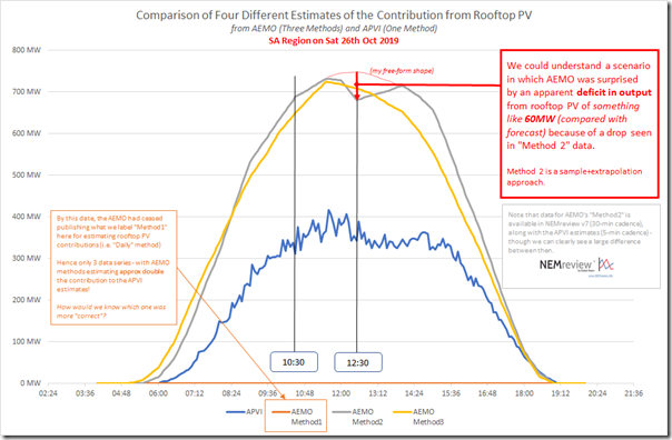
In that article I included this trend from three different estimates (two from AEMO and one from APVI) which show a wide degree of variability in estimating what the contribution actually was on Saturday 26th October:
It’s clear to see that (on this particular day) the various estimates were almost 200% apart, in terms of the estimated contribution from rooftop PV:
(a) The APVI estimate was considerably lower, peaking just over 400MW for discrete 5 minute instances; whereas
(b) The AEMO estimates (two different methods) both peaked over 700MW.
Can anyone actually tell me which magnitude is correct? There is a huge difference between these estimates!
Subsequent to this article, our data feed from the APVi was upgraded to use a newer estimation methodology that had the effect of moving the estimate from the APVi up closer to (but still not the same as) the AEMO estimate.
.
Common sense suggests that the correct answer is that none of them will be perfectly correct – but I have no real basis for judging whether the “actual” contribution is more towards the lower end of the forecast range (from the APVI) or more towards the higher range (from the AEMO). Or maybe it is higher than the AEMO estimate, or lower than the APVI one?
(a) On what basis would we really know?
(b) Surely we owe it to ourselves to be reducing the uncertainties about this, moving forwards?
There is a difference in the cadence of the data (i.e. AEMO estimates are published on 30-minute time steps, whereas APVI estimates are published on 5-minute time steps). However, even taking into account the shorter time-steps for the APVi estimates it’s clear to see that the APVI data set has a much less smooth shape over the day in question. Can anyone actually tell me which shape is correct?
Given the time spent watching the output of our own rooftop solar power station at home (thanks Solar Analytics and WattWatchers!) there are plenty of days where we see more jagged patterns – but also days where we see a copybook smoother shapes that look like they have come from the sales brochure (probably too many of those days in recent months for Brisbane, given the absence of sorely-needed rainfall).
(a) Do they actually average out, over a large area (as the AEMO seems to be suggesting with their estimate) – or does the diversity itself actually make “bumpiness” more likely (as the APVI data suggests)?
(b) How would one actually “know”?
Given the non-trivial contribution rooftop PV is now making, and the fact that this contribution is set to grow significantly in the coming years, surely it’s in our interests to be investing focused resources to actually determine the answers to these questions?
We’re fast approaching the time (perhaps past the time, on specific days like the following) where a better understanding would be more than just an academic exercise. We’re entering an environment where it matters in the real world!
(C2) Wednesday 6th November – when the NEM was powered by 50% renewables (maybe more, maybe less?)
Late on 6th November 2019, Giles Parkinson noted on RenewEconomy a milestone with an article “Australia’s main grid reaches 50 per cent renewables for first time” on 6th November. This followed some short snippets on social media, and was also echoed in several mainstream media locations, including:
1) this article in the ABC by Markus Mannheim on 7th November.
2) Graham Readfearn with this article in the Guardian on 7th November.
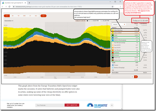
In Giles’ article he includes a snapshot from the OpenNEM trend focused on what Giles thought was* 11:50 NEM time on Wednesday 6th November – which I have copied below with annotations:
It’s worth noting a few things here in relation to the image above:
1) Firstly (as noted * above) Giles interpreted the diagram as showing data that pertained to 11:50 NEM time on Wednesday 6th November, however this appears not to be the case.
We suspect that there’s an easy-to-make ‘beginner’s mistake’ currently in the OpenNEM tool, in that it will use the PC’s own time clock to display data in that time but not alert the user to that in any way, which means that:
(a) It is very easy for the user to (mistakenly) make suppositions like he has done; and
(b) Makes it impossible for any user to actually know, with 100% confidence, the time that is actually displayed (e.g. because the timezone is not referenced as UTC+X on the image anywhere I can see).
We understand others have also recently alerted OpenNEM to this.
2) Secondly, what appears to have been done is time-shift AEMO’s InitialMW back to the start of the dispatch interval in which it is started to make it an “actual”.
(a) This is an understandable way of helping the user overcome some intricacies of dispatch intervals.
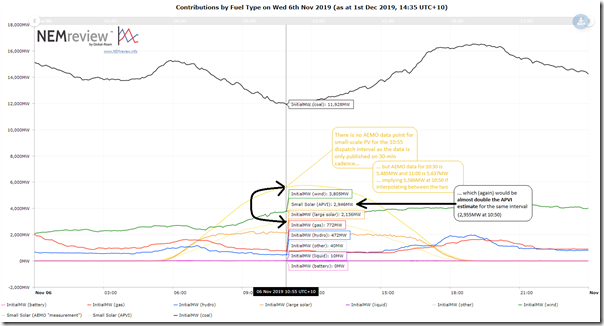
(b) On this basis, the totals for the green boxes map correctly to the data summarised in the trend from NEMreview v7 shown below.
3) Finally, we note that the production rate shown for “Solar (Utility)” at this point in time (i.e. 2,126MW) appears to be 10MW too low compared with aggregate data published by AEMO (2,136MW) – so we presume that OpenNEM has omitted the contribution of a particular solar farm in AEMO’s list for some reason?
Here’s the equivalent (unstacked) trend in NEMreview v7 (clients can open their own copy of the trend here), with the exception being that we have included AEMO’s estimate using the “Measurement” methodology, and also the APVI’s (quite different) estimate:
With particular respect to contributions from rooftop PV it appears that OpenNEM uses an estimate that is closer to the levels estimated by AEMO (again APVI estimates are about half) but we can’t deduce exactly where OpenNEM gets its estimate, as:
1) the ones we know of from the AEMO are only published with 30-minute cadence, and
2) interpolation does not give the exact number quoted by OpenNEM.
Perhaps OpenNEM is using another different estimate for rooftop PV, which (if so) would not appear to be helping to reduce the confusion that surrounds the actual contribution from rooftop PV. Perhaps a reader can help us out below in comments?
(C3) Sunday 10th November – with 64% contribution from Rooftop PV in South Australia
Just last week (Friday 29th November), Giles Parkinson wrote about “The day rooftop solar met two thirds of South Australia’s total demand”, referencing some information published by AEMO on Thursday 28th November in their “South Australian Electricity Report – November 2019”.
(C3a) Record Low Operational Demand … but not Scheduled Demand!
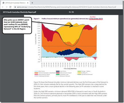
In particular, Giles’ article picked up on this image within the AEMO report that spoke of a record low in Operational Demand experienced on Sunday 10th November 2019:
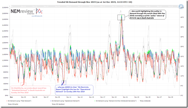
This prompted me to search for this article I’d written about “South Australia experiences lowest (non System Black) Scheduled Demand in at least 21 years” – and I see that it was posted a week earlier, on Sunday 3rd November 2019. Hence I powered up NEMreview v7 again to have a look at the trend of the three main measures of demand that the AEMO publishes:
Here’s this query, for NEMreview v7 clients.
We can see that the Scheduled was somewhat lower on Sunday 3rd November than it was on Sunday 10th November – but on Sunday 3rd November the Operational Demand figure was considerably higher than it was on Sunday 10th November (low point 458MW at 13:30 NEM time – so 14:00 in Adelaide). One more example of the complications of measuring demand (as discussed here in some detail).
(C3b) Peak contribution from rooftop PV on Sunday 10th November 2019
In the page above the one shown in the AEMO document (i.e. page 25) the AEMO notes:
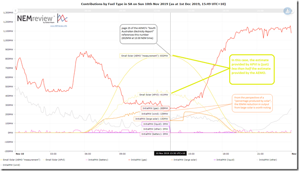
“The most recent record, as seen in Figure 9, occurred on Sunday 10 November 2019 at 2:00 pm (Adelaide time). At this time, demand from the grid dipped to 458 MW (446 MW sent-out), South Australia was a net exporter, and the peak rooftop PV generation was 832 MW, or around 64% of the underlying operational demand. This day was a clear day, with high solar irradiance for the time of the year and daytime temperatures in low to mid 20s, but, being a weekend, a day with low commercial and industrial loads”
With respect to rooftop PV I am particularly interested in the AEMO report noting that their estimate of the contribution from rooftop PV peaked at 832MW at 14:00 local time (so 13:30 NEM time). This enables us to include a similar, but unstacked, trend from NEMreview v7, again also including the separate estimate from APVI for contribution in South Australia:
Again, licensed users for NEMreview can access their copy of this query here.
With respect to the thrust of this article, we note that the APVI estimate is just under half of the estimated used by AEMO. Also noted is a 95MW reduction in output from aggregate large-scale solar, which we presume was related to prices and commercial outcomes (but have not looked).
(D) AEMO’s DER Register as the next (necessary) step – beginning Sunday 1st December 2019
Coincidentally yesterday (Sunday 1st December 2019) was the planned go-live date for the AEMO’s Distributed Energy Resource Register (i.e. DER Register).
I’ve briefly discussed this here (on our Battery Storage site), also linking to some context of how we had been involved in the earlier days of the broader project. We can see a clear and compelling need for something that operates successfully in this space:
(1) First and foremost to provide a complete and up-to-date record of meta data pertaining to DER resources deployed across the NEM; and
(2) Then, secondly, hopefully helping us do much better with operational data – to help us resolve some of these ongoing challenges with the opacity of DER, including rooftop PV.
(E) Is it time to retire the APVI data feed?
In parallel with the DER Register, and in the light of the growing differences between APVI numbers and those separate estimates being provided by the AEMO, I have been wondering increasingly if it is time to retire these APVI data feeds, to avoid ongoing confusion that we will have (inadvertently) become part of?
The answer to that question is not as simple as it might initially seem, however – for a number of reasons including:
Consideration #1) We don’t actually know whether AEMO is closer to reality than APVI!
How would we (or anyone in the energy sector) be able to know this? There is a large and growing difference between the two estimates.
Consideration #2) Neither AEMO, nor the APVI, provide access to a complete data series for estimated contributions
As seen in Figure 2-1 at the top of this article, the AEMO data feed for estimated contribution from rooftop PV began in 2016 (hence my earlier article about “The opacity of distributed, small-scale solar PV output”) and no provision has been made, as far as I am aware, to back-calculate this back to 2011…
(a1) hence the dotted lines “indicative only” in Figure 2-1 copied above; and
(a2) hence it was impossible to use AEMO estimates in performing a longitudinal study, such as in the Generator Report Card 2018.
We know that (because of the huge difference between APVI and AEMO estimates) we could not plausibly mesh the two estimates together at that particular date point.
Indeed, whilst we do have a longitudinal data set that we have collected from APVI because of the data we have been receiving for many years, we do not have confidence in its fitness-for-purpose for longer term trending and analysis for a number of reasons including:
(b1) there are gaps and discontinuities in the data (e.g. where their data feed has fallen over at various points in time, and not been back-filled); and
(b2) more significantly, the APVI methodology has changed a number of times over the years (such as in the sampling technique changing from some data points to different points) and yet the historical trace has not been re-populated with a consistent methodology over the entire date range.
As such our perspective has grown to be that, whilst the APVI data feed is of academic interest (and useful from a ‘general interest’ point of view), we would be concerned about any organisation or individuals making business decisions or major policy decisions on the basis of the data. In our view, the longer-term veracity of the data as a time-series is questionable, for the reasons above.
We’d look forward to hearing from those who can help?
(E1) What should we do, for our software and widgets?
We utilise the APVI data in a range of different places – with the most widely used piece of software in question being our RenewEconomy-sponsored NEMwatch Live Supply & Demand Widget, which is:
(a) Installed on RenewEconomy here;
(b) Installed on our sites in various places – like here on NEMwatch and here on WattClarity; and
(c) Installed on an every-growing number of other sites scattered across the internet.
Because it was the only estimate that existed at the time, in 2015 we built the APVI estimates into the installed NEMwatch dashboard and also the RenewEconomy widget.
We have had a time-series of the APVI’s estimates for rooftop PV injections on a 5-minute basis, along with AEMO’s estimates as well, in NEMreview v7 for some time (indeed the APVi data has been in NEMreview v6 beforehand).
However we are uncertain as to what approach we should be taking to these two different sources for estimated contributions from rooftop PV in future, in each of our products – or to other sources as well, if they exist (e.g. if OpenNEM uses a source we are not aware of?). Suggestions welcome!
(E2) What should happen, in the broader energy industry?
More broadly, this seems like an area which requires additional focused (and coordinated) investment – in order to understand better the accuracies of the different methods that currently exist, to improve them, and to disseminate the results of these assessments so that stakeholders can be fully aware of the levels of accuracy/inaccuracy involved.
(E3) Asia-Pacific Solar Research Conference (in Canberra this week)
Coincidentally it might be worth noting that the 2019 Asia-Pacific Solar Research Conference is on in Canberra this week – Monday 2nd December through till Thursday 5th December 2019. It’s run by APVi and hosted by ANU.
Perhaps delegates there can consider the questions posed above and feed back to me?


A lot to digest here. I guess paying people for their solar output at a mlf of 100% (or 1) in the long term will more than likely have to be reduced down, as more and more people get solar and on average the solar from houses has to go further to be used.
I thought there was no need for a MLF because inverter settings are meant to reduce output to zero when the voltage at the inverter reaches 258 Volts. This occurs occasionally in my unit between about 11 am and 3 pm on sunny days when there minimal load in our house. However there is no process to formally check inverter settings. How is this overvoltage curtailment captured in the AEMO and APVi data? Our curtailment data are captured in the Fronius database, which may be made available to these data sources.
Earlier this week there was an interview on the 7:30 Report with a spokesperson for SA Power Networks, where he said there was a time recently when there was so much rooftop solar output that the entire southern half of Adelaide fed back into the transmission network.