Long-term readers will recall that, over successive years, we’ve tried to keep a habit of reviewing the pattern of prices seen in Q2 periods each year … with the underlying logic being that Q2 periods were traditionally one of the more ‘boring’ quarters with lower demand levels and hence seen as the logical time to conduct outages (on the generation side, and also on the network side).
Even some years ago we started to see that this long-running ‘rule of thumb’ was no longer holding true … but with Q2 2022 being the epicentre of the ‘2022 Energy Crisis’ (at least thus far!) the ‘boring-ness’ of Q2 has received its final nail in the coffin.
(A) Looking back over prior Q2 periods
Let’s start by a quick review of where we’ve come to, across the 7 year time range over which we’ve been conducting these reviews:
| Q2 2016 |
Back (what seems a lifetime ago) on 4th July 2016 I posted this review of spot prices for energy in Q2 2016 where I’d noted about some changes to the underlying patterns that had persisted (pretty stubbornly) for at least a decade beforehand. At the time I labelled the change in pattern ‘truly remarkable’. |
| Q2 2017 |
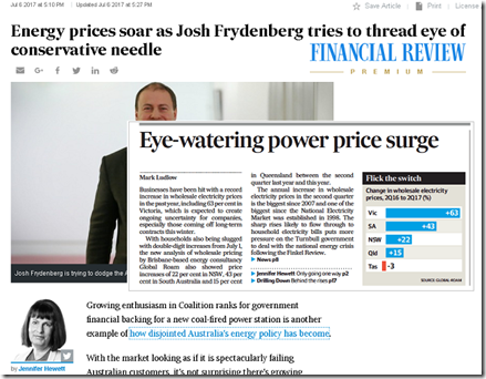
We picked up the same theme in July 2017 to review Q2 prices for 2017 and concluded that “price outcomes for Q2 2017 were off the chart”. These thoughts were picked up in various news media organisations, including in the AFR: |
| Q2 2018 |
A year on from all the news media attention, we saw that prices had backed off somewhat from the extreme outcomes of Q2 2017 – though we cautioned that ‘we’re far from out of the woods, yet’! In that analysis for Q2 2018 we extended what we’d done: Enhancement 1 = I added in prices for the electricity market in south-western WA (i.e. the ‘WEM’); Enhancement 2 = I used the access we have to end-of-day clearing futures prices for QLD, NSW, VIC and SA to see what the expectations had been for Q2 prices in 2018; Enhancement 3 = we looked at the rising incidence of negative prices (in part because of the ‘wind correlation penalty’ particularly in South Australia and the ‘solar correlation penalty’ particularly in QLD). I did not have time to complete the analysis started on FCAS prices. |
| Q2 2019 |
I took a break from this line of analysis in 2019 with so much else on, including being swamped by what followed on from the release of our inaugural Generator Report Card 2018 , which proved exceptionally popular. |
| Q2 2020 |
For a variety of reasons, including the presentation to a Vestas audience about ‘NEM merchant pricing – is this the new normal?’, I picked up this line of questioning again for Q2 2020 here. Top of mind in review of Q2 2020 was that the quarter: 1) occurred in the aftermath of a massive summer 2019-20 period with extremes in temperature and demand, and the repetitive incursions of bushfires; and 2) was been beset by the flow-on impacts of COVID-19. |
| Q2 2021 |
Through Q2 2021 we were busily occupied with the development of new versions of our dashboard-style software to take account of Five Minute Settlement that began at the end of Q3 2021 … however there was plenty of distractions such as: 1) the Callide C4 Catastrophe (from 25th May 2021); and 2) the Yallourn flooding (from 11th June 2021) … which both ratcheted up further what had already been escalated spot pricing compared to Q1. It certainly was ‘anything but boring’. |
| Q2 2022 |
Back on 3rd June … with the quarter only two-thirds done … I posted ‘Anatomy of an Energy Crisis – part 1’ with a longer-term trend of monthly average prices since NEM start. Even at that time it was apparent that what was happening was wholly unprecedented in NEM history (some were calling it ‘worst in 50 years!’ … and this was prior to the 12th June and 13th June when QLD, then NSW, then SA and VIC all reached the CPT triggering APC and then Market Suspension. |
| Q2 2023 |
Looking ahead a year (to Q2 2023) we wonder what kind of outcomes we’ll be seeing … will the current crisis have been a positive learning experience, or will we be further steps into the dissolution and destruction of the NEM?! It truly does seem that the range of choices include such stark possibilities. |
Given what we’ve been watching (and documenting when possible here on WattClarity®) it was with keen interest that we powered up NEMreview v7 to have a look at just how different Q2 2022 has ended up being, compared to all prior Q2 pricing periods … and indeed any other period since the start of the NEM…
(B) Pattern of prices for ENERGY in Q2 2022
Like in prior years, for this year we’ve only had time to look at the pattern of prices for ENERGY – FCAS will have to wait for another year!
1) Average prices for Q2 required more than doubling of the y-axis
Starting at the top of the NEM and working our way around, we see that time-weighted average prices jumped so significantly they were above the $150/MWh upper cap we’d used in each of these prior reports … being more than double any other Q2 period:
1a) Trended Stats for QLD
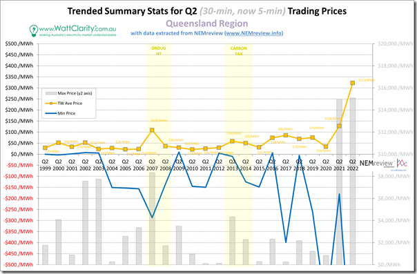
It’s clear to see that (in terms of Q2 outcomes) price outcomes for QLD in Q2 were the highest they have ever been since the start of the NEM:
With respect of the two types of statistic shown here:
1) In terms of the long-term trend of average price:
(a) The time-weighted average price for the quarter (at $322.70/MWh) was higher than the Administered Price Cap that caused problems towards the end of the quarter, prompting this Rule Change Proposal from Alinta; and
(b) This TW average is 2.5 times higher than the ‘next worst’ TW average price (from Q2 2021, that we noted then was ‘anything but boring’)…. and 6.7 times the long-run average of all Q2 periods before that.
2) In terms of the extremes, keep in mind that Q2 2022 is the first of these quarters operating under Five Minute Settlement … which makes it quite likely that both:
(a) the minimum (now 5-min) trading price in the quarter was quite low (indeed well below the –$500/MWh minimum set in this static axis)
… there were 42 hours, in aggregate, with prices at or below $0/MWh
(b) the maximum (now 5-min) trading price in the quarter would be up around the Market Price Cap
… there were 32 hours where the price was above $1,000/MWh in the quarter
… but this was not the highest incidence in history!
.
1b) Trended Stats for NSW
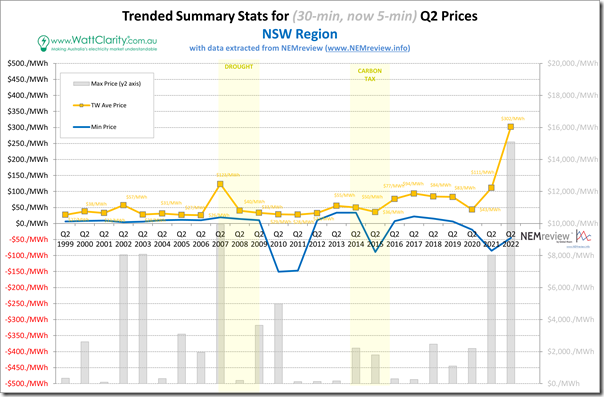
Moving south of the border we see a similar pattern in NSW:
In terms of the statistics trended
1) Regarding the average we note that:
(a) At $302/MWh, this was also above the current level of the Administered Price Cap;
(b) Was 2.4 times the next highest … which in this case was back in Q2 2007
(c) Was 5.9 times the long-run average of Q2 prices over the entire period beforehand.
2) In terms of the extremes, we note that:
(a) The minimum (now 5-min) trading price:
(i) Was only –$45/MWh; and
(ii) Was at or below $0/MWh for less than 9 hours over the quarter.
(b) The maximum (now 5-min) trading price:
(i) was at the Market Price Cap (no real surprise there); and
(ii) Was above $1,000/MWh for 16 hours in total … but this was significantly lower than Q2 2021.
.
1c) Trended Stats for VIC
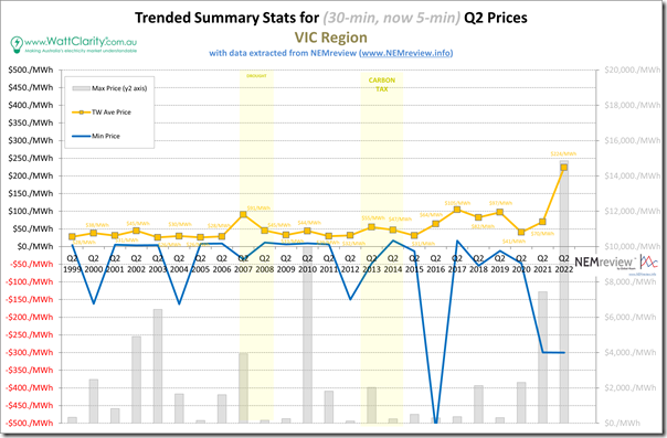
Further south into Victoria we see average prices were up again, but not to the same extent as in QLD and NSW …
In terms of the statistics trended
1) Regarding the average we note that this (just under $224/MWh) was:
(a) Was 2.1 times the next highest level; and
(b) Was 4.6 times the long-run average of Q2 prices.
2) In terms of the extremes, we note that:
(a) The minimum (now 5-min) trading price:
(i) was only –$300/MWh
(ii) but was at or below $0/MWh for 111 hours in total … that’s more than 4 days!
(b) The maximum (now 5-min) trading price:
(i) was not quite at the Market Price Cap (only $14,858.93)
(ii) But was above $1,000/MWh for 5 hours in total.
.
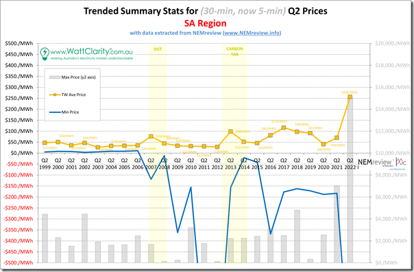
1d) Trended Stats for SA
Taking a turn west into South Australia, we see the same underlying pattern, layered with South Australia’s own uniqueness …
In terms of the statistics trended
1) Regarding the average we note that:
(a) The TW average was $256.37/MWh
(b) This was 2.2 times the next highest average (back in Q2 2017); and
(c) Was more than 4.7 times the long-run average of Q2 prices.
2) In terms of the extremes, we note that:
(a) The minimum (now 5-min) trading price:
(i) Was down at the –$1,000/MWh Market Price Floor; and
(ii) That there were 215 hours over the quarter where the price was at or blow $0/MWh … which was the highest incidence of any Q2 period for South Australia.
(b) The maximum (now 5-min) trading price:
(i) Was up at the Market Price Cap; and
(ii) Where the trading price was above $1,000/MWh for 14 hours in total across the quarter.
.
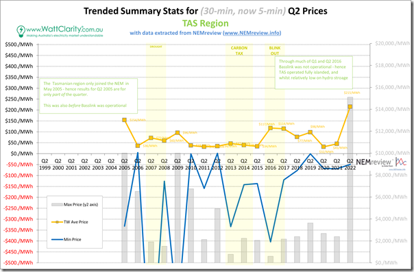
1e) Trended Stats for TAS
Upping anchor and sailing down to Tassie over Bass Strait, we see that Tasmania continues to sing its own tune at times …
In terms of the statistics trended
1) Regarding the average we note that:
(a) The TW average was $215.10/MWh;
(b) Which was still 1.4 times higher than what we’d thought was an outlier outcome in an incomplete Q2 2005 when TAS had joined the NEM prior to Basslink being commissioned; and
(c) Was over 3.2 times the long-run average across all prior quarters.
2) In terms of the extremes, we note that:
(a) The minimum (now 5-min) trading price:
(i) Was only –$48.98/MWh;
(ii) But the market saw 30 hours of TAS prices at or below $0/MWh over the quarter
(b) The maximum (now 5-min) trading price:
(i) Was at the Market Price Cap; and
(ii) Was part of the 7 hours experienced with prices above $1,000/MWh over the quarter.
.
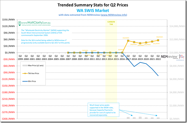
1f) Trended Stats for WA SWIS
I noted in the report for Q2 2018 that we had commenced the process for the addition of data into NEMreview v7 for the spot market of the South-Western Interconnected System (SWIS) in WA.
It’s not been our focus to fill out the data sets available for that market, yet. Let us know if you would like to speak with us about what we could do with respect to the SWIS?
However we can show you how pricing patterns have progressed over the two subsequent Q2 periods:
In terms of the statistics trended
1) Regarding the average we note that the average price outcome has been trending upwards since Q2 2019.
2) In terms of the extremes, we note that:
(a) The minimum (still 30-min) trading price was –$104.42/MWh
(b) The maximum (now 5-min) trading price was only $176.06/MWh
.
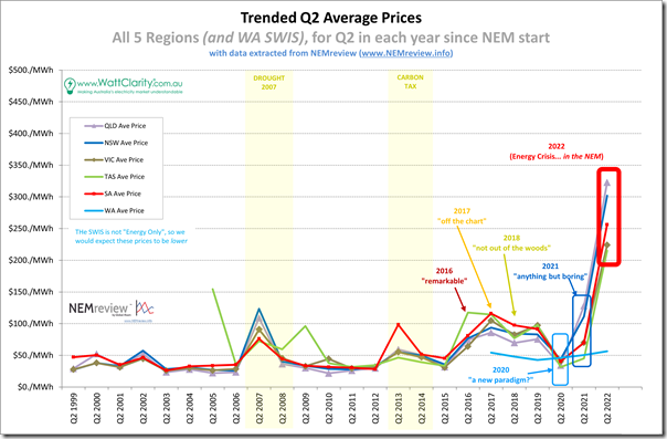
2) Simple time-weighted averages through the roof in Q2 2022
So here’s the summary trend:
We see TW average prices are up in all regions (and in WA) compared with Q2 2021 – but especially so in QLD and NSW.
3) How have the distributions of prices changed over time?
I reminded readers last year that:
1) ‘the NEM is a complex place’
2) … and that Allan stated in January 2020 that ‘the NEM is a market where the details matter’.
Whilst time-weighted averages are easily calculated, and readily digestible, for an increasing number of stakeholders they are less and less relevant (including most Semi-Scheduled generation operators).
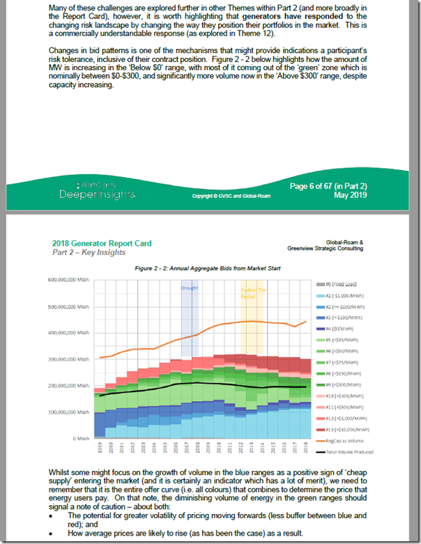
It’s for this reason that we started taking a closer look at the distribution of prices back in 2016 – and in 2020 we noted that ‘a new paradigm’ appeared to be emerging. One of the fundamental reasons for this new paradigm was discussed in the Generator Report Card 2018 – in which we wrote how ‘the level of Risk in the NEM is increasing’:
This was done as Theme 2 within Part 2 of the 180-page Analytical Component. One of the illustrations of this increased risk came where we highlighted that there is less and less volume of capacity offered in the ‘green’ range of prices (above $0/MWh but below $300/MWh):
This is a NEM-wide phenomenon (and we updated this view in GenInsights21 more recently) … and it means that the contingency size required to have the price shooting from very low to very high is reducing in size.
Or, in other words, the NEM is becoming more volatile. What we saw happen in Q2 2021 makes sense, understanding this, because we saw pricing outcomes ‘up at both ends’… in other words:
1) More high prices; but also
2) More low prices as well
3) … which means fewer prices inside the ‘normal’ range.
Makes for accelerating divergence of LWA Prices, as discussed in other articles on WattClarity.
—
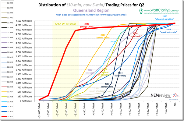
With the above macro trend in mind, take a look at the comparative distributions of pricing patterns for Q2 2022 with respect to prior Q2 periods … it’s easy to see that Q2 2022 was in a league of its own…
3a) Distribution for QLD
Again, we’re starting at the top of the NEM to work our way around:
In the strange inverse world that was 2016-2019 we can clearly see uplift in ‘everyday high prices’ that (combining also with a spike in prices above $100/MWh) delivered the much higher average prices for the Q2 periods over those 4 years. We see that 2020 saw a different paradigm start to emerge, with an increase in the number of negative prices.
In 2021, in contrast, we see a combination of two factors:
(i) Too Low for Zero
As noted on 17th February 2021 (i.e. part-way through Q1 2021), there is an accelerating rise of Negative Prices in the NEM. This is causing all sorts of challenges in commercial operations … and leading to some changes to NEM Rules as well.
We can clearly see in the chart above (top-right corner) that this trend has continued … summed up also below.
(ii) High Price incidence
The incidence of prices above $100/MWh was somewhat lower than some earlier crazy years.
However the incidence of prices above $1,000/MWh was (and still remains, even with Q2 2022) the highest it has ever been!
… hence we said ‘up at both ends’!
For Q2 2022, however, we see the incidence of prices above $100/MWh blow outside of any other prior Q2 period!
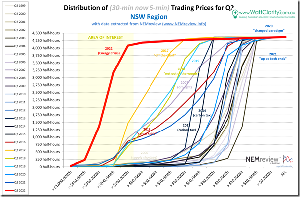
3b) Distribution for NSW
Moving into NSW, we see a similar story unfolding:
Again in Q2 2022 we see the curve stretched enormously to the left, with almost all dispatch intervals above $100/MWh.
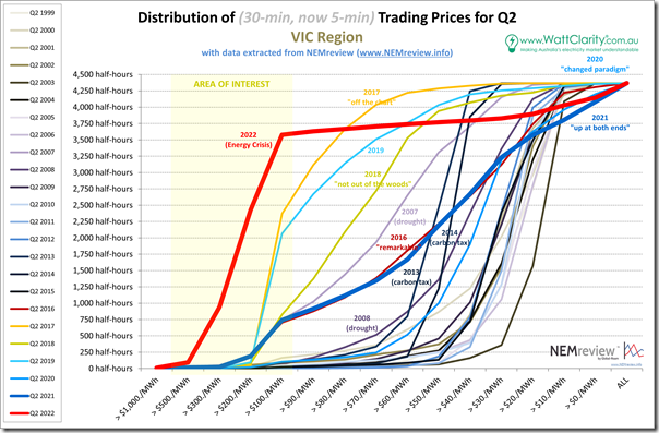
3c) Distribution for VIC
Further south into Victoria the ‘up at both ends’ picture is similar:
Same picture in Victoria … with almost all dispatch intervals above $100/MWh.
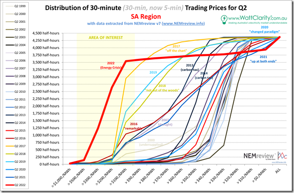
3d) Distribution for SA
In South Australia we see a similar sort of picture emerging:
Same picture in South Australia … with almost all dispatch intervals above $100/MWh.
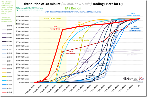
3e) Distribution for TAS
Down in the apple isle there is the same type of underlying pattern, but with its own Tassie style …
Same picture in Tasmania … with almost all dispatch intervals above $100/MWh.
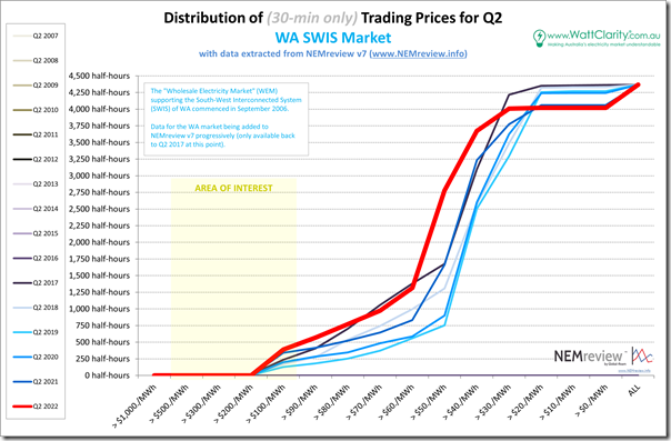
3f) Distribution for WA (SWIS)
Over in the west, we still have not yet compiled a longer-range history for the WEM in the SWIS. What we have is shown here:
We know that the WA market has been separated from the ‘2022 Energy Crisis’ that has best the NEM for Q2 2022.
However even without this overriding factor, and keeping in mind the existing Capacity Market, we see above:
1) the general shift in the incidence of higher prices to the left (hence the higher TW average shown on the trended averages above).
2) except for the (increasing) incidence of sub zero prices as well.
Without exploring in any more detail, I wonder if this continuation of ‘up at both ends’ is not a general outcome of this energy transition.
4) Trend of price excursions
This time last year I noted how the pattern of Q2 2021 was generally ‘up at both ends’ … meaning both:
1) increased incidence of high price;
2) increased incidence of low price; and
3) a hollowing out of the middle (one artefact of the increased risk we’re facing in the NEM we wrote about in the GRC2018 and also in Generator Insights 2021).
Let’s have a look at the high and low extremes…
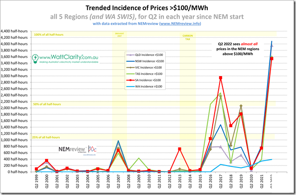
4a) Trend of price excursions (>$100/MWh)
Looking at the number of times the trading price period exceeded $100/MWh, we see a particular pattern:
In the vast majority of all trading periods through the entire quarter, the trading price was above $100/MWh in all give regions of the NEM!
It’s also worth nothing that, though it is on a completely different scale, the incidence of these prices has been growing in WA over recent quarters.
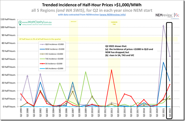
4b) Trend of the incidence of extreme price excursions (>$1,000/MWh)
However it’s when we set a higher benchmark (trading prices exceeds $1,000/MWh) that we see something that’s perhaps not fully understood given all the talk about ‘Energy Crisis’:
It’s a mixed bag, in terms of the total amount of time that saw prices exceeding $1,000/MWh over the quarter:
1) The two regions that saw the highest incidence of extreme pricing in Q2 2021 actually saw that incidence decline in Q2 2022 :
(a) This occurred in QLD and NSW
(b) The decline was by a considerable percentage as well
(c) That said, these two regions still saw a higher incidence than the other four regions/locations;
(d) Though SA, in particular, is closing fast.
2) The other three NEM regions (VIC, SA and TAS) saw the incidence of extreme pricing grow:
(a) As implied above, this was off a lower level in other recent quarters;
(b) SA has climbed the most … but it’s still not as high as we saw in Q2 2013;
3) As we would expect there are no price spikes above $1000/MWh in Western Australia (its capacity market means a lower Market Price Cap is possible).
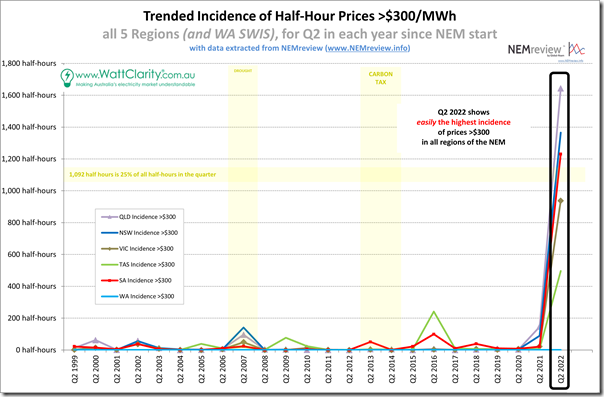
4c) Trend of price excursions >$300/MWh
However it’s when we set a mid-range benchmark (trading prices exceeds $300/MWh) that we see something much more staggering:
For more than one quarter of all (5-minute) dispatch intervals in the quarter, the trading price was above $300/MWh in each of three regions (QLD, NSW and SA) … with VIC not so far behind.
1) All regions saw prices more than $300/MWh more than 10% of all trading intervals in the quarter.
2) Is it any wonder the market experienced problems when the Cumulative Price Threshold was reached and Administered Pricing began … capping prices at $300/MWh?!
3) Timely, then, that Alinta Energy would submit this Rule Change Proposal to the AEMC asking to temporarily raise the APC to $600/MWh.
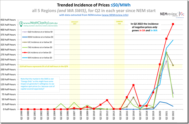
4d) Trend of LOW price excursions
Looking at the number of times the trading price period dropped to, or below, $0/MWh, we see that the trend of outcomes is different in different locations:
Quickly summarising:
1) In two locations the incidence of negative prices continued to climb compared to Q2 2021:
(a) In the SA region, the incidence is climbing towards 10% of all trading periods in the region through the quarter
(b) The WEM market for Western Australia also saw ongoing growth in negative price incidence.
2) In Victoria, the incidence dropped slightly – I’m not sure I would read too much into this;
3) In two regions, the incidence dropped sharply:
(a) For the QLD region there are a number of factors, with my hypothesis being that there were two significant factors to note:
i. The increased volume in thermal unit outages decreased the oversupply during the middle of the day; but
ii. This was combined with a generally poor solar harvest through Q2 (due to La Nina conditions)
(b) For the TAS region we also see this dropped considerably.
4) In the NSW region, the incidence still of negative prices remains quite low.
5) Expectations from the futures pricing?
For Q2 2021 and years prior to that I also invested time to include a view of ‘Futures Convergence’ to provide an illustration of how closely the actual outcomes through that Q2 matched earlier expectations, in terms of traded prices for the Q2 baseload contracts at ASX Energy.
I’ve no time to complete this analysis* at this point and so will have to complete this later and post as a follow-on article.
… * though I’d not be alone in thinking that the market as a whole was blindsided by the extreme outcomes – us included – in spite of what we’d written previously about ‘the level of risk in the NEM is increasing’!
(C) Alas no FCAS Price Analysis for Q2 2022
Once again, we’ve no time to further extend this article with discussions about FCAS pricing … but it’s worth noting that there are 8 other commodities there and (as discussed in Appendix 9 within GenInsights21 not so long ago) they will be increasingly important as the energy transition continues.
There were some challenging outcomes for FCAS commodities (which fed through to price outcomes) in Q2 2022 – but there’s no time to explain/explore more here this evening….



Sun Metals lodged its 5MS rule change request on 4 December 2015.