It’s been a couple weeks since we shared the last update on our progressive review of Queensland’s heatwave (and extreme NEM outcomes) of 1st and 2nd February 2022.
However the silence on this event has not meant it has slipped off our radar …
(A) A reason to revisit
Last week I was supposed to have given a briefing to EUAA Members (until other circumstances intervened). To do this, I prepared some additional analysis – and, rather than have it sit on the shelf, thought I would share it with WattClarity readers here today.
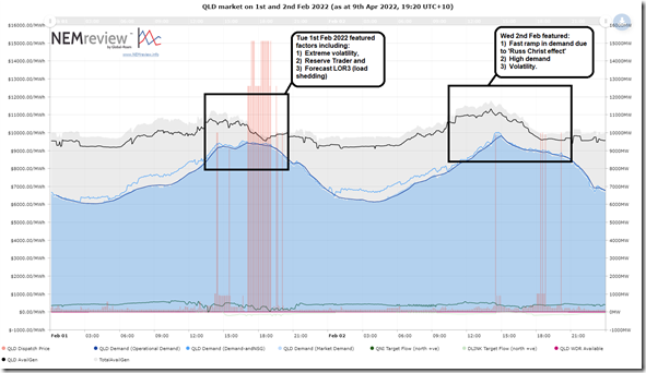
Let’s start with this summary chart of both Tuesday 1st February and Wednesday 2nd February 2022 in the Queensland region, to highlight the periods of keen interest to different people, for different reasons:
For those with a copy of NEMreview v7, they can open their own copy of this pre-configured trend here.
As highlighted, both days were of interest, for different reasons:
(A1) Tuesday 1st February 2022
This day is probably of most interest to large energy users for a number of reasons – including :
(a) the long run of spot prices at and near the Market Price Cap,
(b) the dispatch of RERT (including the associated cost of that), and
(c) the earlier forecasts of the need for more widespread load shedding under LOR3 (Low Reserve Condition) conditions.
(A2) Wednesday 2nd February 2022
The following day saw less volatility, but this may well have been due to the ameliorating effect of storms that came through early in the afternoon to cool things off … but not before giving us an exhibition of what Paul Simshauser told us was the ‘Russ Christ’ Effect.
At the end of the day, the peak level of Grid Demand (and Market Demand, which is slightly different) was still higher than on Tuesday 1st February 2022.
(A3) Was forecast in advance
It’s also worth pointing that (as noted here the Thursday beforehand) the tight supply-demand balance was forecast in advance by AEMO … even to the point of forecast LOR3 (i.e. Load Shedding) conditions for QLD for Wednesday 2nd February … and later (see note here from Monday 31st January) for Tuesday 1st February 2022.
(B) Recapping some supply-side factors
We’ve already posted some articles about supply-side factors … but I thought it would be useful to also reiterate some here, including the helpful hyperlinks to earlier articles:
(B1) Outages at the start of the day
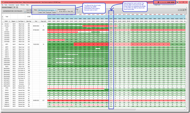
Using the new ‘Generator Outages’ widget (now released in ez2view v9.4) I’ve time-travelled back to the 09:00 dispatch interval on Tuesday 1st February in order to summarise the thermal units in Queensland that were unavailable at the start of the day.
In the list here we see that:
B1a) Callide C4 outage
As we know, there’s a long-term outage running on Callide C4, following the Callide C4 Catastrophe. The three coal units out were discussed on the morning of Tuesday 1st February here.
B1b) Callide B2 outage
Also on the same site was the maintenance outage at Callide B2, which was (as at 18:00 on Saturday 29th January 2022, which was the last MT PASA DUID Availability run at that time) expected to be back on 3rd February 2022.
B1c) Kogan Creek outage
At this time, Kogan Creek was out – and not expected back until 15th February … i.e. 2 weeks later after this day.
These three coal units out were discussed on the morning of Tuesday 1st February here.
B1e) Swanbank E outage
There was also the long-term outage running on Swanbank E (which we covered in this later article here).
—
So, at the start of the day there were 4 units offline for maintenance out of a total of 42 thermal units in QLD…. though Allan reminded us that it’s the MW capacity that’s more important than the number of units, and the units out are all larger (and lower cost) ones in the QLD thermal context.
(B2) Units that tripped
As noted in this article, before the real crunch time happened we had 4 coal units offline instead of three, with the trip of Tarong unit 2 in the 15:15 dispatch interval.
(B3) Low wind
Later in the evening on that day, we wrote about how ‘The performance of QLD’s two wind farms through Tuesday 1st February 2022’ … was quite low.
(B4) Solar
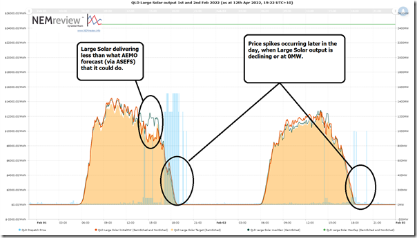
Also worth noting (though it did not need a specific article) that the timing of the major price spike was when the aggregate output from Large Solar farms through this day was quite low.
For those with a copy of NEMreview v7, they can open their own copy of this pre-configured trend here.
Note with this diagram that there are a couple smaller ‘Large Solar’ farms in QLD that are Non-Scheduled, so do not bid like Semi-Scheduled plant … so do not:
(a) obtain an AvailGen number from ASEFS or the Self-Forecast; or
(b) receive a Target.
As such, be a little careful in comparing the 4 different metrics for Large Solar on the chart as they are not exactly ‘apples to apples’, but pretty close.
I’ve highlighted on the chart:
1) The price spikes were typically occurring:
(a) later in the afternoon when solar is rapidly declining … which contributes to the rapid ramp requirement of ‘Aggregate Scheduled Target’ (see from the 26 minute mark in this video) and hence the price impacts; or
(b) in the evening when solar is gone for the day.
2) There’s also some volatility earlier in the day corresponding with periods where solar output had dropped quickly, but AvailGen forecast remained higher. I’ve not checked the specifics here but …
(a) some of this might have been due to storm cover crossing through the afternoon that was not picked up in time in the forecast; but
(b) I’ve previously noted how network constraints (like the ‘Q^^NIL_CS’ central-south constraint) were also a factor.
The key point to note is that there are two factors that are important (not just one) in how this shape above contributed to price outcomes:
Factor #1) What’s obvious to everyone is that the aggregate level of production is relatively low, or non-existent at the end of the period;
Factor #2) However what’s sometimes overlooked is that the rapid rate of decline means a commensurate requirement for rapid rate of increase in ‘Aggregate Scheduled Target’ which also contributes to the price spikes that occurred (see discussion from Appendix 15 inside of GenInsights21 from the 26 minute mark in this presentation to Smart Energy Council audience on 5th April 2022).
(C) Looking at (wholesale) demand-side factors
So with the above coverage in mind, let’s switch to looking at the demand side – but focus mostly on Tuesday 1st February 2022.
(C1) Underlying demand
I’m going to focus on what’s visible in Large Energy User land, but worth highlighting that Linton already addressed Underlying Demand, including the effects of rooftop PV, in his pair of articles – Part A (on 18th February) and Part B (on 7th March 2022).
(C2) Various forms of Demand Response that are possible
There are a various different forms of demand response that are possible in the NEM, including the three that follow:
(C2a) Reserve Trader (including negawatts) dispatched outside of the Spot Market
Over several prior articles, we discussed how the AEMO commenced RERT negotiations on Monday 31st January for the following day (and also for NSW the following morning). At 13:57 on Tuesday 1st February, the AEMO (via MN94370) communicated that it had dispatched Reserve Trader to commence operations from 17:00 through until 21:30.
On 2nd March 2022 the AEMO published their ‘RERT Contracted Report for 1st and 2nd February 2022’ which highlighted a number of suppliers contracted (mainly in QLD, but a bit in NSW).
1) Of the contracted supply, the largest was three chunks of capacity from QGC Pty Ltd (now owned by Shell) …. which we suspected was to do with curtailment of upstream (electrified) compression of coal seam gas for export via Curtis Island near Gladstone;
2) Keep an eye out, as we walk through the Powerlink Qdata collection below, to see what response is visible in different locations.
(C2b) Negawatts … centrally dispatched
For instance, Linton noted that there were some Negawatts centrally dispatched in the Victorian region on Monday 31st January 2022 … i.e. the day earlier than day we’re most focused on in this article (and, of course, a different region).
To me it seems strange that …
1) More than three months after the commencement of the WDRM (on 24th October 2021); but perhaps more tellingly
2) Twenty months after the AEMC made the rule change (on 11th June 2020) that would allow for Negawatts to be centrally dispatched via NEMDE in all dispatch intervals…
3) …. none have been registered in Queensland.
(a) Whereas if I look today, I can see 5 units registered in NSW, 5 units in VIC and 1 in South Australia (none in QLD or TAS).
(b) Back on 1st and 2nd February, the number of units registered was lower, 2 in NSW and 1 in Victoria.
Where are the Registered Negawatts in QLD?
I am surprised that, so long after the rule change was passed (after being advocated for so strongly by a number of parties, including Negawatt Aggregators):
1) that there’s still not a single negawatt registered in Queensland for dispatch via NEMDE
2) which is especially interesting, given that QLD has probably been the most volatile region of the NEM in those recent periods.
Yet Negawatts apparently used in RERT?
Interestingly, the AEMO’s ‘RERT Contracted Report ’ listed contributions for RERT of around 10MW from each of AGL, EnergyAustralia, EnelX, Origin, Shell Energy Retail and Visy:
1) All of which I suspect are Negawatts of some form,
2) Which would have thought might have been registered to supply Negawatts through NEMDE more generally.
(a) However of these 6 parties, my understanding is that none are yet registered to do so in Queensland, and I am not sure why?
(b) Perhaps one of our readers can help me understand why the very slow registration rate?
(C2c) Spot-exposed energy users
Frequent readers (and EUAA members) will know that we (i.e. Global-Roam Pty Ltd) have been helping large energy users across all 5 regions of the NEM with this form of demand response for close to 20 years now.
1) Each energy user is different in different ways, but the basics are the same – some form of spot exposure (with AEMO direct, or via a Retailer), and the means to physically curtail to manage the risk.
2) Back in January 2019 we posted ‘Some highlights on our Demand Response journey (to 31 Dec 2018)’ to provide an explanation … but, as noted then, it’s not been without its own barriers.
3) As noted before, this type of demand response is opaque to the rest of the market.
So I was interested (in the zonal review below) to see what could be seen of any spot exposed demand response at a zonal level for the 1st February 2022. I’ve not had time to look at Wednesday 2nd February in detail – so that will need to be a later article.
During the day, Daniel Lee did post about how ‘Spot-exposed retail customers in QLD prepare for tonight’s extreme pricing’, with reference to communications from Amber Electric.
(C3) Reviewing QData for Tuesday 1st February
As an optional extra in our ez2view software, clients can access and visualise a data set of near-real-time intra-regional transmission flows (i.e. inter-zonal) within the QLD region, and zonal consumption levels being supplied out of Powerlink’s transmission grid.
(a) It works currently for a set of 11 zones that Powerlink define (and use frequently in their Annual Planning Report, for instance) to describe the main load centres and pinch points on the transmission grid.
(b) They call this data set ‘Qdata’.
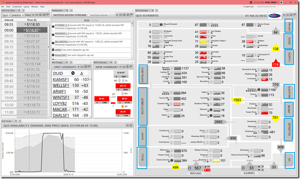
To illustrate these zones I have attached another snapshot from ez2view time-travelled back to the 09:00 dispatch interval on the Tuesday 1st February 2022 (i.e. same DI as shown in the ‘Generator Outages’ widget above), and highlighted them in blue. Here you can see which units were operational of the morning of that eventful day:
In this case you can see (in the ‘QLD Schematic’ widget on the right) how all of the units were performing in that dispatch interval … not just the thermal ones shown above.
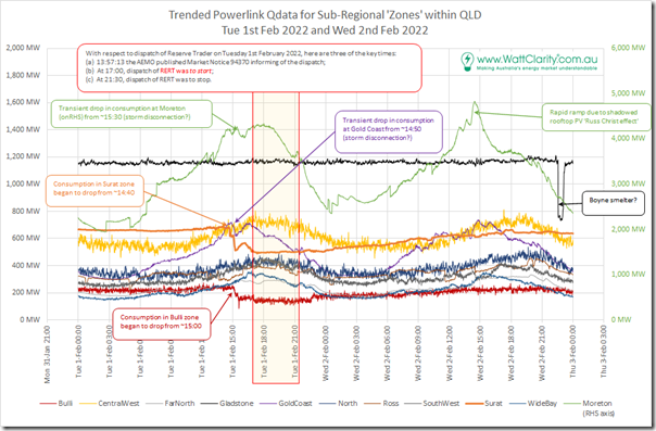
Taking the (1 minute cadence) readings from Powerlink for each of the 11 zones and trending over the 48-hour period through Tuesday 1st February and Wednesday 2nd February 2022 reveals this summary trend:
There’s a lot going on in this chart, so we’ll walk through each of the 11 x zones (roughly) from north to south in the grid, just focused on the period of the volatility in the QLD region on Tuesday 1st February 2022:
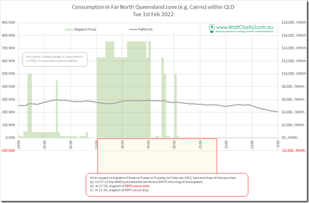
(C3a) Far North zone
The Far North zone is centred around Cairns, in terms of consumption, and includes the NQ hydros and Mt Emerald Wind Farm on the supply-side:
In the trend above, which is focused just on the period of volatility on Tuesday 1st February 2022:
1) there’s no obvious dip in consumption coincident with the high priced periods that might be a clue indicating spot price exposed demand response
2) there’s also no demand response visible over the 3.5 hours that AEMO noted was the dispatch period for RERT.
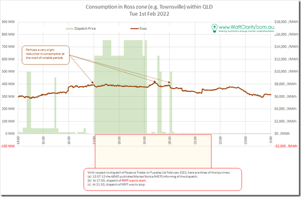
(C3b) Ross zone
The Ross zone is focused on Townsville (from a consumption perspective) and so includes the two thermal peaking plant in the city, and also a number of solar farms:
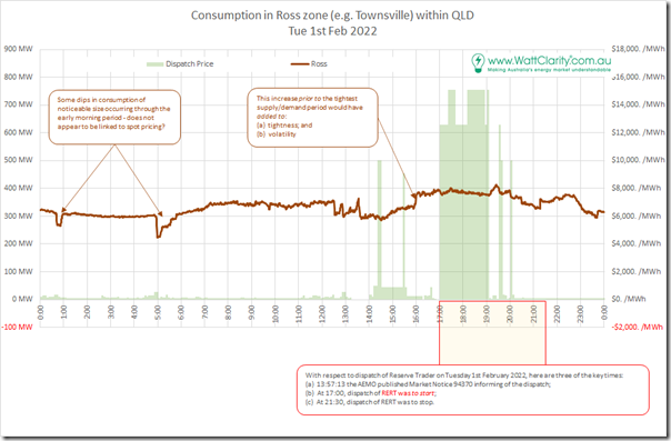
Given the long history of spot-exposed demand response at the Sun Metals smelter in the zone, I was surprised to see no obvious curtailment in response to spot prices. So I would the window out to look at the full 24 hours:
Indeed over the range there are some pronounced dips and increases seen, with the increase in consumption to 16:00 quite surprising.
It may have been that there was curtailment of consumption in response to spot price that’s masked by other overall increases in the window, but (as noted in the two charts above) it’s difficult to see more than very slight reductions in aggregate across the zone at times of extreme pricing. That surprised me!
(C3c) North zone
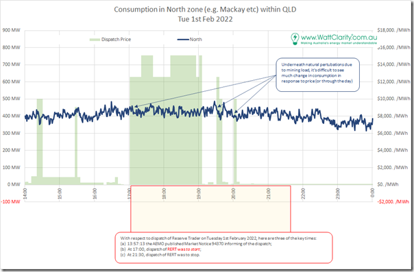
The North zone incorporates the Mackay area from a consumption perspective – including some mining and associated loads, which account for the greater ‘noise factor’ on the 1-minute cadence consumption signal taken by Powerlink.
You’ll also see similar ‘noisiness’ at other zones incorporating major mining load below.
As noted on the chart perhaps there is some relatively minor spot triggered curtailment, but it’s difficult to see.
(C3d) Central-West zone
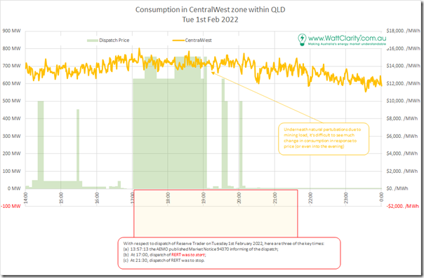
Here’s the Central-West zone, which incorporates Rockhampton and further west (e.g. Blackwater and so on). Again you will see the noisiness in the signal:
Again it’s difficult to see any large-scale curtailment in response to price (or in relation to RERT).
(C3e) Gladstone zone
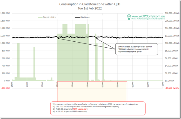
As the name suggests, this encompasses the Gladstone area – but especially a number of large loads in the area (aluminium smelter, alumina refineries, cement plant, etc).
Unless you squint very hard, it’s difficult to see any demand response due to spot prices or RERT.
(C3f) Wide Bay zone
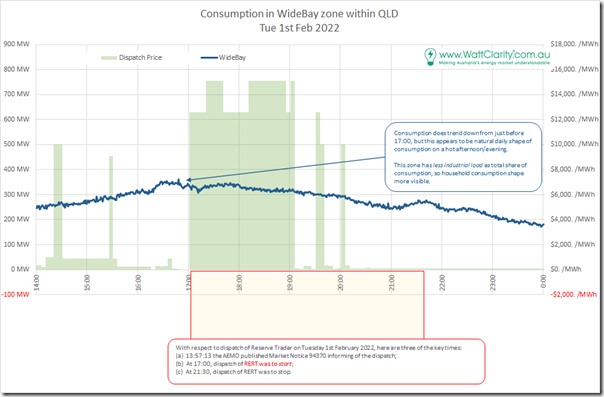
The Wide Bay zone is more dominated by residential load (net of what might be Australia’s largest percentage penetration of rooftop PV!), and as such it’s no surprise to see the load sliding off from around 17:00 on the day:
Again, its difficult to see much in the way of curtailment in consumption.
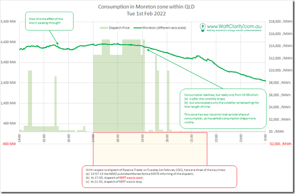
(C3g) Moreton zone
The Moreton zone encompasses the broader Brisbane region – so note that the y1-axis has a much larger scale than any of the other charts in this series.
What’s surprising (on the one hand) and understandable (on the other) is that, unlike what we saw for Wide Bay zone above, the aggregate consumption level does not decline by very much at all through the period through until after 19:00 – which:
1) Helps to explain why the prices remained high for as long as they did; but also
2) Illustrates different factors (including potentially different local micro climate) affecting Brisbane compared to Wide Bay above and Gold Coast below.
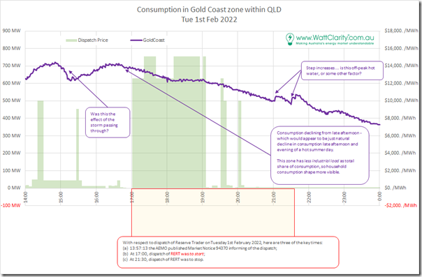
(C3h) Gold Coast zone
The Gold Coast zone should be self-explanatory.
Like the Wide Bay zone, the (residentially driven) consumption here began tapering off from 17:00, or a bit beforehand.
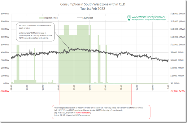
(C3i) South-West zone
The South-West zone incorporates the Tarong and other stations:
I’ve flagged a particularly troublesome increase in consumption that occurred around 17:30 – at least in terms of the supply/demand balance, the Reserve Trader and price volatility.
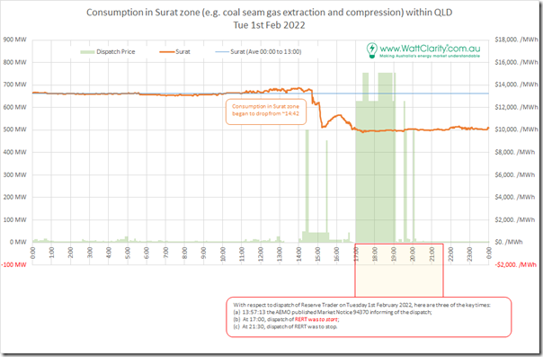
(C3j) Surat zone
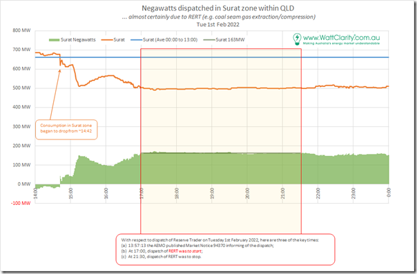
We get to the Surat zone by heading west, out into the coal seam gas fields – with electric compression on coal seam gas wells for supply to Curtis Island being one of the main sources of consumption.
Looking over a 24-hour period, there’s a distinct drop in consumption (which is ordinarily pretty flat) around the time of the price volatility and the Reserve Trader:
Zooming into the focused afternoon area, we are able to estimate how many negawatts were provided for Demand Response as shown:
As noted, this equates to 163MW consistently through the RERT Dispatched window from 17:00 to 21:30 … and actually beforehand and afterwards as well (though I’d gather those out-of-time negawatts won’t be paid for by AEMO).
In the AEMO’s ‘RERT Contracted Report ’ there are three different responses from QGC Pty Ltd which add up to 280MW … but my understanding is that it’s not as simple as just adding them up, as the responses have different timeframes of operation. I’ll be interested to see more, when the AEMO publishes a follow-on report.
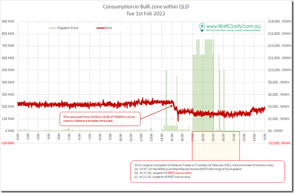
(C3k) Bulli zone
The Bulli zone, down near the border and where QNI connects, contains the Kogan and Millmerran power stations along with a couple others as well. Again if we start with a 24-hour view, there’s clearly a reduction in consumption preceding the time of the price volatility and reserve trader, following a noticeable ramp up from around 11:00:
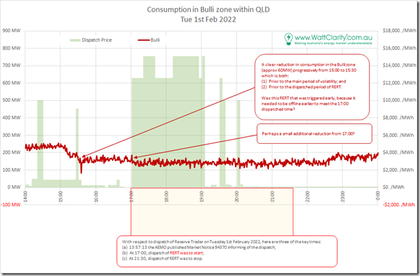
Zooming in, we’re able to add some more comments about the specifics (particularly estimating a 60MW negawatt response):
Again, we’ll be interested to learn more from the AEMO, when the next report is published.
(C4) Broader Load Shedding
Worth a short note to refer back to this article on the day that highlighted how there were a number of changes in AEMO’s vision for whether load shedding would be required, or not… due to the difficulties in forecasting various factors during these times of high temperatures and storm activity.


Leave a comment