Yesterday evening, at the end of a remarkable day, I posted about how ‘Victorian Scheduled Demand plunged..’ and how it was probably a ‘…new daytime record low’ point.
A couple of offline questions from various parties prompted me to dig a bit deeper, as a result of which I’ve pieced this together today, in between other weekend commitments (note that it’s been a stop-start process today so may have mistakes – if you spot any, feel free to point them out in comments below, or one-on-one).
(A) Prices plunged, with the NEM swamped with capacity
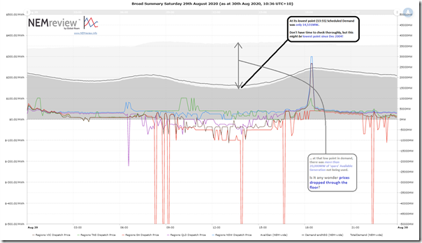
In situations like this, with lots of moving pieces, it’s sometimes best to step back and look at some market fundamentals at the start of the process. For this purpose I pieced together this high-level trend of the day using NEMreview v7 to show the following:
There are three key things to note from this chart:
Observation #1) I’ve flagged how the NEM-wide Scheduled Demand* had slumped to 14,531MW at 13:55 yesterday. I only scanned quickly so might have missed some, but it does appear that this might be the lowest level of NEM-wide Scheduled Demand seen since December 2004:
* For those who forget the many different ways in which electricity demand is measured, here’s the detailed explanation.
#1a) That’s over 15 years ago!
#1b) The level yesterday was seen in the middle of the day whereas way back then it was likely to be the early hours of the morning.
#1c) One more example of ‘the duck’ (being rooftop PV in particular) growing increasingly hungry – and helping to illustrate why the AEMO is increasingly concerned about minimum demand, which seems to be a problem that is accelerating towards us.
Observation #2) Despite there being such a low level of demand, we see that Available Generation through the day was still over 35,000MW (which is despite some plant being out for maintenance in preparation for the coming summer).
#2a) At the depths of demand there was more capacity available but unused (i.e. 20,000MW) than there was capacity available and used (15,000MW).
#2b) Easy to see that this is a sign of challenges ahead!
Observation #3) Is it any wonder that generators, fighting over a dwindling pie, found themselves in negative price territory through much of the daylight period across three regions – QLD, VIC and SA.
#3a) Prices were not great in NSW, either, being under siege on both northern and southern ends, as well as with its own surplus of capacity to deal with.
#3b) Clearly something’s got to give…
(B) Over 2,300MW of available Semi-Sched wind and solar spilled at its peak
There’s obviously going to be a story in how every DUID (and the Portfolio above them) responded to adverse conditions such as this.
However the questions I have received from various parties have meant I focused today on the responses of the Semi-Scheduled capacity (which is the vast majority of the Large Solar and Wind Farms scattered across the NEM). Time permitting, I might come back later to explore what happened with the Scheduled units, and also the Non-Scheduled ones again for which the AEMO provide visibility.
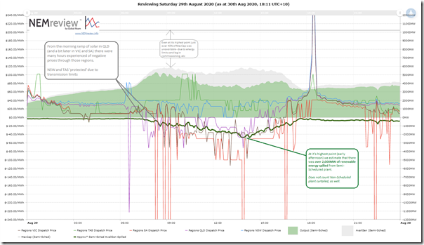
Again using NEMreview v7, I prepared this trended view of the three key data points relevant for Semi-Scheduled units across the NEM:
From this chart, we can add to observations:
Observation #4) We see that aggregate production from the Semi-Scheduled units peaked over 5,000MW in the hour ending 09:00 – but that it declined progressively through the day in conjunction with the negative priced excursions in each of the three regions.
Observation #5) Keeping in mind Marcelle’s caveats on the difficulties of estimating curtailment of renewable energy generation, I’ve had a stab at doing this in the above chart, and see that ‘spillage’ of Semi-Scheduled renewable capability exceeded 2,300MW in the early afternoon period:
#5a) Which we see, from the above, was also when Scheduled Demand was at its low point.
#5b) It also coincides with the period where prices are the lowest in QLD, VIC and SA.
Observation #6) Keep in mind that this amount of spillage does not factor in all of the Non-Scheduled wind and solar generators who would have been switching off in the carnage that ensued yesterday:
#6a) A small number of these sites (the larger ones) are visible by the AEMO in real time.
#6b) However there are many more that are invisible to the AEMO in real time because of their small size. One of the sites at the smaller end of those we assist was discussed by AZZO in this video here.
Observation #7) Also worth noting that, even at the high point of renewable energy availability through the day, just over 40% of the aggregate installed capacity of the Semi-Scheduled wind and solar fleet was unavailable to the market:
#7a) That’s quite a large amount of capacity unavailable.
#7b) Without looking into the details, three main reasons immediately jump out at me that would collectively contribute to that large amount of ‘missing’ capacity:
i. Some plant might be unavailable due to maintenance or other plant physical reasons;
ii. Also on the physical side, there is a lag between plant capacity appearing in AEMO systems as ‘Maximum Capacity’ when registered, and when it is fully able to supply due to the stepped commissioning process;
iii. Finally, for wind and solar plant that is fully available physically, in aggregate there will still be capacity ‘missing’ due to energy limitations (e.g. lack of wind, cloud cover, etc).
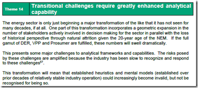
The challenges this presents for objective analysis (i.e. not having a clear view of the ‘physical availability’ in addition to the ‘energy constrained availability’) was discussed in Theme 14 within Part 2 of the 180-page analytical component within our Generator Report Card 2018 :
#7c) In more general terms, this might be a useful reminder that thinking of wind and solar plant in terms of installed capacity is quite likely to be misleading, or misinterpreted (some might call it a ‘vanity metric’).
With more Wind and Solar capacity piling into a market that is already oversupplied much of the time and with the exit of coal units still quite uncertain, I’d repeat my concerns voiced in March about whether ‘we’ve been killing New Entrants with kindness?’.
The penny must be dropping soon that simplistic metrics (like LCOE – which don’t factor in curtailment, and hence reduced utilisation, like seen on Saturday) have limited usefulness in the market we’ve been transitioning into over the past 5 years, and that it’s well past time we all focused a lot more on providing VALUE, not obsessing over COST.
(C) Dynamic operations at Semi-Scheduled capacity
When we compiled the data for our Generator Report Card 2018 (developed in conjunction with GVSC), we compiled a review of how each Semi-Scheduled DUID operated with respect to negative prices, by looking at bidding through 2018 (see p72 in Part 4 for Wind and p87 in Part 4 for Large Solar in your copy of the GRC2018).
Given the increasing incidence of negative prices seen in all regions we’ll be quite interested to update and extend this analysis in the next update to the Generator Report Card (perhaps for release early 2021).
My interest in the operations of Semi-Scheduled capacity is also heightened because of the growing series of Case Studies which we’ve been accumulating here on WattClarity®. Especially because of the negative prices that were a key feature of what happened yesterday (and their relation to issues of behaviours in the AER Issues Paper) I thought I would take a closer look…
(C1) Background context
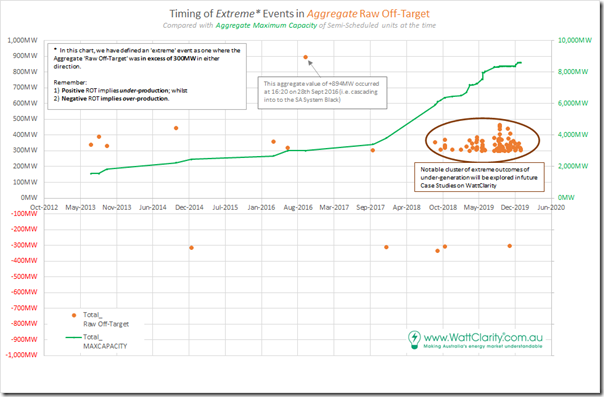
Remember that we identified a total of 98 discrete instances where aggregate Raw Off-Target across all Semi-Scheduled units was either:
(a) above +300MW (representing collective under-performance) or, much less commonly,
(b) under –300MW (representing collective over-performance relative to AEMO’s expectations, seen in the Dispatch Target).
There was a smattering of only 10 cases through 2013, 2014, 2015, 2016, 2017 and through until August 2018. However thereafter (to the end of 2019) there was a sharp escalation of extreme incidents – as seen in the following chart:
Note also that we have not yet looked into 2020 data, which will be the focus of the GSD2020 (so we can’t comment on whether the trend from 2019 has continued to grow).
We’re doing this given a push from the AER Issues Paper, but moreso inspired by the deliberations by the (now defunct) COAG Energy Council and (extended?) ESB relating to ‘NEM 2.0’. Note that these case studies deal with imbalance in the Dispatch Interval timeframe, but readers should understand that there are other challenges that ‘NEM 2.0’ also needs to resolve, including:
Other Challenge #1) Within the dispatch interval timeframe, energy-related services focused on frequency maintenance and response to contingencies;
Other Challenge #2) Relating to ‘firmness’ of supply in the broader forecast horizon; and
Other Challenge #3) Others that we bundled into a ‘keeping the lights on’ services in our discussions in the Generator Report Card 2018 (for instance, in relation to System Strength).
In preparing these focused Case Studies, we’re seeking to understand why and what the implications are of this escalation. … so let’s look at this particular event:
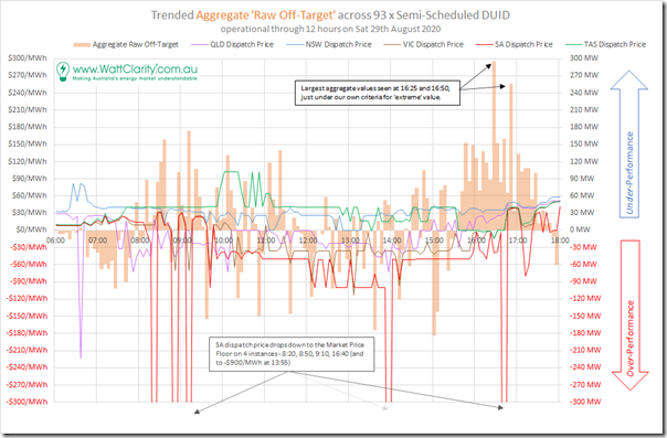
(C2) Trend of Aggregate Raw Off-Target through the day
As a result, I’ve compiled this trend of Aggregate Raw Off-Target across all Semi-Scheduled units through the day:
On this trend, I have also included the trended dispatch price in each of the 5 regions in order to help highlight any coincidence with negative prices and extreme values of aggregate Raw Off-Target.
Observation #7) We can see here that the most extreme value for Aggregate Raw Off-Target occurred at 16:25 and was up just below the +300MW criteria we established for extreme collective under-performance.
#7a) At this point in time, QLD, VIC and SA all had negative dispatch prices (but that coincidence was not particularly startling on this day).
#7b) We have not yet systematically looked through all dispatch intervals in 2020, but I suspect that these ‘extremes’ in outcome will be less and less remarkable in this year and those to come as the Semi-Scheduled capacity continues to grow, and if nothing is done to improve the performance of individual units.
Observation #8) At 16:50 we see the aggregate value was above +250MW. All other instances were below +200MW in terms of collective under-performance (or over-performance as above –200MW).
———–
There are a number of avenues of exploration I have started today from this point, but yet to pull together. Time permitting tomorrow, I might be able to continue and post as a subsequent article…


Hi Paul
Was wondering if this was a minimum record for coal generation (black + brown)? even if not quite since market start, at least minimum for the last 10 years, say?
Belatedly here, Kieran:
https://wattclarity.com.au/articles/2020/09/the-slow-decline-of-coal/
Minimum NEM Coal since 01 Nov 2010 was 10,665 MW on Sun 22 Sep 2019 at 12:30 hrs. Last Sat 29 Aug 2020 minimum was 11,062 MW at 13:30 hrs. Another notable minimum was 11,098 MW on Sun 25 May 2014 at 04:05 hrs.