
Capacity factor is often discussed when evaluating and comparing the efficiency and performance of solar farms. However, looking just at this metric can be misleading as it ignores many underlying technical and commercial factors, as solar farm specifications almost never align for a simple apples-to-apples comparison.
As many of us in the industry will be meeting at the Clean Energy Council’s Large-Scale Solar Forum in Brisbane on Wednesday, I thought I would publish this article as a timely reminder of the many important development and operational factors that can affect the performance of a solar farm.
The analysis presented in this article draws upon a range of data, primarily from our recently released GSD2022, and explores just a handful of reasons why comparing solar farms on capacity factor alone is overly simplistic and can be misleading. In doing so I run through a list of metrics that help paint a more complete picture of how to view generator performance.
Capacity Factor
Let’s begin by having a look at what capacity factor is, before we delve into what it isn’t.
For a given length of time, a generator’s capacity factor is simply its electricity generated divided by the theoretical maximum that it could have produced. It’s a metric that is especially discussed when comparing solar farms as they all operate on relatively similar and predictable schedules.
Below, I’ve made a fairly simple chart using data from our GSD2022 to compare solar units in the NEM. For convenience, I’ve filtered out all units that have a maximum capacity of around 30MW or less and have excluded any units that connected to the NEM after 1st January 2022.
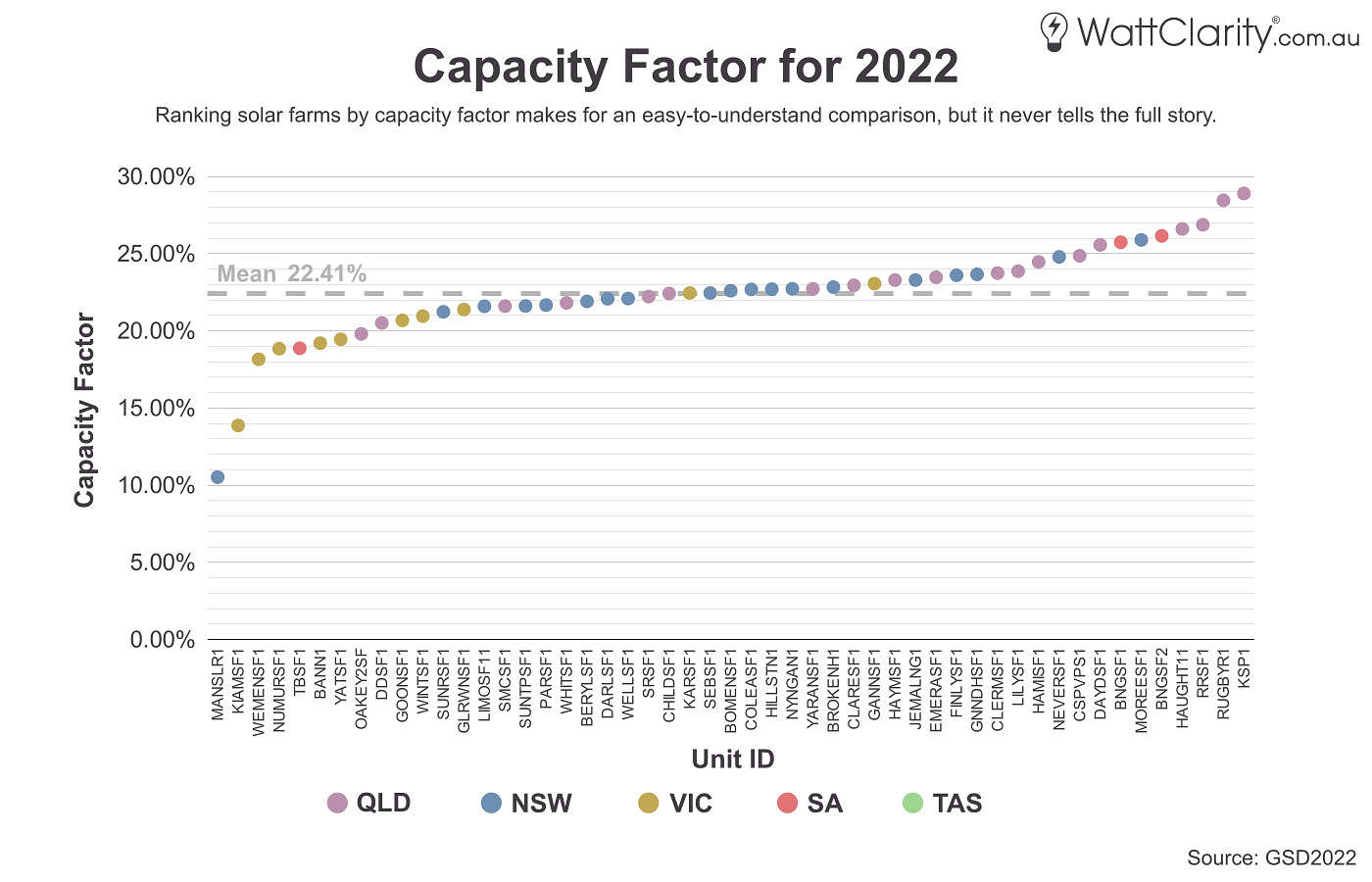
It’s common to see solar units ranked from ‘best’ to ‘worst’ based on capacity factor.
Source: GSD2022 Data Extract
The chart above makes for a simple and easy-to-view comparison but glosses over a lot of important details. This is because capacity factor really only captures two variables:
- Generation – More specifically, final generation output. This means it skips over all of the differing factors that impact each individual unit’s output such as location, network constraints, bidding behavior, etc.
- Capacity – And even deciding which measure of ‘capacity’ to use is more ambiguous than you might think.
Furthermore, it completely ignores other equally important aspects of performance such as:
- Revenue – income such as the Spot Revenue, LGC revenue, etc.
- Costs – construction costs and other associated operating costs.
A tale of two solar farms
I thought it was best to present a case study to illustrate just some of the complexities that are involved in understanding solar farm performance. In this analysis I’m comparing the performance of two solar units in South Australia throughout last calendar year:
- Bungala One – Half of the Bungala Solar Farm, operating since 2019 and located near the town of Port Augusta with a maximum capacity of 110MW.
- Tailem Bend – A solar farm East of Adelaide that has been operating since 2018 with a maximum capacity of 95MW. Stage 2 of the project is currently under development.
I’ve chosen these two units as they are located in the same region (hence are subject to the same Regional Reference Price), have a relatively similar maximum capacity, and were constructed around the same time – but have quite different capacity factors.
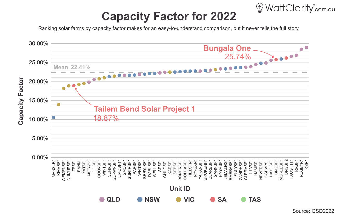
Bungala One and Tailem Bend are two solar units in SA. They ranked amongst the ‘best’ and ‘worst’ capacity factors, respectively, in the market in 2022.
Source: GSD2022 Data Extract
Disclaimer
All information, analysis, and hypotheses presented here are based on my own research, calculations, and observations. If you spot any omissions or mistakes or have any other feedback then please feel free to post a comment below.
Technical Reasons
Many decisions that impact performance get made during the design and construction phase of development, and the following reasons demonstrate why not all solar farms are created equal.
Reason 1) Latitude
The first factor that affects solar generation is the raw energy potential of the solar farm’s location. And to a large extent, this comes down to the latitude of its location.
As the sun’s trajectory relative to the earth follows a cosine curve, broadly speaking, it is the latitudes between the Tropics of Cancer and Capricorn that receive the most overhead sunlight. As a very rough rule of thumb in the NEM, the further south from the Tropic of Capricorn (which runs through the Queensland town of Rockhampton) that a site is located, the less solar irradiance it should receive. One small caveat is that coastal areas have higher levels of moisture content which means that they are more likely to have more frequent cloud cover.
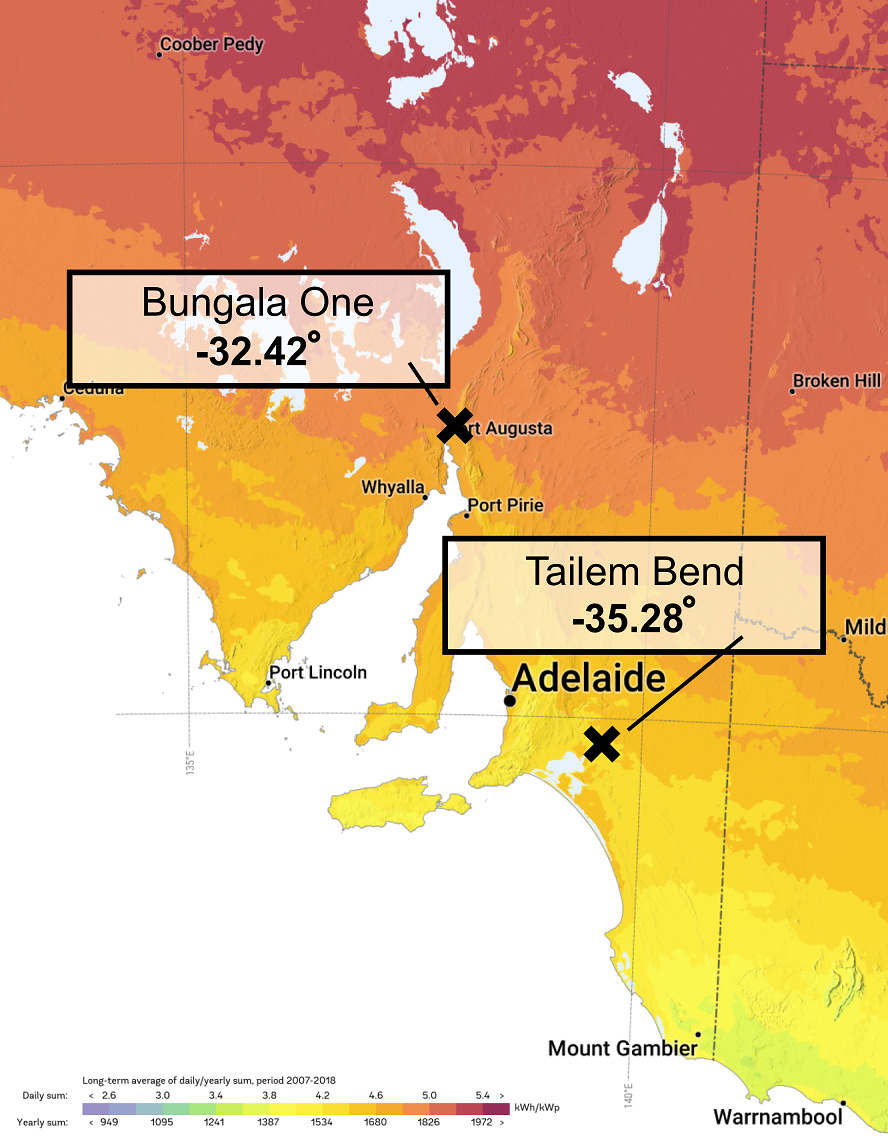
Bungala One receives significantly more raw energy than Tailem Bend, but that’s not necessarily the most important factor to determine performance.
Source: 2020 The World Bank, Global Solar Atlas 2.0, Solargis
For our two solar units in question, we can see from the map above that Bungala One’s more northerly latitude contributes to its location having a higher raw solar irradiance.
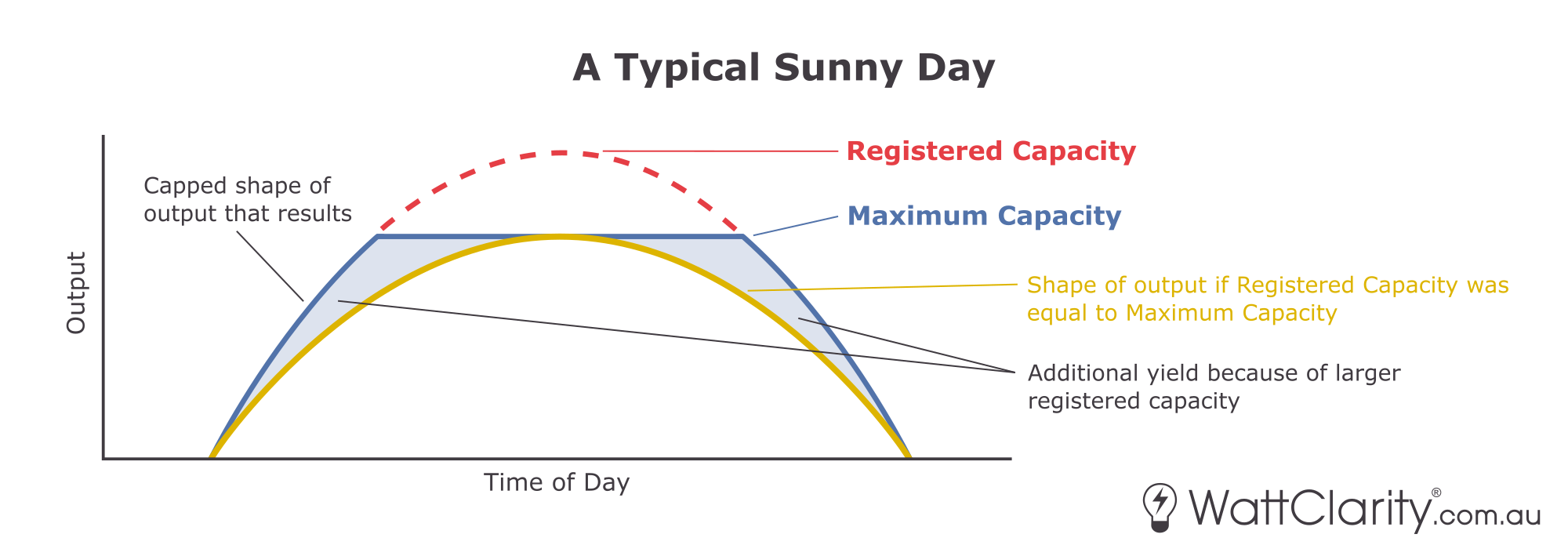
Reason 2) Capacity
There are two measures of capacity that analysts often use when calculating capacity factor – ‘Maximum Capacity’ or ‘Registered Capacity’. Paul McArdle has written an explainer distinguishing the two measures, and when it is appropriate to use each. For solar farms, registered capacity usually denotes the size of a unit’s panels, and maximum capacity denotes the size of its inverter. Therefore, it would be more correct to use maximum capacity when analysing solar farms as output is limited by the inverter.
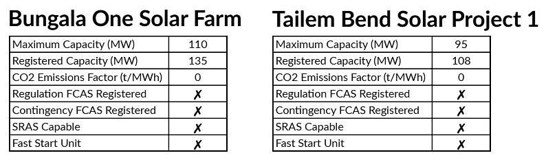
The maximum and registered capacities of Bungala One and Tailem Bend
Source: GSD2022
In the NEM there is an increasing trend for solar farms to oversize the capacity of their solar panels relative to their inverter. Having a higher Max-to-Registered-Capacity ratio results in a more pronounced capped shape of output where output is generally higher in the early morning and late afternoon periods than would be for a solar farm with a simple 1:1 ratio.
From using the tables above, my math here tells me that Bungala One has a Max-to-Registered-Capacity ratio of 1:1.23 while Tailem Bend’s is 1:1.14. This means that if all other things were equal, Bungala’s output would be slightly higher during the shoulder periods of daylight.
Reason 3) Angle of incidence
Solar farm designs can employ variations of fixed, single or even dual-axis tracking.
The majority of solar farms in the NEM use single-axis tracking on their panels, with some of the newer solar farms such as Columboola using bifacial single-axis tracking. Typically older solar farms and those located within cyclone-prone areas (such as at Sun Metals) were constructed without tracking, and thus are fixed. There are currently no solar farms big enough for NEM registration that use dual-axis tracking, but The University of Queensland has built a <1MW dual-axis solar array on their Gatton Campus for research purposes. Wine connoisseurs might also be aware that two dual-axis solar trackers were installed at the Jacob’s Creek Winery in SA in 2011.
The charts below have been taken from our GSD2022 and show both the range of output for each day over the year (min-to-max in green); and the maximum daily availability (in black) for both Bungala One and Tailem Bend.
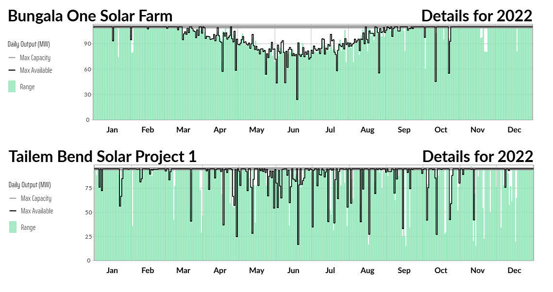
Tailem Bend’s output is less consistent, but Bungala One’s availability has a noticeable dip in winter
Source: GSD2022
There are clearly some differences visible between the two units:
- Bungala One has a very pronounced dip in availability in winter, while Tailem Bend does not.
- Tailem Bend has many days where maximum output does not rise close to maximum capacity (i.e. white space visible in the chart) whereas Bungala One reaches close to maximum output most days.
- Tailem Bend also saw more days where availability was also limited well below maximum capacity.
My current hypothesis for why Bungala One shows a drop in output during winter, while Tailem Bend does not, is that it comes down to panel orientation and use of tracking. Bungala One employs single-axis tracking where its solar panels face East each morning, and track West throughout the day. Meanwhile, Tailem Bend’s panels are northward facing and are fixed (at approximately 19° according to ARENA’s benchmarking PV performance report). Perhaps one of our more learned readers can comment below to help me understand if this hypothesis is correct?
During summer months, the sun’s trajectory in the sky is higher so panels that track East-to-West are significantly more effective at capturing direct sunlight. In winter there are naturally less hours of sunlight, but the suns trajectory is also lower and further north (relative to South Australia) – this means that panels that track East-to-West receive less direct sunlight during the middle-of-the-day peak in winter than they do in summer.
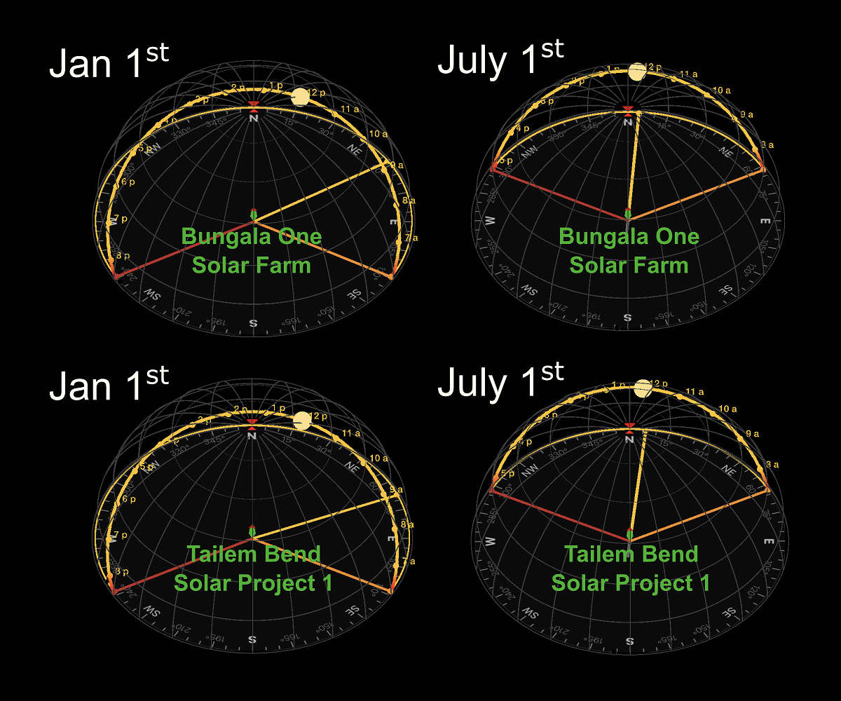
The sun’s trajectory over both solar farms in summer vs winter.
Source: Sun Surveyor
My two graphics below attempt to summarise this hypothesis to show the panel orientation and tracking for both units and the resulting impact on their summer vs winter output.
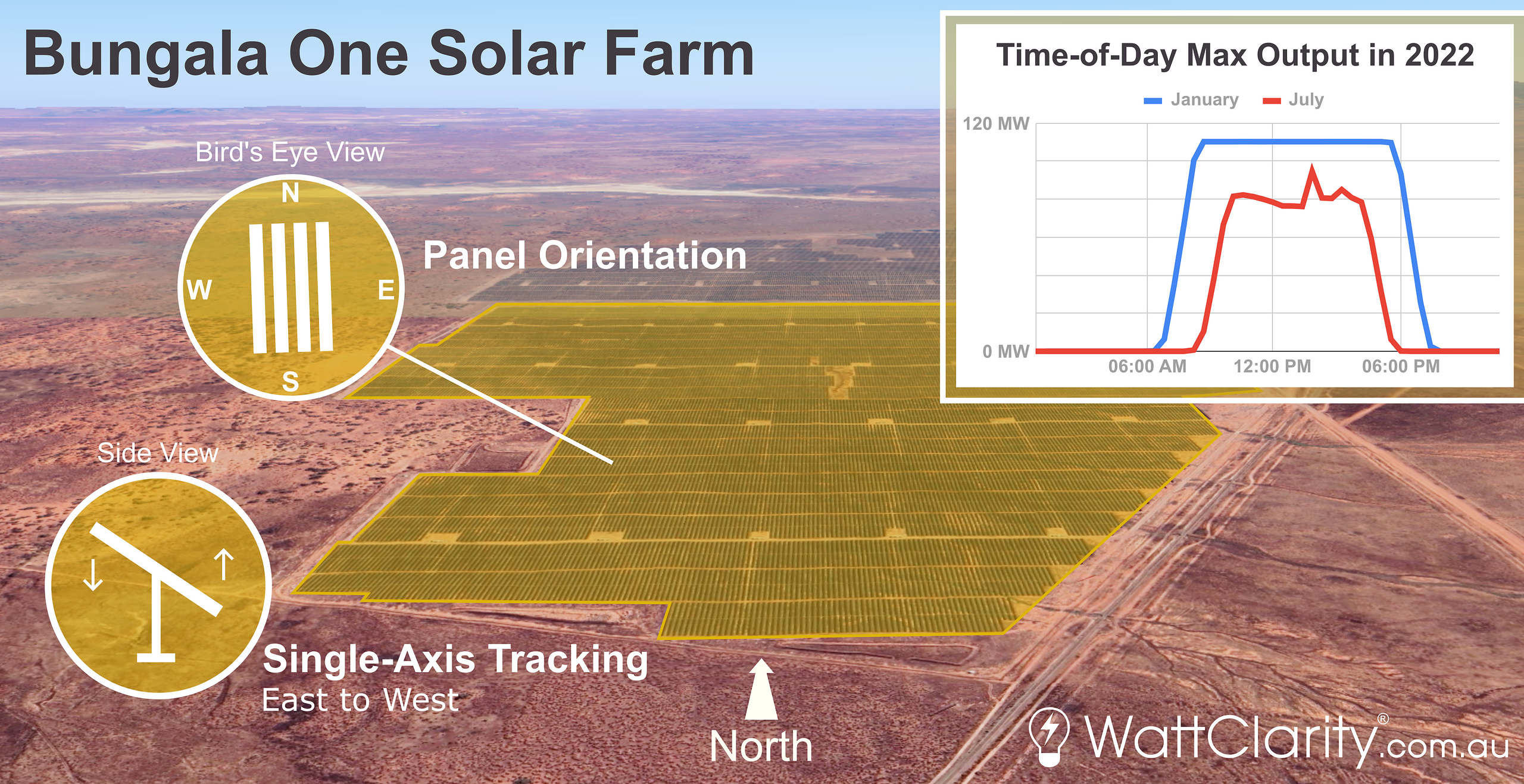
I believe Bungala One’s East-to-West single-axis tracking causes its generation profile to receive a ‘winter shrink’ compared to summer.
Source: Google Earth and NEMreview
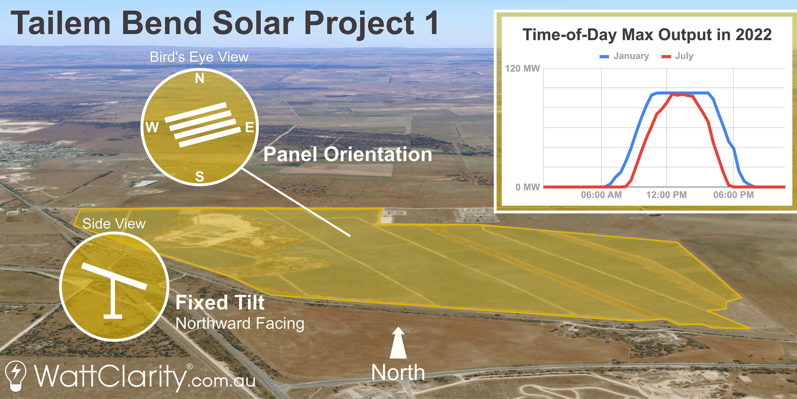
Contrastingly, it would appear Tailem Bend’s northward-facing fixed panels means that its generation profile gets a ‘winter pinch’ compared to summer.
Source: Google Earth and NEMreview
Ultimately the choice of fixed vs single-axis tracking comes down to economics and suitability. As we can see in the charts above, Bungala One’s single-axis tracking means that it captures a higher volume of energy in total than a fixed set-up such as at Tailem Bend.
Operational Reasons
Once built it is then only operational decisions that can positively (or negatively) impact a unit’s performance and subsequent returns. And motivations behind these operational decisions are sometimes difficult to ascertain as commercial arrangements are generally confidential by nature.
Reason 4) Negative prices
When discussing performance, specifically financial performance, it’s of great importance to analyse how effective a solar farm is at generating when electricity is most valuable, and inversely, how effective a solar farm is at bidding themselves out of the market when prices are negative.
Nick Bartels has already explained, and used, the RRP Energy Price Harvest metric from the GSD2022 to demonstrate how effective an individual unit is at capturing high or low spot prices.
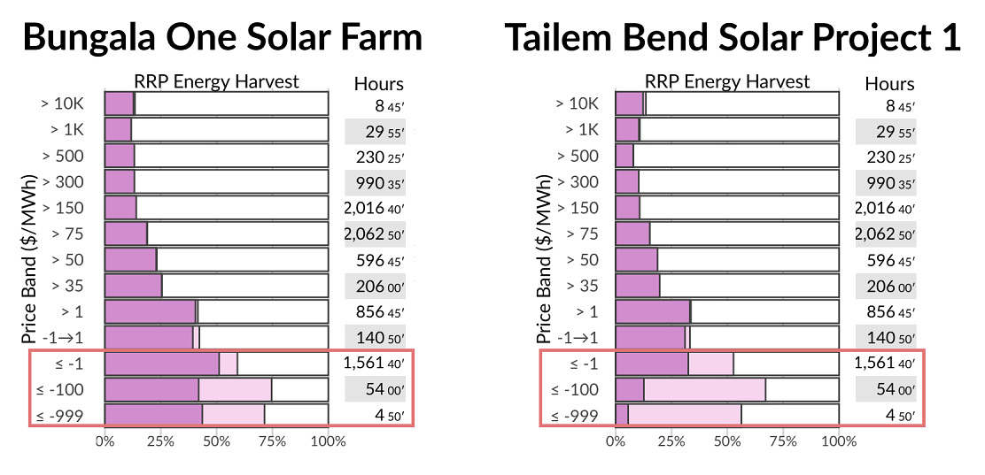
Throughout 2022, Tailem Bend generated significantly less than what it had available during negative prices compared to Bungala One.
Source: GSD2022 Data Extract
In the charts above, both unit’s capacity factors (dark purple) and availability factors (light purple) are binned into price bands of the South Australian Regional Reference Price.
It is worth noting that the existence of the LGC scheme (to be discussed later) augments the revenue of renewable generators, and can contribute to their profitability. Depending on the specifics of the PPA structure the interaction of Spot Revenue and LGC revenue might affect the way in which the solar farm operates. For instance, it might still be profitable for a solar farm exposed to spot prices to operate at spot prices slightly negative if the revenue earned on LGCs helps to offset the costs paid to generate at negative spot prices. For this reason, we see a number of solar farms and wind farms bidding at what amounts to ‘negative LGC’ prices.
The bars in the highlighted red area of the charts show negative prices, and we can observe:
- That both Solar Farms have tried to avoid generating at negative prices in 2022 (i.e. we see light purple in the bars in the negative price buckets);
- But that Tailem Bend has been more active in trying to avoid negative spot prices.
Bringing this back to the focus on capacity factor, we surmise that this difference in behaviour (i.e. more volume sacrificed at Tailem Bend to avoid negative prices):
- Will have contributed to a lower capacity factor at Tailem Bend
- But might have contributed to a higher aggregate spot revenue earned by the station over the year. But remember again that we don’t have visibility of either solar farm’s PPA to understand the degree to which this is a motivator.
Reason 5) Network constraints
Network constraints can have a significant impact on the generation figure used when calculating capacity factor, and in order to understand this, some analysis must be done to examine how much an individual unit was constrained, and for what reasons.
It is important to understand that a unit can be ‘constrained down’ (i.e. curtailed), but can also be ‘constrained up’ in any given dispatch interval. The constraint equations that are processed by NEMDE dictate these outcomes.
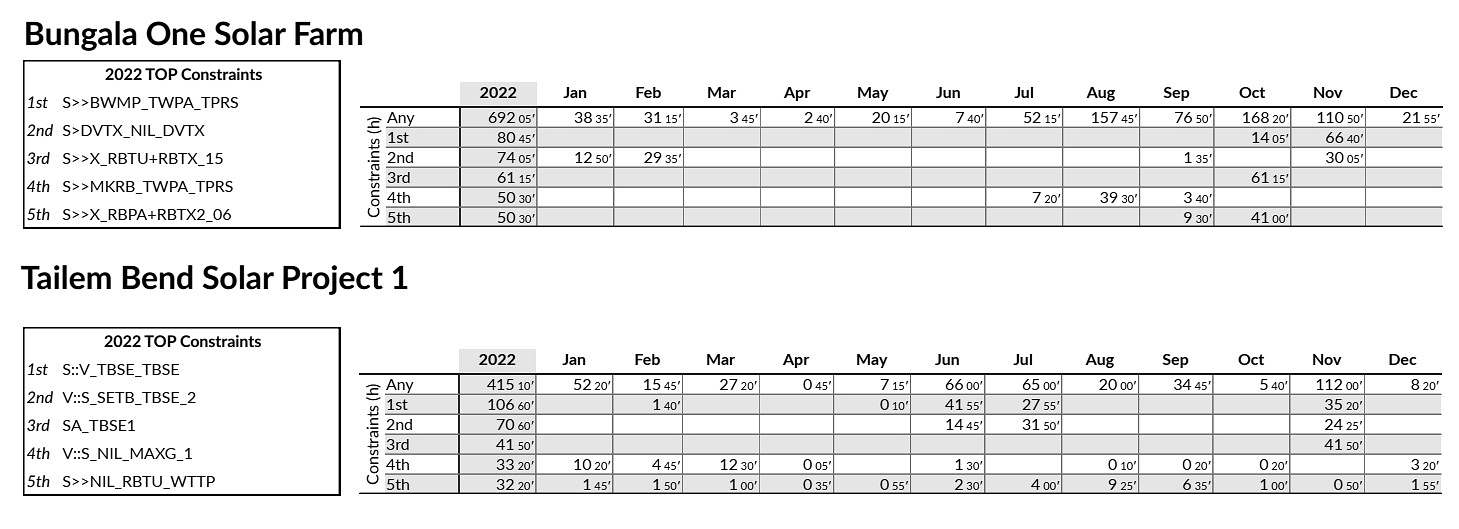
The ‘top five’ constraint equations that affected each unit throughout the year, and the amount of hours the unit spent on the Left Hand Side (LHS) of each corresponding constraint when it bound.
Source: GSD2022
For those familiar with the NEM dispatch process, the screenshot above shows the ‘top five’ constraint equations (by hours bound) and the amount of time that each unit appeared on the LHS of the equation when each of those constraints were bound. We can calculate from these tables that Bungala One appeared on the LHS of bound constraints around 167% more of the time than Tailem Bend.
For those who aren’t so familiar with the inner workings of the dispatch process, myself and the team here at Global-Roam have done our best to try to translate the AEMO’s constraint data into curtailment figures for each of these two units. Below I have used a two-dimensional scatter plot to visualise the incidences of curtailment at each solar farm. To assist in understanding these charts, I have created this graphic to provide a quick explainer on how to interpret them.
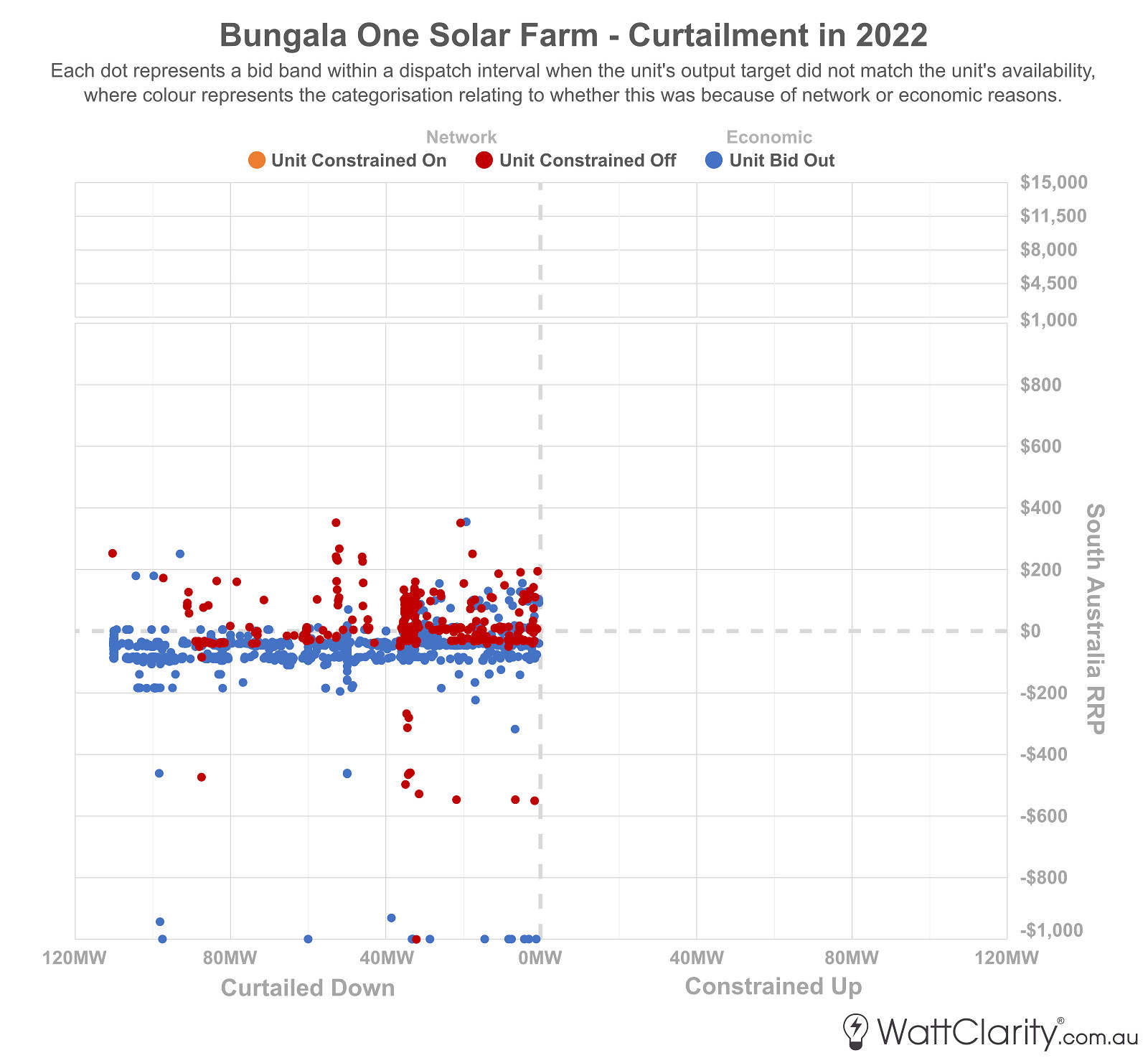
The red dots highlight the extent to which Bungala One was adversely affected by network constraints throughout 2022.
Source: AEMO MMS
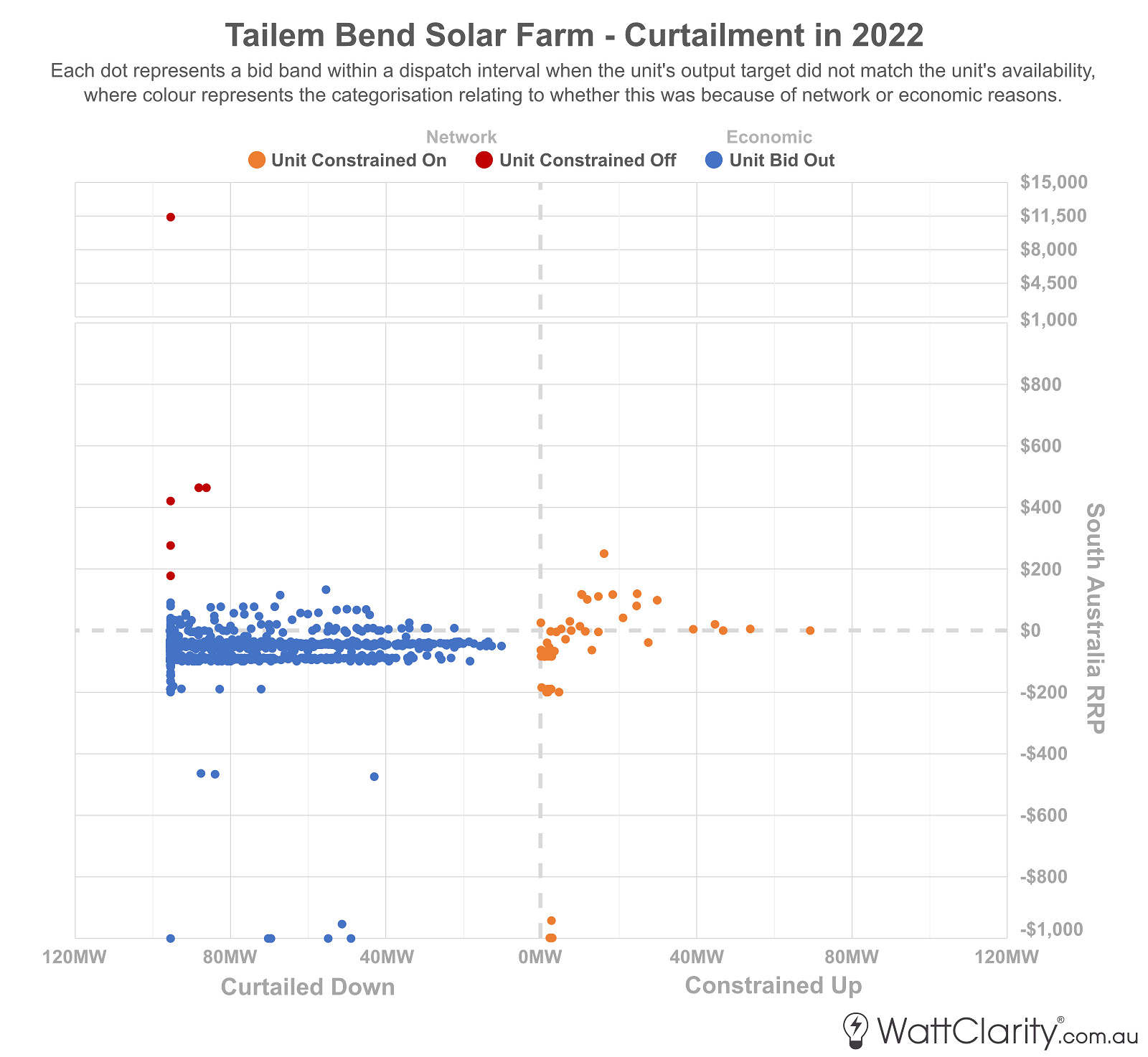
In contrast, Tailem Bend was more active when attempting to avoid negative prices.
Source: AEMO MMS
The charts illustrate the slight differences in bidding strategies employed by each operator. It would appear that Tailem Bend was more active when attempting to avoid an expected negative price by bidding out. Bungala One’s location on the network, and its bidding behavior, resulted in it being ‘constrained off’ far more often.
Closer inspection of the data shows me that almost all incidences where Tailem Bend was ‘constrained on’ (i.e. the orange dots) occurred during the November 2022 SA islanding event – which was coincidentally caused by a transmission tower failure near the town of Tailem Bend. As Allan O’Neil noted at the time, ‘energy’ prices during the islanding event remained stable whilst FCAS prices skyrocketed to the Administered Price Cap. Such a mismatch of ‘energy’ and FCAS prices could provide an incentive for some units (of any fuel type) to bid out of the market to avoid the risk of a high Contingency Raise FCAS bill.
Reason 6) FCAS costs
All generators must pay their share of FCAS costs.
In the GSD2022 we included a table for each DUID to estimate (using our own calculation) of what FCAS costs they will have incurred through each month of the year. The month of November – which contained the SA islanding event – has been highlighted in the table below to draw your attention to how severe the costs were for both solar farms, and indeed all SA generators, during the islanding.
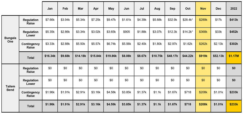
* Asterisk in the table denotes that the unit changed FCAS Portfolio during the month. See the GSD2022 for more detail.
Note: AEMO recovers regulation costs by FCAS Portfolio, and hence not always on a unit-by-unit basis. In our GSD2022, where a unit was part of a larger portfolio, we have attempted to calculate that unit’s share of FCAS costs.
Bungala One’s FCAS bill was almost $1M higher than Tailem Bend’s over 2022, owing mainly to higher FCAS (Regulation and Contingency) costs incurred during the SA islanding event in November.
Source: GSD2022 Data Extract
In the table above I’ve shown FCAS costs together, but readers need to be clear that sometimes FCAS costs are best considered separately.
There are three bundles of costs, of which generators pay two. We recommend you read this page here to ensure you are aware of the correct details, but the simple summary being as follows:
Bundle 1) Regulation Costs (Raise and Lower)
The regulation FCAS costs:
(a) Are apportioned to both Generators and Loads;
(b) Using a complex ‘Causer Pays’ mechanism, which has been described in more detail by Harley MacKenzie;
(c) Where there is a timing mismatch in this process, between the calculation of the ‘Causer Pays Factor’ (CPF) and the allocation of the cost … and this timing mismatch changes the incentive to respond;
(d) And as Jonathon Dyson has written and spoken about with respect to ‘The Rise of the Machines’, it’s become apparent that some Semi-Scheduled units have adopted the use of self-forecasting systems in an attempt to achieve a low or zero Causer Pays Factor and so to pay low, or no, Regulation FCAS costs.
As Jonathon noted here, a by-product of this process is that a unit operating in this manner might sacrifice volume in the ‘energy’ market at certain times of the day (e.g. when the system frequency might be typically low) to achieve the outcome of low CPF. Readers might note that this would have the effect of lowering a unit’s overall capacity factor. However determining the size of this effect is difficult, as the ‘Availability’ (and not just the ‘Output’, during Semi-Dispatch Cap intervals) of the unit might be artificially lower as a result. Of the two units shown above, we see that the GSD2022 calculates that Bungala One paid almost $900,000 in Regulation FCAS costs through 2022, but Tailem Bend Regulation FCAS costs were calculated as $0 for the year:
-
-
- So we might hypothesise that Tailem Bend used a self-forecast through 2022 whereas Bungala One did not;
- But note that in this analysis:
- I have not looked specifically at the extent to which either Solar Farm used self-forecasting.
- Nor have I looked at what specific impact this might have had on capacity factor
- Hence readers should read the above as a general guide only.
-
Bundle 2) Contingency Raise Costs
Generators operating during any given period pay their share of what the Contingency Raise FCAS costs are at the same time. For the avoidance of doubt, the ‘Causer Pays’ mechanism has nothing to do with apportioning these costs.
Especially given the SA islanding event of Nov 2022, there would have been an incentive for all generators in SA to reduce generation in the ‘energy’ market, (and increase supply of Contingency Raise – for those able to do so) to avoid ‘losing out’ on the mismatch between high Contingency Raise prices and lower ‘energy’ prices. Obviously, any reduction in generation (to try to avoid Contingency Raise costs) would also contribute to a lower capacity factor for the month/year. The scatter plots above suggest that this might have been a motivation in this case, but that generators on occasion were ‘constrained on’ in any case. We see above that Tailem Bend paid a lower amount for Contingency Raise costs in November 2022 than did Bungala One … but that this was also the case in the other months of the year.
Bundle 3) Contingency Lower Costs
For clarity, the third bundle of costs is in relation to the Contingency Lower FCAS services … but these are apportioned to loads and so are not relevant in this analysis.
Other Considerations
The reasons listed above are just some of the drivers for ‘how’ capacity factor can be misleading, but to answer the overarching ‘why’ listed in this article’s title, we must consider known and unknown motivations and incentives for generator behavior.
LGCs
An additional revenue stream for solar farms comes from Large Generation Certificates that can generated, banked and sold – but the exact returns from this stream are much harder to calculate. Whilst some brokers (such as the good people at Green Energy Trading) publish a daily spot price for the value of an LGC, generators are not forced to sell each certificate at the time of generation and exact specifics of transactions or stored amounts is not publicly available.
It is important however to note that LGC revenue can skew market behavior, and therefore generation performance.
PPA and/or portfolio arrangements
The high majority of solar farms are built and sold on long-term PPAs, contracted at a fixed price. The terms of a PPA are typically confidential by nature, which limits our ability to understand why generators behave in certain ways.
Tailem Bend was constructed throughout 2018 by Equis Energy, and a 22-year PPA was signed with Snowy Hydro. While the specifics of that contract are not public, RenewEconomy reported in 2019 that “Tailem Bend has an off-take agreement with Snowy Hydro that broadly requires it to switch off when wholesale electricity prices go into negative territory”.
Bungala Solar Farm meanwhile was constructed by Reach Solar starting in 2017, and signed a ’long-term’ PPA with Origin Energy. The specifics of that contract are also not public but Origin has disclosed that it would acquire the associated LGCs generated by the solar farm as part of the PPA.
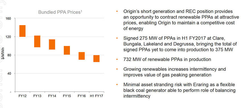
Origin Energy reported that it’s bundled PPA prices were around the $70-$80 per MWh mark when it signed a long-term PPA with Bungala One.
Source: Origin Energy
A half-year results presentation from Origin Energy in February 2017 shows that the average PPA contract price at the time that the Bungala PPA was signed was around $70-$80 per MWh. It’s worth noting that the counter-party, Enel (the operator of the solar farm), wrote-down a large portion of that contract value nearly three years later, after it encountered significant delays to have the solar farm fully connected.
Final conclusions
Using our GSD2022 data extract I can calculate that, net of FCAS costs, Bungala One generated approximately $16.03M of spot revenue in the market in 2022, while Tailem Bend generated approximately $13.37M.
If we divide that number by the maximum capacity at each solar farm – Bungala One generated $145,727 per MW of installed capacity, while Tailem Bend generated $140,705 per MW of installed capacity. We can therefore see that normalised spot revenue results by this measure were not all that different despite what our basic, original, interpretation of capacity factor might have led you to expect.
Spot revenue is however not the be-all and end-all of assessing performance, because as I’ve stated, the operators of each solar farm may be motivated by other unknown incentives within their commercial arrangements.
Key takeaways
The NEM is a very complex place, which means that casual observations are increasingly at risk of being overly simplistic.
The analysis presented above is only a start at trying to look ‘under the hood’ of how two solar farms are performing but I hope it has provided the following key takeaways:
- Operational decision-making can be just as important as decisions made during development. As we have seen, generator output and financial returns can be just as impacted by bidding strategy and behavior, as they can be by design choices.
- Commercial arrangements and incentives largely dictate generator behavior. But unfortunately, we are not always aware of these motivations as the details of these arrangement are typically confidential.
- Capacity Factor might be easy to calculate and interpret, but there is almost always more to the story. And while we can’t always take the time to assess and reassess generators on a comprehensive case-by-case basis, we should at least take caution when trying to compare or even rank them.
Great charts on the curtailment/constraint side of things. In the USA based on NREL work it seems the DC/AC ratio is known as the Inverter Load Factor (ILF).
Excellent article Dan. Another consideration is what did the developer or owner assume for all these factors when building their business case or arriving at the price they paid for the project. Whatever the effect of each factor, if it turns out operationally to be ‘better’ than assumed, then the project could still be regarded as successful.
Paul, you continue to provide the most erudite and accurate analysis of all things NEM coupled with in-depth common-sense assessment of the relevant issues. Thank you. Greg