
The GSD2022 is packed with information for nearly* all power stations units that are operated in the NEM.
* Some power stations that are very small have been removed (generally below 5MW), as well as units just supplying FCAS (e.g. some Demand Response units). We’re looking forward to finding a way (with a redesign) to include the FCAS units for the first time in the GSD2023 (next year).
With the release of the Generator Statistical Digest 2022 on the 31 January 2023, I took a particular interest in the ‘Price Energy Harvest’ on the ‘B’ Pages of the report, mainly because it is the first full year of 5-min data.
The ‘Guide to Statistics’ (on p39/856) explains what Price Energy Harvest is all about – but I’ve copied it in here for readers on WattClarity:
About the ‘Price Energy Harvest’ figures
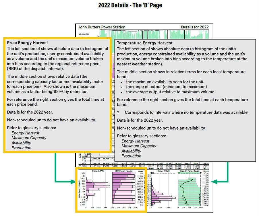
For those with a copy of the report (clients can download here), it is the figure at the bottom left of every ‘B’ Page (highlighted in red in the image below).
For every DUID that was operational in the ENERGY market in 2022, specific data is provided with a chart and table illustrating:
- The ‘Price Harvest’ figure containing two charts (absolute, and relative) and a table.
- All 105,120 dispatch intervals through 2022 are bundled into price bands (which are the same as the bid price ranges used in other illustrations throughout the GSD2022).
- Speaking to the middle chart (which I have circled in red below) there are essentially three coloured bars used for each of the price bands:
- A white band (i.e. the background) represent 100% of the Dispatch Intervals for 2022 in which the spot price (in that DUID’s region) fell inside of that price band
- A light pink band represents the volume of energy available from that unit across all the dispatch intervals that fell in that price band (i.e. as a percentage of Maximum Capacity for that unit)
- The darker pink band represents the volume of energy output from that unit across all the dispatch intervals that fell in that price band (i.e. as a percentage of Maximum Capacity for that unit)
You can think of:
- Light pink bars are the Availability Factor (in that price range); whilst
- Dark pink bands as the Capacity Factor (in that price range).
Availability Factor is the energy a unit had readily available at that time to supply the market, and is expressed as a percentage of its installed capacity (we use Maximum Capacity – see here) multiplied by the total hours in that period.
- A thermal coal plant will generally have Availability Factor of 50-90% (e.g. for a year). Availability is independent of actual operation or usage. Something can be available but not operating, for example, a gas-fired peaking plant.
- The Availability of Wind and Solar units are affected by the availability of the (wind or solar) fuel resource (it’s much less frequently that thermal plant has its availability affected by a fuel resource – but it occasionally happens, such as in June 2022).
Capacity Factor is the actual energy generated over a period of time, expressed as a percentage of its installed capacity multiplied by the total hours in that period.
These factors are different – one is the availability to generate, the other is the generation itself. Both of the factors are critical in understanding electricity generation AND markets.
It is possible to have a 100% Availability Factor and a 0% Capacity Factor, but not the other way around. If a unit has a 0% Availability Factor, it will have a 0% Capacity Factor.
The ‘Price Energy Harvest’ figures are more important post 5MS
These charts have been included in each release since the GSD2019 – but it’s important for readers to recognise that calendar 2022 was the first full year to elapse since the commencement of Five Minute Settlement.
Hence it’s in the GSD2022 (post 5MS) that the ‘Price Energy Harvest’ chart is particularly relevant.
What can we see?
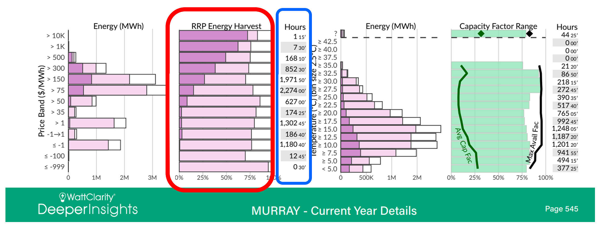
To illustrate, I’ve chosen the Kiata Wind Farm and Murray Hydro station (both in Victoria) – but the analysis further on covers all the units included in the GSD2022:
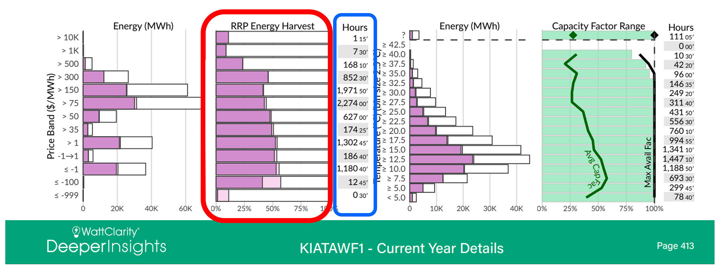
In the examples above, Kiata’s capacity factor very closely matched its availability factor except for prices in the bottom two price ranges (i.e. under -$100/MWh, and down at -$1,000/MWh) which suggests a number of things:
- When it has energy available, it will run to that level (the dark pink covers most of the of the light pink),
- Kiata does not want to run at very low prices,
- However, at prices from $0 to $300/MWh its capacity factor and availability factor are consistent between 40% to 50%, which is rather good for a wind farm,
- But at prices over $500/MWh (which generally start to indicate demand/supply challenges) these values drop, and at very high prices, available energy capacity factors are only about 10%.
For Murray, the Energy Harvest is a completely different shape. Murray’s capacity factor is Nil or very close to it at prices under ~$35/MWh, but it begins to step up progressively at prices over $50/MWh and is the highest at prices over $10,000/MWh. While Murray’s capacity factor was zero at lower prices, its availability at lower prices was around 75% or more depending on price bucket.
Some people would look at this and say, ‘see, wind and solar make the price lower’, and there is an element of truth in that. However, I wanted to highlight an increasing problem in the NEM today, one that we see when using large scale views such as the GSD2022.
Consistent patterns across many units in a fuel type?
If you look at the Availability Factor (what can it do), rather than just the Capacity Factor (where it actually operated), you can see that the availability factor of some fuel types is very consistent across the various price bands.
With the above two stations in the same NEM region (Victoria), they were exposed to the same pricing outcomes. As each image shows in blue, there was 7.5 hours where prices were above $1,000, and 1.25 hours where price were over $10,000. The average availability factor for Kiata was 9% and 11% respectively for those price periods, whereas for Murray it was 62% and 72%. If you were someone who wanted to ensure prices were kept as low as possible, wouldn’t you want to install units that operate when the price is high to put downward pressure on the price?
The analysis below is for all stations in the NEM that are scheduled or semi-scheduled. Looking at this data, we start to see the trends across fuel types for both the prices when they generate and when they are available. From AEMO’s point of view, if the prices are high and energy is not available, that is when we start to have issues such as those experienced in June 2022.
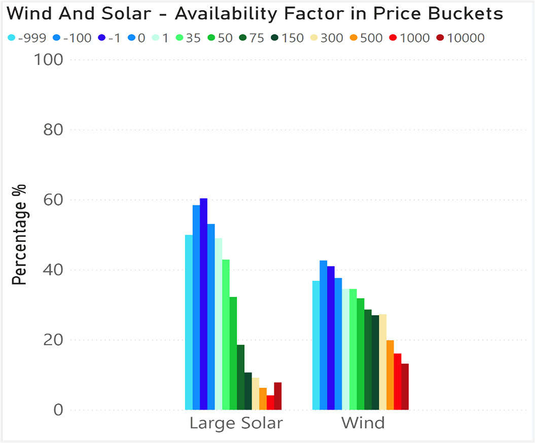
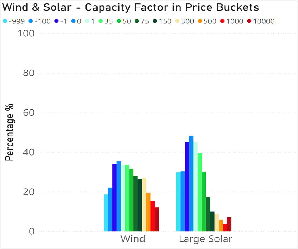
Availability Factors in price buckets (by Fuel Type)
With the data available for every DUID in the ‘GSD2022 Data Extract’, in the following series of charts I’ve aggregated up the Availability Factor in fuel type bundles (and used similar colour coding of the Price Ranges that are used through other artefacts inside the GSD2022.
The figures below shows four sets of bar charts for both Availability Factors , and for Capacity Factors with the groupings depicting:
- VRE (Wind and Large Solar)
- Traditional base loaders (Black and Brown coal)
- Traditional mid-merit (Hydro and Gas Peakers)
- Super-peakers (Liquid Fuel and Battery Storage)
These four categories cover all the scheduled and semi-scheduled units in the NEM. The GSD2022 includes 436 DUIDs with that type, as well as non-scheduled units.
With respect to each, I’ve added some brief commentary (keeping in mind we’re looking at availability factor here).
Availability Factor in price buckets (for Wind and Solar)
In these images we can see how the Availability Factor drops in aggregate for each fuel type at the higher price bands. Indeed, that’s part of the reason why prices are high when supply of wind and solar are low.
Availability Factor in price buckets (for non-VRE)
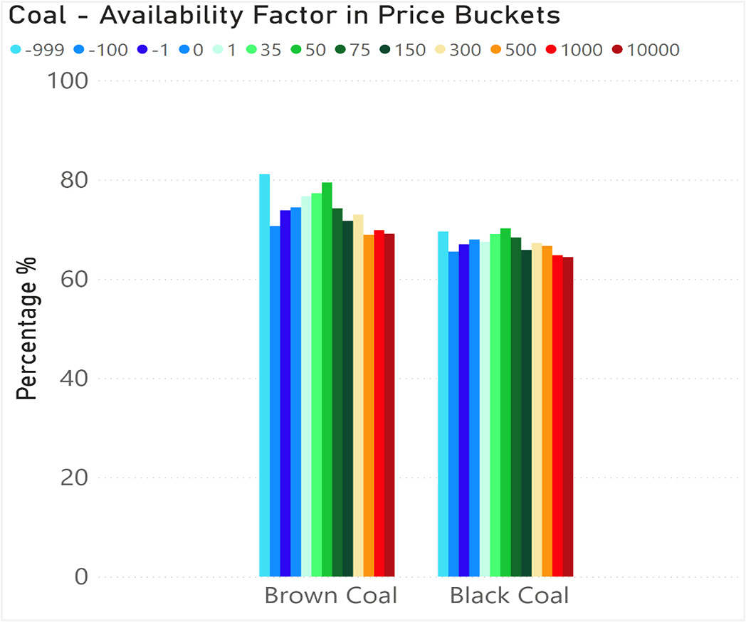
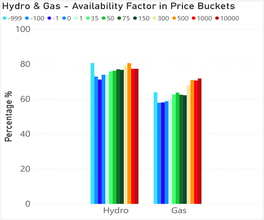
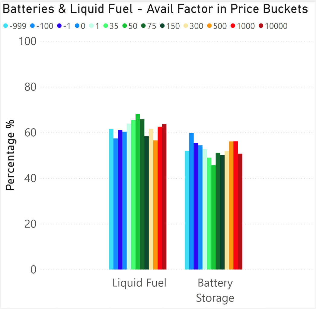
We largely see a fairly similar picture across fossil fuels (coal, liquid, gas), hydro and batteries. The pattern of availability is fairly flat across the price buckets.
Capacity Factors in price buckets (by Fuel Type)
Now that we’ve looked at Availability Factor, we can move on to do the same thing with Capacity Factor by fuel type – again, using the data available for every DUID in the ‘GSD2022 Data Extract’.
Capacity Factor in price buckets (for Wind and Solar)
Because availability is generally low for wind and solar when prices are high, it follows that capacity factor must be low.
Capacity Factor in price buckets (for non VRE)
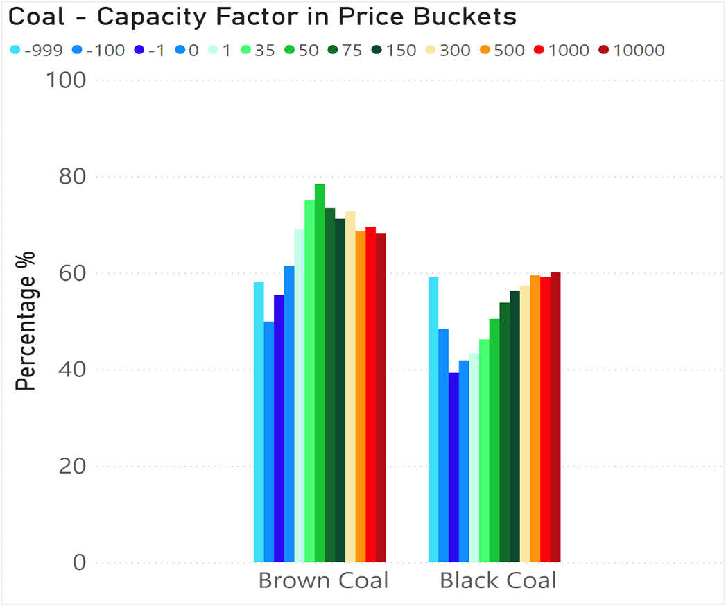
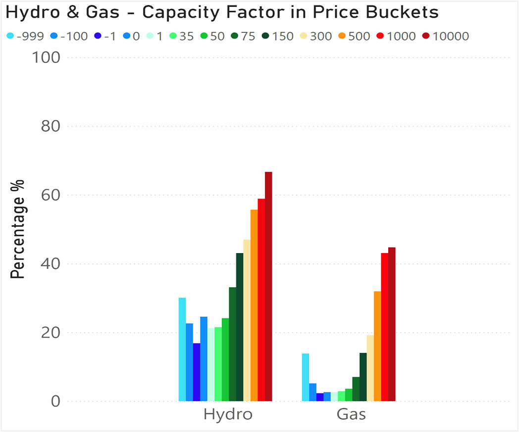
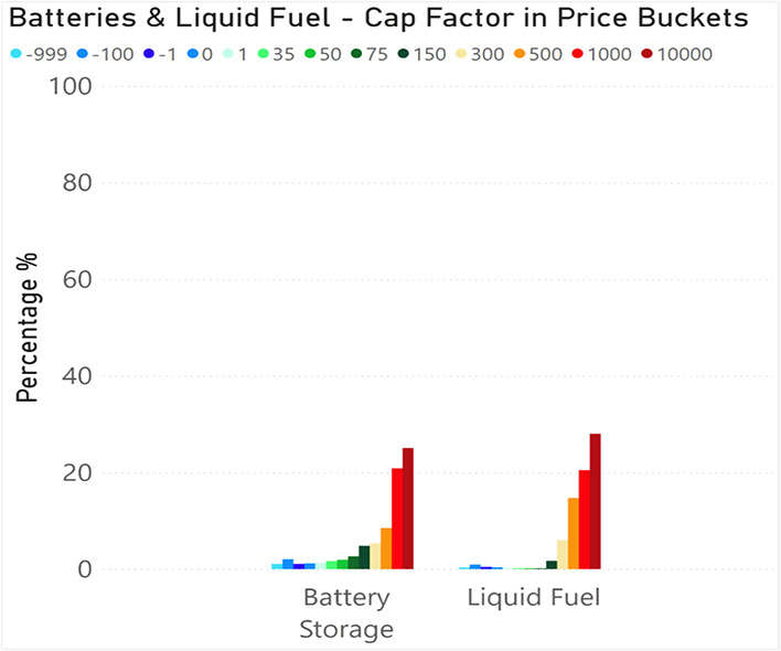
With the fully dispatchable plant, the charts for Capacity Factor are a little different than for Availability Factor.
What can be seen here is that at times of higher prices, when the market is signalling that capacity is required to be dispatched, Hydro and Gas generators as well Liquid Fuel and Batteries step in to provide the capacity, while Black and Brown coal are also as capable of providing capacity as they are at lower prices.
However, the bulk of the wind and solar generators are not providing capacity when prices are higher (when the market is indicating that it is required). And similarly, they are providing lots of capacity at times when prices are very low (and we are now subsequently seeing more constrained output – that is for another article).
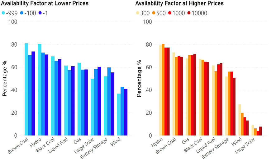
Availability Factors at Low, and High, Prices (by Fuel Type)
Similarly, the figure below shows the same information in a different way – firstly for Availability Factor.
We see here that Hydro and Fossil Fuels have relatively high availability factors at lower prices as well as higher prices, but the drop off in availability for Wind and Solar at higher prices stands out.
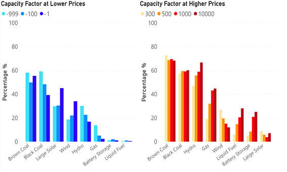
Capacity Factors at Low, and High, Prices (by Fuel Type)
Next we do the same with Capacity Factor:
With this we see:
- Solar has relatively high capacity factors at low prices, but the lowest at higher prices. Part of this is because there are also high prices after the sun has set, so this fuel type is disadvantaged in that regard.
- Gas and Liquid Fuel (the highest cost fuels) have low capacity factors at lower prices but are still available, so that they can then generate at higher prices.
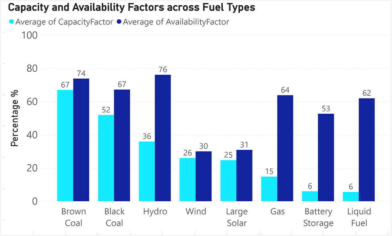
Comparing Capacity Factors with Availability Factor (in any Price Band)
The chart below shows the overall Availability Factor compared with Capacity Factor across the fuel groups.
What is the data telling us?
What this information is starting to show is that all the new generation we are placing into the market are generating mostly at the LGC subsidised prices (and pushing prices down towards the subsidised price), but unfortunately, they are not generating when the market requires the capacity. This is problematic and whilst some are hoping for large amounts of battery storage to time shift some of the energy, with capacity & availability factors around 6% and 53% respectively, battery storage at the moment is not readily replacing the current gas peaker capacity/availability which sits at 15% & 64% respectively.
Controversially, this sort of data starts to indicate that if we do want enough capacity to be available (not just generating) then we really need it in the market at the high priced times. Continuing to subsidise generation that has very similar ‘Availability’ profiles as the current wind and solar generators, the chances of successfully achieving the energy transition will reduce.
And whilst some want to change the market to suit the technology, here at Greenview Strategic Consulting, we are thinking through ‘How do we help build the generator of the future?’, for what the market, hence electricity consumers, really require: affordable electricity with the lowest possible emissions footprint.
About our Guest Author
|
|
Nick Bartels is a Senior Consultant at Greenview Strategic Consulting.
Greenview Strategic Consulting was formed to provide specialist market advice to energy, government and community organisations in the complex domain of energy and critical infrastructure. You can find Nick on LinkedIn here. |

To a great extent this seems like a truism: the cheapest generation isn’t available at the most expensive times, but that’s precisely why those are the most expensive times.