Today much of my day was invested in playing catch-up, with the processing of all the pre-orders and orders for GenInsights21 (which we released now 2 weeks ago today, on Wednesday 15th December).
———
It took a while to work through the list, but now:
1) Everyone who’s pre-ordered and ordered (until Wednesday 29th December) should be able to download the PDF here:
https://downloads.wattclarity.com.au/
2) Most of the printed & bound hard copies (bound in two volumes as noted on LinkedIn last week) should be on the way to your delivery address (we’ve not received enough from the printers prior to Xmas, so the later ones will be sent out next week).
3) From today, all those clients should have had payment processed and invoices provided.
Hence let us know if you provided your order already but have not heard anything from us (or submit your order today, to have us start the process for you)!
———
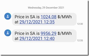
Whilst I was doing this, I did note a few SMS alerts come in for elevated prices in the South Australian region:
(Alerts like these are configurable in our ez2view, deSide® and NEMwatch Platinum Model software).
(A) An initial look, with the NEMwatch (entry-level dashboard)
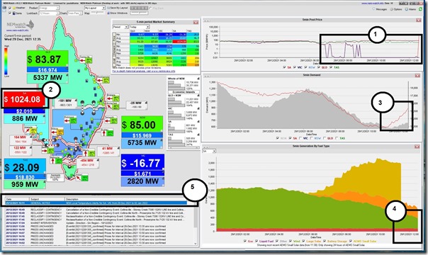
The price first spiked in the 12:35 dispatch interval today (NEM time) – and was captured at the time in this snapshot in the NEMwatch dashboard display:
In relation to the numbered highlights on this snapshot:
1) Prices in South Australia had been quite low for a number of hours until the price spike,
2) The price spiked initially to $1,024.08/MWh in the 12:35 dispatch/trading interval before climbing further to $9,956.29/MWh
3) The ‘Market Demand’ in South Australia had been climbing over the past couple hours.
4) We also see that wind output had been trending down whilst gas output was steady (and quite low), and Large Solar output was quite steady. NEMwatch now uses AEMO estimates for Small Solar (i.e. rooftop PV under 100kW) output, which are some ways behind ‘real time’ so we can’t specifically see what was happening there.
5) Also flagged, but not relevant to this spike, was a ‘High Temperature Alert’ warning for SA and parts of VIC for New Year’s Eve and the weekend (remembering that extreme temperatures affect many different types of generation technology).
6) Not annotated on the snapshot (though perhaps it should have been) we also see that the import capacity over both Heywood and Murraylink interconnectors is ‘Maxed Out’ by virtue of the red arrows pointing east-to-west from VIC into SA. No more of the cheaper energy in VIC could make its way into SA.
… so the NEMwatch snapshot does not really tell us much about why the price suddenly spiked from around $0/MWh to above $1,000/MWh … and then further to almost $10,000/MWh within a 10 minute period and not forecast in advance.
(B) Looking further, with ez2view (higher-end dashboard & forensic tool)
Thankfully, our ez2view software is very good at that (even with the limitations on data today that mean bid data, unit targets, and some private constraints, are not visible)! Here’s a few snapshots to help explain:
(B1) The ‘Forecast Convergence’ widget
Frequent readers here will have seen be reference the ‘Forecast Convergence’ widget within ez2view on numerous occasions in recent years … that’s because it’s really good at painting a clear picture of how expected (or unexpected, in this case) was a particular market outcome.
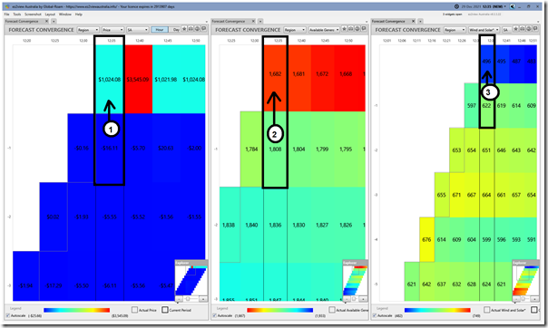
In this snapshot from 12:35 we’ve mashed together 3 different copies of the same widget, Time-Travelled back to 12:35 to reveal a number of things:
Again with reference to the number coding on the image:
1) AEMO’s P5 predispatch forecast had been expecting prices to fall (from –$0.16/MWh at 12:30 to –$16.11/MWh at 12:35) … and yet prices ended up spiking to $1,024.08/MWh (a clear ‘out of the blue’ event!)
2) Coincident with this, we see aggregate Available Generation from all Scheduled and Semi-Scheduled plant in South Australia dropped from 1,784MW to 1,682MW … but the actual mis-match was a bit larger than that, given the expectation was that it would increase to 1,808MW (i.e. a total missed forecast of -126MW).
———–
That may not seem like much, for some readers, but those who can reference Part 4 (Aggregation by Region) in GenInsights21 will understand the significance of a seemingly small miss in forecast!
———–
3) Coincident with that drop in forecast Available Generation, we see that the AEMO’s expectation for ‘Unconstrained Intermittent Generation Forecast’ (i.e. UIGF) for Wind and Large Solar in the South Australian region was off by a similar margin (i.e. 622MW – 496MW = 126MW).
Remembering that there was very little gas-fired generation running at the time, it limits the workable options that can ramp quickly to fill in this ‘lost’ generation from Large Solar.
(B2) The ‘SA Schematic’ and ‘NEM Map’ widgets
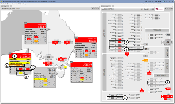
In this second snapshot (still at 12:35) we combine a NEM-wide view on the left in the ‘NEM Map’ widget (now upgraded for v9.3 to show Negawatts when dispatched) and the ‘SA Schematic’ on the right:
Again with the annotations we see:
1) The SA dispatch/trading price is coloured red because it’s changed by (way more!) than 15% in the increase from –$0.16/MWh to $1,024.08/MWh.
2) We see that (in aggregate) Batteries in South Australia have switched from charging (in aggregate –17MW at 12:30) to discharging (+59MW in aggregate), which is totally understandable:
(a) However what’s particularly interesting is what happened on an individual level:
i. Hornsdale BESS represents the whole of that change!
ii. Nothing visible for Dalrymple BESS
iii. Nothing visible for Lake Bonney BESS
iv. Nothing visible for the various SA Water BESS (which I believe are still in the process of commissioning).
(b) Will have to wait for ‘next day’ data to see how these units were bid, to understand more (e.g. if they were enabled for particular FCAS services in preference to ENERGY). But it is notable that the other batteries did not respond.
3) The Large Solar aggregate output on the Map is coloured yellow because it has increased by more than 5% from 12:30 to 12:35 (up 182MW to 192MW on a ‘Final MW’ basis in Time-Travel).
(a) In the SA Schematic, this translates to a red colour (i.e. >15% change) alert on Bungala One Solar Farm because of the smaller numbers in the 18MW to 23MW change there.
i. What’s not shown in the colour coding, and was relevant in terms of the price spike, was the preceding large drop (from 86MW to 18MW, on a ‘Final MW’ basis in Time Travel) for the same unit.
ii. ‘Private Data’ is not visible today for this unit, so there may be other factors at play in the change in output (e.g. constraints just on that unit, or a sudden change in bid) – but the evidence above in the UIGF drop in the next 5 minute period suggests that there was some unforeseen cloud cover emerge that contributed in quick succession to:
Step 1 = rapid drop in actual output from 12:25 to 12:30 on a ‘FinalMW basis’ and then
Step 2 = based on this unforeseen drop, a drop in UIGF – and hence dispatch target from 12:30 to 12:35, which was a large contributor to the price spike.
(b) The decline for Bungala 2 Solar Farm was slightly slower (from 111MW at 12:10 to 55MW at 12:25), and earlier as well.
4) In contrast, the Tailem Bend Solar Farm is shown to be very steady output at maximum level over the 2 hour time-frame in the trended capacity factor spark line trend.
5) The ‘Generation’ aggregate in the NEM Map is shown as orange because of the significant increase (from 561W to 640MW – more than 10%), mostly contributed by the increased output at Hornsdale Power Reserve.
———–
For those with access to GenInsights21, you might want to refer to Appendix 15 for the discussion there about increasing ramping required of ‘Aggregate Scheduled Target’ … and how this is being further complicated by the increasing uncertainty about when, and where (Appendix 16) because – at least in part – of the added overlay of ‘Anytime/Anywhere Energy’ as seen in this case today in South Australia.
———–
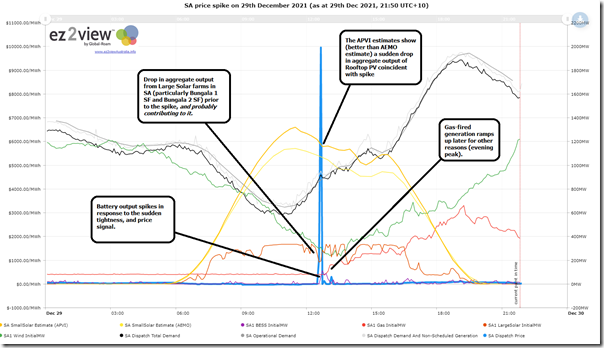
(B3) The ‘Trends Engine’ within ez2view
One of the components within ez2view is a ‘Trends Engine’ that features both as a widget in the installed software, and is accessible in a browser through ez2view online. It’s like NEMreview v7, but with added functionality – and has been undergoing some upgrades in recent months following the transition to Five Minute Settlement.
Using this Trends Engine, we’ve prepared this quick overview this evening:
(Those with a licence to ez2view can access their own copy of this trend query here)
As noted in the trend:
1) We can see the aggregate drop in Large Solar output prior to the price spike, and (it seems) contributing to the price spike.
2) Also seen in the APVI estimates for Small-Scale Solar (i.e. rooftop PV systems under 100kW) is a sizeable sudden drop in rooftop PV production, coincident with the price spike.
(a) This is not shown in the AEMO estimates, at least in part because they are only of 30-minute cadence;
(b) In both cases we stress that these are estimates not actuals, and would remind readers of the ongoing opacity of rooftop PV … another instance of (the invisible) Villain #8!
.
Whilst more data will be visible tomorrow, when ‘Next Day Public’ data set becomes available, it seems highly likely that some fast-moving (and not predicted) cloud cover had a significant impact in solar output at Bungala and on Rooftops, and drove the price sky-high.
.
(C) Looking into the future…
The analysis performed for GenInsights21 would reinforce for us that:
1) This (extreme volatility to relatively small changes in supply/demand balance) is totally expected; and
2) We should expect to see more of it in future; and
3) In particular, perturbations in the weather (some which are very difficult to predict) will play an increasing role.
What a coincidence that Elouise Fowler would write in the AFR that the ‘$2.3b power cable between NSW-SA gets green light’ this afternoon.
1) What role could it have played in what happened this afternoon?
2) A caution to anyone who sees transmission development as another form of Magic Wand, or panacea. What are the costs and other impacts going to be (e.g. on remaining viability of thermal units in South Australia)?
Strap in for a challenging future!


Leave a comment