
Over on RenewEconomy today, David Leitch of ITK has posted some analysis here using our NEMreview software to compare actual outputs of wind farms through the past 9 months (including Mt Emerald Wind Farm as the first wind farm in Queensland, thousands of kilometres away from the wind farms clumped together in the south-eastern corner of the NEM). This coincided with a conversation I had earlier today with a client about the same subject matter (diversity of intermittent supplies).
In Theme 10 within Part 2 of our Generator Report Card 2018, we published the results of some significant analysis we performed, which would augment the results that David has presented there for RenewEconomy readers. However it turns out I can’t add in images there anymore – so it occurred to me to also copy the three main points in here for WattClarity readers:
1) Readers need to understand the difference between three types of outcomes (high correlation, randomness and high anti-correlation), and why randomness is not the ideal outcome we would be hoping for. See the table cut from the Report Card:

2) In the GRC2018, we investigated displayed degrees of correlation between all wind and solar plant (in Renewable Energy Zones) over a number of years to 31st December 2018. This needs to be done at a dispatch interval basis from the perspective price outcomes, constrained outcomes, firmness and so on (though chunking up to days or larger time slices would help in understanding energy balance and storage requirements and so on).
3) We also explored hypothetical wind production across all Renewable Energy Zones using 3 years of granular (i.e. close to 5-minute) historical wind speed readings in those REZ.
We hope that the results presented in the Generator Report Card can raise the level of awareness of what’s actually happening (and possible) in order that we can move on to explore approaches that will actually help the energy transition succeed – rather than just re-hashing old debates. From an “ideal outcome” point of view, “just” randomness is not enough.
PS1 Diversity is not a magic wand
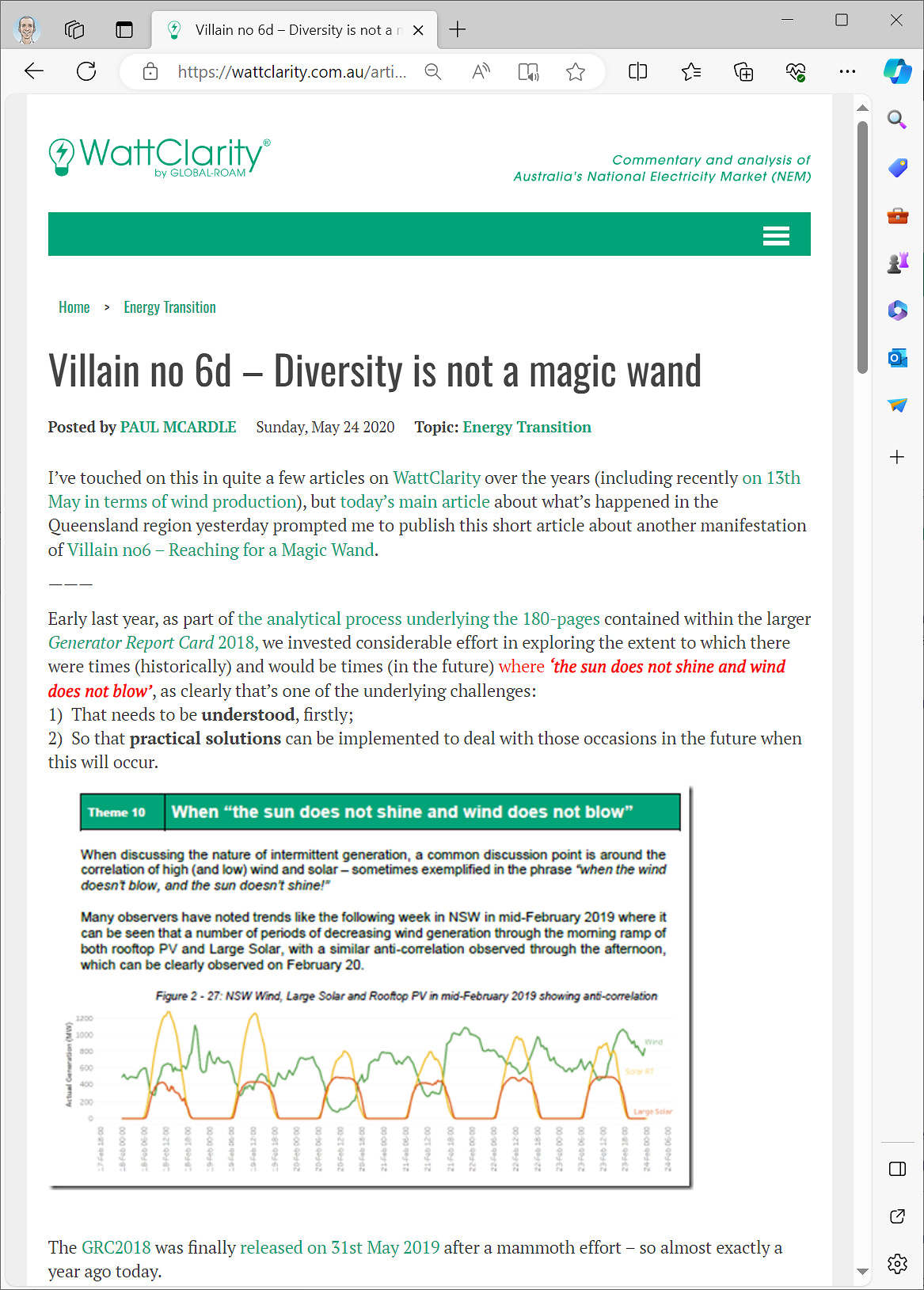
On 24th May 2020 we shared more from the GRC2018 in the article ‘Villain no 6d – Diversity is not a magic wand’:
“We hope that the results presented in the Generator Report Card can raise the level of awareness of what’s actually happening..”
Well all I know is I just got my last power bill in suburban Adelaide and they’re charging me 51.2c/kwhr peak in an all electric household (19.05c for off peak HWS). It was 43.2c peak last quarter so the poor folk must be wondering when the cheap renewables are coming down the wires.
On Friday night there was a grand total of 150MW wind output across the entire NEM. Low correlation won’t help with that.
Correlation is a popular argument used to advocate for more transmission lines. But interconnectors expose regions to price volatility and system strength issues as much as they expose generators to more load.
Has SA found their interconnection with VIC reduced their c/kWh? Or gas QLD being linked to NSW helped QLDs c/kWh?
I think a region with low volatility and generation over-supply would be better off without an interconnector.
The inherent variability of wind turbines and its effect on price volatility and system strength would be better off not spread throughout the NEM.
Spot the correlation with AGL having a change of heart over closure of Liddell-
https://www.msn.com/en-au/money/company-news/agl-delays-closure-of-liddell-power-plant-after-battle-with-government/ar-AAFcr5X