As noted on the weekend, Vestas have invited me to speak next week (Wed 15th July) about the very topical question ‘NEM merchant pricing–is this the new normal?’, and I have started pulling some thoughts together (including some background I’ll share here today).
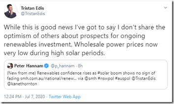
Somewhat coincident with (and related to) this, I noted Tristan’s comments on social media on Tuesday 7th July:
These comments were in response to Peter Hannam’s article which followed this CEC note reporting ‘investor confidence remains strong across both small and large-scale renewables’. I know I’m not alone in wondering what numbers these project developers are actually looking at, if they still have confidence to invest more…. cause the returns don’t look great in looking at current prices?
(A) Looking back over prior Q2 periods
I’ve re-opened the file on Q2 pricing patterns in order to determine what’s changed (and what hasn’t) in terms of underlying pricing patterns in the NEM. Longer-term readers might recall that I chose Q2 deliberately, in order to look more at underlying patterns of outcomes (hence have some insight into fundamentals) – less affected by seasonal variables like summer heat prevalent in Q1 and the occasional winter chills of Q3.
This line of questioning has been continuing for a number of years, as noted below:
| Q2 2016 | Back (what seems a lifetime ago) on 4th July 2016 I posted this review of spot prices for energy in Q2 2016 where I’d noted about some changes to the underlying patterns that had persisted (pretty stubbornly) for at least a decade beforehand.
At the time I labelled the change in pattern ‘truly remarkable’. |
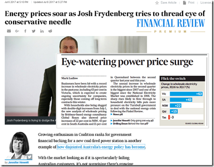
| Q2 2017 | We picked up the same theme in July 2017 to review Q2 prices for 2017 and concluded that “price outcomes for Q2 2017 were off the chart”. These thoughts were picked up in various news media organisations, including in the AFR: |
| Q2 2018 | A year on from all the news media attention, we saw that prices had backed off somewhat from the extreme outcomes of Q2 2017 – though we cautioned that ‘we’re far from out of the woods, yet’!
In that analysis for Q2 2018 we extended what we’d done: I did not have time to complete the analysis started on FCAS prices. |
| Q2 2019 | I took a break from this line of analysis in 2019 with so much else on, including being swamped by what followed on from the release of our inaugural Generator Report Card 2018 , which proved exceptionally popular (sales still arriving sporadically – more than 12 months after its release now). |
| Q2 2020 | For a variety of reasons now, including the upcoming discussions on the question ‘NEM merchant pricing – is this the new normal?’, I have picked up this line of questioning again.
Top of mind in review of Q2 2020 is that this quarter: Through this all we’ve been keeping an eye on the NEM through our ‘work from home’ dashboards – mostly NEMwatch v10 (the entry-level dashboard) and ez2view (higher-end dashboard), but also deSide® (specifically for energy users), as we contemplate ‘new deSide’ with our clients. |
Hence it’s with great interest that we’ll look into the pattern of what’s changed….
(B) Pattern of prices for ENERGY in Q2 2020
In this article we’ll only have time to look at the pattern of prices for Energy (using data extracted from NEMreview v7 ), but will look for an opportunity to discuss FCAS prices as time and space permits.
1) Average prices for Q2 are down – that’s good news, isn’t it?
For long-suffering energy users, the fact that average prices have dropped will generally be seen as good news. However this is not universally good news for everyone …
1a) Trended Stats for QLD
As for the past 3 times we’ve done this, we’re starting at the top of the NEM to work our way around:
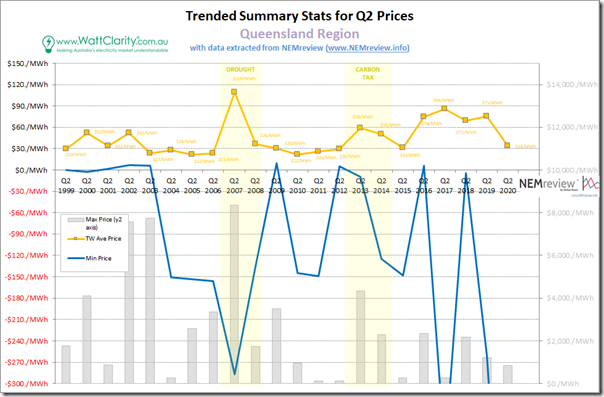
On a simple (and perhaps increasingly overly simplistic) time-weighted average basis, we see that the average Q2 spot price in Queensland has dropped down to be only $34/MWh – which is approximately at the level that it had last been in 2015, but still slightly above the price levels seen for most of the initial 10 years of NEM operations.
1) Highest trading price in the quarter ($837/MWh) did not even crack $1,000/MWh (it was $837.33/MWh for half-hour ending 18:00 on 9th June, when ‘Dunkelflaute down under’ hit – simultaneous with the other mainland regions);
2) But we see, on the flip side, the lowest price below the scale of the chart:
(a) This was down at –$701.65/MWh at 11:30 on 2nd May
(b) Which was one of 17 consecutive half-hour periods with trading prices below zero on the day, as I warned here the day before.
(c) More on this later…
1b) Trended Stats for NSW
Moving south of the border we see a similar pattern in NSW:
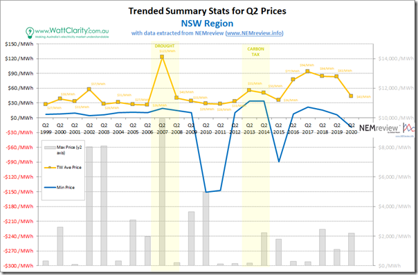
The simple time-weighted average for the quarter in NSW was (at $43.45/MWh) a significant amount higher than in QLD (i.e. 26%), and indeed highest average price in the NEM for the quarter:
1) The highest trading price seen in the quarter was $2,196/MWh (18:00 on 9th June – simultaneous with the other mainland regions);
2) The lowest trading price seen in the quarter was just below zero, at –$19.41/MWh (at 10:30 on 5th April – one of 6 trading periods below zero on that day in NSW, simultaneous with the other mainland regions).
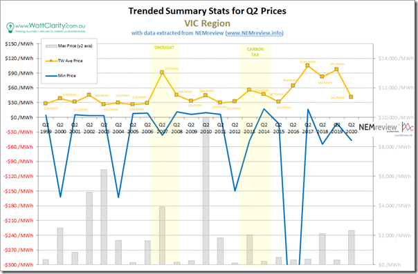
1c) Trended Stats for VIC
Further south into Victoria (which unfortunately has started Q3 with its second stint of lockdown, at least in Melbourne) …
Simple time-weighted average price at $40.57/MWh is a smidgeon below the result seen for NSW:
1) The highest trading price seen in the quarter was $2,303.31/MWh (18:00 on 9th June – simultaneous with the other mainland regions); whilst
2) The lowest trading price seen in the quarter was –$47.20/MWh (at 03:30 on 7th May).
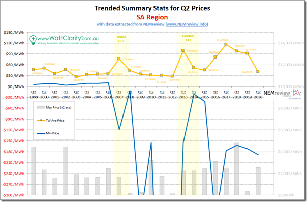
1d) Trended Stats for SA
Taking a turn west into South Australia, we see the same underlying pattern, layered with South Australia’s own uniqueness …
The simple time-weighted average for the quarter in SA was (at $40.31/MWh) just a shade below that in VIC:
1) The highest trading price seen in the quarter was $2,549.63/MWh (18:00 on 9th June – simultaneous with the other mainland regions);
2) The lowest trading price seen in the quarter was just below zero, at –$188.24/MWh (at 12:30 on 9th May).
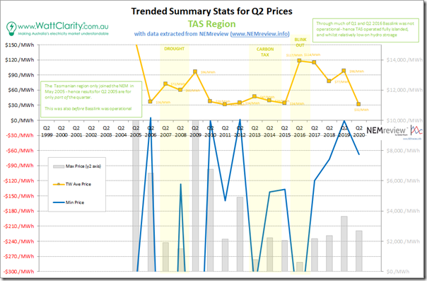
1e) Trended Stats for TAS
Circling back over Bass Strait to Tassie, we see that (whilst loosely coupled to the mainland NEM through Basslink) it does sing its own tune at times …
The simple time-weighted average for the quarter in TAS was $31.55/MWh – which was lowest average price for any region in the NEM for Q2:
1) The highest trading price seen in the quarter was $2,678.09/MWh (occurring at 11:30 on 26th May – which was coincidentally a time when mainland NEM regions were quite modest);
2) The lowest trading price seen in the quarter was just below zero, at –$67.66/MWh:
(a) This occurred at 16:30 on 7th May;
(b) This also happened to be a day of many negative prices in VIC and SA;
(c) Also worth noting that 3 hours later the trading price in TAS jumped to $2,482.56/MWh (not far off the peak for the quarter).
1f) Trended Stats for WA SWIS
I noted in the report for Q2 2018 that we had commenced the process for the addition of data into NEMreview v7 for the spot market of the South-Western Interconnected System (SWIS) in WA.
It’s not been our focus to fill out the data sets available for that market, yet. Let us know if you would like to speak with us about what we could do with respect to the SWIS?
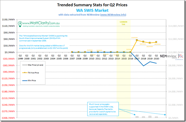
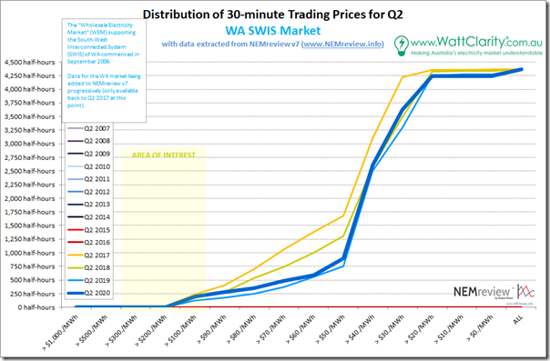
However we can show you how pricing patterns have progressed over the two subsequent Q2 periods:
I can’t help notice the irony of the situation where the SWIS, a market providing capacity payments so (in theory) having lower balancing prices, saw a higher Q2 average price than any NEM region – reaching $46.23/MWh:
1) The highest price for the quarter was (understandably) low, at only $188.83/MWh (on 7th April); but
2) The lowest price in WA was similar to the NEM regions, at –$50.07/MWh (indeed, this also happened on 26th April – which was a day that also saw negative prices experienced at times in all NEM regions).
2) Simple time-weighted averages down for Q2 2020
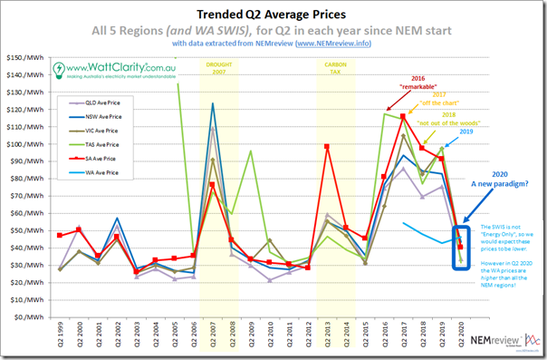
So here’s the summary trend:
If I listened to the broader commentary closely enough, I’m sure my Irony Detector might be blaring on account of:
(i) The people who’d previously climbed on the ‘it’s high gas prices that drove electricity prices high’ in the Q2 periods 2016, 2017, 2018 and 2019,
(ii) And yet (changing horses midstream) abandon that line of reasoning and (ignoring the recent declines in those same gas prices) instead argue that the subsequent drop in electricity price outcomes through Q2 2020 has been due to other factors.
From my perspective, it seems important to understand the distinction between:
Reality #1) Whilst it’s the marginal generators (for about 70% of dispatch intervals it’s a number of them, concurrently) that set the price;
Reality #2) It’s all generators that are involved in where prices actually land – even those who can’t or won’t turn up at certain dispatch intervals (for whatever reason – tube failures, lack of water, energy constraints, high temperatures, whatever)
—
Thinking more broadly about ‘winners and losers’ (which again seems to devolve to shallow thinking) the the drop in spot prices will clearly be a win for some energy users.
However it won’t be a win for all stakeholders (hence Tristan’s comments, and the underlying concern in the request for me to speak), or even for all energy users.
e.g. I can imagine some feeling burnt, if they previously had been unable to hold out any longer and signing retail contracts a year or more ago on the basis of the higher spot prices that had been occurring at that point in time (especially if their competitors had not made the same decisions, or had just been purchasing on spot through Q2 2020).
3) How have the distributions of prices changed over time?
We’ve noted before on WattClarity® ‘the NEM is a complex place’ – and as Allan stated in January, ‘the NEM is a market where the details matter’.
Whilst time-weighted averages are easily calculated, and readily digestible, for an increasing number of stakeholders they are less and less relevant (including most stakeholders who will be on this call). It’s for this reason that we started taking a closer look at the distribution of prices back in 2016.
3a) Distribution for QLD
As for the past 3 times we’ve done this, we’re starting at the top of the NEM to work our way around:
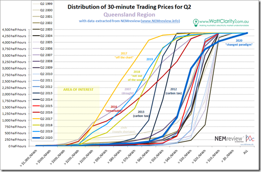
In the strange inverse world that was 2016-2019 we can clearly see uplift in ‘everyday high prices’ that (combining also with a spike in prices above $100/MWh) delivered the much higher average prices for the Q2 periods over those 4 years.
In contrast, we see that the bulk of the curve has shifted back to more (old) ‘normal’ range in 2020 – but the curve is actually far from ‘normal’ because of what’s happened at both ends of the curve.
(i) Too Low for Zero
I noted (over on ‘NEM Risk Bulletin’) that Matthew Warren referenced my article on Saturday in this note about how ‘It’s negative wholesale price season again’. As the chart above notes, sub-zero pricing was a frequent visitor to the Queensland region through Q2 2020, and followed on from sprint 2019 including this spell in September.
So, rather than being a particular ‘season’ for negative prices, it seems to me that it’s fast becoming the rule not the exception – we’re going to have to get used to living with them, and ensure our strategies for dealing with them are sound, and sustainable (and scalable for the market as a whole). This will have huge implications as the incidence grows.
As a (admittedly wide) tangent, I wonder about the extent to which ‘Too Low for Zero’ help us understand the issues the AER is exploring?
(ii) High Price reduced, but not eliminated
Whilst there has been a more-than-10-fold-reduction in the in the incidence of prices above $100/MWh compared to the crazy 2016 and 2017 years in particular, the genie is not totally back in the bottle there. We still saw 58 (half-hour) trading periods with prices above $100/MWh. None of these proceeded as far as $1,000/MWh.
3b) Distribution for NSW
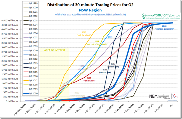
Moving into NSW, we see a similar story unfolding:
Reviewing the two extremes in this chart:
(i) Sub-Zero
It’s a noticeably flatter curve at the lower-priced end compared to QLD for Q2 2020 (i.e. fewer low and negatively prices trading periods). This makes sense, given that NSW is strongly interconnected on both sides so somewhat immunised from this latest malaise.
However (just like the very topical (and sad) situation of COVID clusters crossing state boundaries), it won’t be too long into the future when we see negative prices in the NSW region become more of ‘a thing’. There were only 38 half-hours in Q2 2020 seeing negative prices in NSW, which is well down on all other regions – however it’s also an infinite percentage increase on the zero cases seen for the immediately preceding year – and indeed many prior years – in NSW.
The better managed organisations will be preparing for that eventuality now… How is yours doing?
(ii) Higher-end Prices
For Q2 2020 we saw 99 half-hours with trading prices in NSW above $100/MWh:
1) The ‘glass half-full’ view suggests that this is a marked reduction down from the sky-high levels seen in the prior 4 years (Q2 2017 was the worst with 1,474 half-hours in total, so about 10% of the entire quarter).
2) However, the ‘glass half-empty’ view reminds us that 99 hours is considerably more than most other years (excluding drought in 2007 and 2016-2019). Keep in mind that some modest (not doomsday) reduction in demand due to COVID-19 might have worked to keep a lid on prices somewhat.
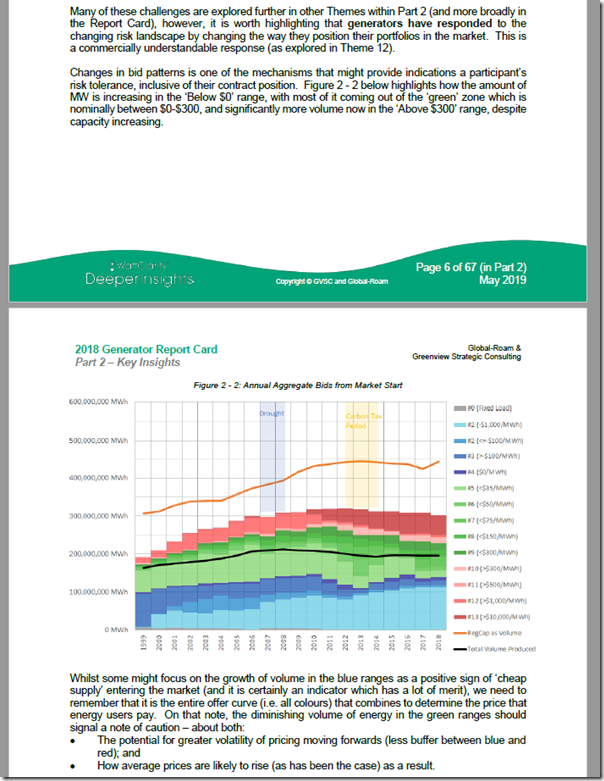
So there are suggestions that this is a ‘new paradigm’ that we’re witnessing the unfolding of. In the Generator Report Card 2018, we’d written about how ‘the level of Risk in the NEM is increasing’:
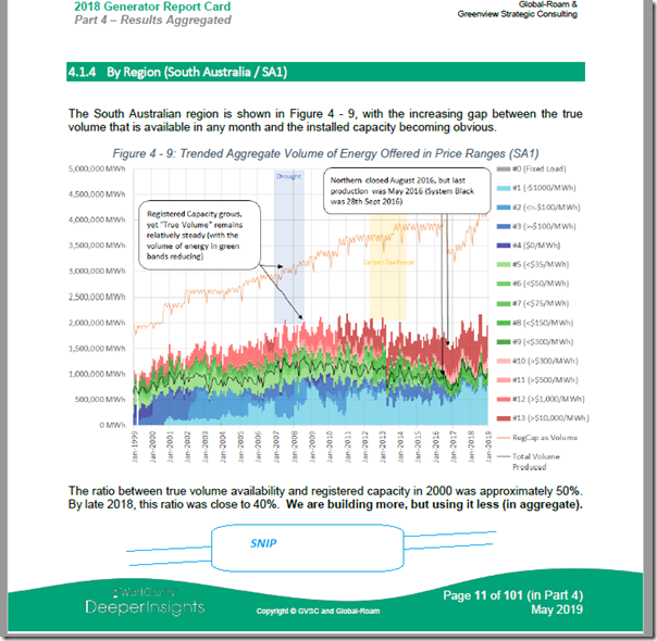
This was done as Theme 2 within Part 2 of the 180-page Analytical Component. One of the reasons why we noted that this has happened is that there is less and less volume of capacity offered in the ‘green’ range of prices (above $0/MWh but below $300/MWh):
Whilst this is a NEM-wide phenomenon, it’s important to understand that this is also happening in NSW, with the fast-approaching departure of Liddell to be another spur.
What this will mean, over time, is that the mid-range part of the curve will take on an increasingly vertical tinge, with prices concentrated increasingly at either extreme.
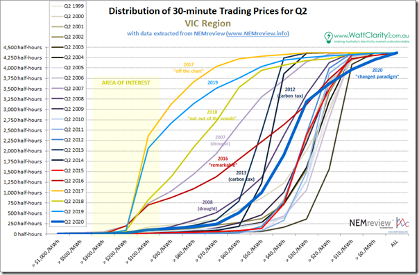
3c) Distribution for VIC
Further south into Victoria, much of which is now suffering its second bought of COVID-induced lockdown:
The same pattern can be clearly seen, with 2007 (drought) and 2016-2019 being clear outliers, with distribution curves shunted to the left (i.e. higher price end). As is the case for QLD and NSW we see that there’s a distinct tail at either end of the curve for VIC in Q2 2020 (104 half-hours above $100/MWh and 170 half-hours below $0/MWh).
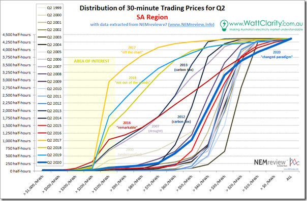
3d) Distribution for SA
In South Australia we see a similar sort of picture emerging:
In this case, in South Australia we see more hours below $0/MWh than in any other region (226 half-hours) whilst we also see more half-hours above $100/MWh than in any other region (110 half-hours). The growth of these tails is understandable, given the very thin strip of ‘green’ bids shown in the equivalent trended bid range chart for generation just in South Australia from the GRC2018:
Get ready for an increasingly bumpy ride into the future if this pattern continues!
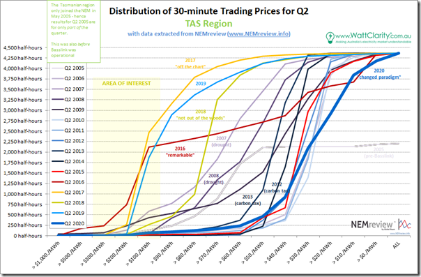
3e) Distribution for TAS
Down in the apple isle there is the same type of underlying pattern, but with its own Tassie style …
Tasmania saw the second highest incidence of negative price (187 half-hours, second to SA) in the quarter – but the second lowest incidence of prices above $100/MWh (74 half-hours, higher than QLD).
3f) Distribution for WA (SWIS)
Over in the west, we still have not yet compiled a longer-range history for the WEM in the SWIS. What we have is shown here:
Intriguingly (given their Capacity Market) the market there showed the highest incidence of prices above $100/MWh (i.e. 198 half-hours, more than any NEM region). It also had a decent number of negatively prices periods (124 half-hours, which was 3 times the incidence in NSW, but below the other regions).
Let us know if WA is of particular interest to you?
4) Trend of price excursions
On 30th August 2019 I explored the ‘Longer-term trends of low (and high) dispatch prices in the NEM across all regions’ – and noted how (for QLD) “the level of incidence of dispatch prices settling at $0/MWh or below has increased markedly through 2019 compared with all prior years”
4a) Trend of HIGH price excursions
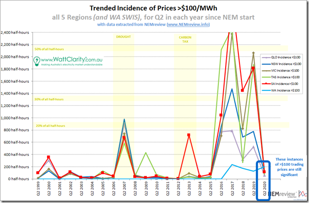
Looking at the number of times the trading price period exceeded $100/MWh, we see a particular pattern:
The first thing that jumps out in review of these trends is that the levels in Q2 2020 have reduced markedly from the sky-high levels seen in the preceding four years (2016-2019), and are also lower than in the drought year (2007). Excluding these 5 years from the 22-year range, we can see that the levels of high pricing are towards the upper end of that seen in the remaining years.
4b) Trend of LOW price excursions
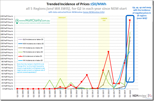
Looking at the number of times the trading price period dropped to, or below, $0/MWh, we see a pattern that’s common to all regions:
As can be clearly seen, the incidence of negative prices has increased off a low base.
In that article from 30th August 2019 I noted how (for QLD) “the level of incidence of dispatch prices settling at $0/MWh or below has increased markedly through 2019 compared with all prior years”. The chart in the article showed what had been seen in dispatch prices (i.e. the 5-minute ones) across all years up until the end of winter 2019. As can be seen from the above, what happened in Q2 2020 gives a clue that the total for all of CAL 2020 will be even higher than for CAL 2019.
This trend (increased incidence of negative prices) looks set to continue. Something’s got to give, it seems, which was one of the reason why Tristan was perplexed at the positive sentiments noted in the CEC survey.
5) Expectations from the futures pricing?
As noted above, there will be some winners in the drop in spot prices seen in the time-weighted averages for Q2 2020 above in all regions.
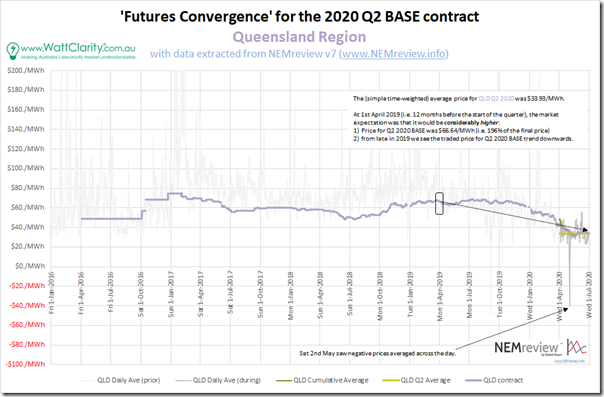
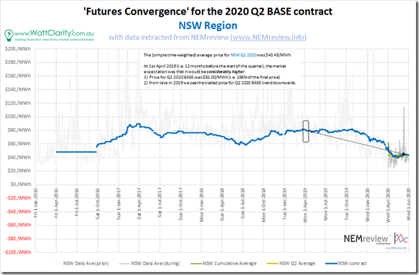
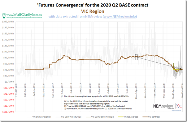
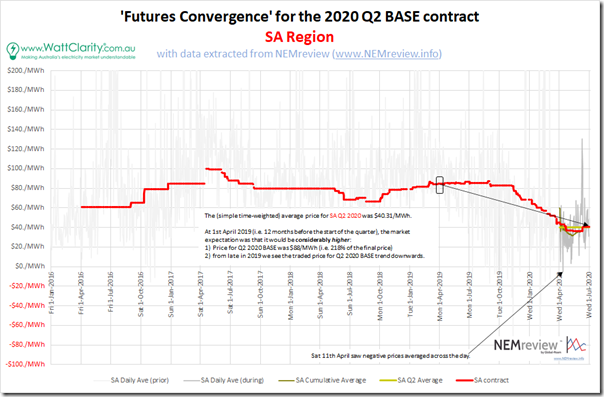
However these winners (and the losers) may not be who you would initially expect to be lining up on either side of that finish line – and this will be, at least in part, because of the varying expectations that they might have had in advance of this quarter. Performing a function that’s similar to the ‘Forecast Convergence’ function in the ez2view software, I’ve extracted some data for 4 regions from NEMreview v7 and give you a view of ‘Futures Convergence’ to illustrate the point:
5a) Clearing Prices for QLD Base Contract Q2 2020
Again from the top of the NEM, we’ll start with Queensland and work our way around:
As highlighted in this progression, the bulk of the market was clearly surprised by where the time-weighted average price for Q2 2020 actually landed. This suggests that there are a number of stakeholders who ended up considerably out of the money. In the example given, if you were an energy user who’d purchased cover for Q2 2020 back in April 2019, you might have ended up paying double what you would have if you had, instead, just bought on spot. Of course, this simplistic comparison does not account for all factors (like risk), but it is illustrative.
5b) Clearing Prices for NSW Base Contract Q2 2020
Moving into NSW, we see the same pattern in the trend:
The factors that led to the decline in spot pricing (i.e. decline of gas prices, small effect of modest reduction in demand due to COVID, and other factors) were clearly a surprise to the bulk of the market.
5c) Clearing Prices for VIC Base Contract Q2 2020
Further south into Victoria the chart is very similar:
We see the premium here for purchasing a Q2 2020 BASE contract a year ahead of the period start (186%) was virtually identical to what it was for NSW – but below that in QLD and SA, which were even worse.
5d) Clearing Prices for SA Base Contract Q2 2020
In South Australia we see the following:
The premium, in this case, was a whopping 218% (which makes sense in part because of the higher reliance on gas, and the generally higher level of volatility in prices as can be seen in the faded historical trend of daily average spot prices).
5e) Clearing Prices for TAS Base Contract Q2 2020
The ASX does not offer hedge contracts for the Tasmanian region, so we do not have visibility of the markets prior expectations for the quarter just passed.
5f) Clearing Prices for WA SWIS Base Contract Q2 2020
The ASX does not offer hedge contracts for the SWIS, so we do not have visibility of the markets prior expectations for the quarter just passed.
(C) Pattern of prices for FCAS in Q2 2020
With best intentions, I had planned to also include an analysis of FCAS prices – as they are proving increasingly important (both from the perspective of revenue for the subset who earn them, but also from a cost perspective for a broader number of stakeholders – we’ve seen a number of affected stakeholders come out of the woodwork after what happened in February in South Australia.
Alas, I have run out of time!



I can’t help but think that uncontrolled rooftop PV is by far the biggest risk to the NEM. And always increasing risk at that.
I’d love to see more about the wholesale price volatility, particularly around the less and less offers in the 0-300 range, and which price ranges are having the most effect on setting the spot price.
For example, spot price is currently low, but if the proportions of price offers keep changing, will the prices stay low?
Am I right in thinking that volume weighted prices are (a)one more degree of difficulty to compute and (b)more relevant to the business outcomes?
I’m thinking that the generally lower prices for the generally lower load periods (ie night, etc) tend to skew the time weighted prices lower than would volume weighted prices.