For a number of reasons*, we’re taking an increasing interest in system frequency.
I thought it might be worthwhile to highlight several things that have already popped out of the number crunching we’ve been doing:
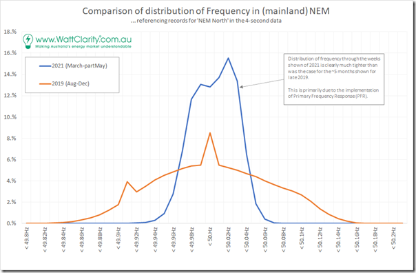
(A) Much tighter distribution of frequency
This will not be a surprise to a number of our readers, as it has been reported in a number of other locations:
As noted on the image, the prime reason for the tightening of distribution of frequency around 50Hz was the adoption of Primary Frequency Response (PFR) by the AEMC as an interim measure on 26th March 2020 following a campaign by a number of people, including Kate Summers who contributed articles on WattClarity as follows:
1) On 23rd March 2017 Kate wondered about ‘Fast Frequency Service – treating the symptom not the cause?’
2) Almost 18 months later, Kate delivered a presentation on ‘Power system control or market control of a power system?’
3) Skip forward to October 2019 (now 19 months ago) and Kate wrote about ‘… reflections on Frequency Control in the NEM’.
—
On 6th November 2020 (i.e. following the AEMC’s rule change, and the implementation of PFR by many generators), Allan O’Neil contributed a great article about ‘What’s PFR and why does it matter anyway?’ that includes similar charts to the above, and provides a lot more context.
—
Incidentally, when we were compiling the Generator Statistical Digest 2020 earlier this year, to highlight derived Conformance Status performance of all DUIDs through 2020, we needed to add another which we marked ‘Suppressed’ to mimic the way in which AEMO switched off their Conformance Status checks on some units as they switched on their PFR:
(Allan’s article above provides a good illustration of how Loy Yang A1 provided a valued service to system stability by intentionally deviating from their targets on 29th and 30th October 2020 to support system frequency – a markedly different approach from the independent running shown on 15th October 2019).
(B) The skew has shifted, towards higher system frequencies?
In the blue distribution above (for ~8 weeks in 2021) we see that there is a noticeably different shape of curve above 50Hz than there is below 50Hz, and we wondered why not just the mirror image?
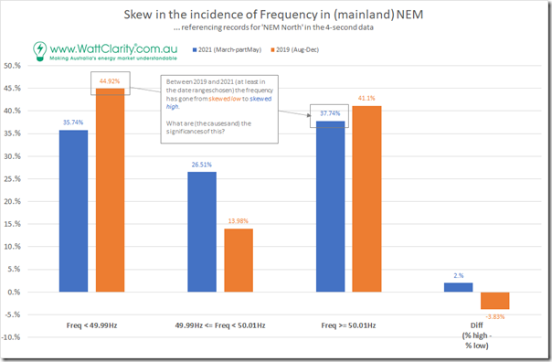
In the image above the difference looks pronounced for 2021 (i.e. significantly more time over frequency than under) – however the reality is a little more subtle, due to the different widths of the curve on either side of 50Hz. Allowing for a 0.2Hz (narrow) band across 50Hz we sum all the other instances as either high or low and see the following:
Based on the date ranges chosen (perhaps it would have been different if different date ranges were chosen) we see that there has been a change in the skew:
1) Skewed low in 2019; to
2) Skewed high in 2021.
One possible hypothesis is that this change in skew is not specifically due to PFR, but rather due to changes in the underlying technologies used in the energy supply mix over that two year period, and the idiosyncrasies of these. I’m interested in hearing more from those who can help extend my understanding in this area.
Might be a good time to remind readers of our question: Do you know of people who can help us?
(C) The skew has is decidedly different at different hours of the day!
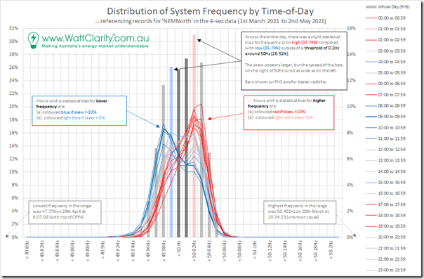
Interested in delving further, I split the frequency distribution for those weeks of 2021 out by hour of the day (i.e. NEM time) and redrew the distribution curve, with 24 curves for the different hours of the day:
The hours of the day are coloured with three different colours:
1) If the skew was towards higher frequency in the hour, then the line is coloured red:
(a) A bright red is used if the skew is >10% (i.e. calculated as ‘Incidence >= 50.01Hz’ – ‘Incidence <-49.9Hz’)
(b) A softer red is used if the skew is >5% (i.e. not so extreme)
2) If the skew was towards lower frequency in the hour, then the line is coloured blue:
(a) A bright blue is used if the skew is <-10%
(b) A softer blue is used if the skew is <-5% (i.e. not so extreme)
3) Skews that are more even than (less extreme than red or blue) are left as grey.
(C1) Frequency challenges different, at different times of the day
Evidently, from the above, the frequency challenges are different at different times of the day.
This intuitively seems to make sense. I was able to quickly expand on the hypothesis above in the table below:
| Time Range … in ‘NEM Time’ |
Skew of Frequency … 1st March to 2nd May 2021 |
Possible Contributing Factors … i.e. this is a speculative hypothesis |
| 00:00 to 03:59 | Frequency is skewed high | Between this time (early hours of the morning) demand is typically trending down to a low point around 04:00 every morning. |
| 04:00 to 04:59 | Frequency is skewed low | Just at the start of the increased ramp in demand |
| 05:00 to 05:59 | Frequency has neutral skew | No comment |
| 06:00 to 07:59 | Frequency is strongly skewed high | At this time of year (i.e. autumn), this is when production from solar PV is starting to ramp up.
Significantly, this is a combination of both: |
| 08:00 to 11:59 | Frequency is strongly skewed low | Whilst solar is continuing to grow, the greater uncertainty takes over in the form of growth in Underlying Demand for this particular day (given how significant the weather dependence). |
| 12:00 to 14:59 | Frequency has neutral skew | No comment |
| 15:00 to 15:59 | Frequency is skewed low | Uncertain what factors are significant here? |
| 16:00 to 16:59 | Frequency has neutral skew | No comment |
| 17:00 to 19:59 | Frequency is strongly skewed high | In the early part of this period, the last of the solar PV is still fading out – but so also is demand declining into the evening.
Perhaps the combination of two quite significant uncertainties magnifies to a general tendency to oversupply? |
| 20:00 to 23:59 | Frequency has neutral skew | No comment |
Very happy to hear from more learned readers who can help me understand why the difference in the skew at different points in time …
(C2) How this ‘pattern of skew’ has changed from 2019
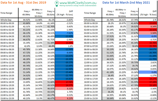
… but, in hearing from you, I’d like to understand why there seems to be such a significant difference in the ‘pattern of skew’ between 2019 and 2021!
For ease of comparison, I have published them in the following pair of tables:
Apart from noting that the pattern of skew has changed between the two periods, I don’t have much more to say at this point.
(D) Some reasons (*) why we’re analysing frequency
Here are two of the reasons are as follows:
Reason 1 = because we’re all (collectively) grappling with new challenges to system frequency as part of this energy transition, we’re exploring what’s happening in order to understand what our software products (like ez2view) need to be able to deliver into the future.
On Wednesday Marcelle posted a concise article about how AEMC proposes that ‘FCAS goes from fast to very fast’ which:
1a) Summarised what the recent AEMC draft rule change on Fast Frequency Response (FFR) is all about.
1b) The purpose of the proposed FFR would be to support (and respond to) system frequency in a lighter inertia system we’re evolving into.
1c) The brevity of Marcelle’s summary resonated with readers.
Reason 2 = as part of our exploration, for the development of ‘GenInsights21’, we are having a look at changing patterns of system frequency.


My laymen thoughts:
#1) Having less actual demand than the 30min prediction could lead to a skew to higher frequency.
#2) Having less demand makes it easier to keep the frequency above 50Hz and keep it close to 50Hz.
#3) The software control of inverters can change output without changing frequency. More generators using inverters (solar&wind) and less using inertia (coal,gas,hydro) could mean the supply minus demand differences are having less effect on frequency. Or overuse of faster FCAS.
#4) NT had a problem with the software & parameters of their grid connected mix of generators where the FCAS capacity was used too quickly, a lack of frequency reduction failed to properly signal correct load shedding, and a few other issues. The frequency increased during a time of demand>supply so some generation was curtailed until the overloaded battery supply could be sustained, this drop from batteries & the grid was unprepared for a sudden loss of battery et. al. generation. They now say they’ve fixed the control software glitches but it could happen again elsewhere in the country if these rare cases are not tested & searched for.
#5) Just because it looks better (tight around 50Hz) while everything is close to “average”, it doesn’t mean it will be better (follow same pattern to be close to 50Hz) during extreme demand & sudden changes compared to 2 years ago.
Thank you for your efforts to analyse the Australian energy market but unfortunately I’m not a big market player (just a little home user). Knowing my kWh from my megawatts, I hear these claims of green energy nirvana with scepticism. If I had the detail from AEMO etc. you (Global-roam/WattClarity) have I could work out modelling of the supply & demand requiring storage & increased supply (roundtrip losses when using storage) to make it work under different conditions/mixes (gas vs battery vs pumped hydro). During each day and between seasons.
Would you say electrical grids are still run within a minute of disaster and always have been? We would need distributed storage with megawatts to meet more than peak demand and with enough GWh storage to meet natural shortfalls & absorb the peaks (not as simple to calculate as it sounds, as Paul McArdle already knows). 100% green is not a problem of just technology and some of it’s cheaper but “whether or when we have the economics, materials & time to do it ALL when competing with the rest of the world for the same limited resources”.
I think you are trying to analyse this to death guys. The % variations you are seeing here is “noise”. The NEM PFR deadband is nominally +-15 mHz – that says the machines governor action does nothing until is falls outside that band. All very nice, but….that is just a crazy setting. Simply too tight and will wear governing systems out and on thermal machines send control system oscillations all the way back through the boiler. Hydro machines are even worse in this small signal area because of the mass of water in the turbine runner that needs to be either accelerated or decelerated. There is a lot more to tuning a governor than just deadband. Gain and reset action will determine how quickly they attempt to correct the error. To add to that not all machines will be in pristine condition all of the time , depending upon where they are in their maintenance cycle. This will mean their will be mechanical hysteresis in their systems also. So all I am saying is a few % here and there is to be expected. This distribution looks pretty good with an effective deadband of about +-50mHz – about as good as I would expect on a system where the dominant frequency regulator is large thermal machines. It might get better if there were lots of big inverter connected batteries around but we aren’t there yet. Generally on falling load I’d expect to see high frequency and rising load, low frequency. Operationally pretty normal and hugely better than before PFR was introduced as you are observing. Simply all machines are now obligated to contribute to correcting frequency(as I might add historically – pre markets – they always did). The other wild card is where an additional generator synchronises (or desynchronises) . Most need a block load or unload their last few MW very quickly when coming off to prevent chilling of metals from excessive throttling. All will represent frequency disturbance. Also, don’t forget that the inertia of the power system is not only the number of synchronous generators on at the time but also the number of induction motors driving loads in the power system at the time. It will therefore change as industry starts up and shuts down each day – the same time generators are loading and unloading in response. All of this modelling is what system modellers spend their lives doing using very powerful modelling software.