In her guest authored article ‘Questions prompted by that chart from the RIS’ on WattClarity today, Patricia poses an interesting question to the reader ….
Q) What do you see, when you view that particular chart from the R.I.S.?
That’s a perceptive (and important) question, as it does help to illustrate that the chart prompts a wide variety of perspectives and interpretations in different people (and I’ve also noted that the chart has also been prone to some misinterpretations).
(A) Here’s what I see
So let’s start by me answering that question…
A) What I see is an ongoing advance to a new environment where:
‘The Average’ becomes less and less dominant as a key performance indicator and
‘The Extremes’ increasingly matter.
For instance, whilst generators might have been able to get away with a focus on things like time-weighted average prices in the past (and a focus on primitive metrics like LCOE), we saw in preparing the Generator Statistical Digest 2019 that there is increasing diversity in Volume-Weighted Average Price outcomes for generators even of the same type:
1) In a section aptly titled ‘Operational complexity is growing’ within his January article, guest author Ben Willacy explored what the 2019 data meant for some solar farms and wind farms;
2) Also on the same day, Allan O’Neil dissected some of the GSD2019 to ask the question ‘How good is solar farming?’.
3) In July this year, after speaking with an audience organised by Vestas, I explored how ‘Revenues for Wind Farms in the NEM take a hit’ using data also taken from the GSD2019 and extended towards the GSD2020 update.
However it’s not just commercial measures that are showing increased diversity – we’re seeing this in terms of the underlying physical factors, as well.
(B) Celebrating the high points …. but also paying particular attention to the low points
The coverage on RenewEconomy is excellent at celebrating the high points of this transition (such as today’s article about the high points last week for wind – and separately for solar – in South Australia). The AEMO also celebrated the achievement reached on Sunday 9th October.
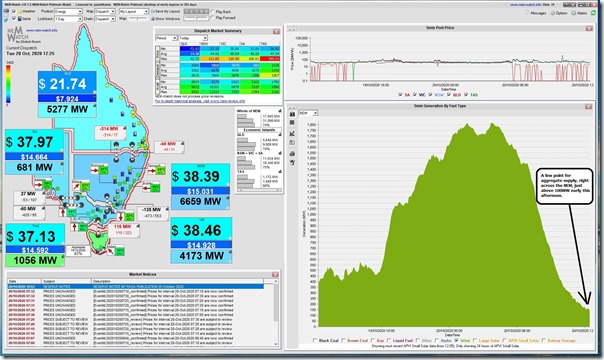
Just as was the case 5 years ago when we’d written here about ‘the Yin and Yang of Wind’, we did not have to wait too long for the other end of the spectrum to arrive – such as what I noticed in a display copy of our NEMwatch v10 (entry-level dashboard) this afternoon:
In this snapshot (from the 12:25 interval) we see aggregate production from wind farms across the NEM drop to a little over 100MW.
(C) What do we expect will happen, moving forwards?
In the inaugural edition of the Generator Report Card 2018, we invested time to complete a hypothetical case study of what would happen if we installed Wind Farms in every single Renewable Energy Zone as defined at the time.
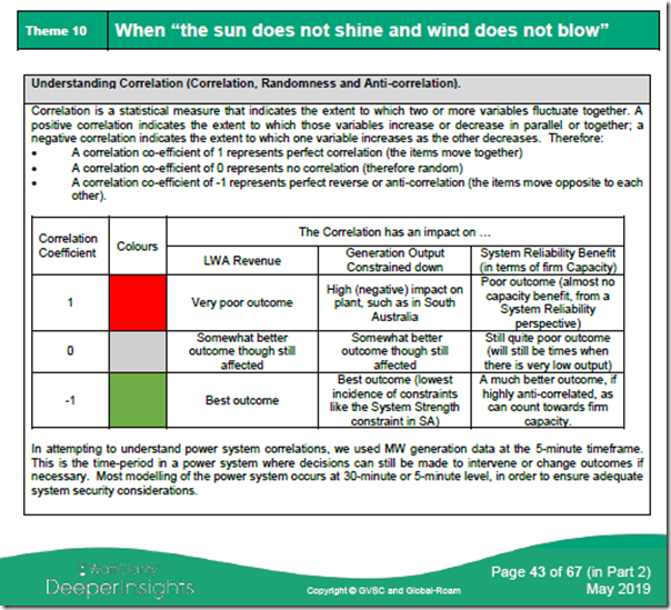
The key to understanding what we found is recognising the difference between a state of randomness and a state of anti-correlation, as described in the following table taken from Theme 10 within Part 2 of the 180-page analytical component within the GRC2018:
We noted from that study that ‘diversity is not a magic wand’ – especially because we found that the pattern of wind spread right across all the REZ in the NEM was random, unfortunately not anti-correlated.
What this means is that we’re not surprised at all when periods of heavy wind generation are followed by periods of quite low wind generation.
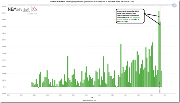
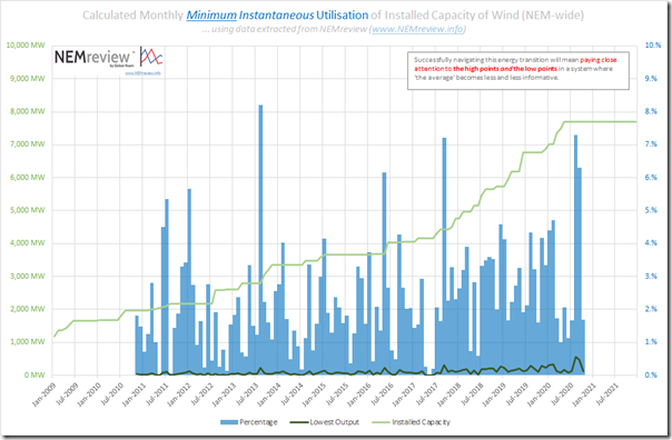
Pondering the ‘how low does it go?’ question when watching what happened this afternoon, we created this query in NEMreview v7 and present the results in the chart below:
As noted in the chart, August and September 2020 were particularly good months – and we also see that, since mid-2018, the low points each month have increased away from the very low points of beforehand.
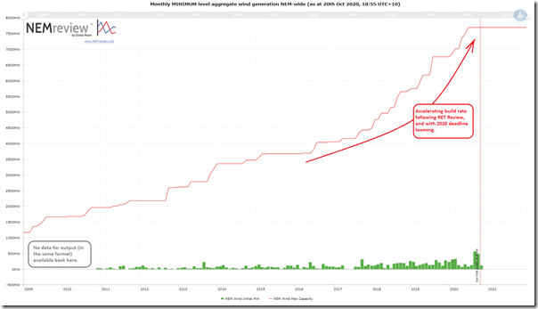
However it’s worth putting this into context by adding the aggregate installed capacity into the same chart:
Seen this way, the accelerating growth in capacity addition is very much on a different scale to the extreme lows of minimum aggregate output each month.
Combining the two data points into percentages should be of interest in understanding (in broad terms) what we expect will continue to happen moving forwards:
From an ‘extremes will increasingly matter’ perspective the take-away is that the minimum points continue to be around only 1-2% of aggregate installed capacity.
—————
Note that this analysis is independent of any consideration of when peak demand (or, perhaps more importantly, ‘peak Underlying Demand net of small and large solar’) has occurred … or will occur in future.
Would be an excellent thing to consider further in the GRC2020 update if we have time!


When I first saw the graph, I realised it was the source of the “75% VRE” statement and I thought, “fair enough, the odd half-hour here and there, but that’s going to need a lot of transmission and support services”.
A bit later I realised the ISP scenarios rely on GenCost, which has a built in carbon price, somewhat separating the scenarios from reality, being much more favourable for VRE and batteries than in practise.
Not long after, the NSW and QLD gov’s announced REZ plans a decade in front of the ISP, and now the second major ISP project – EnergyConnect – is going to cost so much more than originally planned it could be canned.
As we speak the NEM investment environment is completely tanked (or not far off), with governments the biggest investors via long term offtakes with VRE.
Before long AEMO will be opening substation feeders to isolate sections with too much rooftop PV, to prevent wider blackouts.
Back to the graph, now I see an increasing number of daytime periods with zero or negative wholesale prices, still no solar output at night or during evening peaks, and coal plant continuing to make room for VRE (except when there isn’t any).
You can probably tell, I’m skeptical The Transition is providing much benefit.