On Wednesday 15th July 2020 I spoke with an audience organised by Vestas on the topic ‘NEM merchant pricing – is this the new normal?’.
I’d promised at that time to post some context to a few of the later slides covering VWA Prices (i.e. Volume-Weighted Average Prices) for Wind Farms, as these were of particular interest – but had not had time to do so. Seeing the question by Craig Memery here over the weekend reminded me that I’d not (yet) done what I had promised, so I’ve invested the time to put this article today.
(A) Background
For those who were not on the call, some quick background might be useful…
(A1) A quick intro to the ‘VWA Price’ Metric
See this page in the growing WattClarity® Glossary to understand how the VWA Price (also known as LWA Price) is calculated, and why it is useful (and why & how it’s not the same as the more widely used VWA Revenue!).
The VWA Price is featured for each DUID through 2019 in the ‘B’ Pages of the Generator Statistical Digest 2019.
Upon release of the GSD2019 on 28th January 2020 guest author, Allan O’Neil, utilised the VWA Prices and other data in the digest to explore ‘How good is Solar Farming?’ (see discussion of ‘Headwind 2 – Spot Discount’). Whilst Allan’s article was focused on Solar Farms (not the Wind Farms of interest to the Vestas audience) it does provide a good example of how to use 3 different Analytical Artefacts in the ‘B’ Pages of the GSD2019 to:
1) compare the ‘Revenue Capture’ performance of different assets – i.e. capturing the high prices and avoiding the negative ones; and also
2) illustrate the reasons why performance might be different from one asset to the next.
Another article published on 10th March 2020 about ‘Using the GSD2019 to explore the value of Dispatchability’ also provided a sense of what could be done.
(A2) Simple Time-Weighted Average Prices for Q2 2020 had fallen
Spurred on by Vestas’ invitation, I updated our prior analysis of Q2 pricing patterns after a gap of a year and posted ‘It’s good news that time-weighted average prices for Q2 2020 are down on prior years – right?’ on 9th July. Note that this article focused on simple time-weighted average price for ‘all hours’ – i.e. aligning with a ‘2020 Q2 BASE’ futures contract.
This reduction in prices was not a result of any large reduction in demand some had been attributing to COVID impacts on the NEM:
1) As noted on 13th July, it’s been difficult to see any significant reduction especially in net terms, given the variability of climatic impact on demand from one year to the next.
2) That’s great news for the health of the Australian economy in these troubled times.
However COVID did have an indirect impact on the price outcomes. As the AEMO noted in their Quarterly Energy Dynamics for Q2 2020, we understand that disruptions to the global economy in part due to COVID has driven prices for oil and gas prices down – and that these lower gas prices had flowed through to bid prices for gas-fired generators in the NEM.
Hence trading prices have dropped … which have flowed through to generator revenues. It’s also worth particularly flagging the rise of negative prices in all regions that were highlighted in that article.
(B) Trended VWA Prices
In the GSD2019 we reported monthly VWA Prices for all DUIDs – but only focused on calendar 2019. You’ll need to wait for the GSD2020 to see how performance has changed for the current year.
For the Vestas audience, and now belatedly for readers here on WattClarity®, we do explore a little further to see what we can see…
(B1) VWA Prices in 2019 – by DUID, by Fuel Type
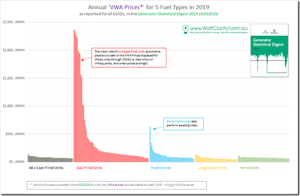
Firstly, in the following comparison we show the the results for 275 DUIDs (i.e. notional units) across 5 fuel types which were operational across CAL 2019 – being 48 x coal-fired units, 80 x gas-fired units, 47 x hydro units, 45 x solar units and 55 x wind units. For each unit we’ve extracted the annual result shown for 2019 in the GSD2019 and plotted in descending order within each fuel type:
We’ve intentionally left a couple of other fuel types (e.g. batteries and liquid fuel-fired) units off this comparison for simplicity – but rest assured that the VWA Price results are there for them (on an annual and monthly basis through 2019) in the GSD2019.
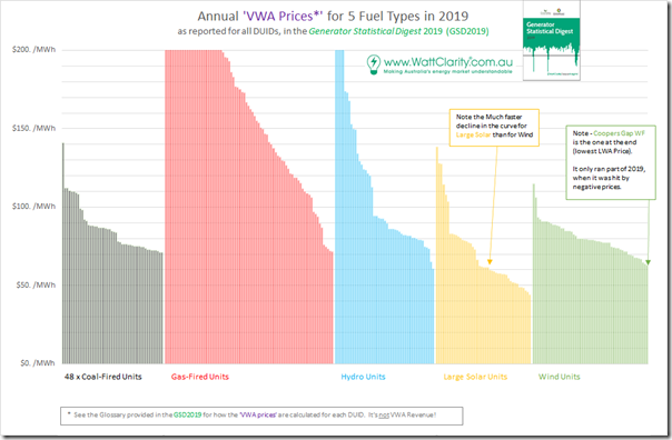
Clearly some peaking plant (mostly gas-fired but some hydro) shown operate differently from other plant and so their revenue harvest pattern is quite different. Given the audience of wind farm stakeholders on 15th July, I’d zoomed in to focus more on the bulk of the units at the bottom end of the chart in this second chart:
Remember that VWA Prices deliberately exclude the effect of network losses, so comparing one unit against another you can more clearly gain a sense of Price Harvest performance.
Lest anyone jump to conclusions that the ‘poorer performing’ Wind Farms were located in South Australia (so suffering heavily from what we’ve termed the ‘wind correlation penalty’) I highlighted that the worst performer of the 55 units shown was Coopers Gap Wind Farm, where the VWA average over the year suffered because it was only operational for the back-half of 2019, and then only partially so. You’ll see from the monthly results below why that drove the annual average lower.
Also highlighted was that the ‘DUID-to-DUID relative decline’ within a fuel type was steeper for solar farms than it was for wind farms – with the ‘worst’ solar farms seeing VWA Prices just north of $40/MWh over the entire year. Again, commissioning schedules are a factor in some of that.
(B2) Trended VWA Prices for 6 x Fuel Types
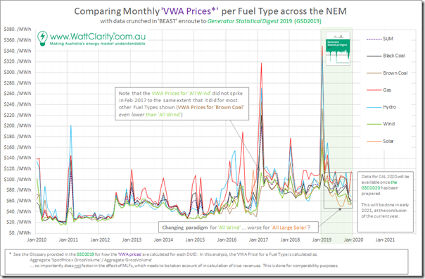
For the Vestas audience, included data we’d crunched back to January 2010 – so providing 10 years of total history to gain a sense of trend. In the following chart we’d grouped together on a volume-weighted basis the performance of all 275 units back over the prior 10 years (with obviously not all units being operational that far into the past) in order to present this comparative trend by Fuel Type:
In this chart, we can clearly see the impact of market events such as:
1) The impact of the ‘carbon tax’ period from July 2012 through to June 2014; and
2) Some tight summer periods for:
(2a) January 2010 and February 2010 – particularly benefiting gas and hydro, but with black coal and brown coal missing out;
(2b) February 2011 – particularly benefiting hydro, but with wind and brown coal missing the uplift;
(2c) February 2017 – particularly benefiting gas, hydro and solar, but with brown coal and wind missing out;
(2d) January 2018 – benefiting gas, hydro and brown coal, but with solar and black coal missing out;
(2e) January 2019 – benefiting gas and hydro and to a lesser extent brown coal, but with black coal missing out.
… each example (and collectively) highlighting the benefit of being there ‘at the right time, and right place’ (or the cost of missing out).
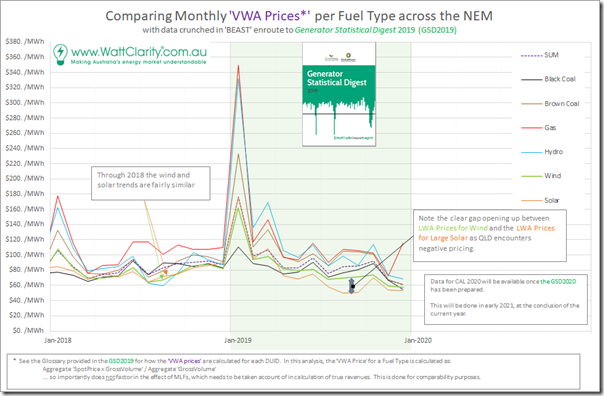
3) Even in the latter half of the 2019 year, we can the ’paradigm shift’ I wrote about on 9th July. Zooming in to show just CAL 2018 and CAL 2019 we can more clearly see the definite change that has overtaken the NEM:
We can see that, in aggregate, solar farms are suffering even more than wind farms – i.e. well under the ‘SUM’ trend (which shows the LWA Price for all 6 fuel types together) for the latter half of the year.
(B3) Trended LWA Prices, just for Wind Farms
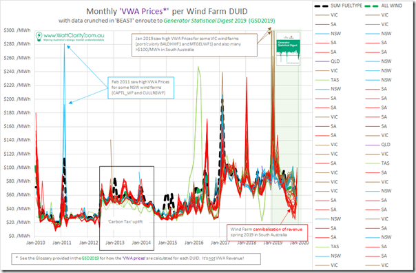
Given the wind farm focus of the Vestas audience, I’d then broken apart the fuel type aggregate for ‘all Wind’ in the sets of charts above to trend the monthly VWA prices for all wind farms (i.e. there were 55 at December 2019) in the 10 years to 31 December 2019. This is shown in the trend below, with the wind farm identified by region:
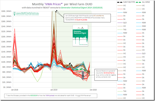
Apart from a few outlier periods in the 9 years to CAL 2019 we see that the monthly revenues lay fairly closely over the top of each other – but that all changed significantly in 2019 (particularly in the latter part of the year). Hence the extra interest in ‘zooming in’ to see just 2018 and 2019:
In this chart we can see:
1) The two periods of summer volatility reflected on VWA prices very differently for wind farms:
(1a) January 2018 –
i. with revenues for NSW wind farms not benefiting from the same uplift in VIC and (moreso) SA;
ii. but the more important/interesting thing was the large spread in returns apparent for wind farms in South Australia in this month.
(1b) January 2019 –
i. With amazing VWA Prices being recorded for some units in VIC (BALDHWF1 and MTGELWF1 in particular high near $500/MWh and above – but also a number above $200/MWh);
ii. Most wind farms in VIC and SA saw uplift – but, again, a very broad spread;
iii. And again NSW and QLD wind farms mostly miss the uplift (TAS results were about average).
2) We also see, in contrast, the bottom fall out of VWA Prices later in 2019:
(2a) Particularly in South Australia
(2b) But in SA we see quite a divergence, which we presume (without inspecting the details) is partly a result of the strategies employed to avoid negative prices (hopefully not this one).
(2c) Again, this ‘bottom falling out’ phenomenon seems part of the ’paradigm shift’ I wrote about on 9th July.
(B4) Using the GSD2019 to compare between DUIDs
For those with their own access to the GSD2019, you can easily perform the DUID-to-DUID comparisons yourself – however it might be useful to highlight a couple of DUIDs in South Australia to illustrate a comparison of the diversity of results:
(B3a) Canunda Wind Farm (CNUNDAWF)
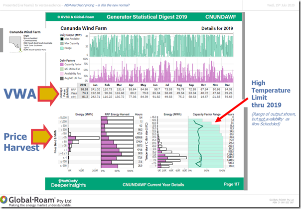
The image that follows is one mashed together from three different artefacts from the Canunda ‘B’ Page inside the Generator Statistical Digest 2019:
Walking through each artefact in turn:
Artefact 1) We can see (from the top of the page) how the unit performed across the year, and that the VWA Price for the year worked out at being $74.10/MWh – which was at the same time:
1a) Boosted by a good return in January 2019 ($192.38/MWh for the month), and decent results for some other months; but
1b) Also weighed down by results in the mid-seasons, particularly in October (only $40.72/MWh).
Artefact 2) The chart at the ‘Price Harvest’ chart at the bottom left of each unit’s ‘B’ Page highlights two things that jump out:
2a) Producing perhaps only 10-20% of the maximum possible volume where the price was $500/MWh or above; whilst
2b) Producing slightly more than 50% (volumetrically) where price was down at –$1,000/MWh.
Artefact 3) In the ‘Temperature Harvest’ chart on the bottom right of each unit’s ‘B’ Page highlights the drop in harvest during times when the local temperatures were higher:
3a) Coincidentally temperature limitations was the subject of the AIE ‘Heat Stress’ discussions on Friday 17th July; and
3b) That I shared some details on summer 2019-20 here later, the December parts of which made their way into the GSD2019 and the results above.
(B3b) Lake Bonney 3 Wind Farm (LKBONNY3)
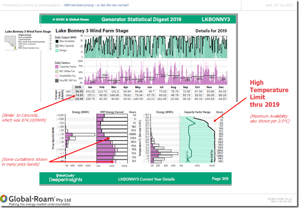
Because it was located in a very similar part of South Australia, I chose to look at Lake Bonney 3 next:
Readers can read from the above a number of other insights, however I’d like to highlight three particular things here:
1) First and foremost, the VWA Price for the year ($74.43/MWh) was quite similar to that for Canunda ($74.10/MWh) just up the road.
2) Secondly, there is more data available in this report because it is Semi-Scheduled (hence Energy-Constrained Availability is published).
3) A bit off-topic, but useful to note the extent to which transmission constraints impacted on the CPD Price for this asset!
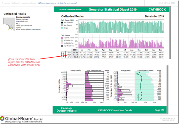
(B3c) Cathedral Rocks Wind Farm (CATHROCK)
In a different part of South Australia, we see some quite different results for Cathedral Rocks Wind Farm (another Non-Scheduled plant, like Canunda Wind Farm above):
In particular, the VWA Price ($82.53/MWh) for the year is markedly above that for the other two. From the other 2 artefacts there are two things that jump out to me to help illustrate some of the reasons why the VWA Price is better for this unit – can you see them?
(B3d) Other wind farms around the NEM
Those with their own access to the GSD2019 can continue this process to understand the extend of the variability of results for the other 52 wind farms operational in 2019 that were reported in the GSD2019. Unfortunately we’ve run out of time today…
(C) Extending the analysis further, with the upcoming GSD2020
Given the popularity of the GSD2019, we intend to extend this analysis further with an update to – and possible extension of – the statistics through a Generator Statistical Digest 2020, which we would aim to publish in January 2021:
1) This would be available to those who purchase access (we’re not yet ready to take pre-orders at this point); and
2) We’d envisage to continue sharing some insights on WattClarity, and in occasional presentations, as we have this year.
———–
Let us know if you have suggestions for how you’d like us to enhance this compendium when we updated it for the GSD2020. Others have called the current issue, the GSD2019, a ‘blockbuster’ with ‘dense data and lots of insights’, or a ‘treasure trove’ , ‘invaluable’ etc…?
We’re also interested to hear from you if you know of other people who can help us in these initiatives?


Leave a comment