The day after un-suspension of the market seems an appropriate time to take a quick look at how volumes offered into the market, and at what price, have changed… but readers should remain cognisant that this focus period (of about 2 weeks) is only a very small subset of the broader challenges of the ‘2022 Energy Crisis’ as noted in this article from earlier today.
(These two linked articles have taken about 12 hours to finish, in total, interspersed with other weekend activity)
(A) Recapping the timeline
Because we’ll be referring back to it frequently, I thought it would be useful to provide the following brief chronological record of significant events:
| Date | Key Event |
|---|---|
Sun 12th June at 18:55 |
The QLD region exceeded the Cumulative Price Threshold and began Administered Pricing. This was discussed in this article on that Sunday evening. |
Mon 13th June at 18:35 |
The NSW region exceeded the Cumulative Price Threshold and began Administered Pricing. This was discussed in this article on Monday evening as it occurred. |
Mon 13th June at 21:50 |
The SA region exceeded the Cumulative Price Threshold and began Administered Pricing. Both SA and VIC were discussed in this article later on Monday evening. |
Mon 13th June at 21:55 |
The VIC region exceeded the Cumulative Price Threshold and began Administered Pricing. Both SA and VIC were discussed in this article later on Monday evening. |
Wed 15th June at 14:00 |
The AEMO Suspended the Market … and Market Suspension Pricing began (Marcelle later described here how this is different than under the APC). |
to Wednesday 22nd June… |
It took a 7 day period after Market Suspension for the effects of the price volatility to Monday evening 13th June 2022 to wash through the Cumulative Price – noting it did not start to drop just with the Administered Price Caps in place because of how it’s calculated. There were a number of updates over that period (such as this article on 21st June) that highlighted how this was trending downwards. |
Thu 23rd June at 04:05 |
The AEMO lifted price caps under Market Suspension. This was noted in this article on that day. |
Fri 24th June at 14:00 |
The AEMO un-suspended the Market. This was noted in this article on Friday. |
(B) Looking back to 9th June 2022
Let’s break the supply-side bids into two discrete bundles of plant to see what each picture can show us:
(B1) Looking at Wind and Large Solar plant
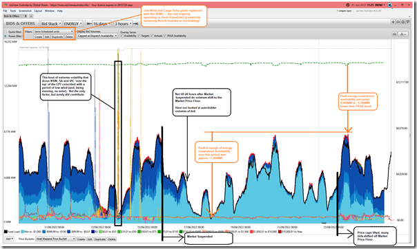
Let’s start by looking at the Semi-Scheduled plant (i.e. Wind and Solar plant) – in the following trended bid stack just for these plant in ‘Bids & Offers’ widget inside of ez2view we see a number of interesting changes over this period:
As we try to do with every article, click on the image for a larger view.
As noted on this chart:
1) Coinciding with (and contributing to) the NSW, SA and VIC regions exceeding the CPT on Monday evening 13th June … a periodic lull in wind output NEM-wide overlapped with sunset and daily peak grid demand to provide two more factors that drove volatility ‘through the roof’ (literally) such that Administered Pricing began.
2) Through the period of the Market Suspension, we highlight that:
(a) Of the ~14,300MW bid into ‘PASA Availability’…
(b) At most there was ~8,000MW available in the energy market (i.e. the volume of energy unavailable was at least ~6,300MW during this time … presumably due to energy constraints (i.e. 44% of the MW bid into ‘PASA Avail’))
(c) At its lowest point there was under 500MW available across Wind and Large Solar, right across the NEM … meaning ~13,800MW unavailable (~96% of the MW bid into ‘PASA Avail’ right across the NEM).
3) Of the energy-constrained capacity that was available:
(a) there was a delay in bidding reverting the significant share of volume to the Market Price Floor after Market Suspension on Wednesday 15th
… I’ve not had time to look into this, but wonder if this was the result of some delay in auto-bidders?
… I’ve also (still) not had time to look further into this rebidding at Coopers Gap WF that went the other way on 12th June 2022 with the QLD region at APC.
(b) In contrast, there was an immediate shifting of bid volumes away from the Market Price Floor on Thursday morning 23rd June when the price capping was removed (something the AEMO had telegraphed in advance).
Food for thought in the above with respect to ‘Anytime/Anywhere Energy’, with respect to the ongoing energy transition.
(B2) Looking at Everything Else (i.e. dispatchable plant)
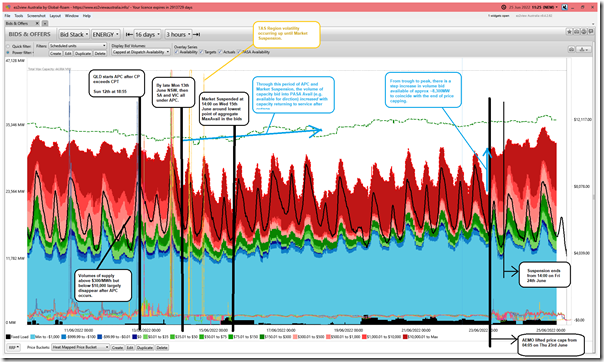
Subtracting the Wind and Large Solar plant off the aggregate supply-side offers over the same period, we’re left with a chart mostly for Scheduled plant (but also some Non-Scheduled as well, though noting they don’t bid) that looks as follows:
In simple terms, this represents the volume (and prices) offered by the ‘Keeping the Lights on Services’ … which in this case was challenged to live up to the label we’ve given it through GRC2018 and GenInsights21 (hence the AEMO stepped in and Suspended the Market).
The image contains a number of different annotations, and I’ll note below the main ones:
1) After QLD breached the CPT on Sunday 12th June … but particularly after NSW, SA and VIC breached the CPT on Monday 13th June:
(a) We see the volume of energy that had been offered to the market above $300/MWh and below $10,000/MWh disappear
… there are two significant theories of why this might have happened, as noted below.
(b) Important to note, as well, that the volume offered to the market climbs during time of morning/evening peak in demand (i.e. when the black line – aggregate dispatch – spikes for morning and evenings):
(i) This leaves the underlying trend of volume offered much more cyclical.
(ii) However we need to remember that the bid availability shown is ‘ex-post’ (i.e. after the fact) so presumably would show the volume added back into the market as a result of directions – I’ve not invested time to check, but presume that at least some (and perhaps all) of those spikes in availability for morning/evening peaks would be the result of capacity offered to the market as a result of Directions from the AEMO.
2) From around the point of Market Suspension or a day beforehand we start to see the trend of volume bid into ‘PASA Avail’ increasing as a number of units returned to service (like these three noted on Thursday 16th with respect to the prior 24 hours).
3) At the point where the price caps were removed on Thursday 23rd June, we see a vertical jump of capacity bid available in the pricing market of ~8,300MW in aggregate across all of these plant included in the filter above.
… seems clear that this was the volume of capacity that had decided (for Possible Reason #1 or Possible Reason #2 … or for some other reason?) that it could not bid into the pricing/dispatch market during APC or during Suspension).
(C) Why withdraw capacity (even if not completely*)?
This is an obvious question that arises from the above … and it’s quite an important one, as well.
1) with respect to the ‘not completely*’ caveat, note in the second chart above that the aggregate level of ‘PASA Availability’ actually trends upwards – hence there is a widening gap between capacity available to AEMO if required and that bid into the normal NEMDE dispatch process
2) it’s this widening gap between the two measures of Availability that has people asking questions.
Lots of people have been asking that question (with a subset using emotive language to describe Possible Reason #1 as ‘gaming’ or ‘gouging’ and so on.) … but most people seem unaware of Possible Reason #2 noted here.
(D) Comparing the two charts
Let’s be clear … what happened in the immediate aftermath of the Administered Price Caps being reached on this occasion appears to be most significantly due to deficiencies in the ‘Keeping the Lights on Services’ shown in the second chart above.
It appears to be moreso a result of ENERGY constraints, not CAPACITY constraints with respect to these plant.
However comparing the scale of the numbers in the two different trends should reinforce questions being asked about ‘The Rise of Just-in-Time’ within GenInsights21:
1) With respect to this energy transition; and
2) Especially when comparing the scale of the numbers for ‘capacity unavailable’ to ‘Total Maximum Capacity’ for each.
—
As noted earlier today, we should be seeking to learn as much as possible from this exercise with an open mind to what it might tell us about the (pretty hazy?) course currently charted through the energy transition seas ahead…


Leave a comment