

In An initial look at 6-day ahead Wind Uncertainty we studied the availability forecasts of wind units from the perspective of over-forecasting.
We summarised the 6-day ahead forecasts for overestimation uncertainty, using the 95th percentile of a week’s-worth of data, with a rolling window.
This opened up more questions such as “what about nearer-term outlooks” and use of other measures of uncertainty that capture the overs and unders more comprehensively.
Indeed, at some times, the uncertainty seemed to be quite high relative to unit capacity and comments indicated that the usefulness of the forecasts would strengthen as the outlook reduced to 3 days or thereabouts.
Windy, or not windy, or in between
Relaxing the precision requirement on forecasts allows us to question whether the forecasts simply provide a good indication of windy or not windy or in between.
Not windy is assigned the ‘Low’ range. In between gets ‘Mid’, being the middle third range. Windy is assigned the ‘High’ range.
In the following chart we present the ranges that align with these Low-Mid-High categories derived by splitting the actuals into thirds:
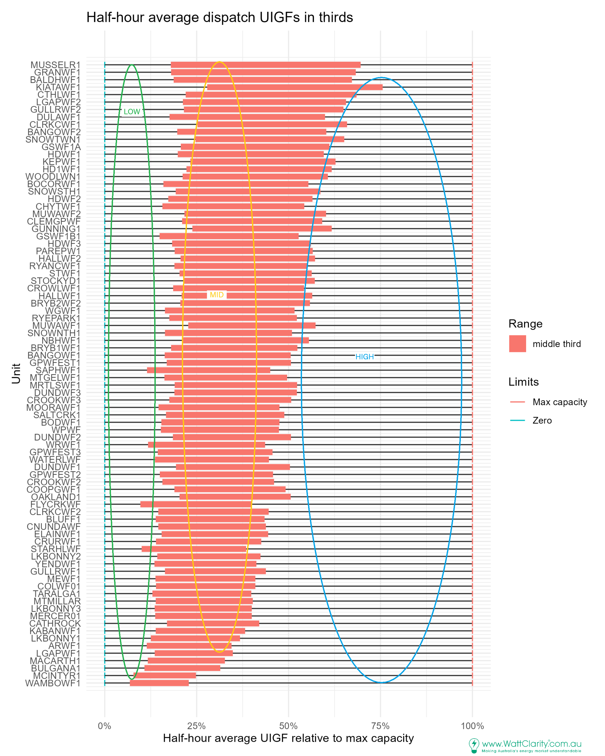
The thirds are relative to max capacity. So, it is indeed another way of looking at capacity factor but that’s not our focus here. We use these thirds to separate the actuals into Low, Mid and High availability categories.
We hold on to the equivalent unit-specific MW values at the cut-points. For example, Musselroe’s (MUSSELR1) has very healthy availability relative to capacity, with the middle third of availabilities being at the top of the chart, higher relative to max capacity than other units.
The underlying data is from August 2025 to May 2026. For Musselroe, 30 MW and 117 MW are its low third and high third cutoffs relative to max capacity of 168 MW.
With these equally populated “thirds” we assess forecast availability in these three categories.
Does the forecast do well at predicting these categories?
Evaluating this question makes use of the 3×3 matrix to count forecasts made in each category combination (actual vs. forecast).
The forecasts are the STPASA unit-level wind availability forecasts. Actuals are the 30-minute average UIGFs used in dispatch.
At the unit-level we inspect Musselroe wind farm in Tasmania, by way of example:
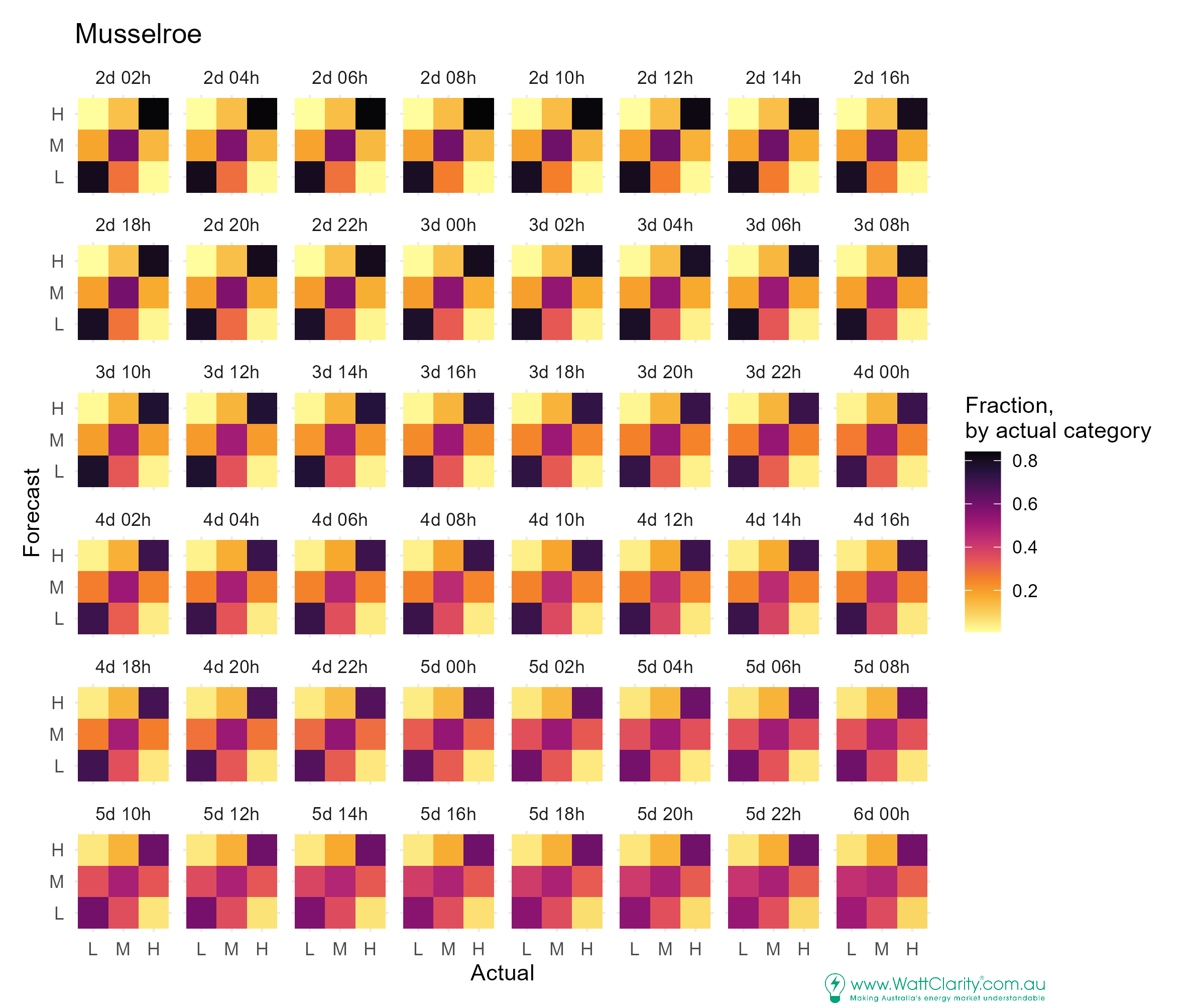
In the early outlooks – the colours are darker along the diagonal indicating forecast categories aligned with the same category in the actuals. There is good success in forecasting the High and Low categories. Less success for the Mid category. Eyeballing the scale we might glean that an actual Mid condition is forecast correctly about 50% of the time and tends to be on the low side when wrong.
As the outlooks extend, the darker colours along the diagonal become lighter indicating reducing accuracy for each category of actual.
Widening the assessment to each wind unit we use a summary statistic to assess whether forecasts for some units are more skilful than others
Is there forecast skill, relative to random?
We condense the 3×3 matrix of outcomes into a skill score. The “Gerrity Skill Score” lets us apply a weighting to reward correct forecasts and penalise forecast misses that are of greater distance; e.g. a forecast for Low is worse than a Mid when actual is High. The score outcome is relative to the performance for random chance such that 0 indicates no skill (random) and perfect performance is 1.
Below, we chart the skill score for each unit (and provide the other unit series in lighter grey for context):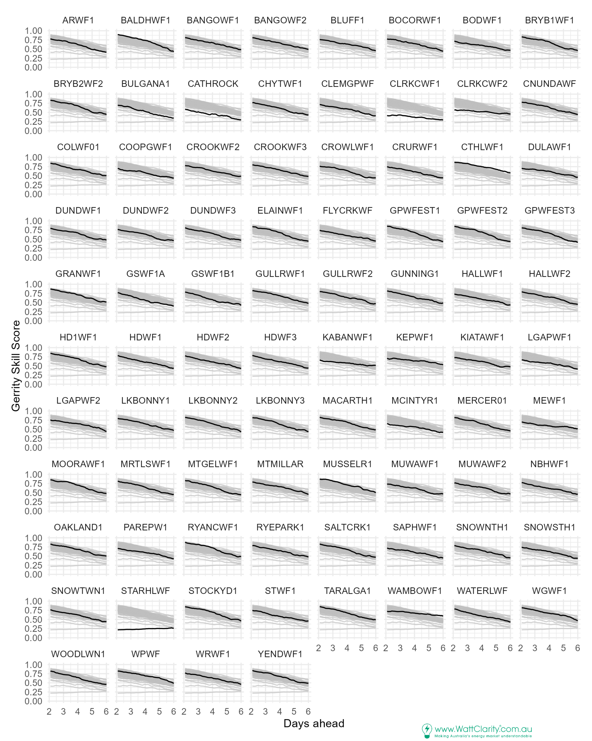
We can visually spot a tight cluster of background lines indicating where the majority of unit scores sit. The solid line represents the scores for the labelled unit.
Some outliers such as Clark Creek wind farms 1&2 (CLRKCWF1, CLRKCWF2) sit towards the lower side of skill, relative to the rest.
Starfish Hill (STARHLWF) is a standout with very low skill regardless of the outlook distance – a case of predominately forecasting in the Mid range in all outlook distances.
Bald Hill (BALDHWF1) and Musselroe (MUSSELR1) are two that sit at the top, relative to the rest.
We observe skill takes a downturn soon after the 4 day mark for Bald Hill.
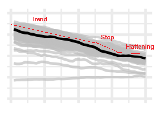
This 4-day turning point appears in the series for many units, suggesting that there is a step change in certainty around windy / not windy / in between for outlooks more than about 4 days ahead.
The downturn after the 4-day mark is labelled as “step” in this example, from Dundonnell 3 (DUNDWF3):
Mean squared error supports the skill score outcomes
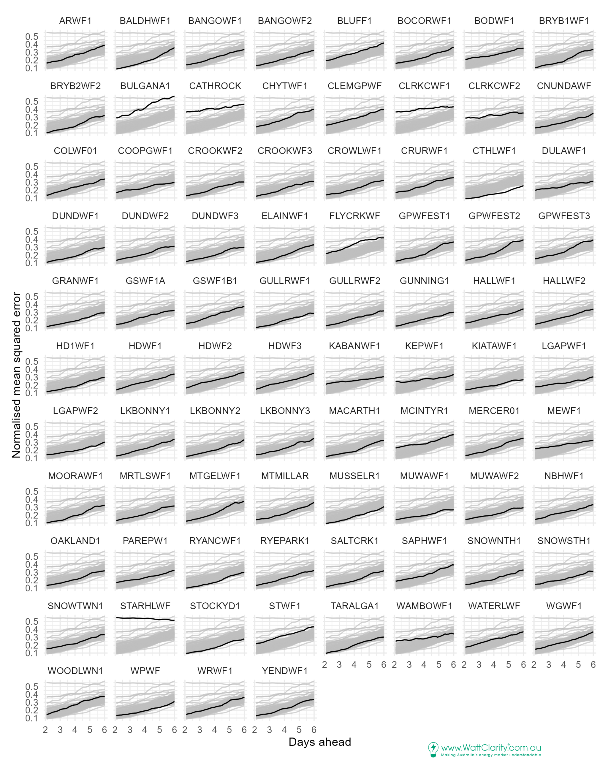
In the next chart we chart the normalised mean squared error (nmse) at the different outlook distances. With this metric lower values indicate better performance.
As seen with the skill scores, in many cases we observe a step change in nmse after the 4-day mark as the gradient of the line increases before flattening somewhat in day 6.
Contradictions?
In the previous article, we found the Clark Creek wind farms to have ‘low uncertainty’ (a measure of over prediction, as we summarised the 95th percentiles).
Our present results assessing skill suggest that, actually, the Clark Creek wind farm forecasts have low skill!
The contradiction arises in assessing overestimations at the 95th percentile only (in the previous article).
If we review the matrices for Clark Creek 1 we can see that Low and Mid forecasts are made most commonly and that high forecasts are relatively rare:
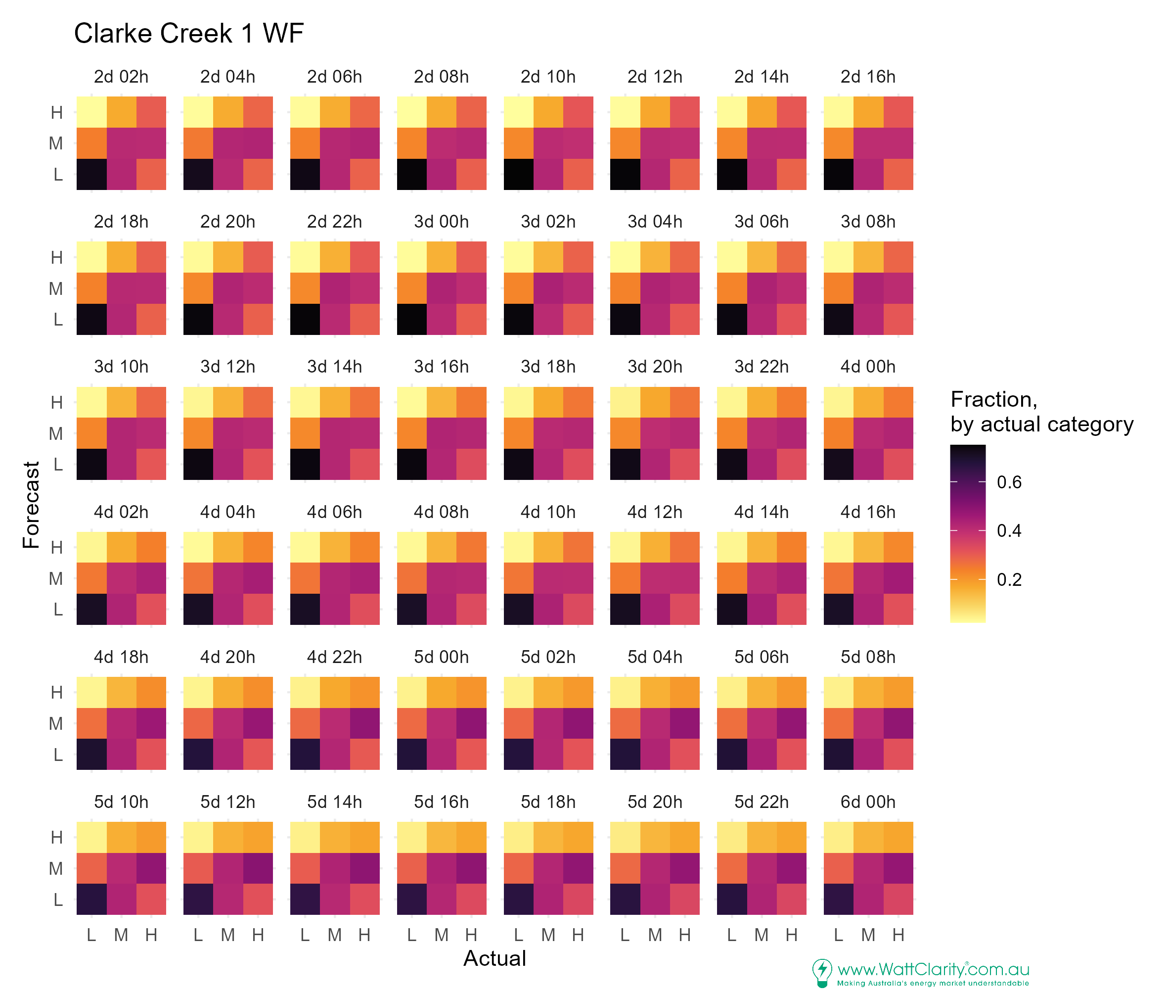
So, low overprediction uncertainty does not necessarily mean a bad forecast but it may not mean a good forecast either, if underpredictions prevalent and important.
For the PASA process, focused on when supply might be inadequate to meet demand, overpredictions are of greatest relevance to the risk of ending up with a shortfall in dispatch.
Yet underpredictions, if material in aggregate, may contribute to results indicating low of reserve conditions unnecessarily.
Mid dominates 6-day ahead forecasts?
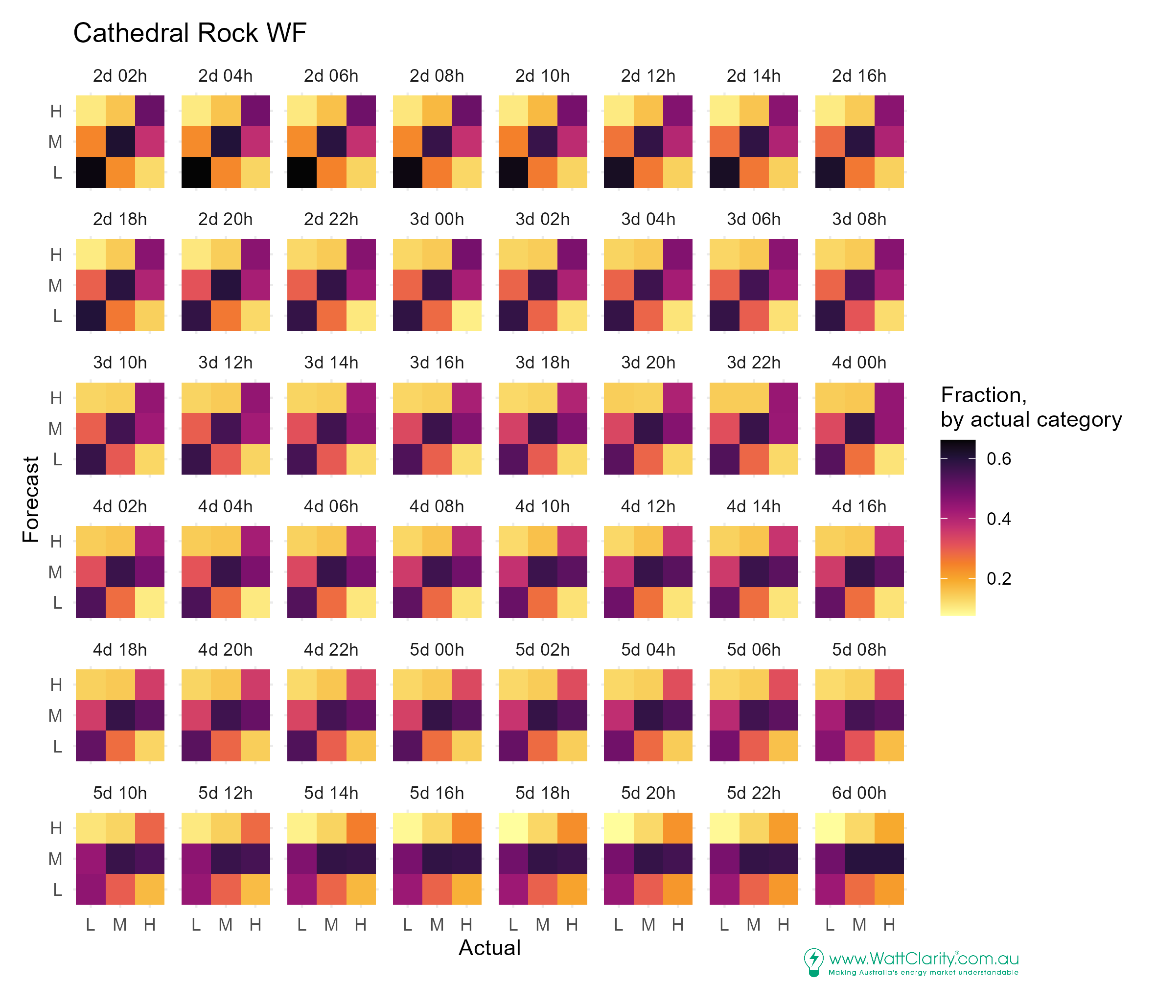
Inspecting Cathedral Rock’s performance, we observe a strong tendency to predict in the Mid range at the 6-day ahead mark, with Low predictions making up much of the remaining predictions. This would presumably lead to higher occurrence of under predictions (impacting 95th percentile forecast error analysis).
Near-term outlooks are good for Low and Mid categories (darker cells). Accuracy for predicting High wind conditions is weak, with a tendency to underestimate.
Conclusions
Wind availability forecasts, when grouped into Low-Mid-High buckets, have greater skill as the outlook gets shorter.
The trend for declining skill as outlook increases is fairly linear.
It is supported by an equivalent trend in normalised mean square error.
We find a notable step-change in improvement at around the 4-day mark.
Encouragingly, outlooks at the 6-day mark generally still have better skill than random – for the three categories we tested.
Forecasts that rarely overpredict availability (or do it to a low magnitude) may still have poor skill and poor overall performance if they have a tendency to persistently underestimate availability.

Is your NMSE normalised to nameplate rating? I.e. a 100MW unit with 0.2 NMSE has an average 20MW error in its prediction. If that’s so, then anything over 0.3 is bordering unusable for estimating shortfalls. If you’re estimating 50MW, but on average it’s either 80MW or 20MW, then it’s not a very useful forecast. CLRKCWF1 being at 0.4 after just 2 days is a real problem.
I would have liked to have seen the 0-2 day numbers, even though it would be crowded.
Most of them “stay in their lane”. MEWF1 is an outlier as it starts in the upper band of poor predictions, but after 6 days is in the lower band of better predictions. Nearby KABANWF1 does the same thing. Both are low on your first “figure of thirds”, so they’re wind farms that spend 60% of their time below 40% capacity. If they’re below 40% most of the time, then predicting the output within 33% after 6 days is easy. WAMBOWF1 also fits this, but MCINTYR1 does not, even though it’s also a “consistently low” unit.
Excellent point about overestimates being more problematic than underestimates. An underestimate results in a little gas be used when it wasn’t needed. An overestimate could result in load shedding. Maybe it’s better to plot both average underestimate and average overestimate.
Could you pick 3 wind farms with high, low, and typical predictability. Make a plot with y-axis showing error in estimate from -60% to 60% nameplate, and x-axis showing days ahead forecast. Average overestimate (estimate – actual > 0) will of course curve upwards (because we’re only averaging positive numbers) and average underestimate (estimate – actual < 0) curves downwards in the negative axis. Plotting every 6-day forecast would get too garbled, so ideally a colour density plot of how often the error in the estimate is at that point. More red area below the x-azis in the density plot would indicate systematic underestimate.
Hi Mark – Thanks fore the comments. The nmse is the mse normalised with the mean square of the actuals. Would love to dig into this further, along the lines you suggest… when time permits!