Last Tuesday 23rd April 2024 I spoke with an audience organised by BofA Securities with respect to ‘Risk, Uncertainty and Volatility in the energy transition’.
That presentation drew from a series of analytical and statistical reports – WattClarity® Deeper Insights – that we’ve been developing as a joint effort between our team at Global-Roam Pty Ltd, and the team at Greenview Strategic Consulting. These cover Analysis and Statistics:
ANALYSIS = The GenInsights21 report, which has led into the GenInsights Quarterly Updates series; and also
STATISTICS = The GSD2023, now the 5th in this annual series of (unit-centric) Statistical Digest.
Background
With an investment-minded audience, it’s understandable that the interest was on price patterns (something we’ve done for a number of successive Q2 periods) and volatility.
1) This pricing variability is driven by a number of factors, including increased uncertainty and risk.
2) Hence it was logical for the presentation to look at several aspects of variability and risk.
A good illustration of one of the drivers to the increased price variability we’re seeing in the NEM these days, is our well used coloured stack of bids for ENERGY from all suppliers, NEM-wide, using three primary colours. Indeed, we’ve seen this before, on several occasions ….
For more than 10 years …
For many years, the ‘Bids & Offers’ widget in ez2view used a ‘Default Price Bucket’ that utilises a bid buckets that use three primary colours. You’ll find many articles here on WattClarity utilising that widget … some of them tagged here.
However it was not until our GRC2018 that we reviewed, and published, a review of bidding behaviour that was both:
(a) long run (back to the start of the NEM); and also
(b) NEM-wide …
Trended bids, to 31st December 2018
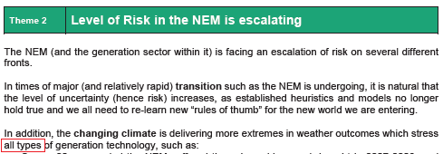
In our GRC2018 we analysed data from 1st January 1999 to 31st December 2018. As Theme 2 within Part 2 of that report, we wrote about how the “The level of Risk in the NEM is escalating”.

As part of illustration of that risk, we illustrated:
1) the declining percentage of energy volume bid in the traditional short-run marginal cost bid bands (i.e. above $0/MWh up to the $300/MWh ASX cap trigger price), which we coloured in green …
2) compared to both:
(a) the blue bids ($0/MWh and below) and
(b) the pink/red bids (above $300/MWh up to the Market Price Cap).
That particular representation of emerging risk:
1) Was copied out into this ‘Longer-term trends of low (and high) dispatch prices…’ article on 30th August 2019; and
2) We referenced Theme 2 within the GRC2018 also with respect to pricing patterns for 2022 Q2 in this article on 6th July 2022.
That revelation in the GRC2018 resonated with a number of people, including journalists such as:
1) In RenewEconomy on 31st May 2019 (the day of release), Giles Parkinson wrote ‘Energy transition has only just begun, but solar has already changed the game’ and referenced this review of bids:
‘It notes also how the generators have responded to “manage risk” (some might say to game the market), with a change in bidding patterns. This is particularly seen in the amount of capacity that is now bid at the high end of the market, an observation shared by AEMO’s recent quarterly reports.’
2) On the ABC on 31st May 2019, Stephen Letts wrote ‘National Electricity Market lacks ‘holistic thinking’ and risks ‘failing to keep the lights on’’, and referenced this representation of bidding behaviour as follows:
‘Supply is being more geographically dispersed, transmission stretched and pricing policies are not helping in designing the most efficient and reliable system.
Changes in ‘bid patterns’ for power are seeing an increasing volatility and a concentration of either extremely low (below $0/MWh) or high (above $300/MWh) prices.
Occasionally “cheap” power may sound good for consumers, but they are bids from price-takers who find it either cheaper to keep plants going, or are happy enough to take whatever price is going — but average prices across the curve keep creeping up.’
3) Later in the AFR, as noted in this WattClarity article on 9th August 2019.
Updated trend of bids, to 31st December 2020
In January 2021, we wrote the article ‘Prior to the wider release of the GSD2020 … here’s a 10-year trend of bidding behaviour’ utilising the same bid band colours NEM-wide.
Updated trend of bids, to 30th September 2021
In the follow-on analysis in our GenInsights21 report, we used a data cut-off as 30th September 2021 to allow us to complete the analysis before the end of the calendar year (and we only just made it).
1) In the 2nd section of that ~500-page report, we updated the trend of bids across all units for the ENERGY commodity to that date:
(a) Broken down into monthly volumes, to provide more detail than the annual stats in the same format chart in the earlier GRC2018;
(b) We also included similar views for each of the 8 x FCAS commodities that existed at that time as well.
2) I’m not sure we copied that into any WattClarity articles … however following the release of this report, a number of commentators shared their views about this report. In ‘David Leitch’s review of GenInsights21’ on 23rd December 2021, David wrote the following:
‘A great example in Section 2 that demonstrates the strengths which GR and GVSC bring to GenInsights21 is the analysis of bid bands over the history of the NEM. This is a wonderful chart that few other organisations have the capacity to produce.
At a glance one can see the total history of the NEM, the increasing proportion of very low bids and the increasing proportion of very high bids and the falling proportion of bids in the middle. At the same time there is the total volume produced, by the “Operational sector” almost unchanged in a decade. It is up to each reader to use that “information” to tell the story as they see it – but there the story is, laid out in technicolour for all to see.’
Since that time…
Following on from GenInsights21 we have been producing quarterly editions of GenInsights Quarterly Updates series …
… but those updates has not included updates to that particular representation.
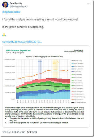
In the years since that red-green-blue representation of bid bands was initially published, there’s been a steady stream of people asking whether the trend has been continuing. Here’s just one example of the question (one received more relatively recently, and which I remembered to save at the time for a future article such as this one):
We’ve been aware of these requests, just have not found time to re-run the numbers until this point.
Aggregated trend of bids, to 31st December 2023
The trigger of the BofA presentation was a catalyst to updating the numbers through until 31st December 2023 – aligned with both the GSD2023 and also GenInsights Quarterly Update for 2023 Q4.
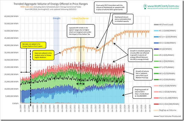
Here’s an update of the same trend – just on a monthly basis, rather than the annual basis used in the GRC2018 all those years ago:
It’s a bit busier (being monthly) but if we look past the monthly fluctuations in bid volumes, the changing pattern of bidding is still clearly visible … however in a glance here it does not appear that the volume of bids in green continues to increasingly diminished. We’ll look more below.
Also noted on this chart is the increasingly apparent divergence of the two data series:
1) The rise, and rise, of ‘Registered Capacity as Volume’ (i.e. assuming 100% Availability – and notwithstanding the hidden complexities of choosing which measure to use for Installed Capacity).
2) Which is running away from the (fairly flat) level of Aggregate Volume bid into the market at any price.
This is just one illustration of the declining level of aggregate availability across the generation mix in the NEM … which is primarily a reflection of the increasing installed base of energy-constrained plant (i.e. VRE). We can see this below, with aggregate level of availability dropping from 70% down below 55% over the last ~5 years.
Updated ratios, to 31st December 2023
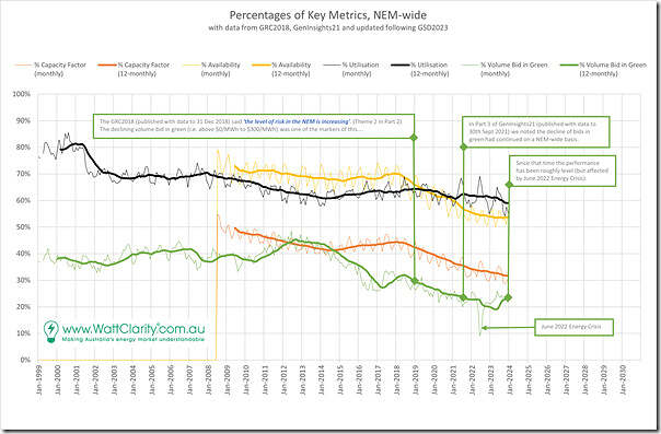
To assist readers, we’ve also updated the NEM-wide ratios used in GenInsights21 on a NEM-wide basis:
Readers in the context of this article will be most interested in the green trend, which is ‘percentage Volume Bid in Green’. We can see that:
1) The ratio for many early years of NEM history was around 40%
2) It rose slightly through the ‘oversupplied’ years (2012-2015)
3) Before dropping to a low point reported in the GRC2018 (i.e. at about 30%) at the end of 2018;
4) The decline continued to a point (low 20’s%) for GenInsights21.
5) There was a further decline related to the 2022 Energy Crisis (and particularly to do with conserving scarce fuel supplies as discussed here … whether that was scarce coal, gas or battery charge),
6) But that trend has largely recovered now to the same point reported for GenInsights21 (i.e. low 20’s as a percent).
As noted before, with the ratio at such a low level, under certain circumstances it would take less of a event, whatever* that was, to have prices jump markedly (or drop sharply) from below zero to above the $300/MWh cap price.
* that contingency event might be some sort of transmission outage (of which we might be seeing an increasing number?), or a major generator trip … or even as simple as a large cloud mass passing over a major population center and dampening rooftop PV.
That’s one measure of the increasing level of risk in the NEM.


Fascinating article, thanks. As a retired engineer, now an outsider to the industry, I very much appreciate this free (to me) trusted communication.
I note the increasing scale of BTM energy, combined with talk of future industrial BTM generation for larger users. Does this tend to move supply from the green zone to “off the picture”? Maybe plot the estimated BTM generation as energy on the first chart, though that is already cluttered.
I don’t think we can assume that the shrinking quantity of bids in the 0-$300/MWh range necessarily increases reliability risks in the NEM. It would do so under the condition that “everything else remains equal” but this isn’t the case here.
There is a reducing quantity of generation priced in the market according to the variable cost of fuel in the price range 0-$300/MWh and this has occurred because we have added VRE priced at zero (or lower) and storage priced according to opportunity cost. These new resources tend to hold a good share of their bid quantities outside the normal price range and yet prices still tend to land within it. If anything, prices outside this normal range are much more likely to be below than above it.
More research is needed to understand bidding dynamics but outcomes suggest bid quantities are being shifted between bid prices above $300/MWh and below zero to achieve this outcome. If rebidding is occurring frequently (every five min for some resources) then even sudden and unexpected shocks might be corrected rapidly (ie in the next 5-min interval).
Thanks GregW
Apologies if what I wrote was not clear, but I was not focusing (just) on ‘reliability risk’ when writing this article.
The much broader pattern of prices in the NEM these days (which was happening anyway, but was also bumped along by 5MS) leads into different types of risk – including commercial risks for a range of different participant.
You mention storage in particular, but that’s only a small percentage of the volume of energy offered in bidding. There are also other reasons why bid prices have changed for a variety of different assets.
Paul
Hello, and thank you for this information.
Regarding the black line marked “total volume produced” on the “Trended Aggregate Volume…” graph, is that the total energy that was actually delivered after bidding?
Thank you.
Great update. My observation is that the green band reduction must be constrained by the number of baseload units available. As more coal units are retired, less volume can be bid $0-300.
This exposes the truth in the idea that ‘cheap’ renewables displace the most expensive generators in the bid stack ie merit order effect.
What’s actually happening is the mid-merit baseload (coal) is being forced out.
The evolution of this trend means the end of baseload generation and much higher system costs.
Clearly more government intervention is required – either to force more floor price generation into the market, or force more baseload.
I’m voting for baseload.