I mentioned yesterday in this article that we’d given an Executive Briefing to a subscriber for GenInsights Q3 2022 (released on Monday). Prior to the session starting, in a conversation with an early attendee I made the comment that wind production was low at the time – and they asked me to send through some information. Rather than just doing that one-on-one, I thought it might be more broadly useful to share the following two images with our WattClarity readers.
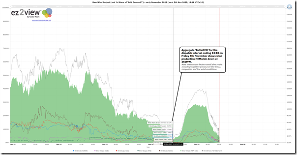
The first image is from our ez2view software (though similar functionality also available in the NEMreview software to a reduced extent) showing the trend of aggregate wind production across the NEM over the past few days:
As noted on the image, after a solid block of production over the preceding days (sometimes above 5,000MW, so still quite a way below the current record) there were a number of hours through daylight hours Monday where the aggregate wind production slumped. At the 13:10 dispatch interval, for instance, the aggregate Initial MW was down at 250MW …
1) i.e. metered output at 13:05 of all Wind Farms across the NEM
2) representing 1.5% of ‘Grid Energy’ supplied from all sources AEMO can see on the grid at this point in time.
(A) Reasons why wind production might be low
Readers need to remember that there are several reasons why a wind farm might be producing low output – including three big ones:
Reason #1) It might be wind farms are commercially curtailed due to negative prices; or
Reason #2) It might be that wind farms are being ‘constrained down’ due to network constraints; or
Reason #3) It might actually be that there are low wind conditions.
Using a process of elimination it turns out that conditions yesterday appear to have been completely due to low wind conditions (i.e. low wind conditions). Let’s quickly explain with a couple snapshots from the installed ez2view software…
(A1) Prices were positive
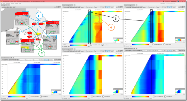
Time-travelling back to the 13:05 dispatch interval to show ‘end of interval’ values for output, we have a window containing the ‘NEM Map’ widget and 5 x ‘Forecast Convergence’ widgets, each showing Wind UIGF* for different regions:
* UIGF = Unconstrained Intermittent Generation Forecast
Annotations show that:
1) Prices are positive everywhere, meaning no commercial incentive to avoid generation;
2) Of the 250MW production NEMwide, more than half comes from QLD at this time…
… which again reinforces the drive to geographical study such as we explored in Appendix 27 of GenInsights21 (and the reason why I’m keen to get stuck into reading this Griffith study).
3) In each of the ‘Forecast Convergence’ widgets, we ‘look up a vertical’ to see that the forecast was consistently in blue in four regions (lighter blue for QLD).
4) Though there does seem to be patches of 4-6 hours in horizontal swipes in all regions where the forecasts appeared to change noticeably for reasons* I’m not aware of.
* perhaps one of our Meteorologist readers can help understand how the weather forecasts might have been changing like this?
(A2) Not much in the way of congestion
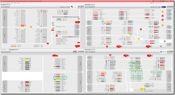
The second window from the installed ez2view software loads up four different regional schematics to indicate that some wind farms were on the LHS of bound constraints … so could potentially have been ‘constrained down’:
I’ve highlighted the ones I saw in a quick scan in NSW and TAS (note that Victoria is obscured in this instance as there was no congestion affecting any units in VIC at this time).
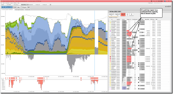
Of the ones in NSW, it’s the currently topical ‘N::N_UTRV_2’ constraint equation that is bound affecting most of the ones in NSW … so I opened up the new ‘Constraint Dashboard’ widget to have a quick look:
The lack of any visible pink/red in the ‘Target/Actual’ column for any of the wind farms in the list reveals that none of those Wind Farms were the ones being ‘constrained down’ by this constraint equation – instead, the pain is being felt by some Solar Farms and UPPTUMUT.
(A3) Poor wind conditions is the primary cause
So we conclude that (on this occasion) it was poor wind conditions that drove the low aggregate production from Wind Farms.
(B) This only looks at wind, not solar production
This stat, of course, does not consider what was happening with solar production at the same point in time. Refer to the images above to see how much production was coming from Large Solar farms across the NEM.


So we have over 8GW of installed wind capacity across the entire eastern seaboard but we can see total output drop to just 250MW and stay low for quite some time.
This seems to fly in the face of the assjmptions that adding more wind farms will increase the minimum ouput during a wind drought
Not necessarily, because new wind turbines perform much better in low winds than older designs, however it is true to say that even with five times as much wind capacity and better turbine designs and wider distribution eg offshore and eastern Victoria, minimum wind output at the time would probably have been only about 2 GW, however as is hinted at in the article if the NEM has 4 times as much solar which is pretty much certain, solar would have supplied between 120 and 200% of the demand between 7:30 and 4:30
Hello Peter,
It seems to me that solar is the way to go, and forget wind. Things that move are much harder to look after and much more costly.
At best the capability for solar is 12 hours, often much less.
Solar can only work in conjunction with significant storage which ends up being way more expensive than thermal plant generation.
Hello V,
Thermal Plant generation is not allowed out in time, it must be from what is deemed Renewable energy. Solar and Bats or solar, bats, and hydro or Solar,bat,hydro, and hydrogen. Is what will end up as the used power supply. Wind just has too much maintaining. There is also Nuke, but too many don’t like it