Shortly after the event (which occurred at 09:45 on Tuesday 13th October 2020) I posted this Part 1 of a progressively developed Case Study, alerting our readers to the price spike up to $15,000/MWh that had occurred out of the blue on the day.
That article, like the event itself, attracted considerable comment in various forums – including direct feedback to me from a number of readers.
The next day I managed to post this Part 2 in the Case Study which highlighted my hypothesis at the time:
In response to this second one, there were some interesting comments here on LinkedIn, and more might also be added here on Twitter. Several well-placed sources that I trust confirmed that this was the general sequence of events.
Today – after finding a bit more free time to dig more, and to document in this article – I’m able to publish this, more expansive, Part 3 in the Case Study exploring a range of interesting machinations that I observed in the process of reviewing the data and feedback.
As always, keen on your feedback (leave a comment below, or contact me directly).
Finally, there are a couple other areas I would like to explore, which will lead (if time permits) to Part 4 and Part 5.
(A) Why these Case Studies?
This is not the first Case Study we’ve prepared on WattClarity. Indeed, it’s a deliberate focus of what we do – taking interesting events and unpicking them (using our software like ez2view where we can) to see what we can see.
(A1) Stretching our (software) capabilities
Part of the reason I have invested so much time in this progressively developed Case Study is because these types of incidents are quite informative in helping us understand how our software can continue be improved, in order to make complex events more clearly and quickly understandable than they would otherwise be.
We’ve come a long way in the 10+ continuous years we’ve been investing a large amount of time and money into the ez2view software – but events like this help to remind us that we have a long way still left to go to ensure if delivers everything that we want it to.
Let us know if you know of others who can help us with that!
In this sense, what happened Tuesday (whilst quite complex and not completely visible in real time – not to mention expensive for some participants!), is proving a goldmine of information for us to wade through…
(A2) Of value to readers of WattClarity®
Keeping in mind that it’s the above objective that is the primary driver (so sometimes helps to shape the priorities we assign to different pieces of analysis we could pursue) we hope that the insights shared freely here on WattClarity will be of interest to our readers.
Please do feel free to point out where you think we have made mistakes, or misinterpretations.
(A3) Food for thought for ‘Deeper Insights’ Publications
On 31st May 2019 we released our Generator Report Card 2018 , developed in conjunction with GVSC and with the help of others, following an extensive period of preparation. That 530-page report was very well received across a broad swathe of the National Electricity Market, and many requests have been made for us to continue delivering value like this with periodic updates.
We’re contemplating a Generator Report Card 2020 update.
Hitting ‘pause’ on some other projects to allow enough time to prepare these Case Studies also helps us (including with reflection on the comments and feedback we receive) to think through areas worth deeper analysis and thinking in a focused way through something like the GRC2020.
(B) Illustrated sequence of events
The hypothesis I developed day after the spike (Wed 14th Oct), following an initial look at private data that had not been visible in real time, was that constraint set ‘Q-BCNE_821’ (holding 13 constraint equations) bound unexpectedly at 09:45 which imposed a rapid ramp down to 0MW dispatch target on 9 solar farms. This collective reduction in targets was one of the prime causes of the price jumping.
Let’s piece together a sequence of events in words-and-pictures below:
(B1) Sharp solar reductions, and price spike at 09:45
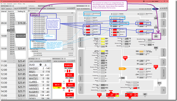
Here’s a view of this particular dispatch interval in a window of ez2view Time-Travelled to 09:45 on Tuesday 13th October, now benefiting from the added data only released after 04:00 the day after:
(click on the image for a larger view)
————
With particular reference to the ‘QLD Schematic’ widget on the right-hand side of the window, power stations in Queensland for which AEMO publishes data are arranged in a total of 11 sub-regional Zones that are defined by Powerlink (commonly used in their Annual Planning Statement, for instance).
1) On the image above we also see near real time metered flow data for cut-sets between these zones, as metered by Powerlink and delivered through to ez2view clients who have licensed access to this data from Powerlink
2) This data set of flows goes with the zonal demand data, also from Powerlink, used to piece together this hypothesis on Wednesday, about what happened on Tuesday
3) These ‘Qdata’ zones are somewhat different to the the Renewable Energy Zones used in the AEMO’s ISP, for instance – they are designed to reflect common areas of transmission congestion, moreso than resource availability areas for renewable development.
4) Please get in touch if you would like to know more about this optional extra in ez2view.
————
With this background in mind we can make the following observations:
Observation 1) That constraint set ‘Q-BCNE_821’ held 13 constraint equations:
1a) each of these equations individually affects a single DUID station in northern QLD
1b) these (11 solar farms and Mount Emerald Wind Farm) are highlighted in blue on the QLD Schematic above.
1c) the form of this System Strength constraint is more complex than the ones used in South Australia as the way in which they affect the output of each plant is specific to the plant under various circumstances. What this means is that there needs to be 13 constraint equations, not just 1 (as is the case in South Australia).
1d) Unfortunately (i.e. because it is one-DUID-per-Constraint-Equation) the AEMO sees these as Private in real time, so the fact that they were binding was not visible on Tuesday (note no ‘+’ symbols on the units in the ez2view snapshot included in Tuesday’s article). Whilst I understand why this is done, it’s still a shame in terms of market transparency and understandability.
1e) Keep in mind that this constraint set had been invoked because of a Transmission Outage on Powerlink’s 275kV feeder between Bouldercombe (i.e. Central-West zone) to Nebo (i.e. North zone).
i. This outage started on 6th October and was (at that time) scheduled to run until 14:45 on Friday 16th October.
ii. Outage concluded yesterday, as per schedule.
Observation 2) As per Wednesday’s hypothesis, which a couple others have since independently verified in general terms:
2a) Aggregate grid demand in ‘North + Ross + Far North’ dropped below 650MW, which was a trigger point on the RHS of the individual constraints
2b) As a result of which, the 12 x units in the constraint set were all ‘constrained down’ rapidly to 0MW.
2c) Note that this really only affected 9 x units (all solar farms) as:
i. Mount Emerald Wind Farm had already been ‘constrained down’ to 0MW from 05:50 as a result of the separate Q_NIL_STRGTH_MEWF constraint equation in the Q_NIL (i.e. ‘System Normal’ constraint set).
ii. Likewise for Haughton Solar Farm via Q_NIL_STRGTH_HAUSF constraint equation in the Q_NIL (i.e. ‘System Normal’ constraint set).
iii. Likewise for Sun Metals Solar Farm via Q_NIL_STRGTH_SMSF constraint equation in the Q_NIL (i.e. ‘System Normal’ constraint set).
Observation 3) Focused readers will remember that (in Tuesday’s contemporaneous article) I noted that Darling Downs Solar Farm also reduced its output … making 10 Solar Farms in total.
3a) However it is now apparent (the reduction at DDSF1 was unrelated to the ‘Q-BCNE_821’ constraint set).
3b) We might explore further about why the coincidence with Darling Downs Solar Farm when we progress into Part 4 of this Case Study (in which I’d like to look at each Station individually).
Remember that ez2view v7.4.5.655 and above show ‘end-of-interval’ FinalMW values for unit output when in Time-Travel mode (these obviously can’t be available within the current dispatch interval in real time mode). Hence the snapshot above shows the reductions in solar output at the end of the period that happened coincident with the price spiking … because the reduced target was part of the NEMDE Dispatch Run.
(B2) Northern Queensland (approx the size of South Australia) gets close to ‘fully supplied by solar’ coincident with SA?
In Part 2 of this Case Study, we established that aggregate consumption supplied off the Powerlink grid across the North zone, the Ross zone (i.e. Townsville) and the Far North zone (i.e. Cairns) was approximately 650MW, which we can see was roughly equal to the amount of Large Solar that was rejected at the time.
Much has been made, recently – including by AEMO here – of how ‘Solar power fuels South Australia’s total energy demand in global first’ with respect to Sunday 11th October.
Whilst it’s easier for more people to see in South Australia (being a contiguous region), I think the numbers above show that northern QLD, which is roughly the size of South Australia, came very close to hitting the same mark on Tuesday 13th October . See in the snapshot above that only Pioneer (biomass) and Moranbah North (coal mine waste gas) are the only non-solar plant visible to AEMO operating in the north.
Observation 4) The numbers might line up that the small drop in demand in the North zone (for unknown reasons) both:
4a) Meant that the small import from Central-West to North was reduced to zero; but
4b) Which meant that, for an short space in time, the northern QLD grid was being supplied just by non-synchronous solar (both Large Solar, shown in the schematic above, and Rooftop PV); but
4c) The current form of the System Strength constraints suggests a recognition that that particular grid situation is inherently unstable – hence the curtailment of solar PV to enable import of synchronous power from central Queensland;
4d) Unfortunately, because of the hard ramp on the constraints at the time* this meant hitting the park brake when coasting down the hill, which led (amongst other things) to the price spiking to the Market Price Cap.
Observation 5) It’s events like this in the grid that make this article on 7th October from Powerlink ‘Powerlink secures Australian-first system strength support model’ particularly relevant.
Those with a licence can keep an eye on this asset here in the Asset Catalog for further information collated by us and our clients in relation to the asset.
(B3) Into the 09:50 dispatch interval, the flow to North Zone rapidly ramps up
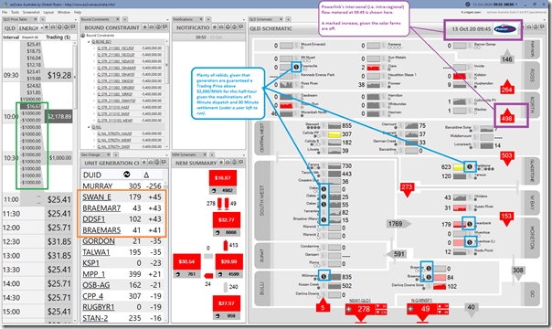
This snapshot of the 09:50 dispatch interval shows that the flows across the QLD grid had changed markedly:
From this snapshot, we can glean:
Observation 6) Pay particular attention to the increased flow from Central-West zone to North zone (i.e. now 498MW metered by Powerlink at 09:45).
Observation 7) With respect to price outcomes:
7a) See that the ENERGY price in QLD has settled back to ‘normal’ levels.
7b) So has the FCAS Contingency (Raise 6 second) price which had spiked at 09:45 as noted in Part 1 on the day.
7c) It’s understandable, given that the Trading Price for half-hour ending 10:00 is guaranteed to be above $2,000/MWh because of the maths behind 5 minute dispatch and 30-minute settlement (under year left to run), that the price forecast is for negative prices in the subsequent 2 dispatch intervals.
7d) In Part 4 of this Case Study (to come), I’m endeavouring to look individually at each DUID to see how each of them responded to see what we can learn.
Observation 8) We can see that, by the time AEMO calculated the dispatch run for 09:50 there were a number of units who had rebid:
8a) These are shown as ‘$’ symbols on the schematic.
8b) We’ll delve into them in Part 4.
Observation 9) I’ve highlighted 4 units in QLD that had big ramps in output – 3 gas-fired plant and also DDSF1 (which presumably had recovered from the cloud cover or whatever had affected it in the prior Dispatch Interval).
(B4) The 09:55 dispatch interval sees the price drop to –$1,000/MWh
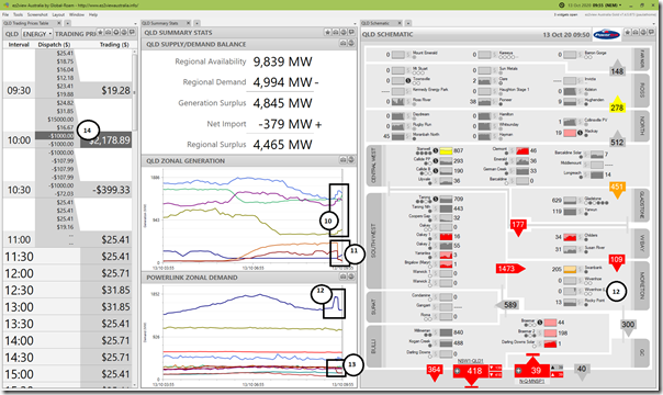
For the 09:55 we show a different widget combination:
From this snapshot, we can glean:
Observation 10) In the ‘QLD zonal generation’ charts (aggregating AEMO data) we see some zones in central and southern QLD increase their output to supply the north.
Observation 11) We also see the northern zones reduce aggregate supply, with solar ‘constrained down’.
Observation 12) We see the short blip in consumption of Wivenhoe pumping (which increased aggregate consumption in the Moreton zone) which was unfortunately timed with … and contributed to … the price spike. More on this in Part 4.
Observation 13) We see the effect of curtailment of spot-exposed energy user(s) in the Ross zone at the time of the price spike … as noted in Part 2, this load remained offline well beyond this trading period.
Observation 14) We also see that the dispatch price did hit –$1,000/MWh in the 09:55 dispatch interval… as had been forecast in P5 predispatch at 09:50.
Observation 15) We also see other rebids at other stations … taking effect 5 minutes later than the ones above (but maybe only submitted slightly later than the ones above, missing cut-off for 09:50 – will look in Part 4).
(B5) The 10:00 dispatch interval sees the price remain at –$1,000/MWh
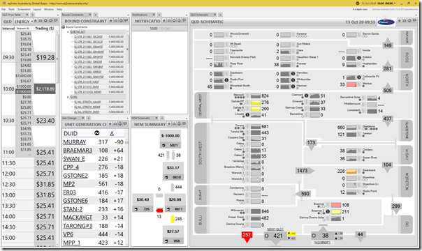
Finally, here’s a snapshot for 10:00, the last dispatch interval in the trading period:
There’s no annotations added here, but a couple extra observations:
Observation 16) The dispatch price here also stayed down … as could be expected due to the 5/30 issue.
Observation 17) Still more rebids rolling in as generators (presumably) try to maximise production for a good price.
(C) Out of the blue?
The price spike, and coincident drop in aggregate supply across numerous solar farms, certainly came as a surprise for me on Tuesday, especially given I was focused on other things and only had my attention dragged back to real-time by the alerting triggered by our software. I wondered, in hindsight, if it could have been predicted in advance?
(C1) Not forecast in predispatch ahead of time
With the power of the ‘Forecast Convergence’ widget in ez2view, operating in conjunction with ‘Time Travel’ we can wind back a window to a historical dispatch interval to see what AEMO had been forecasting (via predispatch, and even via PASA) prior to that time.
(C1a) Price Spike not forecast in advance
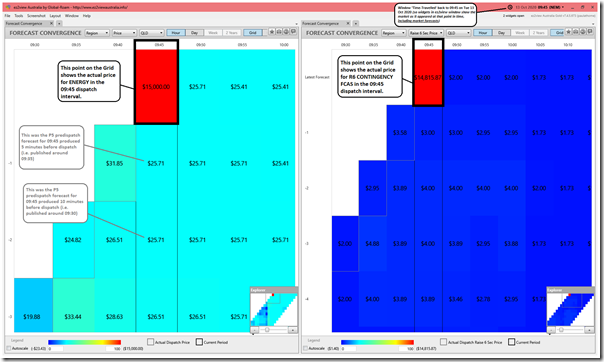
Time-travelling this window (containing two separate Forecast Convergence widgets) to the 09:45 dispatch interval we see what the AEMO had previously been forecasting:
We can see the following:
Observation 18) Using the thermally-based colour-coding in this widget, we see the price spikes did literally jump ‘out of the blue’:
18a) The widget on the left shows how the spike in ENERGY price was not previously forecast in P5 predispatch.
18b) The widget on the right shows that the (coincident) spike in price for CONTINGENCY 6SEC RAISE was also not previously forecast in P5 predispatch.
———
A gentle reminder to those who are not so familiar with the way in which the NEM works (some refreshers here) in that:
1) Predispatch prices are not firm offers to purchase (or sell) energy;
2) They are not intended in that way, but rather as a feedback mechanism to help the market respond to forecast shortage, or surplus;
3) This role is critical to the properly functioning market, given supply and demand must always been in balance or the system becomes unstable;
4) Because this is the purpose, it would be incorrect to think of forecast prices being different from what transpired as ‘errors’.
———
(C1b) Unforecast Drop in Aggregate Large-Scale output across 9 x Solar Farms
There were, in total, 11 different Large Solar Farm DUIDs that were affected by the individual constraint equations bundled into the ‘Q-BCNE_821’ constraint set (and also the Mount Emerald Wind Farm in Far North Queensland) as seen in the snapshot from 09:45 above.
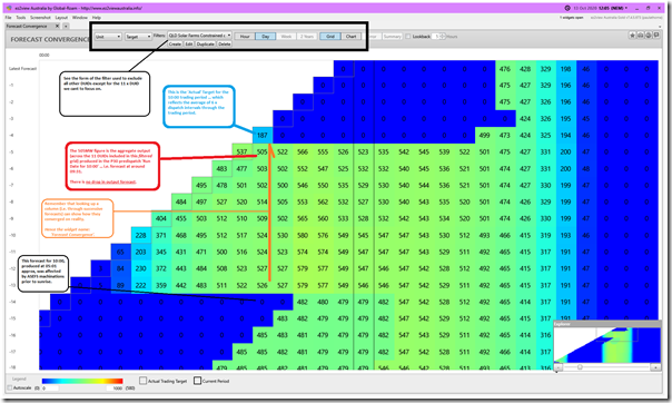
Opening another ‘Forecast Convergence’ widget in a different window and Time-Travelling forwards to 12:05 (i.e. more than 2 hours past the curtailment and price spike) we see an interesting picture emerge. Unfortunately in this case, it is too soon* for AEMO to have released the ‘old’ P5 predispatch targets for generators.
Whilst this data set is marked as ‘next day public’ in the MMS Schema, for unknown reasons the AEMO does not publish until some time later in a batch process.
i. Hence we don’t currently have visibility of these forecasts on a dispatch interval basis.
ii. Pretty sure we have logged a job with AEMO at some point to get this changed, but not sure where it is at?
As such, we have to make do with the AEMO’s P30 predispatch targets, which are a little more coarse, but still useful:
We can see the following:
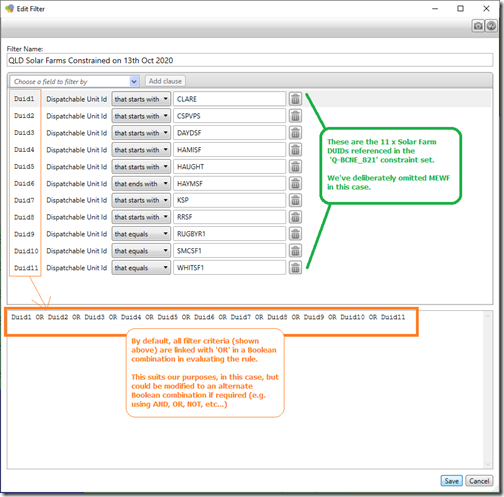
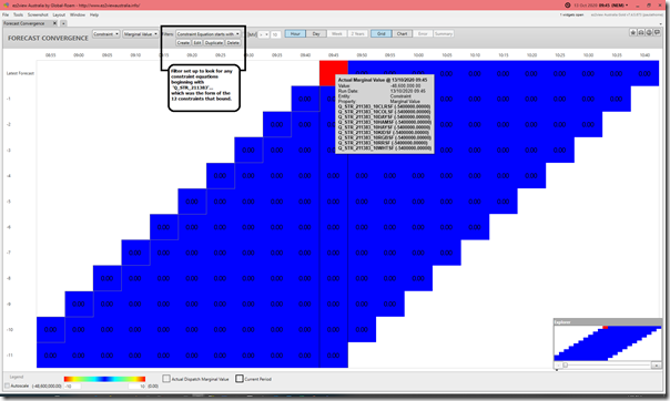
Observation 19) We’ve filtered the data being used to populate the grid using the following Boolean expression in the interface provided for in ez2view:
… which means that the grid just shows aggregate Targets for each Trading Period for the 11 x Solar Farm DUIDs specifically chosen as they were the ones affected by the ‘Q-BCNE_821’ constraint set.
Observation 20) We see the (averaged) aggregate Target for the 10:00 Trading Period had dropped to 187MW, taking account of the curtailment for 4 dispatch intervals in the trading period.
Observation 21) As seen in the cells under that one in the column in the grid, this reduction in output had not been forecast in advance by the AEMO.
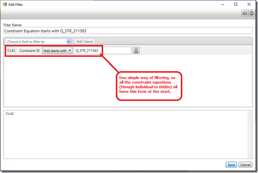
The ‘Forecast Convergence’ widget can also evaluate convergence of forecast Marginal Value for a user-configured selection of constraint equations. In this case, we define the filter simply as:
… so using this Filter and flipping back to ‘HOUR’ view (to see dispatch interval data) Time-Travelled to 09:45 we see the above:
Observation 22) This confirms that the binding of all of these constraint equations was not forecast in advance … despite the fact that we saw the aggregate grid demand supplied in the 3 x northern zones steadily declining down to the trigger level where the swamping would disappear and all 9 x plant would be curtailed suddenly.
(C2) Were there warning signs?
So the AEMO predispatch data did not provide any direct warning of looming curtailment, hence price spike. However I have been pondering the question ‘were there warning signs or leading indicators’ (mostly so we can learn how we can help our clients even further) and am coming to the view that there is more that stakeholders in the market could have done … or at least can do from now moving forwards.
(C2a) Outage-related Constraint Set ‘Q-BCNE_821’
As noted before, the outage related Constraint Set ‘Q-BCNE_821’ was invoked from Tuesday 6th October … a week previously. If time permits I will unpick this particular constraint set in more detail – but wonder if this should have been a leading indicator of potential curtailment.
(C2b) Flow Central-West to North
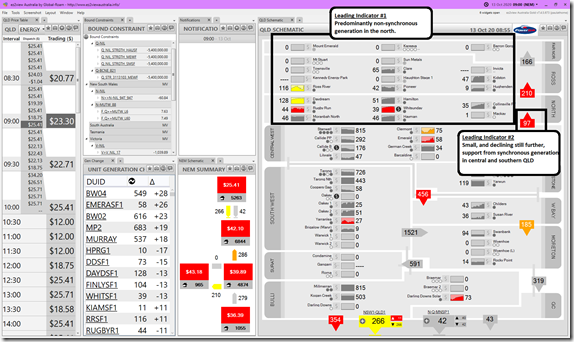
Winding back the main display to the 09:00 dispatch interval (i.e. 45 minutes prior to the spike) I want to flag two simpler leading indicators:
Observation 23) I’ve annotated the Leading Indicators as follows … especially when seen in combination:
Leading Indicator #1 = predominantly non-synchronous supply in northern Queensland.
Leading Indicator #2 = small, and declining further still, support from synchronous units in central and southern Queensland.
These are certainly two factors we’ll be keeping a closer eye on into the future…
(D) More to come still
Stay tuned for more, in Part 4 of this expanding Case Study, and maybe even a Part 5 ….


Hi Paul, thanks for another insightful case study. I’m looking forward to you unpicking the the ‘Q-BCNE_821’ constraint set. I understand why such a System Strength constraint exists, but I don’t understand why it would trigger an immediate dial down to 0MW for all solar farms. It seems to me that the constraint itself leads to the very concern that it is trying to avoid, that is the rapid loss of a significant portion of variable supply in the region. Why would the constraint not just dial back the solar output to ensure it remains below ‘reasonable’ levels?
I note your comment “Unfortunately, because of the hard ramp on the constraints at the time* this meant hitting the park brake when coasting down the hill” – but I couldn’t find whether the * meant you had some further notes about the reason for the unfortunate hard ramp?
Cheers
Mark
Did this ‘Part 5’ (follow-on) article help answer your question, Mark?
https://wattclarity.com.au/articles/2020/11/casestudy-p5-q-bcne_821/