As noted with Part 1 earlier this evening, I had been wondering whether we might experience something like this…
The 18:05 dispatch interval (captured in our NEMwatch v10 dashboard) shows the SA dispatch price up at the Market Price Cap (currently $15,000/MWh).
Note here, and also below, all times are in ‘NEM Time’ … which is Eastern Standard Time (i.e. UTC+10) so 30 minutes behind local time in South Australia at this time of year.
I noted in Part 1 that this price spike happened at the same time as Scheduled Demand is only sitting at 1651MW (very much in the ‘green zone’ in terms of the historical range that South Australia has experienced). As a number of people have noted on social media (I particularly noticed this on Twitter) ‘thankfully it’s not hot, or it would be a whole lot worse’.
(A) What’s happened this evening…
As with any situation that evolves in a complex, inter-related system like the National Electricity Market (and the grid below it) there is almost always more than one ‘cause’ for a particular outcome. Not that this stops many of us cherry picking data, and jumping to the wrong conclusions (a problem that seems particularly acute at either end of the Emotion-o-meter).
Let’s see what we can piece together in this article (which I will call Part 2). Time permitting, our treasured guest author, Allan O’Neil, might be able to follow up early next week with further details (we’ll call that ‘Part 4’, perhaps) that benefit from all three factors:
(i) A cool head on his shoulders, and loads of experience
(ii) Not so much adrenalin/tiredness flowing as is the case now as the event is still ongoing/distracting as I delve into the numbers; and
(ii) Importantly, Allan will also be able to review the Private Data (e.g. bids, rebids (including reasons), private constraints, predispatch targets and so on) not published until tomorrow morning – which should make the picture clearer, and help us answer questions I am unable to at this point…
(A1) Conditions beforehand
It’s important to understand a couple of different factors that are relevant to what happened today in the lead-up to this event:
(A1a) Heywood Repairs started Friday morning, as planned
Remember the storms that knocked over the Heywood interconnector on 31st January 2020 and islanded South Australia (and drove prices through the roof – not to mention FCAS costs that burnt a hole in many generator’s pockets).
Well, I noted on Wednesday that AusNet Services were looking to proceed with an outage starting Friday morning (i.e. this morning). They did proceed and, as noted in my article on Wednesday this would have some impact on interconnector transfer capability, amongst other things. We were hoping for calm conditions … but that’s now what actually eventuated.
(A1b) No directions issued by AEMO?
I had been half expecting to see that the AEMO would have issued directions (perhaps on Friday morning) to some synchronous units to be running through the period … but I checked this evening and did not see any directions issued (e.g. this morning). So I assume that the review of planned dispatch of gas plant on Friday evening (as at Friday morning) to be sufficient to avoid the need to do this?
Q1 for Part 4, time permitting!
(A1c) Forecast spike in price
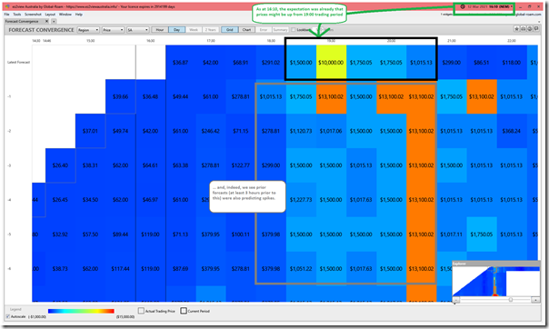
In the following image, I’ve Time-Travelled the ‘Forecast Convergence’ widget in ez2view v8 back to 16:10 to show that these price spikes certainly did not appear ‘out of the blue’!
Remember to look up a vertical (i.e. column) to see how successive forecasts developed for the same actual trading period.
(A1d) Forecast drop in Available Generation
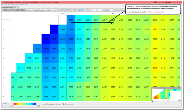
Flipping the same grid ‘Forecast Convergence’ to look at Available Generation for South Australia, we see that the AEMO forecasts were fairly consistent … about a decline in Available Generation through the evening:
(A1e) Forecast drop in Wind and Solar
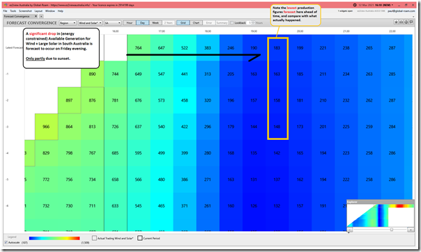
One of the reasons why the Available Generation is forecast to decline is because the AEMO forecast for (energy constrained) Available Generation for Wind and Large Solar in South Australia was also forecast to decline into the evening:
The ‘most recent’ forecast run at this time was suggesting that the contribution from Wind (with Large Solar having set) for the half-hour ending 20:00 would be 183MW, and that would be the lowest production seen that evening (barring network constraints). Keep this in mind with reference to what actually happened (below).
(A2) What’s happened this evening
This afternoon as a team (as we do each Friday), we were winding down over weekly Beer O’clock virtual catch-up on ‘wins for the week’ (some good ones there, but that’s a separate article).
Anyway, my concentration was increasingly disrupted by audible alerts triggered by one of my copies of ez2view notifying me that there was a ‘forecast price spike in South Australia above $1000’ later that evening. This was the audible version of the ‘Forecast Convergence’ view seen at 16:10 above:
1) My concentration was disrupted to the point (because of this alerts, and also some precursors) that I temporarily muted the alerts.
2) On reflection now, it was nice to see that the alert had the intended effect (i.e. prompting me to take some action!)
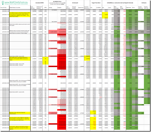
I’d not yet signed off for the day, when the first actual price spike occurred (to $1,500/MWh) at 17:55, thereafter whatever I had planned to do went out the window. In the table below I have included a little of what actually unfolded (until 23:10 at least – but note that prices have continued to remain high):
Click on the table to open a much larger (hence hopefully readable) view.
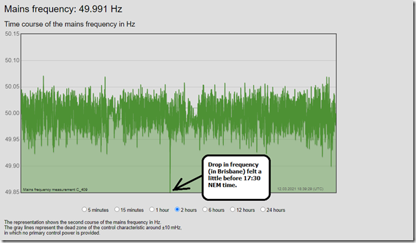
Before we get into market data directly, I wanted to add in this plot of system frequency measured in Brisbane at high speed that shows a drop in frequency we saw (down below 49.85Hz) for a very short period of time sometime before 17:30:
Q2 for Part 4) Perhaps this lines up with something to do with the incident (I am uncertain about this) but it would be worth checking with reference to the AEMO 4-second data when it’s available what was visible there around the time of the unit trip and afterwards.
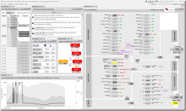
Here’s a snapshot from ez2view in the 20:05 dispatch interval (which I tweeted here) in which I’ve annotated with fuel type details for all of the South Australian region:
Details are discussed further below…
(A2a) Fire in the Torrens Island substation, trips Barker Inlet peaking plant
The immediate trigger for the prices to skyrocket was the trip of Barker Inlet, the result of a fire in the Torrens Island substation.
As noted in the table above, at 17:39:29 the AEMO published Market Notice 83251 that notified of the trip of Barkers Inlet generator tripping as a result of the fire:
——————————————————————-
MARKET NOTICE
——————————————————————-
From : AEMO
To : NEMITWEB1
Creation Date : 12/03/2021 17:39:29
——————————————————————-
Notice ID : 83251
Notice Type ID : POWER SYSTEM EVENTS
Notice Type Description : Emergency events/conditions
Issue Date : 12/03/2021
External Reference : Non-credible contingency event – SA region – 12/03/2021
——————————————————————-
Reason :
AEMO ELECTRICITY MARKET NOTICE.
Non-credible contingency event – SA region – 12/03/2021
At 1708 hrs the Torrens Island Power Station West A and West B 275 kV buses tripped. Barkers Inlet generation (88MW) also tripped.
AEMO did not instruct load shedding.
AEMO has not been advised of any disconnection of bulk electrical load.
The cause of this non credible contingency event is not known at this stage.
Manager NEM Real Time Operations
——————————————————————-
END OF REPORT
——————————————————————-
It’s important to note (in terms of the specific sequence of events) that, whilst the trip occurred in the 17:10 dispatch interval (so the drop in output was seen in the 17:15 dispatch interval) the market was not informed of the reason for another 30 minutes. Useful to keep in mind in reviewing rebidding behaviour when that data is available.
Social media is both a blessing and a curse…
(i) Social Media – possibly as a blessing
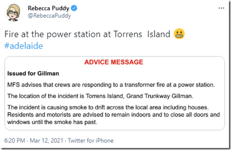
Sometimes the ‘wisdom of crowds’ methodology does help – such as in this tweet about the fire at 18:20 NEM time‘
At 18:42 local time, I believe (so 18:12 NEM time) the SA Metropolitan Fire Service issued this Warning Message.
(ii) Social Media – possibly as a curse
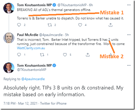
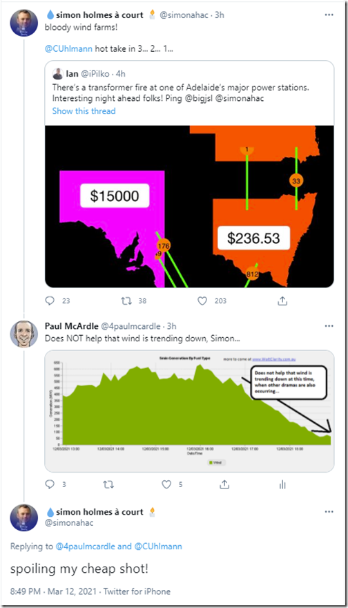
Unfortunately there were also other examples where the information conveyed was not quite correct in the rush of the moment, such as these two examples:
Thankfully those mistakes did not (I hope) propagate too far into collective consciousness … there are enough of those out there already.
(A2b) Solar switching off the for the evening
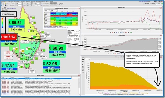
In this snapshot from NEMwatch v10 for the 19:10 dispatch interval, we see that aggregate contribution from solar PV (small rooftop PV and also from 3 x Large Solar Farms) in South Australia we see that the the output:
(i) had dropped from a peak earlier of over 1,200MW (one of the main drivers of the explosion in negative priced periods that have affected the economics of all large generation plant)
(ii) down to 0MW
(iii) and yet the tight supply/demand balance, and high prices, has a number of hours yet to run…
Whilst not ideal, of course, this disappearance of contribution would have been expected by everyone….
(A2c) Wind also ramping right back (to <50MW), right at the wrong time
… however what’s perhaps more difficult for one group to forgive (and also difficult for another group to acknowledge) was the astoundingly poor contribution from Wind Farms in South Australia (of which there are many):
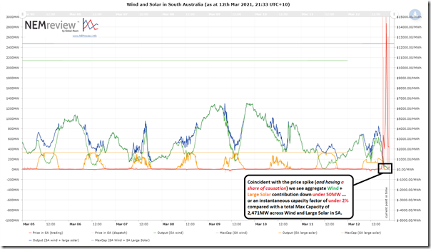
The following chart is an 8-day trend from NEMreview v7 highlighting just how low the aggregate contribution was from Wind + Large Solar during the period of the price spike:
We can see that the aggregate contribution from all plant (Wind + Large Solar) dropped to under 50MW during the time of the price excursions … which (in relation to an installed capacity of 2,471MW for the same plant (i.e. MaxCap)) equates to an Instantaneous Capacity Factor of under 2%. That’s a gobsmackingly bad contribution – and not to mention very unfortunately timed.
Whilst it was understandable, and entirely expected, the Large Solar would produce nothing after the sun went down, it was a very unfortunate time for aggregate Wind Production to almost completely go totally missing …
To follow on from my ‘Willie Wind’ analogy in the Texas story, in this case poor Willie Wind could not even reach the quite low performance performance levels the AEMO had been expecting of it a couple hours beforehand.
————–
It’s worth pointing out that (from 22:25) there has been another factor also limiting the output of the Lake Bonney 2 and Lake Bonney 3 Wind Farms, being the binding of the ‘V_MLMO_VS_LB_CAN_50’ Constraint Equation – part of the ‘V-MLMO’ Constraint Set discussed above in relation to the repair of Heywood. Not the main reason for the low aggregate output, but one more spanner in the works.
(A2d) Some (gas and liquid) peaking plant not operating to full capacity
In the ‘SA Region Schematic’ in the image from ez2view (at 20:05) above, we can see that there were a number of gas and liquid fired plant that were not operating as much as perhaps they might have been during the many hours of elevated prices.
Now, before some load up on their ‘the market is broken’ rants, we need to reflect on the fact that (especially in an Energy-only market) the spot price should be sky-high in times of genuine scarcity of supply, like what happened tonight. Keeping that in mind, there are a number of questions I have that I don’t have the time (or the access to today’s Private Data) to properly answer – such as:
Q3 for Part 4) Why was the output of the Torrens station (in total) not higher than it was … especially prior to the ‘S_TIPSB_270’ constraint imposed from 17:55 capping aggregate output at the 4 x B units to only 270MW.
Q4 for Part 4) Why was Pelican Point only running a little under half load at the start?
4a) Something to do with some kind of outage, or lack of gas, or some other reason?
4b) I see if did come up later.
Q5 for Part 4) Osborne did not seem to run at all … was this an outage?
Q6 for Part 4) What about the other (former) ’emergency’ generator:
6a) One was sold/leased to Infigen and the other to Nexif (the sale was somewhat politically controversial)
6b) I think it was the Nexif one that was not operational on Friday evening
6e) I have some vague memory of one of them being relocated, and converted from liquid to gas fuel
… and no doubt I would find more if I looked further.
(A2e) Batteries potentially running out of charge?
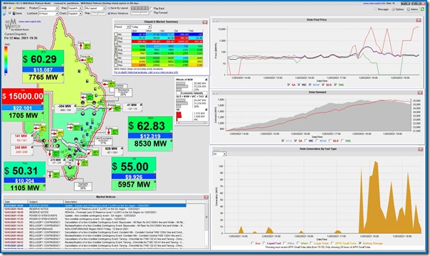
At 19:34 I tweeted this image from NEMwatch v10 snapshot at 19:35 showing that the aggregate output from the 3 large batteries in South Australia (Hornsdale, Lake Bonney and Dalrymple) had dropped right back to only 30MW, despite the price still being high and the Instantaneous Reserve Plant Margin down near very low levels for the SA ‘Economic Island’:
In the table above we clearly see the sharp oscillations in output in the (very energy-limited) batteries. Note also how some of the batteries even charged during this evening period, as well.
Q7 for Part 4) To what extent was the State of Charge (SOC) getting low on the batteries, or were there other reasons (like being able to supply FCAS) that contributed to the pull-back on dispatch in the energy market?
(A2f) Imports from Victoria constrained
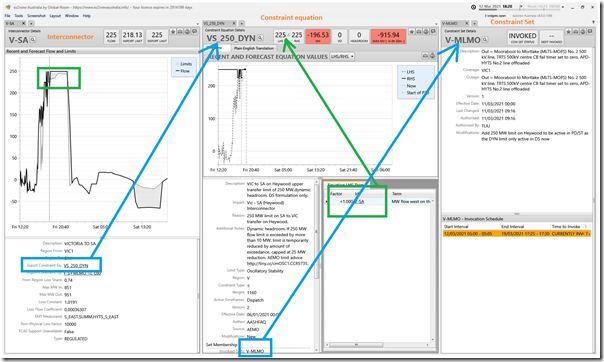
Here’s a 3-widget window taken from ez2view in in real time at 18:20 on Friday evening that shows what was happening to limit flow west on the Heywood interconnector:
At this particular dispatch interval, the flow is limited to 225MW west, because of the ‘VS_250_DYN’ Constraint Equation – which we see is a member of the ‘V-MLMO’ Constraint Set – which you might remember from Wednesday’s article is one of the constraint sets invoked because of the repair work on the damaged Heywood interconnector.
Might be a worthwhile time to remind readers that this repair work, once started, ‘cannot be recalled’.
Q8 for Part 4) As the evening progressed, there were other constraint equations that came into play, impacting on flows in different ways. Would be a good one to explore/explain further, as time permits.
(A2g) Behind the meter response
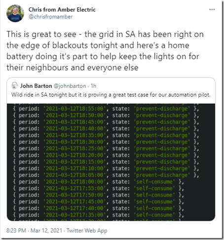
I’ve seen a range of comments on social media from people involved with, or at least watching, the operation of behind-the-meter discharge of home battery systems – such as this from the Amber Electric team:
Q9 for Part 4) Would be really nice to understand what went on with these distributed generation options!
(B) Questions for the future
Sorry, but it’s well past midnight, and this one will have to wait for Part 3 …


![2021-03-12-at-18-05-NEMwatch-SAprice-15000bucks_thumb[1] 2021-03-12-at-18-05-NEMwatch-SAprice-15000bucks_thumb[1]](https://wattclarity.com.au/wp-content/uploads/2021/03/2021-03-12-at-18-05-NEMwatch-SAprice-15000bucks_thumb1_thumb.jpg)
Leave a comment