Alternative Title = Is the traditional form of Demand Response becoming more difficult to utilise?
There’s a form of Demand Response that’s been operational in the NEM for more than 20 years, and has been actively used by large energy users through that time:
Method #1) No, it’s certainly not the ‘Centralised Negawatt Dispatch Mechanism’ (a.k.a. WDRM), which the AEMC is currently reviewing;:
- Which has been pretty lacklustre in the 3.5 years since its mandated start;
- And may even be slated for retirement in preference for ‘Schedule Lite’.
Method #2) Rather, it’s an approach that combines:
- a form of spot-exposure ;
- and the use of manual curtailment or load shifting … when
- Prices are above an (internally determined) trigger level;
- In conjunction with other on-site parameters.
It’s the second form of Demand Response that we’ve been supporting for years, such as in 2019 when we wrote:
- Both ‘Some highlights on our Demand Response journey (to 31 Dec 2018)’ on 3rd January 2019; and also
- ‘Real Barriers we’ve experienced in the growth of Demand Response in the NEM’ on 7th January 2019.
- whilst acknowledging (numerous times) that it’s not a perfect method, but it has proved quite useful for the clients we have served over the years (decades, in some cases).
However, in more recent years we’ve become increasingly curious as to whether some changes in price patterns (driven by several different factors) is providing increasing challenges for energy users who have been utilising Method #2.
We’re going to explore this at this week’s 2025 EUAA National Conference in Melbourne, with the start of some analysis (including this piece). Might see you there?
The changing Pattern of Prices
By now we’re pretty sure that everyone’s noticed a changing pattern of price outcomes in the market.
This was not so obvious back in 2016 Q2:
- when we compiled some analysis and published ‘Reviewing Q2 prices – short-term excursion, or more systemic change in pricing patterns?’
- in what has become the first in an ongoing series at the end of each Q2 period since that time
The level of risk is increasing … due to several factors
The changing prices speak to an increasing level of risk in the NEM. In our GRC2018 we analysed data from 1st January 1999 to 31st December 2018. As Theme 2 within Part 2 of that report, we wrote about how the “The level of Risk in the NEM is escalating”.
Since that time we’ve collated a series of articles also speaking to this challenge. Without dwelling on the details, let’s just flag two different contributing factors (but remember that there are many!) …
The emerging schism
Also in the GRC2018 (and then further in GenInsights21) we wrote about an emerging schism between ‘Anytime/Anywhere Energy’ and ‘Keeping the Lights on Services’ that the form of support for this energy transition is incentivising as two completely separate bundles of services:
(a) Often supplied by different parties; and
(b) Often not closely coordinated.
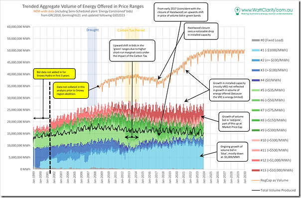
Reduced volume of energy ‘bid in green’
It was on 30th April 2024 (i.e. just over a year ago today) that we posted the article ‘Updated trend of ‘ENERGY’ bids in red, green and blue’, and it’s worth re-sharing the headline chart for the ease of readers here (i.e. with bid data shown to the end of 31st December 2023):
In April 2024 we wrote:
‘It’s a bit busier (being monthly) but if we look past the monthly fluctuations in bid volumes, the changing pattern of bidding is still clearly visible … however in a glance here it does not appear that the volume of bids in green continues to increasingly diminished.’
A trended view of the opportunity, assuming ‘perfect curtailment’ (i.e. with lots of caveats!)
With the above in mind, let’s do some first-pass analysis of the hypothetical opportunity to secure a reduction on time-weighted average price (i.e. representing volume-weighted average price) in a region assuming ‘perfect curtailment’ – by which we mean:
Assumption 1) All high prices are avoided, in descending order of magnitude; and
Assumption 2) Curtailment is full and instantaneous for the affected trading periods (remembering that these trading periods were 30 minutes long prior to Five Minute Settlement).
With this in mind, let’s walk through each region, starting in the north.
Trending the QLD Region
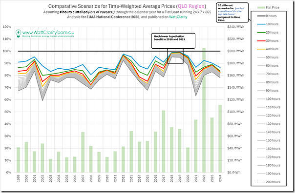
Here’s the trended analysis for the QLD region, charting 20 different scenarios for ‘perfect curtailment across the top NN hours in the year’ as shown in the legend:
For each scenario (a certain number of hours), the assumption is that (being a flat load) the best curtailment would have been achieved if the highest prices were avoided – no matter when these occurred, or how contiguous (or not) these volatile periods were.
For all 25 years shown for NEM history, we see that:
1) There was always a hypothetical benefit in a year
2) Which varied depending on the year:
(a) but approached 20% reduction in time-weighted average cost for curtailment of of just the 10 highest price hours in the ‘best’ years
(b) but we see that in 2018 and 2019 the hypothetical benefit was minimal (at least in QLD).
3) They grey series (i.e. scenarios 50 hours up to 200 hours) revealed diminishing incremental returns for progressively increasing curtailment) for almost all years.
On this trend we have also included (in bars) the time-weighted average price for the year (i.e. assuming no curtailment). Readers can see that the relative level of this price is somewhat independent of the hypothetical curtailment benefit in the year.
Trending the NSW Region
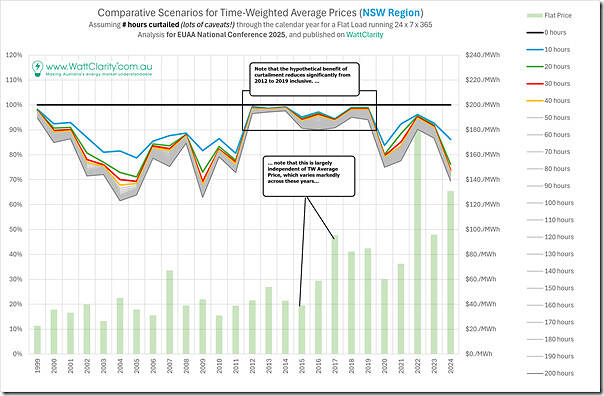
So let’s move onto the NSW region:
In this case we see some similarities in patterns, which is understandable given the method used.
But we also see some differences, with two big ones being:
1) Considerably larger benefit in some of the early years, compared to the the QLD chart; but also
2) A considerable number of years (2012 to 2019) where the benefit was minimal in NSW.
So let’s move further south …
Trending the VIC Region
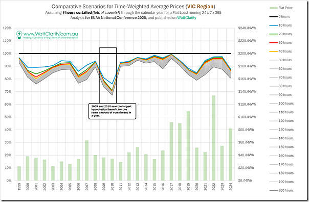
Here’s the same analysis for the VIC region:
We’re beginning to see more similarities here
Trending the SA Region
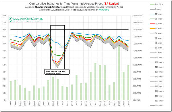
Here’s the same analysis for the SA region
The standout (in terms of differences from the other regions) were the years 2008 to 2010 where the hypothetical benefit of perfect curtailment was staggeringly large, even for just 10, 20 or 30 hours in total over the year.
Trending the TAS Region
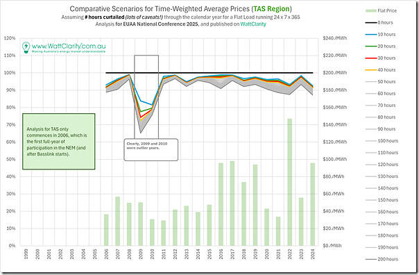
Here’s the same analysis for the Tasmanian region:
As noted on the image, 2009 and 2010 were outlier years. But it’s also worth noting that the relative benefits in most other years are more muted than on the mainland regions.
Comparison Trend across Regions
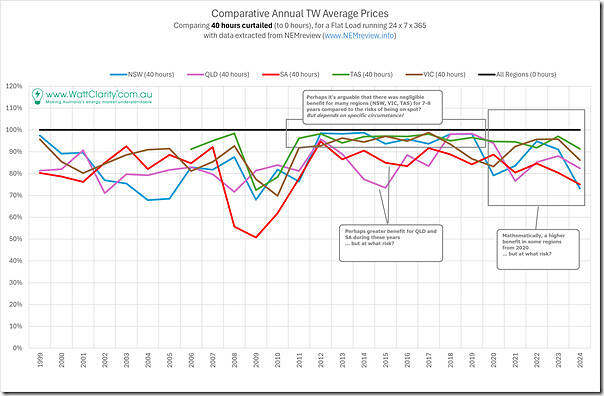
Selecting the ‘perfect curtailment across the top 40 hours in the year’ scenario across all regions, here’s what the trend looks like:
So we see:
1) considerable variation in the scale of the benefit (relative to the time-weighted average price for the region for the year), both:
(a) Across regions; but also
(b) Across years
(c) Which, we noted above, is somewhat independent of the average price for the year.
2) But, across 25 years and (4 or) 5 regions, there was a sizeable benefit in most scenarios
3) For some regions, benefits have begun to trend upwards in recent years
Still to come … exploring the Caveats!
Readers should keep in mind in the above that the assumption is ‘perfect curtailment’ which is obviously not possible in reality, for reasons including:
1) Reasons related to the price patterns, including:
(a) As discussed here under the AEMO-titled ICF0002 Initiative, there’s a ~20 second lag between the start of the dispatch interval and when energy users receive, and hence can respond to price spikes.
(b) As such, every user must use price forecasts to some extent (from the AEMO or from somewhere else), which is further complicated
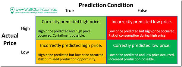
… we have analysis underway (and will share when we’re done as subsequent articles in this series) that assesses price prediction performance via this conceptual matrix:
(essentially different forms of ‘Forecast Convergence’ logic).
2) Reasons related to what happens onsite, including:
(a) In our experience, no energy user is perfectly flexible:
i. In our experience, each user user has different loads that have different degrees of flexibility
ii. With these variables including notice period, duration, depth, ‘reliability’ and price trade-off.
(b) Such considerations might vary by season, or by year, or according to their own commodity price and business cycles.
… or, in other words, these responses as not firm, to various degrees


Leave a comment