
One of the most characteristic features of our NEM is the sheer length of the entire network. With roughly 40,000km of high voltage transmission lines spanning a physical distance of around 5,000 km, we have one of the longest interconnected electricity grids in the world.
While long, it is also sparse.
It’s a relatively unique trait that has brought with it a unique set of issues. One of these issues is electrical losses, and the not-so-simple task of accounting for them.
In our GenInsights21 report released last December, I contributed “Appendix 4: A twenty-year history of MLFs” which featured a graphical representation of long-term MLF trends around different areas of the NEM. Up until then, we’d seen an increasing amount of coverage on the discrete year-on-year MLF changes which was particularly framed around ‘winners’ and ‘losers’ that risked readers not seeing the forest for the trees.
In this article, I will provide some context about MLFs and why they are important, before diving into a couple of more notable MLF trends to give examples of what’s driving long-term location signals in our market.
What are Marginal Loss Factors?
Electrical Losses
In any electrical system, some amount of energy is always lost during the transportation of electricity from the source of generation to the point of consumption. The AEMO estimates that electrical losses equate to roughly 10% of all electricity generated in the NEM.
There are two distinctive features of electrical losses:
- They increase the further away the generation is from demand as resistance increases with distance.
- They increase quadratically to the electrical power transmitted.
Electrical losses are always changing – this is because they are a function of the load, network and generation mix, which themselves are constantly changing.
Losses in the NEM (The Long Version)
In an electricity market, these electrical losses need to be accounted for and incorporated into the pricing mechanism in order to ensure that there is a disincentive for developers to build new generation in locations that will increase losses in the system.
In the NEM, we currently use Marginal Loss Factors (MLFs) as that mechanism. Consistent with the marginal-cost market design of the NEM, a marginal loss is the incremental change in total losses for an additional unit of electricity generated.
An MLF represents the marginal losses between the given connection point and the Regional Reference Node (RRN). Each region has a designated RRN which is usually near its demand center (e.g. Victoria’s RRN is in suburban Melbourne) and by definition, the RRN has an MLF of 1.0. While the RRN is typically at/near large loads, the choice of which connection point is the RRN itself is completely arbitrary – the calculation eventually makes this mathematically redundant – as Ben Skinner has noted.
MLFs are forward-looking. The AEMO takes several inputs (projected generation, demand and dispatch patterns, etc.) and runs a load flow model for every half-hour in the financial year ahead in order to obtain a volume-weighted average of the projected marginal losses. Each connection point, be it generation or load, is given an MLF – but note that for the purposes of this article, I have only examined MLFs as they relate to generation connection points. The AEMO publishes MLF figures for all connection points about two-to-three months prior to the start of a new financial year. The MLF then applies for one year and remains static until they are recalculated for the next financial year. The AEMO reserves the right to perform intra-year revisions where they identify a modification that would result in a material change in capacity of an existing connection point.
Typically when commentators or media outlets talk about regional ‘spot prices’ they are referring to prices at each RRN. But the reality is that an MLF is applied to a generator’s bid in dispatch when the NEM Dispatch Engine (NEMDE) calculates their ‘effective’ bid at each 5-minute interval. In settlement, the MLF is multiplied by the price at the RRN to get the effective settlement price for the generator and is an important figure in revenue calculations.
A very simplified example:
In dispatch, a generator with an MLF of 0.8 bids at $80/MWh. This effectively gets treated as a $100/MWh bid ($80 ÷ 0.8 = $100) at the RRN. If the price is set at $90/MWh for that interval, this generator will not have been dispatched even though they bid below the eventual RRN price.
In settlement, this process happens in reverse. In the above example, if the RRN price was instead set at $100/MWh, the generator with the MLF of 0.8 will only receive $80/MWh ($100 × 0.8 = $80) if they were dispatched. You could think of this as a calculation to determine the value of the electricity that was delivered to the RRN.
If you are longing for a document that will help put you to sleep at night, you can read the full methodology for how the AEMO calculates these figures.
Losses in the NEM (The Short Version)
Marginal Loss Factors are a key part of the price signal that the NEM is designed to provide. They are supposed to represent the locational element of this price signal and should help inform developers, investors, and/or other stakeholders where to build and invest new generation.
A higher MLF should generally be a signal for more generation near that connection point.
So MLFs are only about location, right?
Wrong.
MLFs are about the volume-weighted marginal losses that will occur to and from the location of a connection point.
To visualise an example of this, let’s look at Oakey Solar Farm and the Oakey Power Station. These are two generators that lie on the Warrego Highway near the Queensland town of Toowoomba. They are separated by a small field almost 2km wide – a tiny distance in a network that covers thousands of kilometers.
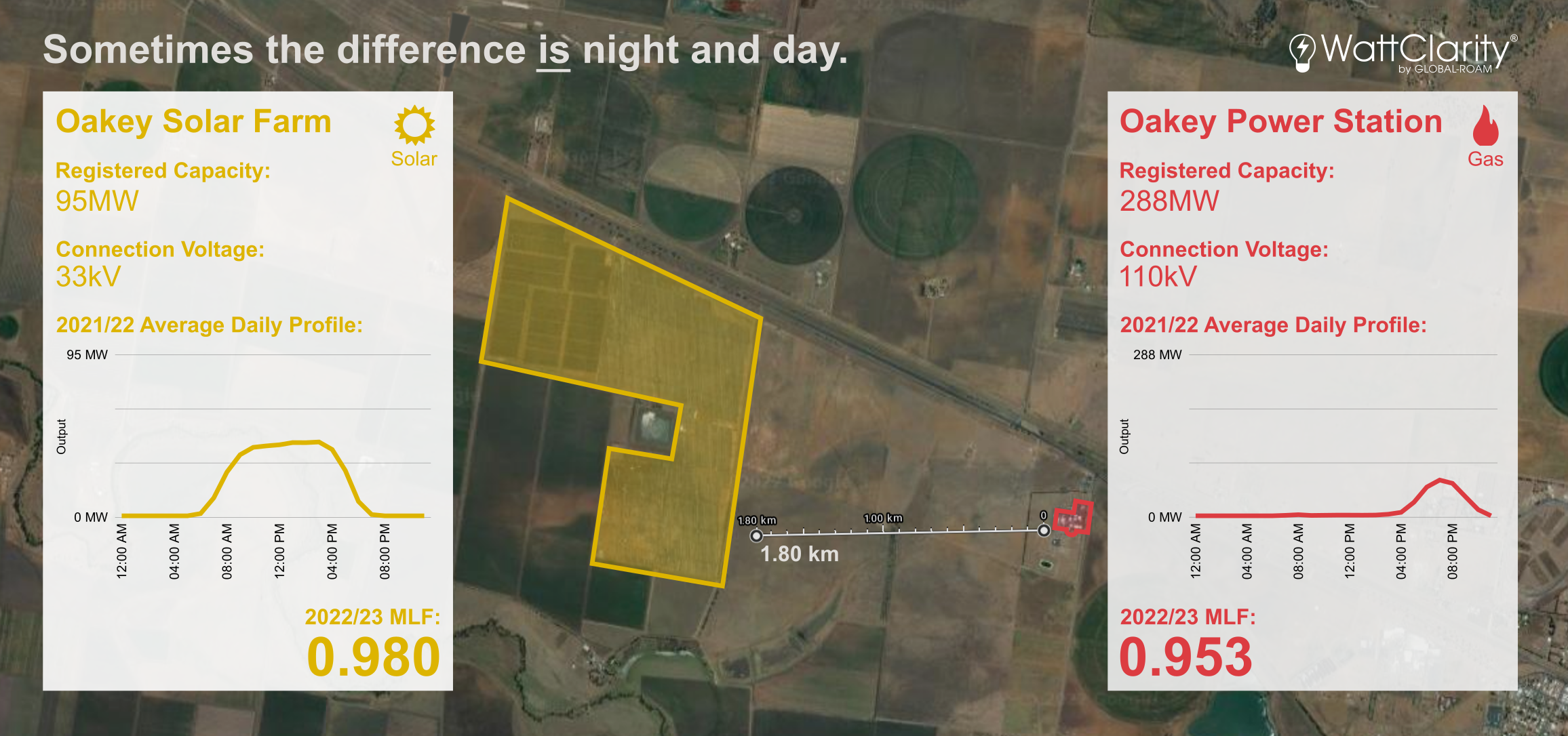
It’s more than just location or even connection voltage that determines an MLF.
Source: Satellite image has been taken from Google Maps
Both generators are almost at the same location on the network but the MLFs are almost three points apart.
In this case it’s not the location, but the time-of-day operational characteristics that separates the solar farm (which generates during daylight hours) and the gas power station (a ‘peaker’ which mainly generates in response to early evening demand peaks).
We can therefore deduce that the marginal losses on the energy generated at this part of the network are projected to be lower during the day compared to the early evening over the next financial year.
While a 2.7% difference in absolute terms may seem minuscule – having a few percent shaved off your top-line revenue can eventually have rather large repercussions on the profitability and the investment viability of your plant. It’s also important to keep in mind that Large-Scale Generation Certificates (LGCs) are awarded/created based on the electricity delivered to the RRN, hence factor in MLFs. This can make it a double-hit for renewable plants.
Why MLFs matter
While it may seem axiomatic that electricity generation should be built close to areas with high electricity demand, this often proves difficult after factoring in things such as
- Optimal energy resources (e.g. high solar irradiance, consistently strong wind speeds, etc.)
- Land acquisition costs
- Local community approval
- Concerns over environmental impact
- Potential issues if the area is one of cultural significance
- Proximity and ease of connection to existing or potential transmission infrastructure
These factors often mean that project developers look further afield to find suitable sites for new generation projects.
However, making sub-optimal decisions about site location can lead to significant consequences on the plant’s ability to deliver electricity to the grid and generate revenue (and in turn, affect investor confidence) as the investment is committed once the project has been built.
A pronounced example that is often cited is the solar and then wind farm that was built around Broken Hill from 2015 onwards. This small town is in one of the most remote parts of the NEM, but now contains around 300MW of registered generating capacity. Much of the generation in this area has been increasingly affected by constraints – not always able to deliver its full potential output to the rest of the network – while also being subject to significant losses when it can dispatch.
I’ve made the animation below to demonstrate the sequence of events that led to this outcome.
It’s a hard life on the fringes
In the early days of the NEM, MLF volatility was far less of an issue as the market never received such sudden influxes of new generation away from the traditional demand centers as it has in more recent years.
The flood of new generation to relatively weak parts of the grid, in what some might call a seemingly un-coordinated manner, led to a number of falling MLFs and other congestion issues from circa 2017. These issues have continued to have adverse outcomes for both the incumbents and the new entrants in these areas.
MLFs in Far North Queensland
Far North Queensland is the northernmost point of the NEM.
The image below shows the long-term trend of the MLFs for the three utility-scale generators in the area.
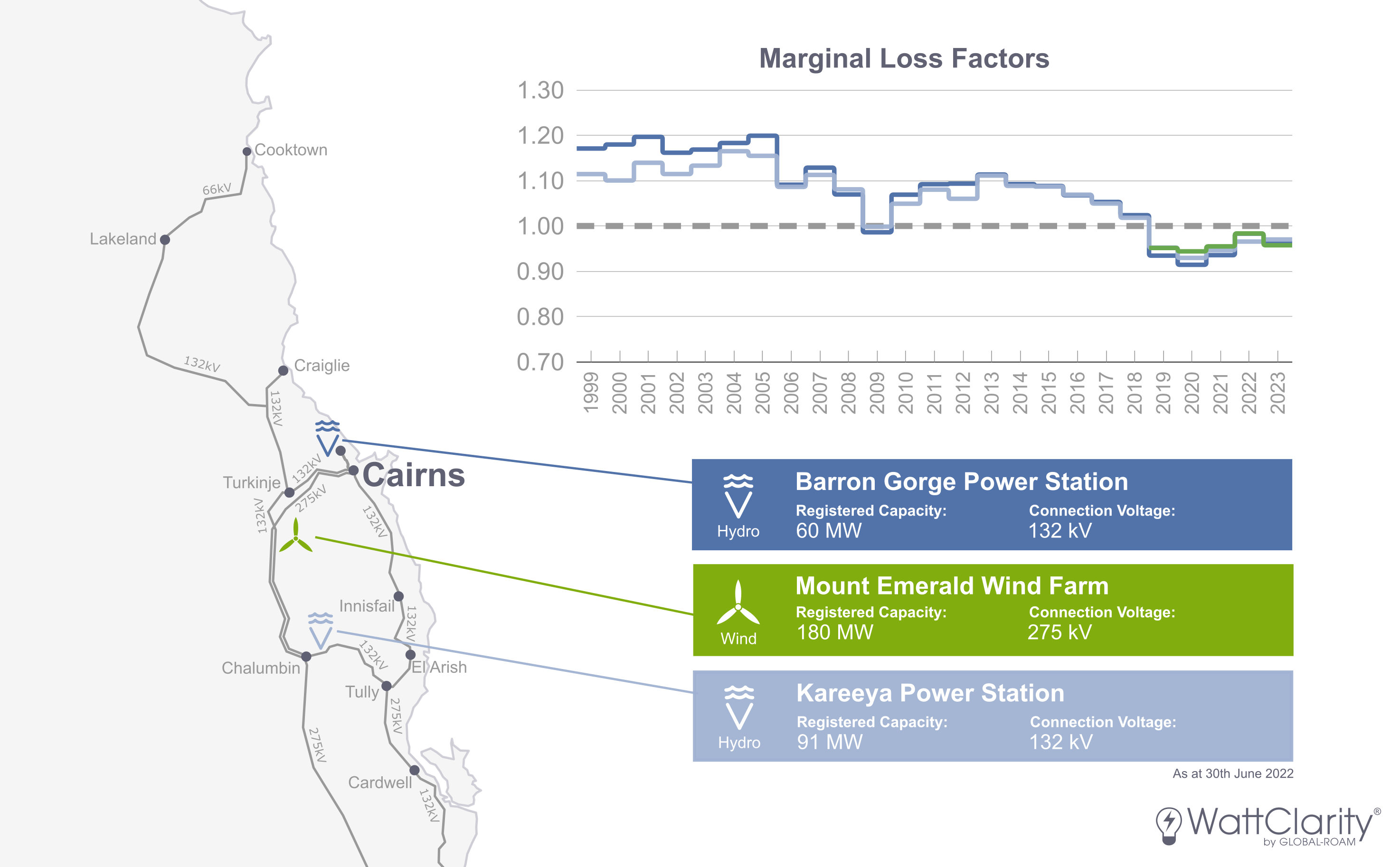
MLFs have been degrading in Far North Queensland, in-part due to new generation connecting around Cairns, and further south in Townsville and the Whitsundays.
Source: Chart first appeared in Appendix 4 of GenInsights21. Transmission map specifications are taken from AEMO Map.
The Barron Gorge and Kareeya hydro power stations were the only generators registered here when the market commenced, and they remained so for almost 20 years. In late 2018, the 180MW Mount Emerald Wind Farm connected to this part of the network. Around the same time, several solar farms began connecting close to Townsville and further south near the Whitsundays. The result of which was a degradation of the MLFs for the incumbent generators in these areas – Barron Gorge and Kareeya being just two examples. Paul noted this impending crunch was coming back in late 2018.
More generation is due to connect with Neoen’s 157MW Kaban Wind Farm currently under construction. It will sit roughly halfway between Mount Emerald and Kareeya and is expected to be fully operational in 2023. That project also includes approval for a 100MW battery and an upgrade from 132 to 275 kV for the transmission line between Cairns and Townsville which may help alleviate the impact of losses when new generation connects.
MLFs in South-West New South Wales
The animation that I embedded above covered the history of the generation that was built around Broken Hill. Since the large drop for the 2018/19 FY, the MLFs for these three generators have failed to retrace the lost ground.
Further south near Balranald, the Limondale and Sunraysia solar farms have also experienced poor loss factors since they were both connected to the NEM. The MLFs for each generator has been announced at 0.831 for the 2022/23 FY.
In a similar fashion, the Coleambally and Darlington Point solar farms which sit further east also saw significant downgrades to their loss factors post-2018. These two MLFs have been set at 0.877 and 0.888 respectively for the 2022/23 FY.
Constraints make it a double whammy
The discussion about MLFs is related to the broader discussion about congestion.
In the case of the Broken Hill Solar Farm, it was the oversupply of energy generation near the other end of the 220kV transmission line that resulted in significant congestion. The change in marginal losses was higher because losses are proportional to the square of the power flow – when power flows are higher, losses are guaranteed to increase (all other things being equal).
Constraints are another aspect of congestion. In many cases, you will find that the generators who have been hurt by falling MLFs in recent years, have also been increasingly hurt by the effect of network constraints at the same time.
Allan O’Neil’s wonderful explainer and case study on constraints in the NEM gives the perfect introduction to this important aspect of the market. Our new Constraint Dashboard has also helped a number of generators navigate these in real-time, as Paul demonstrated for a price spike on the 6th of June 2022.
What lies ahead?
Generation Removal
Given that I’ve demonstrated how new generation can increase marginal losses in the surrounding area, it is worth exploring what effect the removal of generation has had. This is relevant given that the market’s remaining coal fleet is scheduled to be decommissioned over the coming decades.
As shown in GenInsights21, the closure of Hazelwood in 2017 had virtually no impact on the MLFs around the La Trobe Valley as the strong transmission infrastructure and proximity to Melbourne meant the marginal losses for those remaining generators barely changed. Instead, it was the generation on the other side of the border in Southern NSW that saw increased MLFs due to the reduction in imports from VIC.
Similarly in the 2016/17 FY in SA, the projected loss of generation from Northern Power Station and Torrens Island Unit A did not affect the MLFs of nearby generation. The impact was instead felt in the far southeast of the state where the MLFs of the generators around Mt Gambier fell around 8 to 12% as a result of increased imports via the Heywood interconnector.
Renewable Energy Zones, EnergyConnect and other transmission upgrades
The image below shows a summary of all committed and potential transmission projects and has been taken from the AEMO’s 2022 ISP that was released earlier today.
![]()
Map of the network projects in the optimal development path
Source: AEMO 2022 Integrated System Plan pg.14
The $40m transmission upgrade near Cairns (Northern QREZ Stage 1) that I alluded to earlier is the only upgrade that is fully ‘committed & anticipated’ in the northern half of Queensland at this stage.
The $2.28b EnergyConnect project is now officially under construction as well. The project includes a 330kV transmission line that will span 900km and will allow for direct interconnection between SA and NSW for the first time. It may go some way in easing the congestion pains felt by those generators that lie in South-West NSW and North-West VIC (within the so-called ‘Rhombus of Regret’).
Market Reform
Perhaps a craftier approach to avoid an MLF headache is to change the market rules to remove them.
Alternative mechanisms have been proposed and discussed, including a move to Average Loss Factors (ALFs) which was rejected by the AEMC in November 2019. Nodal Pricing (where a local connection point price is adjusted dynamically in real-time) is another mechanism that has been implemented in other markets around the world and has been debated at length on our own shores. Tom Geiser has explained a number of these alternative mechanisms and their merits in his article “Let’s Talk Losses”. Derek Chapman has also written about the “War of Losses”.
With any of the proposed mechanisms (and the existing MLF structure) there will always exist a trade-off between:
- The accuracy of how the electrical losses are represented in pricing; and
- The ability for participants to interpret AND effectively hedge against risks that arise in the market.
In any case, a change in the market rules does not magically banish the underlying losses – they will still occur and need to be priced within any market design.
Better Decision Making
I could argue that past missteps, while costly, have been somewhat instructive to developers planning site locations for future generation projects. The increased awareness of this risk will have led to market participants being more cognisant of the inherent complexity of participating in the NEM.
A small number of industry consultants have developed their own models to help developers predict future MLFs using a similar methodology that the AEMO uses. Like any modelling or forecasting, these have their limitations – as future generation, demand, transmission upgrades, or even market design are far too hard to predict the further into the future you attempt to do so.
Final Conclusions
The NEM is full of intricate and nuanced concepts, and marginal losses are just one of these. I will finish by listing a few of my bigger picture takeaways about MLFs and their role in price signaling in our market:
- The NEM is complex. Seriously.
- Electrical losses are a function of physics, not the market. MLFs are simply the market’s method of representing a law of physics.
- MLFs are more than a simple location signal. They are an attempt to boil down all of the volume-weighted marginal losses that are projected to occur to/from a given connection point over a financial year into a single number. Electricity flow, connection voltage, time-of-day generation profile are just some of the important underlying factors.
- Don’t be surprised when supply chases demand – it’s a market after all. If an MLF is high, that is an incentive for developers to build new generation near that connection point, which in turn (all other things being equal) should lower the MLF the next time it is calculated.
- There is no perfect market mechanism for dealing with losses or congestion. There will always be a trade-off between representing the realities of physics and the ability for participants to effectively interpret and hedge against risk.
- Regardless of what market arrangement is in place, it’s the value of the underlying electricity being provided that is key. My final point here is that whilst change is inevitable, electricity markets will always be designed to be a valuation system for the power being produced.
For Further Reading
This article builds upon what was presented in Appendix 4 of GenInsights21. The appendix included 48 charts of long-term MLF trends (like the chart shown for Far North Queensland) representing smaller chunks of geographic areas of the NEM.
I have also used our GSD2021 to calculate various different figures shown in some of the graphics. More information about both publications can be found in the Deeper Insights section of WattClarity.
Author’s Note: This is my first long-form article for WattClarity. I’m currently undertaking a Masters of Sustainable Energy, so readers should keep in mind that I am still on the ascent of a steep learning curve. Please feel free to add any feedback or corrections in the comments section, or reach out to me directly on LinkedIn.
A good read Dan. As someone with a background in electronics I was aware of the implications of I2R lossses ,but not across the Jargon.