My last update was only a month ago (on 13th July) but time flies when on ‘COVID-19 time’ as in the meantime Victoria’s case numbers surged, leading to the declaration of a ‘State of Disaster’ and some more stringent lockdowns.
Having been asked the question a couple of times, I’ve taken an updated look at the effect on electricity consumption, as follows…
(A) Prior discussion about COVID posted on WattClarity®
Firstly, a quick review of what we’ve published before on this topic:
| Tuesday 24th March 2020 (First Article) |
There’s been a lot of water under the bridge since I posted these ‘1st thoughts on possible impacts of COVID-19 on Australia’s National Electricity Market (NEM)’ . In that article, I mentioned three different ‘levels’ of risk: Level 1 = about electricity infrastructure. There are still concerns here: 1a) With some maintenance having been deferred from the traditional outage period prior to winter, there will be challenges in the lead up to summer to ensure we’re all ready to go for the summer peak periods. Watch this space… 1b) There’s also talk about possible construction/commissioning delays with new plant due to additional difficulties in arranging the relevant international experts to come onsite at various points. Challenges to work through. Level 2 = about demand. That’s what the first article was about (and indeed also this article today). Level 3 = broader impacts. Given that the services sector of the economy has been significantly hit and that there are currently planned sunset periods for different aspects of support provided by the Government, I have concerns about what it means for energy users – and hence flow-through effects on energy retailers and others in the supply chain, when the music stops and we find out how many chairs are missing. Watch this space… |
| Tuesday 31st March 2020 (Second Article) |
This was then followed up the following week with ‘Electricity demand as a Performance Metric, in the age of coronavirus’. Thankfully it seems that the broader information economy has been providing metrics that are better than electricity consumption to map the impact of COVID. |
| Thursday 16th April 2020 (Third Article) |
Spurred on by some conversations I had seen elsewhere, I cautioned that we should be ‘Careful with the ‘doomsday claims’ that COVID responses have (or will) massively reduced aggregate underlying electricity consumption in the NEM…’ as I’d been seeing increasingly alarmist forecasts of what might happen – which unfortunately seemed more based on what had happed overseas than analysis of data about what had occurred, to date, in the NEM. In the analysis behind that article, I was able to extend the number crunching to also look more directly at ‘Underlying Consumption’ in order to avoid the confusion that some might be suffering when equating the reduction in ‘Operational Consumption’ (or ‘Grid Consumption’) that’s happened because of an uptick in rooftop solar PV with COVID effects. |
| Sunday 24th May 2020 |
Somewhat related to this topic, I was able to utilise the same data structure to look at ‘Underlying Consumption’ just for the QLD region in posting about how ‘Sunshine State forgets its own branding on Saturday 23rd May 2020’ and hence how underlying consumption rose. |
| Monday 13th July 2020 (Fourth Article) |
On Monday 13th July (in part prompted by the need to discuss for this audience) I took a look and spoke about ‘Difficult to determine (i.e. minor) reduction in daily NEM-wide aggregate ‘Underlying Consumption’ in 2020, the (first?) COVID year’. By this time (i.e. 2 months after writing about ‘doomsday claims’) I’d started to feel like I was not totally on my own, in terms of thinking that COVID had not shifted the dial on electricity consumption as much as others might have initially thought was the case. |
| Monday 20th July 2020 |
A week later, we found some analysis by the Energy Networks Australia of interest, ‘Mapping the impact of COVID-19 on electricity demand in Victoria’. |
| Wednesday 22nd July 2020 |
Then two days later (on the 22nd July 2020), the AEMO released its Quarterly Energy Dynamics for Q2 2020. In conjunction with the release of the QED, they published the note ‘Demand and price reductions due to COVID-19’ which discussed two impacts of COVID on the National Electricity Market: Impact #1 = modest reductions to electricity demand The AEMO noted: ‘… NEM operational demand was down 2% when compared to Q2 2019, with COVID-19 contributing to an estimated 2.1% reduction and an increase in rooftop PV contributing a further 1.2% reduction. This was offset by increased heating requirements due to cooler weather, which increased demand by 1.3%. By sector, there were large reductions in commercial demand (around 10-20%), large increases in residential demand, with industrial demand mostly flat.’ Impact #2 = reductions to electricity prices Indirectly, as well, COVID impacted on price outcomes (seen here for Q2 2020): (a) in part because of the modest demand reductions, but (b) moreso because the drop in oil & gas prices due in large part to COVID internationally flowed through to bid prices for gas generators and hence price outcomes. |
| Friday 14th August 2020 (Fifth Article) |
Which brings us to this fifth article here in the series looking at daily aggregate consumption levels: (a) As per prior articles, we look at NEM-wide daily consumption; and (b) In addition (new for this article) we also take a look at what’s been happening within each region. |
| Monday 5th October 2020 (later than intended!) |
Worth noting that (if time permits) I will also be posting a separate article about ‘Risks we see surrounding COVID and the NEM’. A fair bit later than I had initially been intending, I posted this sixth article in the series on Monday 5th October 2020 in the lead-in to summer. |
.
(B) The impact of COVID on electricity demand around the NEM
So let’s update the numbers, in terms of what’s been happening to electricity consumption in comparison with prior years:
(B1) Measurement of electricity consumption
Let’s start by flagging this detailed explanation of why there are different measures of electricity demand – and how they differ.
From the perspective of this particular question, the key thing to remember is that:
1) ‘Operational Consumption’ (which is sometimes called ‘Grid Consumption’) is what the AEMO sees in real time and is that supplied from the larger generators across the NEM (for whom they have metered production values sampled every 5 minute dispatch interval);
2) However, this measure is not all the electricity consumed in the interconnected NEM – with a growing amount supplied by an assortment of embedded generation which the AEMO does not ‘see’ in real time:
(a) Conceptually, if we were to add all of this consumption back in (i.e. no matter what supplies it) then we would arrive at a notional figure for ‘Native Consumption’ (sometimes called ‘Underlying Consumption’).
(b) However doing this is not as simple as it might initially seem:
i. Most (but not all) of this embedded generation is rooftop solar PV, only some of which is estimated by the measures put in place by APVI and (separately) by the AEMO.
ii. Remember prior comments about the challenges in estimating this contribution … and even knowing how accurate your estimates are! We’ve chosen to use AEMO’s estimates of supply from rooftop PV, at least in part because the data is easier for us to work with in this case.
iii. However keep in mind that this number won’t take into account a share of consumption on industrial sites supplied by what seems to be a growing number of embedded generation of any type (e.g. gas-fired turbines or reciprocating engines, or rooftop PV >100kW, etc…).
(B2) Trended (daily aggregate) ‘Underlying Consumption’
In most of what follows, we use the estimates we have prepared for Underlying Consumption:
(B2a) Across the NEM
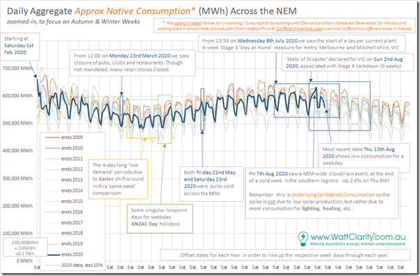
With data updated to Thursday 13th August 2020 (i.e. because we’ve not seen the full day elapse today), here is an update on the year-by-year comparison of ‘Underlying Consumption’ NEM-Wide:
This NEM-wide aggregate has been a feature of prior articles because it helps to focus attention of the scale of the underlying response to COVID-19. In this 13th July update we noted only a minor reduction was visible.
In the 4 weeks since that, it’s been an eventful period. In particular it’s worth flagging three key events that are relevant to consumption patterns shown above:
Event #1 = on Sunday 2nd August a ‘State of Disaster’ was declared for (parts of?) Victoria, with:
1a) Stage 4 lockdown commencing during that week for Melbourne and the surrounding area. This included more onerous ‘work* from home conditions’ commencing during that week for Melbourne and the surrounding area
* ‘work from home’, for those fortunate enough to be able to do so.
1b) The rest of the state was ratcheted up to Stage 3 lockdown
Event #2 = coincidentally in that week, the southern part of the NEM suffered a significant cold snap, with temperatures significantly down (and electricity consumption for heating up).
Event #3 = on Friday 7th August 2020 we experienced this remarkable day with widespread cloud cover (and significant rain) impacting on the NEM in several ways:
3a) Firstly, it meant a significant drop in production from solar PV – both Large Solar, but also Small Solar (i.e. Rooftop PV). Note, however, that the effect of this will not be seen in the chart above as we are looking at ‘Underlying Consumption’.
3b) What will be seen, however, is the added effect on consumption that the dimmer cooler (and cooler apparent temperatures) that these conditions
3c) As noted on the image above, aggregate Underlying Consumption was 2.6% higher on Friday 7th than on Thursday 6th right across the NEM.
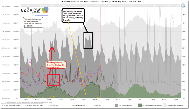
At the end of that week, I’d tweeted the following trend from ez2view online which illustrated what happened through the week quite well:
Noting that this chart shows ‘Operational Demand’ as an instantaneous measure, we can clearly see here how the lower temperatures from Tuesday 4th August contributed to higher demand in the Victorian region (and how the ‘duck curve’ effect of rooftop PV largely disappeared on Friday 7th August).
(B2b) Specifically in Victoria
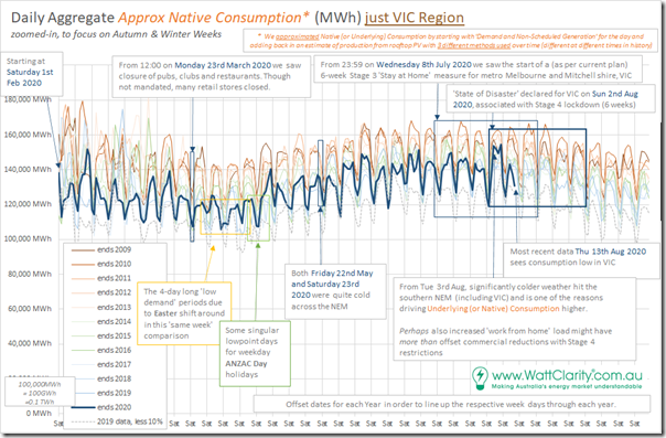
For the first time in this series, I’ve had time to break apart the aggregated NEM-wide numbers above to show the relative changes in consumption on a year-on-year basis over 12 years in each region, starting with Victoria:
Note here that, because we are looking at ‘Underlying Consumption’ the aggregate consumption on Fri 7th Aug was not too dissimilar from the other cold days that week – a far greater contrast comes when we see how consumption has fallen away significantly in the following week (i.e. which is currently drawing to a close).
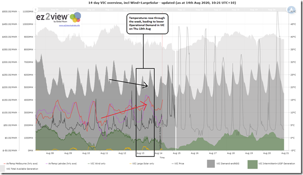
Note in particular the significant drop in aggregate Underlying Consumption on Thu 13th Aug (yesterday). Using this trend template from ez2view online, we can clearly see that the drop in Operational Consumption is correlated with (and to some extent attributable to) the rise in temperatures, hence lower heating load:
Perhaps there are other factors involved (in addition to just being a warmer day) but I would caution about jumping to a ‘it’s due to COVID!’ conclusion…
———–
In relation to the COVID-19 impacts on electricity consumption in the VIC region, it’s useful to refer to p9 of the AEMO’s QED for Q2 2020 . In this the AEMO notes:
“Victoria’s COVID-19 demand reduction was moderate. Compared to the pre-COVID-19 control model, weekday operational demand in April reduced by 1%, with the largest decrease during the morning (Figure 7). The comparatively cooler climate meant that decreased commercial demand was offset by increased residential demand, driven by higher heating requirements. By June, demand reductions in Victoria shifted to increases, predominantly due to cooler winter temperatures.”
At only 1% reduction through April in aggregate modelled by the AEMO and looking at Operational Consumption (different to Underlying Consumption above), you’d have to squint really hard to perceive any real change in the trend line for 2020 compared with prior years above.
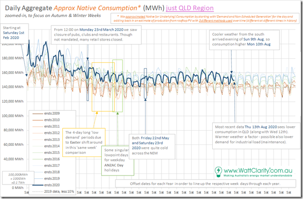
(B2c) Daily Underlying Consumption in QLD
Away from Victoria, we’ll start up north in Queensland and work our way around:
In contrast to the VIC region (and others to come below), we can see a couple significant differences here:
Difference #1 = consumption in 2020 is higher than the consumption from 10 years ago
… due primarily due to the development of sizeable load for upstream compression of coal seam gas for export via the LNG trains at Curtis Island near Gladstone.
Difference #2 = the relative day-to-day variation is lower in QLD than it is in all other regions.
… due primarily to the higher base of industrial energy consumption (mining and minerals processing load, which is 24×7 operations and is largely season independent).
Difference #3 = daily consumption is more purely driven by summer heat, and much less by winter heating load – understandably.
… that said, the warmer weather yesterday (Thu 13th Aug) that significantly reduced heating load in VIC also had a (smaller percentage) effect in reducing electricity consumption in Queensland, where Archerfield daytime temperatures were in the mid 20’s yesterday.
———–
In relation to the COVID-19 impacts on electricity consumption in the Queensland region, it’s useful to refer to p9 of the AEMO’s QED for Q2 2020 . In this the AEMO notes:
“New South Wales and Queensland demand was most affected by COVID-19 restrictions. This was mainly due to the combination of mild weather (which limited the COVID-19 related increase in residential demand) and COVID-19 related in commercial demand in these regions.”
and…
“− Queensland’s COVID-19 demand impact was similar to New South Wales’, except with slightly greater demand reductions, as well as less easing of the COVID-19 impact into June.” (i.e. 5% reduction in April 2020)
With respect to the chart above, seeing a 5% reduction in April is challenging in the absence of the ‘black box’ models used by AEMO! Keep in mind that our chart above shows Underlying Consumption, whereas AEMO is speaking about Operational Consumption.
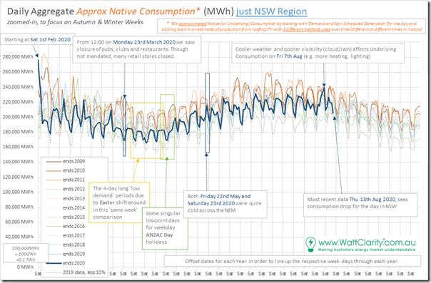
(B2d) Daily Underlying Consumption in NSW
Here’s the same chart for NSW:
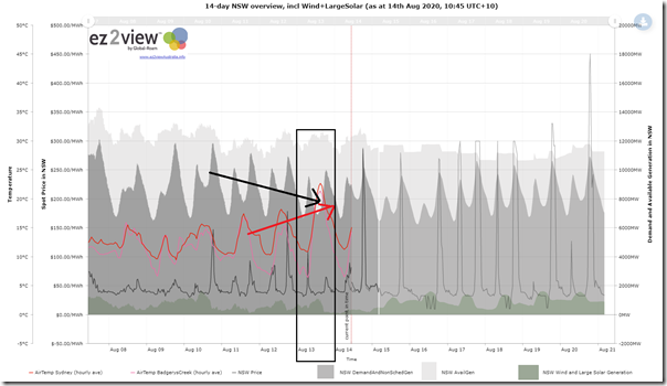
We can see how Underlying Consumption dropped yesterday (Thursday 13th August) but again this is understandable when we see temperature progression using the following snapshot from this 14-day trend query from ez2view online:
Again this trend shows trended instantaneous rate (i.e. MW) of Operational Demand.
———–
In relation to the COVID-19 impacts on electricity consumption in the NSW region, it’s useful to refer to p9 of the AEMO’s QED for Q2 2020 . In this the AEMO notes:
“New South Wales and Queensland demand was most affected by COVID-19 restrictions. This was mainly due to the combination of mild weather (which limited the COVID-19 related increase in residential demand) and COVID-19 related in commercial demand in these regions.”
and…
“As shown in Figure 6, the New South Wales COVID-19 related demand decrease was largest during April (-5% on average) when strict restrictions were imposed for the whole month. However, demand reductions progressively eased during May and June (-1%), due to cooler weather and the gradual relaxation of restrictions”
Useful to see what that (AEMO’s calculated 5% reduction through April) looks like in the trend of Underlying Consumption above.
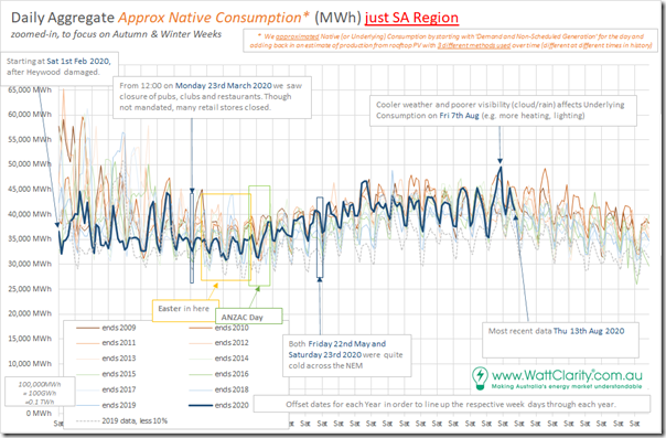
(B2e) Daily Underlying Consumption in SA
Skipping down to South Australia here is the similar chart:
First thing that jumps out at me, when I see this trend, is the very low level of aggregate daily Underlying Consumption in South Australia from 1st February 2020 (i.e. just after Heywood was damaged, islanding the region). This reinforces to me how the South Australian region really ‘dodged a bullet’ in the aftermath of that trip, as discussed as the 4th Headline Event of summer 2019-20.
———–
In relation to the COVID-19 impacts on electricity consumption in the SA region, it’s useful to refer to p9 of the AEMO’s QED for Q2 2020 . In this the AEMO notes:
“In contrast to other regions, South Australia’s operational demand increased due to COVID-19. This was a function of South Australia’s low proportion of commercial load, comparatively high proportion of electricity heating systems, and colder than average conditions during Q2.”
No specific percentage is provided on that page – for me, it’s difficult to discern (by eyeball) much change at all on a year-to-year basis, given all the other variables that affect consumption.
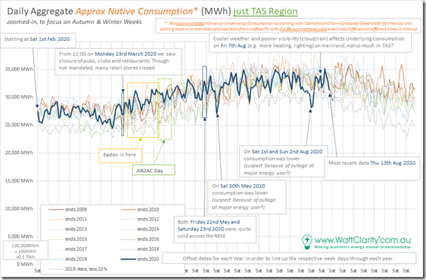
(B2f) Daily Underlying Consumption in TAS
Finally, into Tasmania here is the same chart:
At the other (colder) end of the NEM compared to QLD we can see that aggregate daily underlying consumption definitely climbs through the winter months.
There is also some significant variation from one day to the next with some pronounced dips, two of which (Sat 30th May and 1st and 2nd Aug) I have flagged as possibly being a result of outage at one of four major industrial energy users that dominate the ‘base load’ underlying consumption pattern in the island.
———–
The AEMO does not provide any specific commentary about the COVID-19 impacts on electricity consumption in the TAS region on p9 of the AEMO’s QED for Q2 2020 . Not sure why?
(B3) Analysis that has not been performed here
Following from the above, it’s worth re-iterating what we can, and can’t, do with the data we have access to – as illustrated on the trend comparisons above:
(B3a) No temperature correction (or other ‘black box’* model)
What we’ve done is present the ‘raw’ results (appreciating that we’ve derived an approximated daily aggregate Underlying Consumption for each region) in the year-on-year comparisons above for each region (for the 1st time in this series) and for the whole of the NEM.
* based on comments from some readers, it’s apparent that my intent in describing the model as ‘black box’ is not clear to some. My main point is not whether the people running the model (i.e. ‘inside the tent’) understand how the model works, or not – it’s moreso that people like me ‘on the outside of the tent’ don’t have visibility of everything the model does.
However it’s important to note that there are many reasons why results might vary from one year to the next on an ‘equivalent week’ basis. Principal of these is different temperatures and other weather conditions, driving different consumption patterns – but there can also be changes due to population and economic growth or decline (and other factors).
Trying to ascertain the impact of COVID-19 in all of the noise in the charts above is quite difficult – but it’s clear to me that it’s definitive that the impact is not huge. Hence:
1) Comments on 16th April about being careful about ‘doomsday claims’; and
2) Comments on 13th July about it being ‘Difficult to determine’ and so minor.
———
The AEMO took a different approach which is possible for them, but not for us. On p8 of the AEMO’s QED for Q2 2020 (section 1.2.1) they note:
“This section provides an in-depth examination of these impacts and differs from the usual approach in the QED; rather than comparing historical data to previous relevant comparison periods (for example, Q2 2019) AEMO has used analytical tools to project what the demand would have been if the pandemic had not occurred. AEMO’s Operational Forecasting and Integrated Energy System teams have developed state of the art models which unbundle the impact of COVID-19 from other factors such as temperature, humidity, day of the week, time of the year, and the amount of distributed PV.”
In other words, they have used their ‘black box’ model to derive more insight.
However the implicit assumption in use of any ‘black box’ model is that the model is actually correct. I’m not making this point to imply that the AEMO’s model is incorrect – but moreso to ensure that all readers are at least cognisant that this is a key factor, and take that into account in where they apply those insights.
Again, not noting this specifically with respect to AEMO, but worthwhile to reiterate these three key factors (I called them ‘flaws’) in relation to any forecasting (or modelling) exercise.
———
Other companies (like the other Tesla – i.e. not the car company) I have seen promoting their modelled results for what a ‘temperature corrected’ consumption profile might have been, to try to extract that bit of noise and look more specifically at the impact of COVID-19. In essence a similar approach to the AEMO one, just a different ‘black box’.
I can’t recall seeing any results presented specifically for the Australian NEM, though.
———
PS at 14:55 Fri 14th Aug 2020
See comments (and illustrations) added by Mark Byron Todoroff from TESLA Asia Pacific on today’s linked discussion on LinkedIn here today.
(B3b) No analysis by customer group, or by location within a region
The data published by AEMO is aggregated to a regional level – hence this is how we have focused.
Whilst we do have access to consumption data for some zones within some regions (i.e. as part of the ‘optional extra’ data sets that can be supplied for some regions within ez2view) we have not taken the time to analyse this data at this point.
I did, however, find the analysis completed by the Energy Networks Association using aggregated Smart Meter data for the VIC region of some interest, which is why we copied over their article ‘Mapping the impact of COVID-19 on electricity demand in Victoria’ on 16th July.
Here’s another useful piece of analysis I saw from Jemena, one of the DNSPs in Victoria.
(B3c) No analysis by time of day
This is something we could do, but have not had time (or really even the strong desire) to do so. This has been done elsewhere, and I’m not thinking much would be gained if we also looked…
(C) Risks of COVID in the NEM
Back when I posted these ‘1st thoughts on possible impacts of COVID-19 on Australia’s National Electricity Market (NEM)’ , I included some thoughts about risks as I see them.
Recently there have been a few events occur that have given cause to think more about these risks, as a result of which I’m also posting this article here [LINK TO COME].


Leave a comment