Last Monday 10th August I posted this 11th Case Study in a series. It was a long one, given the number of different factors contributing to collective under-performance (measured with Raw Off-Target) across all Semi-Scheduled units that existed back on 15th September 2018. Took a short break from this type of analysis to focus on other priorities…
Thankfully this one is a fair bit simpler!
(A) Background context
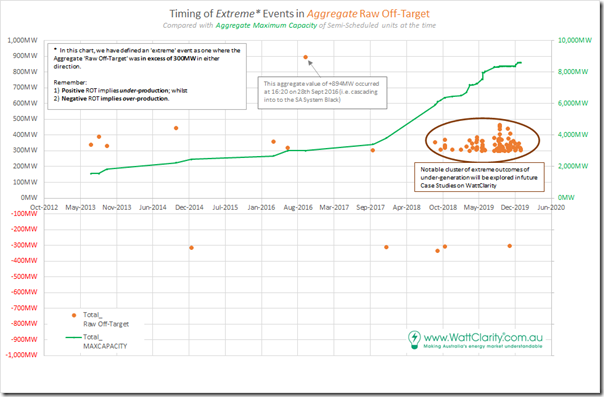
Remember that we identified a total of 98 discrete instances where aggregate Raw Off-Target across all Semi-Scheduled units was either above +300MW (representing collective under-performance) or, much less commonly, under –300MW (representing collective over-performance relative to AEMO’s expectations, seen in the Dispatch Target).
There was a smattering of only 10 cases through 2013, 2014, 2015, 2016, 2017 and through until August 2018. However thereafter (to the end of 2019) there was a sharp escalation of extreme incidents – as seen in the following chart:
Note also that we have not yet looked into 2020 data, which will be the focus of the GSD2020 (so we can’t comment on whether the trend from 2019 has continued to grow).
We’re doing this given a push from the AER Issues Paper, but moreso inspired by the deliberations by the (now defunct) COAG Energy Council and (under threat?) ESB relating to ‘NEM 2.0’. Note that these case studies deal with imbalance in the Dispatch Interval timeframe, but readers should understand that there are other challenges that ‘NEM 2.0’ also needs to resolve, including:
Other Challenge #1) Within the dispatch interval timeframe, energy-related services focused on frequency maintenance and response to contingencies;
Other Challenge #2) Relating to ‘firmness’ of supply in the broader forecast horizon; and
Other Challenge #3) Others that we bundled into a ‘keeping the lights on’ services in our discussions in the Generator Report Card 2018 (for instance, in relation to System Strength).
In preparing these focused Case Studies, we’re seeking to understand why and what the implications are of this escalation.
… so let’s look at this particular event:
(B) Summary results for Friday 28th September 2018
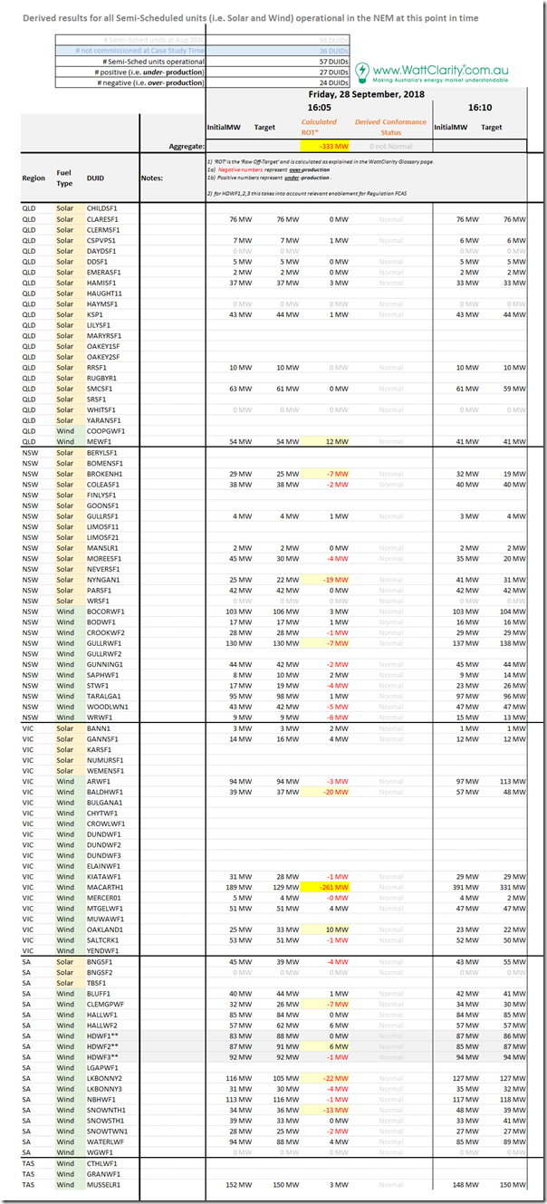
Here’s the same tabular framework of results for individual Raw Off-Target performance of all 57 x Semi-Scheduled units that were operational at the time:
In summary from this table, we can see the following:
1) There were 57 DUIDs registered and operating at this time, of which it was almost an even split between under-performing (27 DUIDs) as over-performing (24 DUIDs).
2) Of the units highlighted as having Raw Off-Target greater than 6MW (a threshold that is one of the inputs in determining Conformance Status for a unit), we see the split is less even:
(a) 8 DUIDs flagged as over-performing by at least 6MW; whilst
(b) 3 DUIDs flagged as under-performing by at least 6MW.
3) Furthermore, we see that:
(a) The MACARTH1 dominates the over-performance number, showing 261MW over-performance in and of itself; and
(b) Across all of the other units, there was a residual over-performance of 72MW which brought the aggregate value to 333MW.
(C) Results for individual DUIDs
So let’s have a look at those highlighted in the table above…
(C1) A major case of ‘went the wrong way’ at Macarthur Wind Farm
We can clearly see that the imbalanced performance of MACARTH1 clearly swamps that of all the others.
Frequent readers will recall that this is not the first time MACARTH1 has appeared in these Case Studies – which is understandable given that it had stood out clearly as the ‘worst performing’ DUID of any kind through 2019 in terms of its ‘Raw Off-Target’ performance when we’d reviewed data for all DUIDs that had been compiled for the Generator Statistical Digest 2019. Whilst its large size is one factor, we understand there are other factors that are also contributing to the large deviations regularly seen.
(C1a) What happened at MACARTH1?
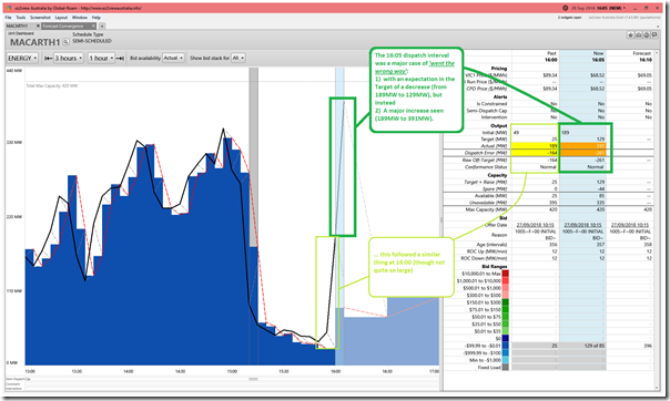
Once again we use the ‘Unit Dashboard’ widget in ez2view (and the ‘Time Travel’ powerful rewind functionality) to review what some of the core stats were for this point in time:
As noted here, the unit unexpectedly increased output of 342MW over a 10-minute period (i.e. output climbed from 49MW to 391MW)! That’s about the same aggregate order of magnitude of as the loss of a potline at an aluminium smelter, albeit that:
1) Deviations like this from MACARTH1 are much more common; but thankfully
2) They tend to happen over a slower ramp rate than an instantaneous trip of a large load.
This translated to an imbalance over that period of 164MW in the 16:00 dispatch interval and an imbalance of 261MW in the 16:05 dispatch interval, which adds up to more than the 342MW unforecast rise because AEMO had been expecting output to drop, in both dispatch intervals.
(C1b) Why the ‘went the wrong way’?
In this case study for 15th Sept 2018, we’d seen on that occasion that HALLWF2 and WATERLWF1 had been units that had ‘gone the wrong way’.
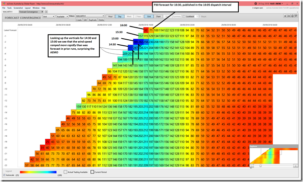
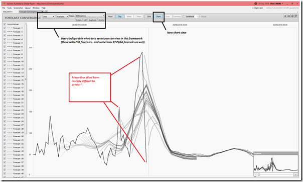
Understanding now that there’s a disconnect currently in AWEFS between the P30 predispatch forecasts and the Dispatch Time horizon, I flipped for the ‘Forecast Convergence’ widget to see what AEMO had been forecasting in terms of the energy-constrained capability of the MACARTH1 unit in this case. I’ve presented the results firstly in tabular/grid form, zoomed in a bit so we can read the numbers:
Noting that the ‘Grid View’ tries to colour data entries with red generally being ‘bad’ and blue being ‘good’ (though appreciating that the perspective of each type of user is different), we can clearly see that the past couple hours the wind speed – and hence energy-constrained available generation – has been very difficult to predict.
In the ‘Unit Dashboard’ view above, we see the large drop in wind output that had occurred particularly in the 15:10 dispatch interval (Raw Off-Target = +195MW on that instance). The grid above helps us understand that this drop in wind occurred ‘out of the blue’.
In the chart view of the same data, we another illustration of how Macarthur Wind Farm is just fundamentally difficult to predict!
———
Thinking forwards to challenges to be resolved as this energy transition rolls forward, and we make the transition to ‘NEM 2.0’ it would seem very beneficial to collectively explore the details of what makes Macarthur Wind Farm such an extreme performer in terms of ‘difficulty to predict’ and to do whatever we can to avoid building too many more of these large size random variables.
C2) Ten other units flagged with moderate discrepancy
As noted above, though no other units were as extreme as MACARTH1 in this instance, it’s worth noting that collective over-performance of the rest was 72MW in aggregate (which is still nothing to sneeze at). Hence it’s worth taking a quick look at the 10 other units highlighted in the tabular summary above:
(C2a) Mt Emerald Wind Farm in QLD
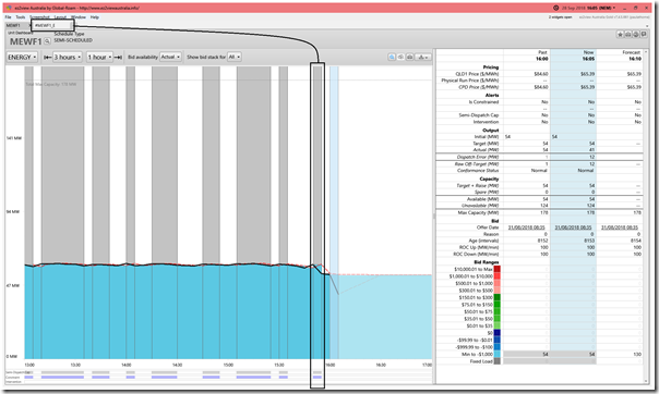
The 12MW under-performance of MEWF1 was beneficial to the aggregate total in this case:
In this case we see that the unit (in many of the DIs prior to 16:05) had been limited to no more than 60MW output due to the ‘#MEWF1_E’ Constraint Equation.
(C2b) Broken Hill Solar Farm in NSW
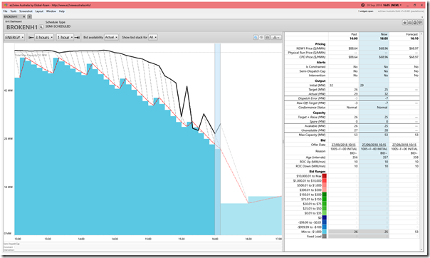
The 7MW over-performance of BROKENH1 was one of the smaller ones of the 8 highlighted:
As the sun fades through this September afternoon, we can see that the actual output of BROKEN1 is consistently falling later than had been forecast in ASEFS on a Dispatch Interval timeframe on this day.
(C2c) Nyngan Solar Farm in NSW
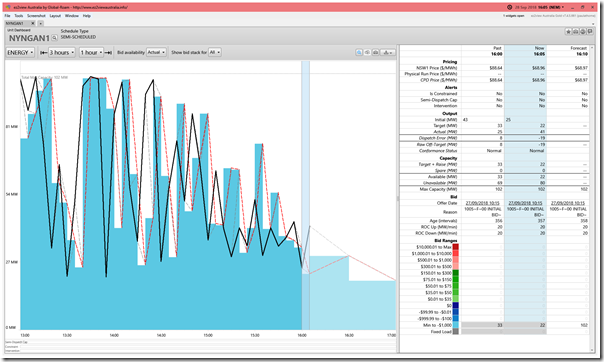
The 19MW over-performance of NYGNAN1 was in the same direction as BROKEN1, but more than twice as large:
Unlike Nyngan Solar Farm (which had been consistently over-performing over the prior 3 hours) the chart for NYNGAN1 looks like a yo-yo! Perhaps some cloud cover impacts?
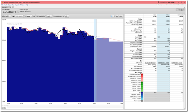
(C2d) Gullen Range 1 Wind Farm in NSW
The 7MW over-performance of GULLRWF1 was one of the smaller ones of the 8 highlighted:
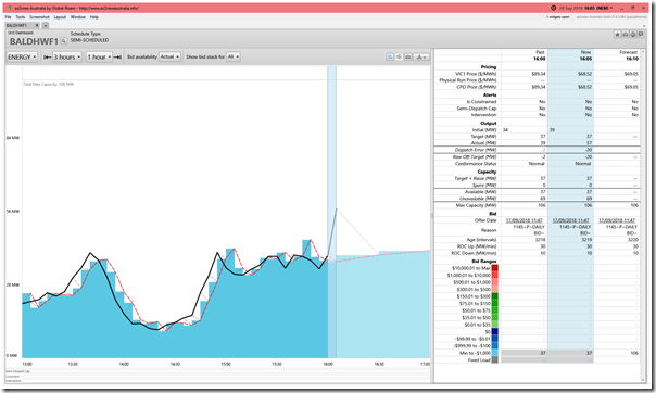
(C2e) Bald Hills Wind Farm in VIC
The 20MW over-performance of BALDHWF1 was the third largest (after MACARTH1 and LKBONNY2):
In this case (a bit like MACARTH1, though not nearly as big) there seems a sudden spike in output not seen in the Dispatch Target.
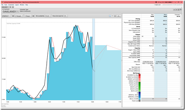
(C2f) Oakland Wind Farm in VIC
The 10MW under-performance of OAKLAND1 was beneficial to the aggregate total in this case:
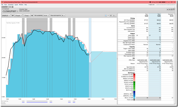
(C2g) Clement Gap Wind Farm in SA
The 7MW over-performance of CLEMGPWF was one of the smaller ones highlighted:
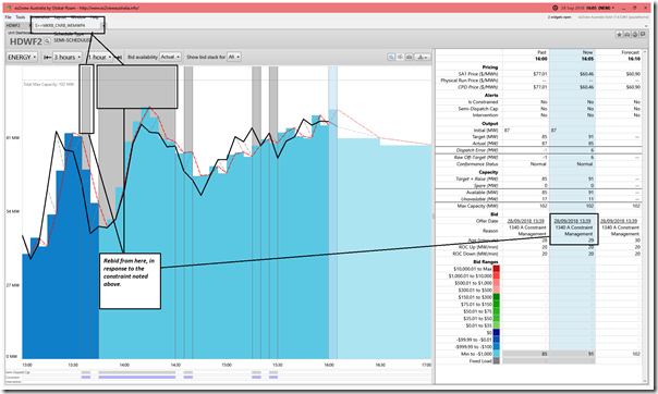
(C2h) Hornsdale 2 Wind Farm in SA
The 6MW under-performance of HDWF2 was beneficial to the aggregate total in this case:
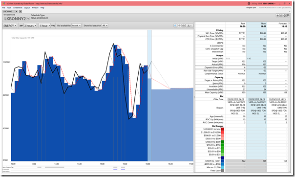
(C2i) Lake Bonney 2 Wind Farm in SA
The 22MW over-performance of LKBONNY2 was second largest (a long way below MACARTH1):
We see a fair bit of variability of output over the past 3 hours.
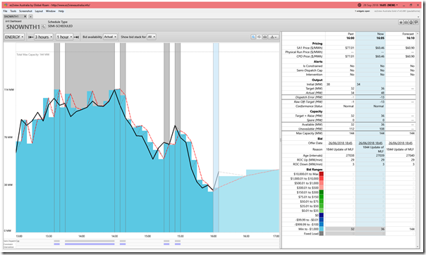
(C2j) Snowtown 2 North Wind Farm in SA
The 13MW over-performance of SNOWNTH1 was one of the 8 highlighted:
—————-
That’s all for this 12th Case Study.


Leave a comment