
This article looks at two topics. Firstly, we note that electricity is losing its share of energy consumption in Australia. That’s the exact opposite of what needs to happen for decarbonization. There is no single energy significant industry where electricity has gained market share in the past decade.
Secondly, going into an issue of interest only to some people, we look at the two main drivers of lower electricity demand this Summer compared to last Summer – that is cooler weather and population growth falling off a cliff. Without getting definitive our feeling is that Covid stopping immigration is as least as important as the cooler Summer. Its likely Australia will lose two years of immigration representing a permanent loss of electricity consumption. Hot Summers on the other hand will be back.
Electricity has lost share in the Australian market
Australia’s energy consumption in FY 19 in PJ is shown below.
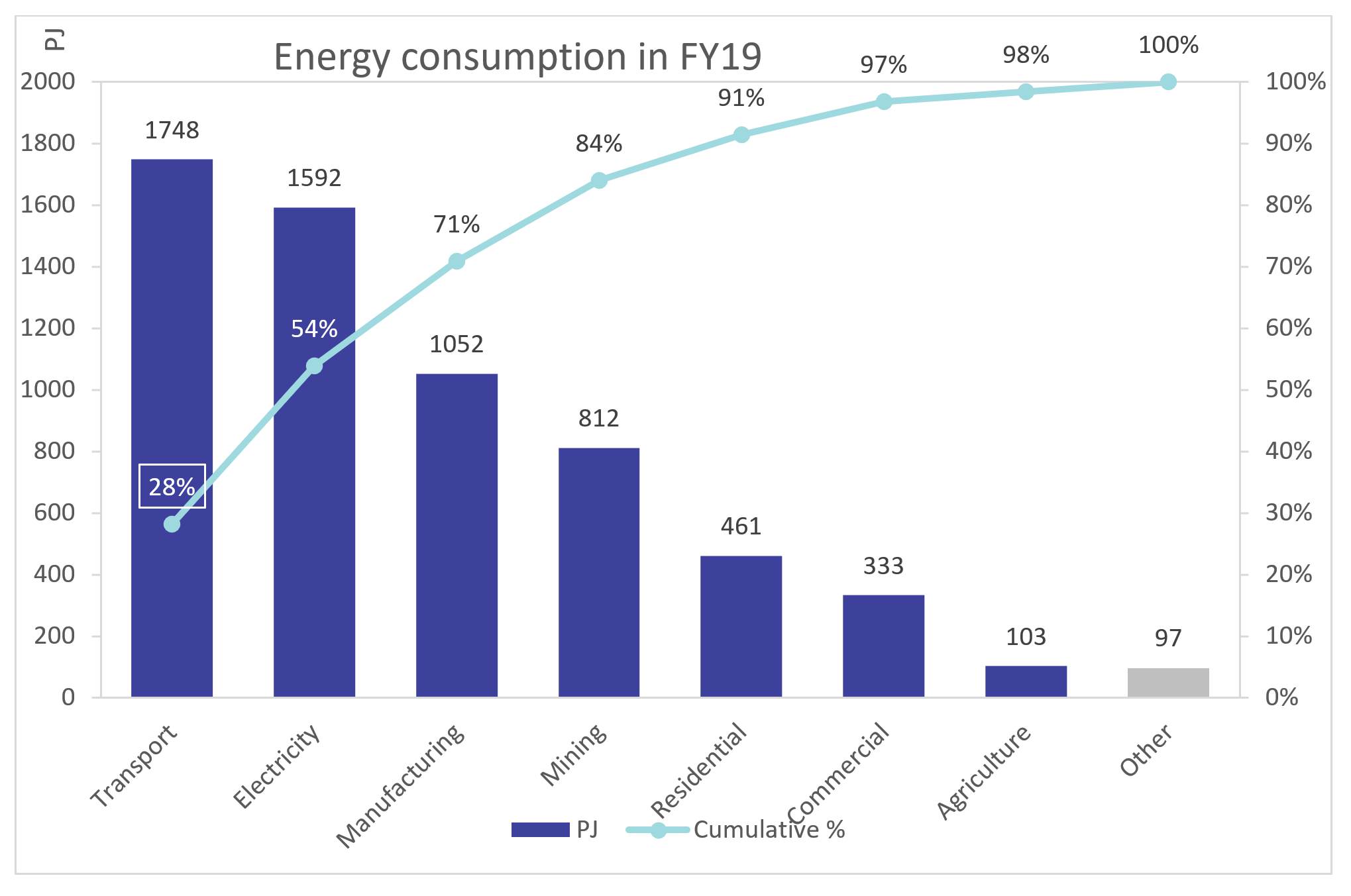
Figure 1 – Source: Australian Government Energy Statistics
85% of Australia’s energy consumption is in transport, electricity, manufacturing and mining.
Between 2003 and 2019 total energy consumption has grown 34% and electricity has lost about 2% market share to gas and oil.
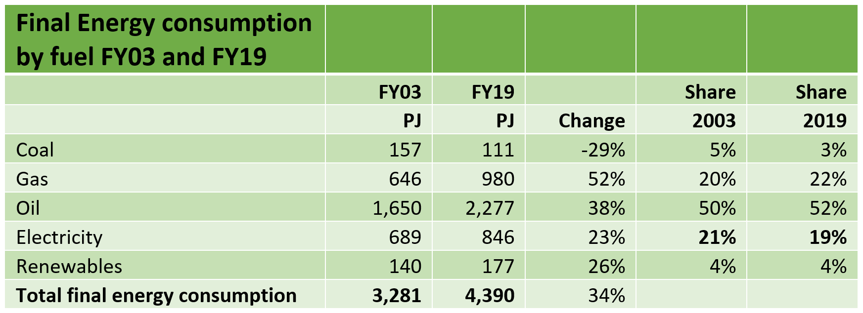
Figure 2 – Source: Australian Government Energy Statistics
Looking a bit closer at the numbers just over the past 10 years, electricity hasn’t gained energy share of any sub-sector of any size. The figure below covers 88% of total energy consumption. The biggest sectors and the ones with growth eg mining, road and air transport have low use of electricity
So this idea that we will decarbonize by electrifying heat and power is so far just an idea. Coal has also lost market share but gas has gained. Enough already.
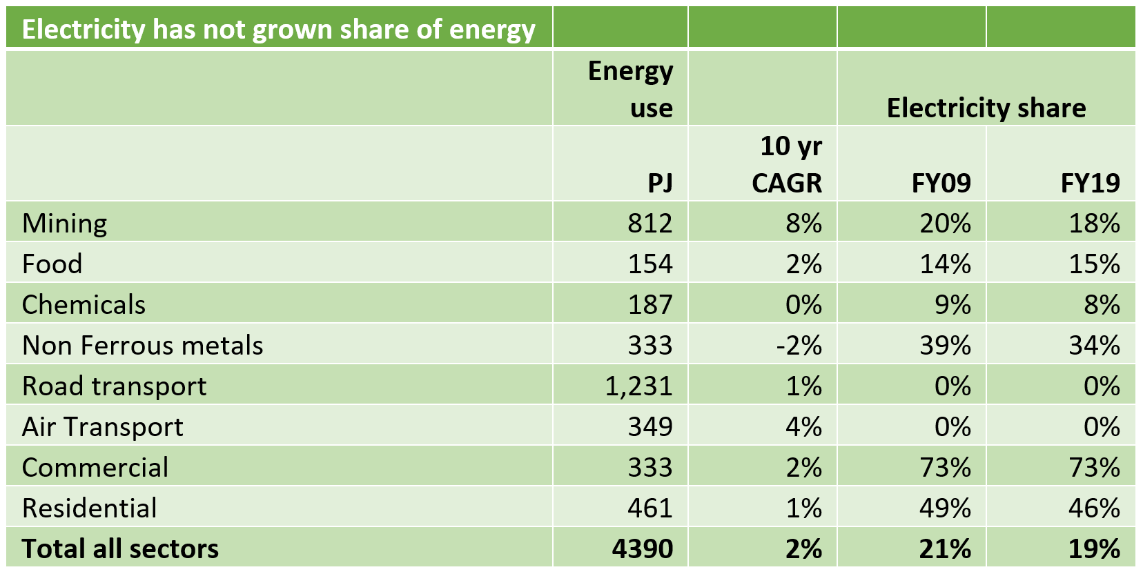
Figure 3 – Source: Australian Government Energy Statistics
Operational electricity demand is a touch lower than in 2014
By and large operational electricity demand is lower now than it was in 2014, but GDP is say 29% higher and population maybe 18 % higher. Behind the meter supply , and energy efficiency, particularly in the built environment, are the basic drivers, as well as the aforementioned loss of share by electricity.
AEMO is the starting point
We consider AEMO’s forecasts to represent the consensus outlook for electricity demand. AEMO considered demand in detail, breaking it down into various sub-sectors and considering each segment individually including employing consultants as required. As such in considering our own (ITK’s) forecasts it’s incumbent on us to start with AEMO’s forecasts. AEMO’s forecasts go further than 2035, as do ITK’s but for this note 15 years seems long enough.
For anyone interested to see just how truly extensive and thorough the work AEMO did on demand forecasting is, see AEMO demand forecasting methods
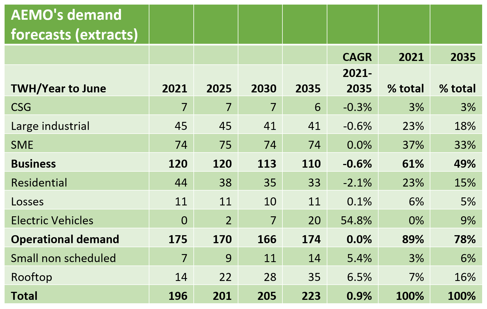
Figure 4 – Source: AEMO
There are many things that interest me in this table but for this note,
- Operational demand in total is flat over 14 years and declines out to 2030 before slowly recovering, however total demand rises at a compound annual growth rate [CAGR] of 0.9%
- Residential demand even in 2021 is only 23% of the total and falls. Yet the vast amount of investment and profit by all actors in the electricity sector occurs through the residential sector. So retailers make far more money from the residential sector than they do from large business. Wires and poles businesses make most of their money from the residential sector. In short residential is far more important in the value chain than it appears in the demand statistics.
- AEMO forecasts constant demand from large industrial loads. Those loads are mostly aluminum and coal mining. Both face an uncertain future and unless new large loads replace them (eg data centres or glory be hydrogen manufacturing).
- Electrical vehicle consumption is 9% of the total by 2035. This is of course an estimate where many different outcomes are possible.
- Business demand [SME] is forecast using a regression model which in the long term uses population growth, household disposable income and the electricity price as the drivers (independent variables). Forecasted business behind the meter generation is subtracted and there is a sort of efficiency adjustment. As Figure 1 shows the result of the forecast is flat SME demand despite population and income growth. There is also a longer-term climate change adjustment, as there is throughout most segments.
- Residential demand was forecast by splitting residential demand into an underlying “base” demand + various adjustments for weather, price, efficiency, and other variables. The base demand increases each year with growth in the number of connections. The following chart shows the process flow. ITK’s observation is that the more input variables and the more complex the model, the more difficult the model is to maintain and the less chance of anyone other than the “modeler” being able to work out what’s really going on.
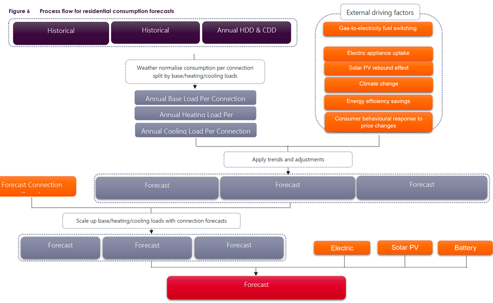
Figure 5 Residential demand forecast process flow – Source: AEMO
And in terms of electrification of heavy industry and or including hydrogen manufacturing, there is essentially no forecast. That’s OK, it would be a brave forecaster to put something in and it would entirely be a guess.
Demand is particularly soft at the start of 2021
The softness of demand this calendar year was the original focus of this article but as Bob Dylan sings “Things have changed”
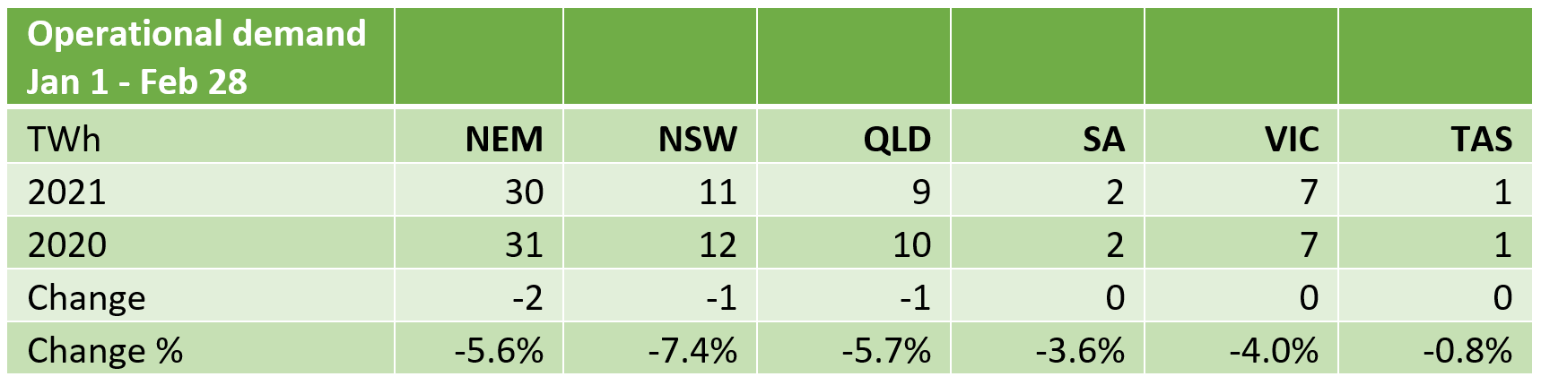
Figure 6 – Source: NEM Review
By time of day using NSW we see in MW the biggest gap is in the late afternoon but in percentage terms, the gaps are in the early morning and late at night, as much as 10% for some half hours. This figure uses total demand, ie including AEMO’s estimate of rooftop, and on average this shows a more startling 7.4% reduction. This does lead me to think about whether AEMO is missing some of the rooftop numbers due to the speed of the recent build-up.
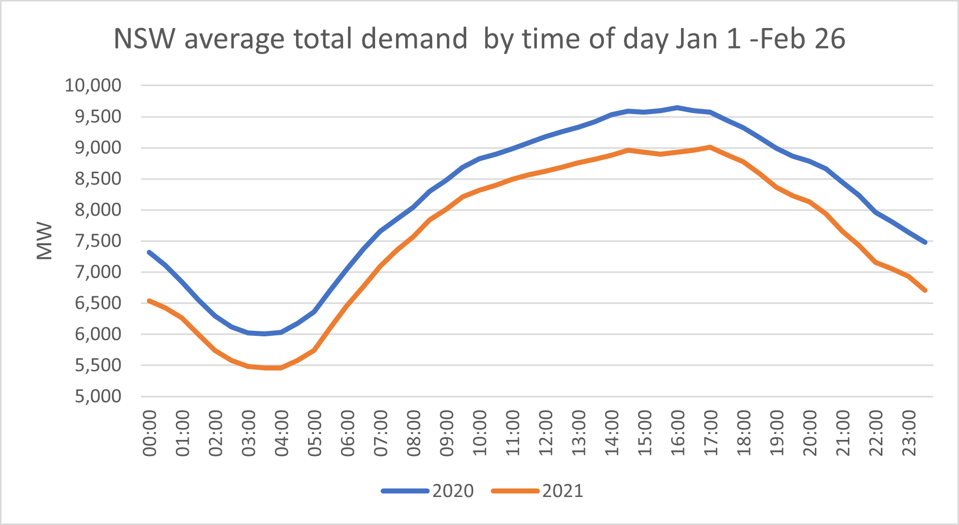
Figure 7 – Source: NEM Review
Immigration’s influence on electricity consumption
Immigration has been adding about 1% per year to the population and when there is negative net migration we would look to a permanent fall in residential consumption as it’s unlikely we will double the immigration rate to make up for the lost migrants over 2020 and 2021.
Australia has had a relatively fast-growing population for a developed country. The population in 2020 has grown about 70% from 1980 with the growth rate has been as high as 2% per year on year at times and a relatively steady 1.6% per year in the past decade.
In recent years there’s been about 0.4 m per year added to the resident population, plus increases in things like students. Of the 0.4 m about 60% had been coming from net migration. The latest data is only for the quarter ended June 2020. In that quarter population growth was negative and I think it’s reasonable to assume that has continued for the last 8 months, so in the graph, the June quarter is the actual number multiplied by 4 whereas all the other data points are a rolling four-quarter total.
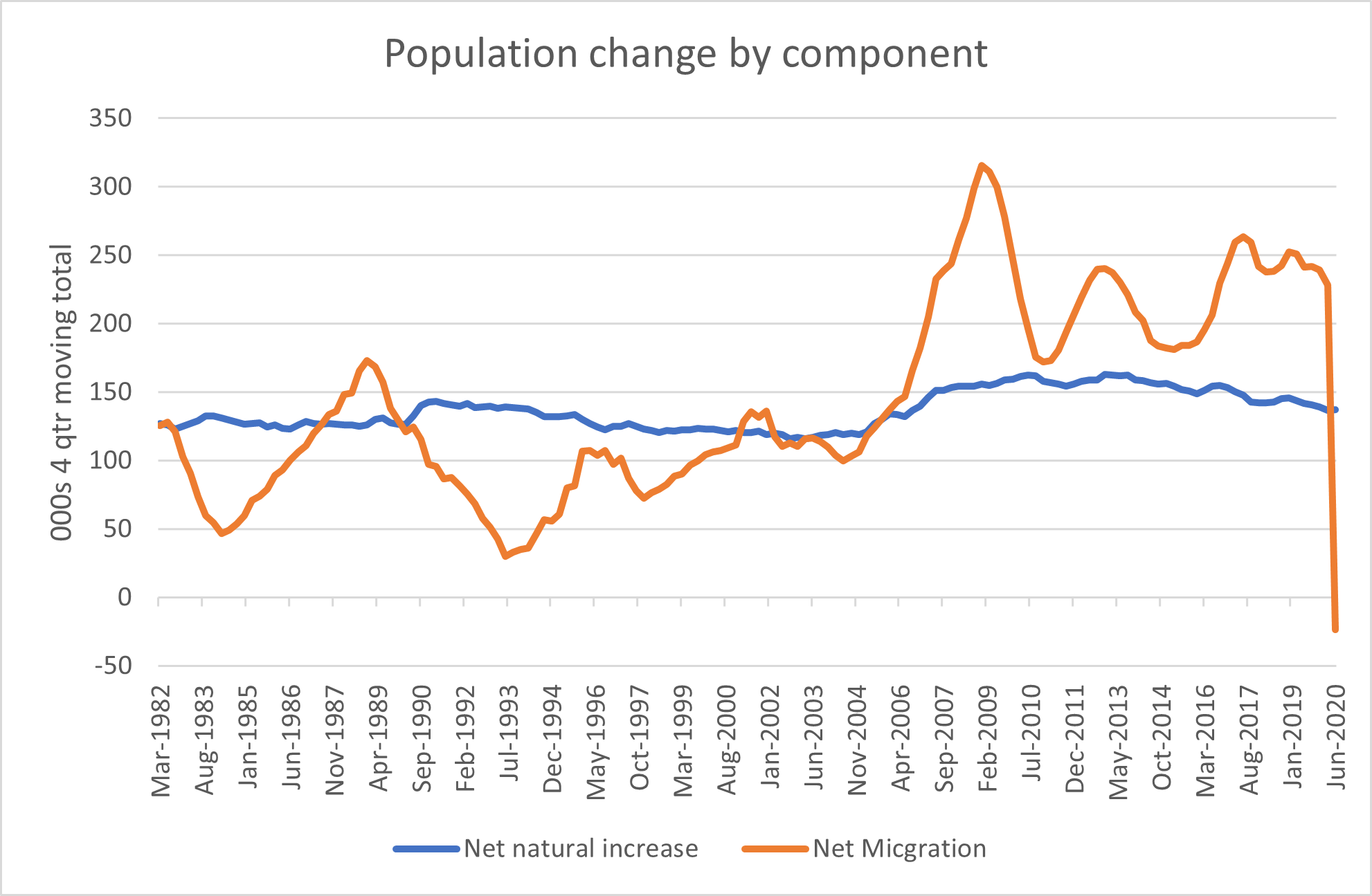
Figure 8 – Source: ABS
As population growth is a driver of both business [SME] and residential electricity consumption it’s clear to see that this dramatic fall in immigration could be expected to negatively impact electricity consumption.
A first guess would be all else being equal that residential electricity consumption changes with the net change in immigration. You could mount lots of arguments about why it might be a bit more or less but…. For SME eventually, a similar relationship would hold, immigrants consume goods and services in the same way as everyone else.
In short at a rough guess, we think the fall in immigration might knockdown electricity consumption by about 0.9%.
Could AEMO be underestimating behind the meter supply?
Demand is ultimately unobservable directly and in practice is calculate as utility supply (adjusted for auxiliary and line losses) + estimated behind the meter production. In turn behind the meter, production cannot be directly measured, or at least only that part of it that is not self-consumed can be measured. In practice, we understand there is something like a sampling process where the output from a series of installations of known capacity is measured. Given the sample output, it’s simple enough to scale up for installed capacity. However, even understanding producing capacity is also an effort.
As the APVI states:
“PV system owners and installers have up to twelve months to report the installation of a new system to the Clean Energy Regulator. Historically, 50% of new installations are registered within one month, and 90% of new installations within four months.
For this reason, the data for the more recent months understates the number of actual installations. In the graphs below, an estimate is made, based on historical reporting patterns, to account for the time difference between systems being installed and appearing in the database.”
The point is that when the pace of installations accelerates, or even if there is a change in reporting patterns by installers to the CER its possible that the range of error in AEMO estimates of behind the meter lag the actual. Were that to be the case demand would be underestimated as would the share of demand being met by rooftop PV.
Temperature impacts
Returning to what’s happening in 2021 compared to last year the following table looks at the half-hourly average temperature at three airports, Sydney, Melbourne, and Brisbane. I’ve shown a percentage change measure in the full knowledge of the problems with doing that when temperature measurement is concerned. By just looking at January through mid-February there is less need to think about cooling degree days. It’s also worth bearing in mind that the March quarter is typically the period where high temperatures can simultaneously cause spikes in demand and falls in supply and that electricity demand falls away strongly as the March quarter proceeds and we get through the worst of the heat and humidity. This year the spikes never came but that is barely detectable in the averages
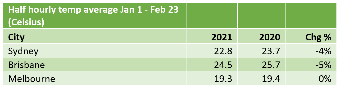
Figure 9 – Source: BOM
Recasting the data as a percentile graph we can see that in Sydney the top 3% or so of half-hourly temperatures were as much as 3 degrees Celsius below PCP
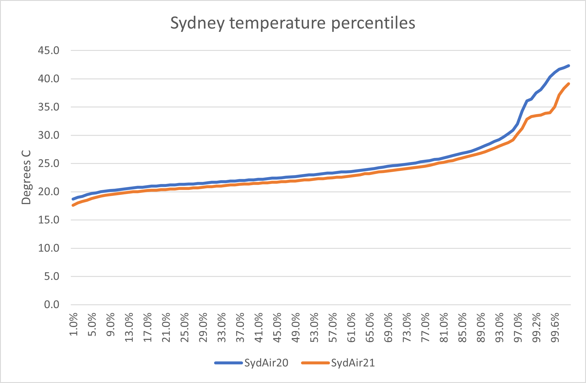
Figure 10 – Source: BOM
In Brisbane though it was cooler weather most of the time and less about the extremes. I guess this reduces air-conditioning load.
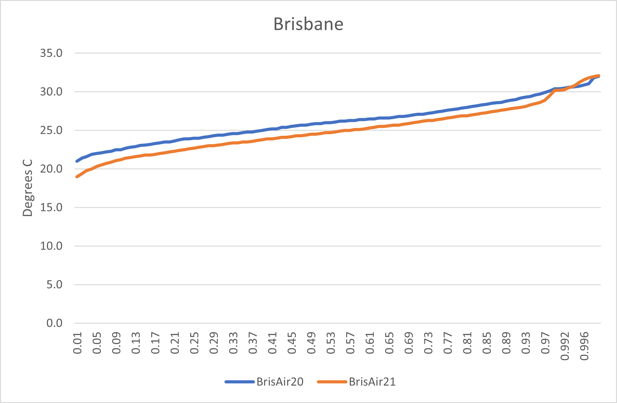
Figure 11 – Source: BOM
Finally, we see that Melbourne is similar to Sydney with the added twist that in 2021 there were less cool periods, potentially reducing heating demand, (in our house temperatures below about 16 C result in calls for warmth, no matter my view that 20 starjumps, a coat or jumper is cheaper and better for the environment)
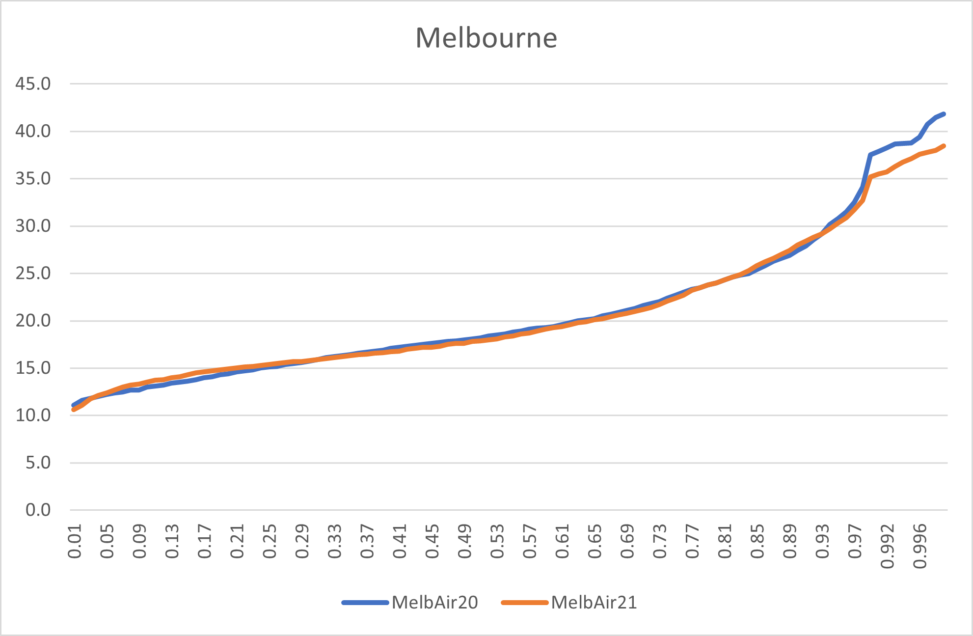
Figure 12 – Source: BOM
In short without doing a more formal analysis, I’d conclude that a milder Summer has contributed to lower electricity demand but the decline in population growth is likely to be as least as important.
————————————–
About our Guest Author
 |
David Leitch is Principal at ITK Services.
David has been a client of ours (and a fan of NEMreview) since 2007. David has been a long-time contributor of analysis over on RenewEconomy, very occasionally contributes to WattClarity! David also provided valued contribution towards our GRC2018. David has 33 years experience in investment banking research at major investment banks in Australia. He was consistently rated in top 3 for utility analysis 2006-2016. You can find David on LinkedIn here. |
I suspect that with improving value in heatpumps and higher COP,electricity gas price differentials moving in favour of electricity and a start of a movement to build gas free developments we have reached a tipping point where domestic and commercial gas is not economical. The building of the first all electric hospitals will confirm the possibility of gas free operation fro most commercial and institutional buildings so hopefully the next 5 years will see a significant reduction in gas use for heating while gas use for power generation could fall by 85% from 2017 levels by 2024 unless coal use falls dramatically, it has already fallen 40% since its peak