Frequent readers will understand that we are particularly keen watchers of what’s happening in the National Electricity Market. Coupled with this underlying interest, we’re giving a portable BBQ away to the lucky forecaster who is closest to the mark with their forecast for the maximum wind farm output over an extended summer period.
Hence we’ve been interested to see what’s happened over summer, to date.
1) Who’s still in the running for the competition?
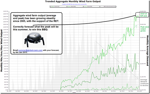
Back in early December, we provided these tips in terms of how wind output had trended over the period since late 2005 (when AEMO started publishing data). The chart has been copied here, for ease of reference:
As can be seen in that chart, wind output had stepped up in mid 2014 with the commissioning of new plant, and was bumping around 2,900MW at times of peak output.
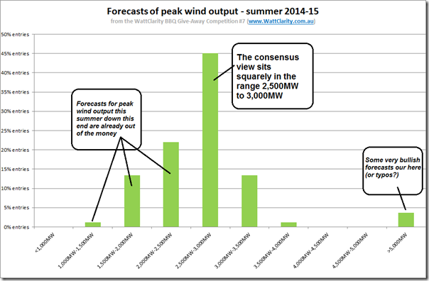
It was with interest, then, when we tallied up the range of entries received over the few weeks we allowed entries in the competition to see the consensus view was that peak output would not be more than 3,000MW (and would, in fact, be pretty similar to what we’d seen in the preceding months).
This was a bit of a surprise to us, as we were aware of a couple wind farms that we were expecting to begin generation through the summer period. Hence it was with interest that we have kept an eye on what’s happened, thus far.
2) So far this summer?
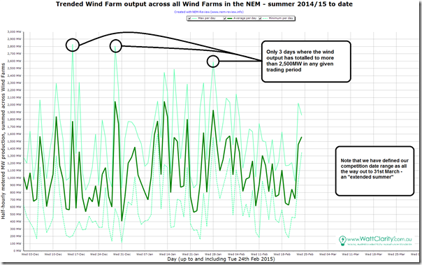
Powering up NEM-Review and looking back over all days that have elapsed in summer to date, we see that the there have been only 2 days so far this summer where the wind output has peaked anywhere near that historic level (3 days above 2,500MW and only 2 above 2,700MW):
Hence, whilst some low-ball entries are already out of the money, it does appear that the consensus view is reasonably close to where peak wind output has tracked this summer (at least so far).
So, we wondered, why was it that we were expecting something higher…?
3) Having a closer look
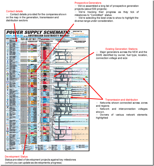
During 2014 we invested considerable time and effort in the updating of our “Power Supply Schematic” Market Map wall chart (2014 Issue) as highlighted here:
Part of this job required us to update a long list of generation projects under consideration in the left column highlighted above. In this wall chart we used light blue to indicate wind farms (many different types of generation, so lots of different colours used).
In the left column we can see a significant amount of light blue, reflecting the large amount of capacity at various stages of development (pending the long-awaited outcome of the RET Review). Note that not all of those projects could be called “shovel ready” – some are but a glimmer in some developer’s eye – but a sizeable amount is, awaiting PPA as a sign to proceed.
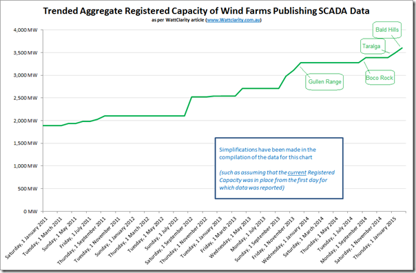
At the time we completed this chart (early September), stations under construction were also listed on the left and not the right (operational) column. Looking back to the start of 2011, we can see the following as an approximate trend in aggregate capacity of wind farms in the NEM:
The four most recent additions (for which output data is now being published by AEMO) are highlighted.
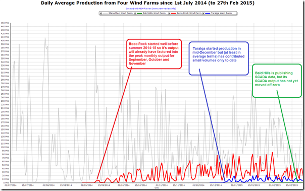
We had been assuming (without really looking at these specifics) that these new entrants would increase the chances of peak output being higher. However on closer note we see that only three wind farm operational start dates are remotely close to summer 2014-15 – as highlighted in this NEM-Review chart which shows averages for the day (as distinct from daily peaks):
For scale purposes, I’ve also included the daily average output production from the large Macarthur wind farm on the chart.
3a) Boco Rock Wind Farm
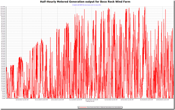
As noted above, Boco Rock output will have been already taken into account in the maximum monthly figures shown in the top chart for the months of October, November and December 2014.
As we can see in the following detailed (half-hourly) view, the station’s peak output had reached its registered capacity by early December 2014:
Hence no additional uplift can be expected for the remainder of summer.
3b) Taralga Wind Farm
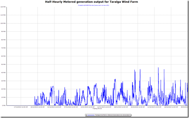
The same chart is shown below for the Taralga wind farm.
As can be seen, metered generation (to date) has only reached about 40% of the registered capacity for the station. We have not checked but expect that this has something to do with the commissioning schedule of individual turbines onsite.
Depending on how this commissioning progresses, we might see an additional 50-60MW contribution at times of peak wind farm output.
3a) Bald Hills Wind Farm
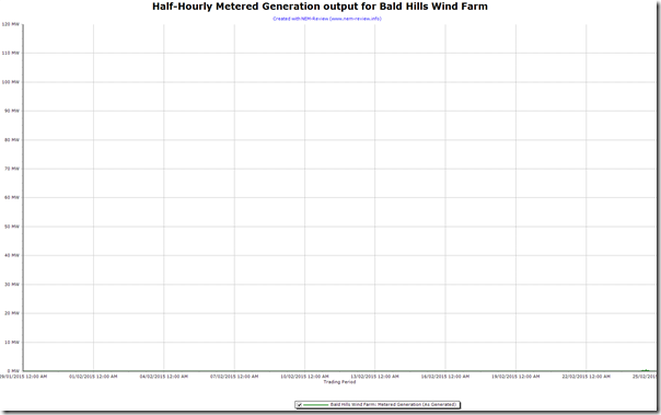
Finally, the same chart is shown here for Bald Hills wind farm – indicating very early days at that station (it has been publishing data these past few weeks, but they are mostly zeros):
On the project site here, it was still noting that expected date of full operations is “early 2015”. According to this article, it may be June 2015 before we see it fully operational.
Hence we’re not sure how much contribution Bald Hills might make to maximum aggregate output by 31st March.
Incidentally, we’ve been thinking about whether there are better ways of tracking project status, and would like to hear from you if this is also a concern of yours. Please please email us if you would also like to find a better way.
4) How you might track this yourself…
4a) For a free view
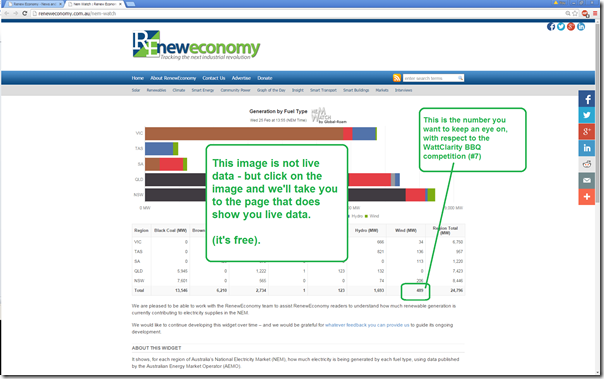
For those who want to view what’s happening in the NEM from time-to-time, in relation to what type of fuel types are being used to generate each MWh of energy, then we would invite you to bookmark and return to this widget/page we’ve teamed up with the RenewEconomy team to provide:
It’s one more service we’ve started to provide with the intent of continuing to make the complexity in the NEM understandable to a broad range of people.
We’re keen to hear from your feedback, once you have had a chance to review this site – hence please let us know what you think!
4b) For more detail, still at a fair price
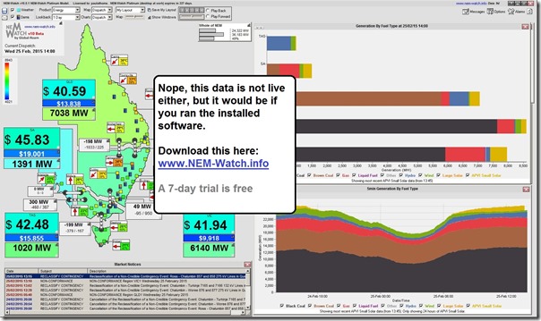
For a fuller view of which fuel type is generating what, and how this is impacting on price (and other) outcomes across all regions of the NEM, we’d invite you to run your own copy of NEM-Watch as a 24×7 dashboard in a central place in your office. Here’s a view of version 10 beta (release coming soon):
4c) To find out who wins the portable BBQ
To learn who wins the competition, we’d suggest you set a reminder to come back and visit WattClarity in April, when the winners for all 7 competitions will be announced. Of course we hope that you’d be finding the articles we post here, including those of our growing number of guest authors, to be of value in the meantime….
If you have other questions about wind generation in the NEM, feel free to add them as comments below.


The sole justification for wind power is to avoid GHG emissions. Therefore, I’d suggest displaying the emissions in real times (as is done in other countries). More importantly show the emissions avoided by wind in real time as well as:
CO2 emissions by technology (t CO2/h) and t CO2/MWh
CO2 abatement cost ($/t CO2 avoided)
See EirGrid for example: http://www.eirgrid.com/operations/systemperformancedata/co2emissions/
And
France: Demand, Generation, Trading, CO2 emissions in real time: http://www.rte-france.com/en/eco2mix/eco2mix-co2-en
I should have said “the principal justification for wind power is to avoid GHG emissions.”