In conjunction with Greenview Strategic Consulting, we released of the Generator Statistical Digest 2019 back on 28th January 2020. Since that time we have been pleased with a steady stream of orders arriving – including from a broad range of organisations who’ve not previously been clients of ours. We thank them all for allowing us to serve them in this way.
Our intention, when we released the GSD2019, was to freely share some of the value contained in the GSD2019 here on WattClarity (with some copied elsewhere as well). I want to focus on the content newly added into the ‘B’ Pages (specifically focused on 2019) that were not a part of in Part 3 within the GRC2018.
Since that time, our attention has been diverted (as has much of the market’s – and rightly so) by an ongoing stream of challenges that have continued to flow through the long, hot and stressful summer 2019-20.
However that summer is behind us now, and we’re into autumn 2020 with already one islanding event under our belts just one week in … so we certainly can’t say we’ve resumed ‘normal programming’ yet. I am hopeful, however, that we can return to our ambition of broadly sharing some value available in greater depth within the Generator Statistical Digest 2019 itself.
——————
In this vein, it was an article in ‘Economists Corner’ of the AEMC website that caught my interest – with the very topical title of ‘The value of dispatchability in the NEM’ published by Dr Alan Rai on 27th February 2020. This short article, in turn, references this paper in The Electricity Journal also titled ‘Is there a value for ‘dispatchability’ in the NEM?’ by Dr Alan Rai and Oliver Nunn (which I don’t have access to, so can’t comment specifically on – and, too be honest, probably has enough mathematical symbols in it to put me to sleep).
Whilst the word ‘dispatchability’ would be what (I suspect) would have fired up the attention of many who have seen it (‘cause there’s no doubting that that’s a big challenge we have to work through if this energy transition is to succeed), I would argue that there is a word in the title that is even more important, and that word is ‘value’.
(A) Have we been killing new entrants with kindness?
That word ‘value’ and the lack of real focus on it for those prompted to just think of the challenge in terms of ‘anytime/anywhere energy’ is of such importance that it prompted me to post this long overdue article here yesterday on WattClarity.
(B) Explaining the Ratio (LWA Price /TWA Price)
Towards the top of the ‘B’ Pages within the GSD2019 , we include three rows of prices for that particular DUID:
| Data Sets Included | Brief Description |
| Time-Weighted Average (TWA) price ($/MWh), or RRP | Being just a time-weighted average spot price for a region, each DUID in the region will see the same TWA Price. |
| Volume-Weighted Average (VWA) price* ($/MWh)
also called |
Whilst the TWA price might garner the broadest attention, it’s the VWA price which better highlights the degree to which the generator matches its output against times in that generator’s region where energy is more highly valued (and hence its competitive position in the market).
* Take careful note that what is presented in the GSD2019 is the VWA Price and not a VWA Revenue number, with the important distinction being that the DUID’s marginal loss factor has not been taken account of in the forming the metric. We have done this so that comparisons between VWA at various assets can provide a clearer view of the differences in production profiles (and, importantly, the commercial implications of this). |
| Connection Point Dispatch (CPD) price ($/MWh) | The CPD Price is calculated by AEMO for every dispatch interval to take account of transmission congestion specific for that DUID. In the GSD2019 we aggregate on a time-weighted basis to help the reader understand the impact of transmission congestion on that asset.
—————- We’re not going to look at the CPD Price in this article, however it has been discussed elsewhere already: In particular, Allan’s article ‘How good is Solar Farming?’ on 28th January 2020 highlights how this table in the GSD2019 makes it easy to quickly compare across a broad number of units to understand both: The way in which the GSD2019 makes it easier to understand congestion risk (and impact) was also picked up by Ben Willacy in ‘What lies ahead for the NEM in 2020? Some lessons from 2019’ on 28th January 2020. |
Within each row, we show an average across the whole of CAL 2019, and also monthly averages for each of the months in the year. In this article, we primarily use the CAL 2019 values and have defined the ratio as follows:
Ratio = VWA/TWA – 1, expressed as a percentage
Hence producing one number per DUID representing the whole of CAL 2019, and where:
(a) a number below 0 indicates VWA < TWA – so a poor performance in terms of dispatchability (in comparative terms specifically with respect to this metric); and
(b) a number above 0 indicates VWA > TWA, sometimes significantly so (e.g. for peaking plant). With that in mind, let’s proceed with the comparisons…
(C) Comparing results for different DUIDs
A note of caution – taking this Ratio and comparing across Fuel Types to pronounce one particular fuel type as ‘best’ would be just as misguided as doing the same with LCOE figures (other shortcomings of LCOE have been discussed before under ‘Cost Confusion’).
(C1) Broad Results
With that caution in mind, this is where we will start, in order to set the scene:
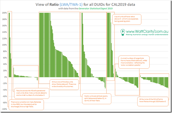
First and foremost we see that there is a significant variability of Ratio across all of the 292 units for which data is shown here. That is expected and necessary, given that different roles that the plant play in keeping the supply/demand balance:
(a) In the (not so distant) past, these types were classified broadly as Baseload, Intermediate (or Mid-Merit) and Peaking
(b) More recently there has been talk about classifying plant as ‘intermittent’ and ‘balancing’; however
(c) In my view, that paradigm is not going to get us where we need to be, which means that we will shift to some other classification that will also reflect the rise in hybrid registrations which are bound to come (perhaps pushed along by the abandonment – or a major rework – of the Semi-Scheduled registration category which is producing growing evidence is not sustainable or scalable in its current form).
However even though it is expected, and necessary, it does bring its own challenges for investors caught on the negative side of the Ratio …. particularly if they have not been properly prepared for this by the way in which we have encouraged their entry.
(C2) Comparing within fuel types
Where it becomes a lot more interesting is where we take the results above and zoom in on specific fuel types, comparing results across assets in the same fuel type class:
(C2a) LWA/TWA Ratio for Batteries
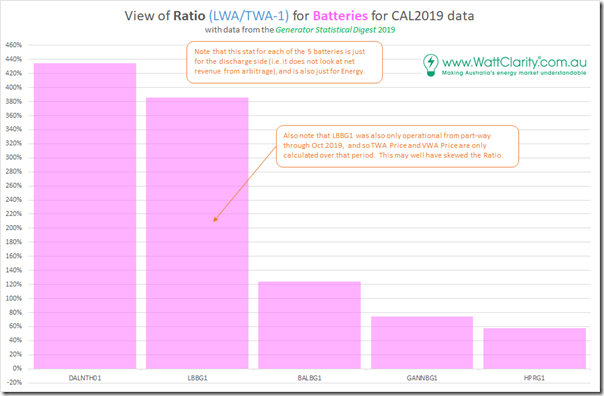
Filtering down to just the 5 batteries that operated in the NEM through some part of CAL 2019, we see the following results:
It’s clear to see that Dalrymple operates very differently to Ballarat, Gannawarra and Hornsdale Power Reserve. Results for Lake Bonney Battery have probably been skewed by the fact that it was only operational from October 2019, so I would not draw much from CAL 2019 results for that battery.
(C2b) LWA/TWA Ratio for Coal-Fired Plant
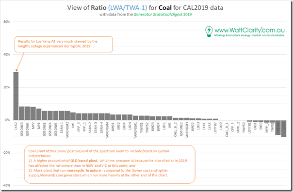
Here are the results for the 48 still-operational coal-fired units:
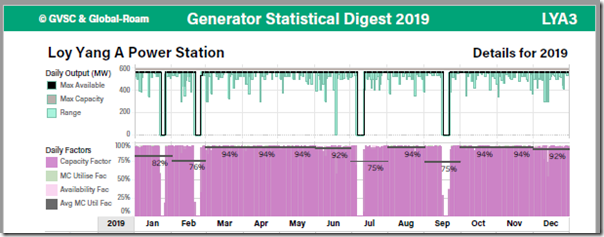
With the exception of Loy Yang A2 (which had its own reasons to be an aberration that AGL Energy won’t be forgetting soon) we see that the results lie in a narrow range from 8% at the high end (Gladstone unit 3) down to –10% at the low end (Loy Yang A3). Unlike Loy Yang A2, unit 3 had a fairly solid year of operations, as shown here in these two images extracted from that particular ‘B’ Page:
Apart from four short outages (and what looks to be an additional trip in June 2019) we see that the plant ran very heavily for the year, often not even significantly reducing load overnight.
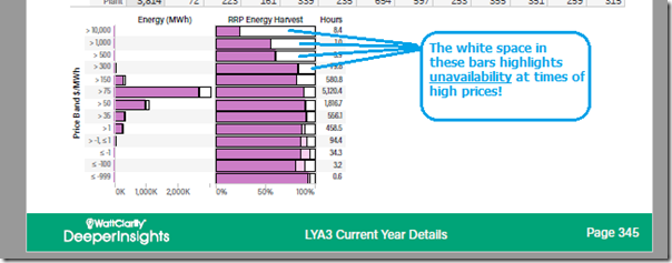
We would need to investigate further why it suffered such a deficit in ratio, then, through CAL 2019. But thankfully this is very easy, with the use of the ‘Price Harvest’ chart at the bottom of the ‘B’ Page:
We can clearly see that this unit ‘missed’ dispatching into a significant number of high-priced events because it was unavailable (and indeed might have contributed to those high prices – particularly on 23rd, 24th and 25th January 2019). Just missing those few days whacked the aggregate result for a year significantly, as we can see above.
Yallourn Unit 4 was also the other poor performer in this group, based on this metric. Those with their own copy of the GSD2019 (download it here, if you have access) can take a closer look.
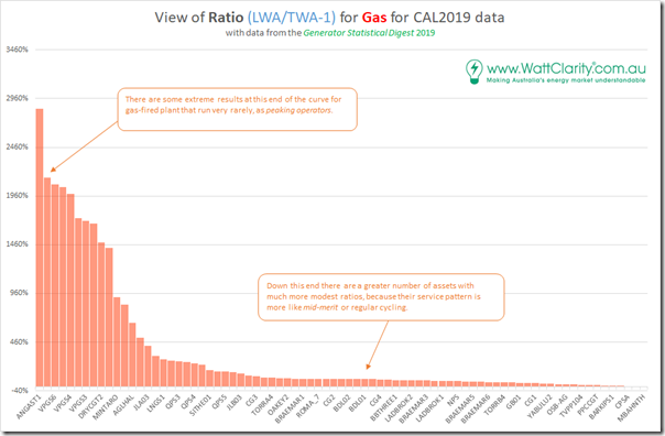
(C2c) LWA/TWA Ratio for Gas-Fired Plant
Moving onto the larger number of gas-fired units, we see a much broader spread of ratio – which reflects the different types of operations duty required for the plant:
With data like this, it would be possible to go some way towards answering the question implicitly asked about ‘underperforming’ gas-fired assets coincidentally asked on the weekend.
… but that’s for another article some other time.
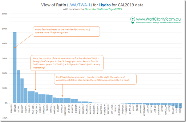
(C2d) LWA/TWA Ratio for Hydro Plant
The diversity seen in the results for Hydro is understandable given the variety of roles taken for these plant – being operated very differently in Tasmania (predominantly hydro) to the Mainland (primarily a peaking role) excluding the hydros in Northern Queensland (which have their own requirements to run partly external to the market). This can be seen in the following split of results:
No time to discuss this further today…
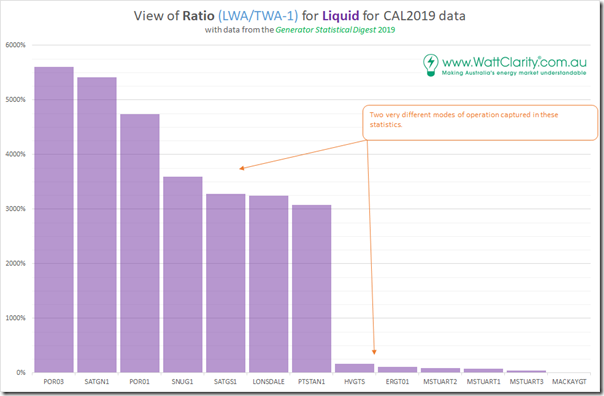
(C2e) LWA/TWA Ratio for Liquid
Here’s the equivalent stats for the smaller numbers of liquid-fuelled units currently operating in the NEM.
Results for Mackay GT are skewed by the fact that it barely ran through CAL 2019, but was moreso used for the provision of FCAS services (see the relevant ‘B’ Page for more details).
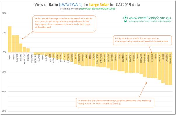
(C2f) LWA/TWA Ratio for Solar Farms
Passing quickly onto the fleet of solar farms that operated through at least a portion of CAL 2019, we see the following:
What jumps out first in this chart is the geographic split in the chart, with:
(1) Solar Farms in VIC up on the left hand (i.e. beneficial) end of the spectrum; whilst
(2) A whole swarm of solar farms in QLD up at the right hand end of the chart, which is no surprise given what we have seen of how the ‘solar correlation penalty’ has taken strength in QLD through the prior year and the growing significance of Queensland’s own form of ‘System Strength Constraint’ (that is touched on here).
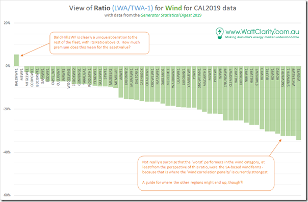
(C2g) LWA/TWA Ratio for Wind Farms
Last but not least, we take a quick look at the same ratio for all Wind Farms and we see the range running from a single Wind Farm above 0% (Bald Hills WF at 6% – worth investigating further at some point) cascading down to quite negative levels, with the worst being Willogoleche WF in South Australia at –34%:
Part of the reason for the poor performance (on this metric) of WGWF1 was the fact that it was only fully commissioned by July 2019, so its output was biased away from the high prices experienced in summer 2018-19 in South Australia. However the fact that Waterloo Wind Farm was only 2% better (at –32%), followed by a whole swag of other wind farms clearly demonstrates the impact of the ‘wind correlation penalty’ and represents an escalating challenge to layering more and more wind into any area that suffers from such a high degree of correlation of wind patterns.
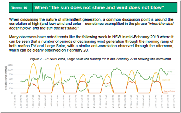
This topic (i.e. diversity of generation patterns) was, for instance, a systemic challenge that in the Generator Report Card 2018 (in Theme 10 within Part 2 of the 180-page Analytical Component) and one we will be looking forward to exploring further in the Generator Report Card 2020 (should we find time enough to produce that – would you like to help with that?):
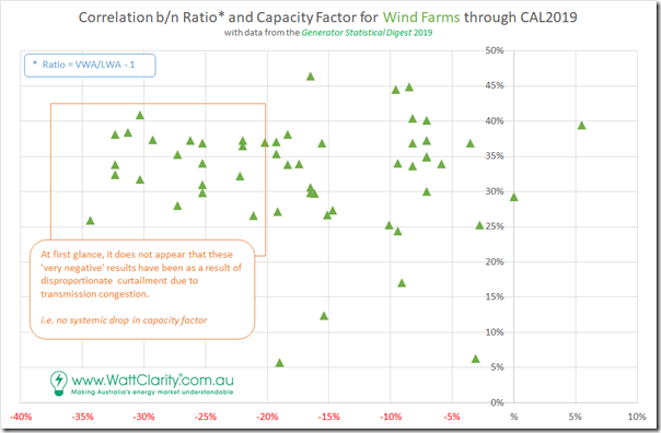
Out of curiosity, specifically for wind farms I threw together this correlation between the Ratio and the Capacity Factor through CAL 2019 for the Wind Farms:
I don’t have a huge amount of time to consider this much, but it does appear that there is no indication that the wind farms on the extreme left (i.e. that suffer the most from ‘wind correlation penalty’ have been disproportionately constrained out of the market due to transmission congestion.
——————-
I’ve have run out time to consider this further today, but we hope to have more insights to share in the afternoon’s ‘Operating in the NEM’ session of the upcoming CEC’s ‘Wind Industry Forum’ in Melbourne, if you will be there?


Leave a comment