Frequent readers might note that I’ve not been posting about forecast LOR3 conditions in recent days … but that does not mean that they have stopped occurring.
Background
It used to be the case that forecast LOR2 and forecast LOR3 were quite rare occasions for any region … and times of Actual LOR2 and/or Actual LO3 were rarer still.
It was with this (‘normal times’) paradigm in mind what we started reporting on these events when they started occurring:
1) On Monday 13th June … at 08:01, at 09:34, after 13:00, around 15:00, at 16:51, and at 18:11.
2) However it was Tuesday 14th June was particularly problematic for us in doing this – we posted three successive updates (around 11:00, around 15:20 and then around 19:22), but on each occasion found the situation increasingly difficult to do:
(a) Difficult to ensure the information presented was correct and complete at the time with so many different alerts; but also
(b) Cognisant that a later reader could easily miss the time-stamp inherent in the article, with data changing so dynamically.
However more significant than the above was the view expressed by Lynne Gallagher (CEO of the Energy Consumers Australia) who wrote here that:
‘It is significant that today the AER has taken the step of reminding generators of their obligations, confirming that generators are “withdrawing available capacity from the market”. This is creating significant anxiety amongst consumers who fear that they will have blackouts this week, because only a week ago they were told that significant capacity was unavailable – due to lack of coal, lack of gas and coal generators going off line. It is critical that households and small businesses hear a consistent message from experts and Ministers, that they don’t have to go without the power they need. Though they do need to be energy wise.’
From a WattClarity point of view, we started adding caveats to these LOR reports … but then reasoned that we’d be better to stop altogether and address this data set another way.
This decision was made because the meaning of the data has (temporarily) changed during this period of Administered Pricing and into Market Suspension (i.e. with the root issue being that price caps are below the level of SRMC of some supply sources).
Initiative #1 = reporting on WattClarity
Instead of reporting static snapshots-in-time as we had been last week, we’ve resolved to build a few live-updating widgets and embed them free-to-access on this page here. This work is underway.
They are not there yet, but interested parties might like to keep an eye on the page for when they arrive (time permitting during the current week).
Three advantages we envisage in building this page are:
1) During the current environment of the ‘2022 Energy Crisis’ these pages:
(a) Will always contain the current data; and
(b) We can expand the page with more focused explanation (and caution about misinterpretation); and
2) Once the near-term crisis has been resolved and we’re out of Administered Pricing, the meaning of the data will revert to the more traditional meaning of LOR1, LOR2 and LOR3.
These widgets will show a simple one dimensional view of the data over time.
Initiative #2 = reporting inside of ez2view™
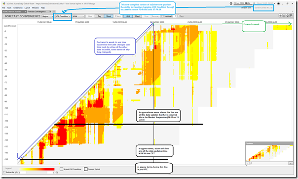
Inside of our ez2view software application, with an upgrade to v9.4.2.62 compiled today we’ve now added in the ability to visualise how the forecast LOR Condition (across PD PASA and ST PASA) changes through that other dimension of time. Here’s an illustration of the ‘Forecast Convergence’ widget for the 18:35 dispatch interval focused on the NSW region, looking backwards a week and forwards a week:
Remember that the diagonals draw in the ‘actual’ half hour periods, and each horizontal row is a successive forecast (across PD PASA and then ST PASA further out). The three colour scale is:
1) LOR1 being yellow,
2) LOR2 being orange
3) LOR3 being red.
I’ve drawn in horizontal lines to indicate approximately:
1) When (at 18:35 on Monday 13th June) the NSW region surpassed the Cumulative Price Threshold and triggered the Administered Price Cap.
2) When (in the 14:05 dispatch interval on Wednesday 15th June) the Market was Suspended across all regions.
Looking up through the grid of colours, it appears that:
1) Prior to the Administered Pricing the small amount displayed suggests not as many LOR conditions forecast.
2) After Administered Pricing the change was initially more moderate … but from around the 13:00 run on Tuesday 14th June the horizontal rows gained a much longer stretch of colours (i.e. a little while before I struggled to make this 15:20 report on the day).
3) From ~23:00 on Thursday 16th June (some time after Market Suspension) the red colours faded away, though leaving large blocks of orange and yellow, and the occasional red forecast.
I’ve not looked at the other regions … but they are all now in ez2view v9.4.2.62 for ease of access.
One more enhancement we’ve made to ez2view recently to address the emerging needs of the ‘2022 Energy Crisis’.


Leave a comment