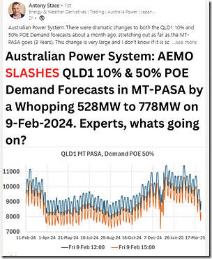
Saw that Antony Stace asked this question here on LinkedIn today:
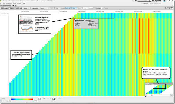
Without going all the way to provide a complete answer to the question, thought it would be useful to provide some quick additional context using the ‘Forecast Convergence’ widget in ez2view, focused on 3 years of history of AEMO’s successive forecasts for QLD’s ‘Market Demand’ in the following grid:
Frequent readers will recall that:
1) You should click on the image to open as a larger resolution image in another browser tab; and that
2) In this widget, each successive row upwards is a more recent forecast run, meaning that you can ‘look up a vertical’ to view ‘that other dimension of time’.
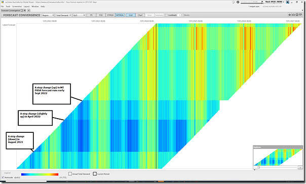
The ‘zoomed in’ image above clearly shows the step change (downwards) that Antony is asking about … but also that there was a very similar step change upwards some months earlier (Aug 2023). Zooming further out in the image below, we also see three earlier step changes (Sept 2022, April 2022 and Aug 2021):
I’m not going to fall into the trap of trying to find what I believe will be on the AEMO website somewhere (as it’s truly a rabbit hole that can suck an hour of one’s time without finding the results), but my guess is that each of those 5 x clear horizontal stripes corresponded with the release of some updated assumptions for demand forecasts (e.g. as part of the ESOO or ISP modelling processes). Note that the horizontal strips are in Aug-Sept each year, plus sometimes ~ half a year after that.
Exactly what the change was that saw the ~500MW drop in forecasted demand in QLD, however, I do not know. Perhaps one of our readers can help Antony?


Leave a comment