
An old adage runs that to eat an elephant, it’s best to proceed in small servings.
With a very eventful Q2 in the NEM not yet finished, the number of headline events is already large enough – unexpected price volatility in Queensland and NSW, a turbo-generator explosion and widespread blackouts in Queensland, major storm damage in Victoria, and flooding threats to the Yallourn coal mine. Not to mention moves in the regulatory and investment space with publication of ESB proposals for market redesign and the Federal Government announcing investment in a new gas-fired generator in NSW.
Digesting the details and implications of all these events is the analytical equivalent of elephant eating, so I plan to post a number of bite-size pieces on WattClarity dealing with a few aspects of what’s unfolded this quarter.
This first course focusses on overall price outcomes and trends in both the spot and forward contract markets.
In subsequent servings I hope to get into a few more details of bidding behaviour and other drivers of specific volatility events, and perhaps some overall comment on what these might indicate for future periods.
Overview
Let’s begin with an overview chart of half hourly and daily average spot prices across the quarter for the NEM’s mainland regions. This shows where and when price volatility outbreaks occurred. Note the different scales, with average daily prices on a scale one-tenth that of half hourly spot.
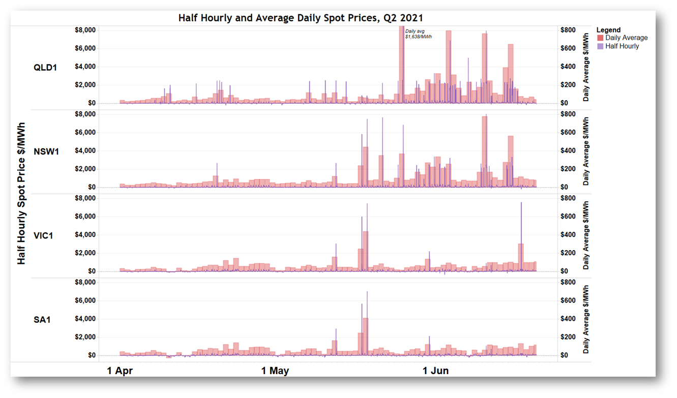
Half hourly spikes to around $2,000-2,500/MWh correspond to a single five minute dispatch price close the Market Price Cap of $15,000/MWh (the half hourly settlement price being the simple average of six dispatch prices per half hour). Higher half hourly prices reflect more than one five minute dispatch price spike in the same half hour.
It’s obvious that many of these volatility events, especially in Queensland, followed the template of a single dispatch price spike per half hour. A smaller number of events involved multiple dispatch price spikes per half hour. I’ll come back to the differing reasons for this in a later post.
It’s also clear that the overall impact of this volatility has been greatest in the two northern states. To quantify this further let’s look at trended quarterly average spot prices:
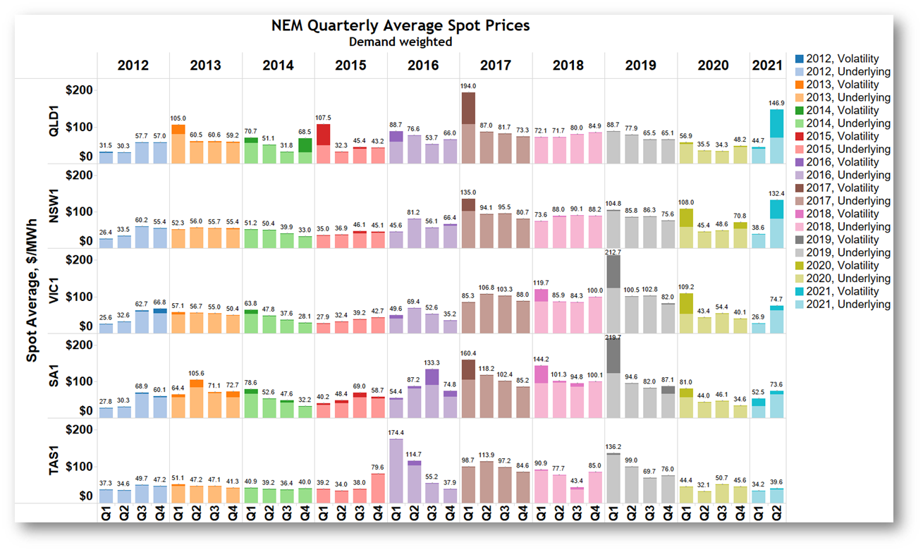
This detailed regional breakdown of quarterly demand-weighted spot prices going back to 2012 shows that in Queensland and NSW, average prices in Q2 jumped right back into territory last seen in 2017, driven by the “volatility” component identified via darker shading. This component is the contribution to the quarterly average of half hourly prices above $300/MWh. The complementary “underlying” price component (average of half hourly prices capped at $300/MWh) also rose strongly, but did not return to the $80-$100/MWh range seen consistently through 2017 – 2019.
Averages in Victoria and South Australia show a smaller impact from volatility. Only Tasmanian averages stayed at the lower levels ruling across the NEM through most of 2020.
Here it’s worth emphasising that volatility – five digit dispatch prices – lifts both the “volatility” and “underlying” components of the average spot price. The underlying component is affected because all half hours are included in its calculation, with very high prices just capped (or replaced) by a $300/MWh limit, while their residual above $300/MWh contributes to the volatility component. If there are many prices above this cap level, their $300/MWh contribution lifts the “underlying” average as well as the “volatility” measure.
Are Prices Rising Across the Board?
By looking at patterns of spot price behaviour across hours of the day, we can get a better sense of whether underlying spot price increases reflect “across the board” secular shifts in levels or are more driven by volatility events. The following chart shows average prices by time of day for the four mainland NEM regions, highlighting how the recent lift in half hourly prices has been highly concentrated in the morning and evening peak demand periods: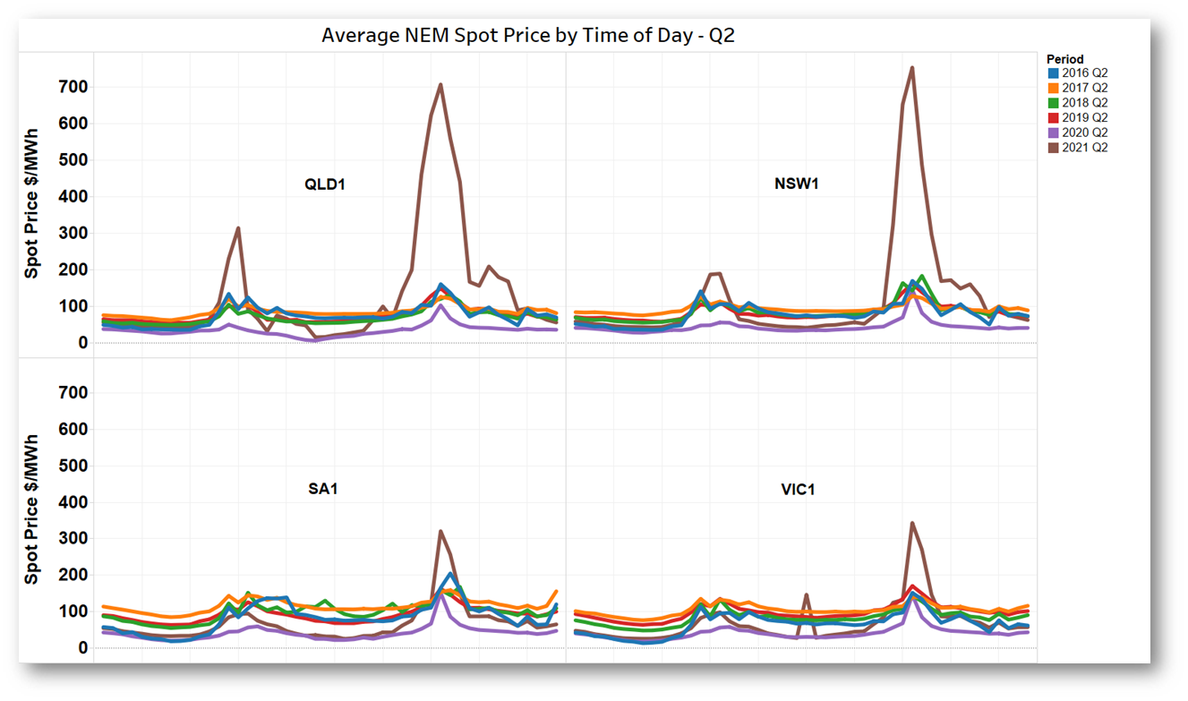 This generally shows that daytime prices remain supressed by the NEM’s growing levels of rooftop and utility-scale PV generation. In a later post I’ll look in more detail at some of the peak period volatility events and the bidding behaviour underlying them.
Back to the Future?
To put all this in overall perspective, here’s a long-term chart of the rolling annualised spot price, demand-weighted across all NEM regions. Overlaid on the chart is a gas price index constructed by averaging regional spot gas market prices for the mainland hubs, again on a twelve month rolling basis:
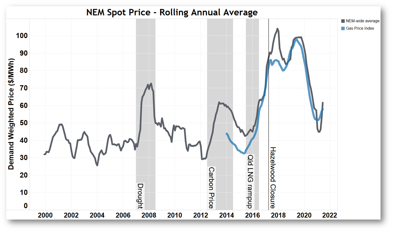
The lift in annual average NEM spot price is obviously limited because we’ve had only one recent quarter of elevated spot prices. Key questions motivated by this chart are whether a) the upturn in Q2 could be the beginning of a trend similar to that seen in 2016, and b) rising gas prices might be pulling up electricity prices, or does the relationship work the other way?
Superficially at least, conditions now are quite different to those five years ago, when Northern power station in South Australia and Hazelwood in Victoria were on the brink of closure, and the upstream gas sector in Eastern Australia was pivoting towards LNG exports which put enormous pressure on domestic gas availability and pricing. With gas being an important “swing” fuel in the NEM, where the spot price is set by marginal suppliers, the relatively sudden shocks of reduced generation capacity and much more expensive gas put a rocket under NEM pricing levels. Only from mid-2019 following strong investment in renewable supply (arguably accelerated by those high NEM prices) and moderating gas prices as upstream supply increased and global LNG prices declined, did NEM prices start falling again.
Current disruptions to coal-fired generation in Queensland and Victoria should be temporary, and that combined with continuing commissioning of new renewable generation ought to make gas prices a weaker driver of NEM prices now than in the 2016-2019 period. It’s also possible that some of the recent increase in gas prices is a direct result of increased demand from gas fired generators, coinciding with seasonally higher domestic gas demand. Finally, the time-of-day spot price averages charted above show that prices outside morning / evening peak demand periods remain at levels closer to those seen in 2020 than the elevated levels of 2016-2019.
Back to the Futures
Another perspective on the outlook for spot prices is available from forward markets for electricity derivative contracts, such as futures contracts traded on the ASX. Futures prices are not formal spot price forecasts, but do represent a kind of “market consensus” on the fair value of contracts which are settled against that spot price, and are therefore strongly influenced by the spot price expectations of market participants.
The next chart shows the historical and recent behaviour of traded prices for futures contracts for financial years 2019-20 (FY20), 2020-21 (FY21), and 2021-22 (FY22) (dashed lines), the rolling twelve month average spot price (solid green), and the outturn settlement price for financial years 2019-20 and 2020-21 (ytd) – these last are the solid horizontal lines which necessarily equal the end-of-financial-year rolling spot average:
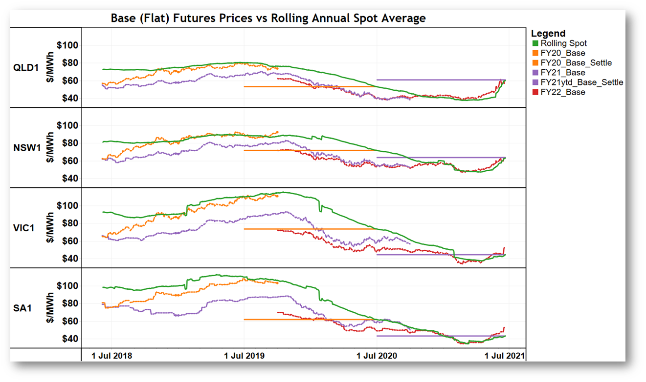
Some observations:
- For FY20 futures the traded futures price tended to track the current rolling average spot price quite closely. Remember that the futures price represents an assessment of fair value for a future year, while the rolling average spot is a backward-looking. Despite this basis difference, the traded market for these contracts was generally following the then-current rolling spot average as its best estimate of fair value for future spot prices. This behaviour is not uncommon.
- In all regions, the outturn value of the FY20 spot price average – against which the FY20 futures contracts were settled – ended up being very substantially lower than traded futures prices leading into FY20. The futures market does not always get its “predictions” right!
- In contrast, traded prices for FY21 futures sat well below rolling spot averages throughout the lead-in to FY21. Here market participants were clearly anticipating a continuing fall in average spot prices from the high levels of 2018 and 2019, probably influenced by knowledge of the coming lift in renewable production as new projects were being commissioned and rooftop PV continued growing at high rates.
- Likely outcomes for the settlement value of FY21 contracts – ie the purple FY21 YTD average spot price lines – show that:
- in Queensland the year-ago “market consensus” of around $40/MWh was clearly for lower prices than have eventuated (around $60/MWh). I doubt the market anticipated the Callide Power Station failure and its consequences for spot volatility!
- In NSW the likely outcome will be fairly close to the futures prices seen in the lead-in to FY21.
- In SA and Vic the outturn price for FY21 is again likely to be well below the range in which futures prices traded, despite recent volatility and the upturn in average spot.
- The recent rise in rolling spot averages, driven by what we’ve seen over Q2, has influenced the market for FY22 futures, but so far has not led to increases much beyond the current rolling annual average. It seems the market has reverted to using that current average as its anchor point for future value.
Here’s the equivalent chart for futures cap contracts – settled against the above-$300/MWh volatility component of the spot average: 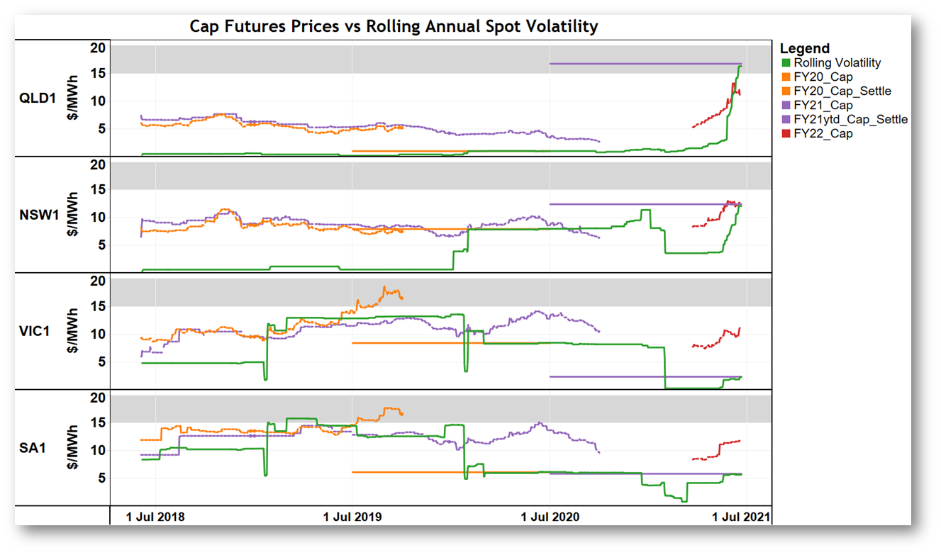
A few important differences from the behaviour observed for base contracts:
- When historical rolling volatility is at very low levels (Queensland until very recently, NSW until early 2020, Victoria earlier this year), futures cap prices don’t fall to follow that average. Cap contracts are more of a one-way bet than base contracts. There’s very little upside for the seller of a futures contract at a very low price: the volatility average can’t go below $0/MWh, but it can rise substantially. A lesson perhaps learned painfully by anyone who sold the Queensland FY21 futures cap contract for $3-4/MWh in July 2020 and is now looking at having to pay out close to $16/MWh!
- Despite recent volatility, and that seen in SA and Victoria around 2019 / early 2020, neither rolling volatility averages nor the traded price of futures caps have spent any significant amount of time in territory above $15/MWh, which is very roughly the value traditionally seen as required to earn good returns on investment in pure peaking generation (eg open cycle gas turbines) designed to run predominantly when prices spike above $300/MWh. Perhaps in a lower interest rate environment a somewhat lower cap value might be adequate. Nevertheless this observation points to a concern raised by some (but not all) market observers that NEM price signals by themselves have not been sufficient to bring forward investment in dispatchable capacity.
More of the Q2 elephant to be served up in a later post.
About our Guest Author
 |
Allan O’Neil has worked in Australia’s wholesale energy markets since their creation in the mid-1990’s, in trading, risk management, forecasting and analytical roles with major NEM electricity and gas retail and generation companies.
He is now an independent energy markets consultant, working with clients on projects across a spectrum of wholesale, retail, electricity and gas issues. You can view Allan’s LinkedIn profile here. Allan will be sporadically reviewing market events here on WattClarity Allan has also begun providing an on-site educational service covering how spot prices are set in the NEM, and other important aspects of the physical electricity market – further details here. |
Leave a comment