In this article on Saturday 17th April we highlighted one instance last week that reinforced what we* wrote in the the Generator Report Card 2018 two years ago, in that ‘the NEM is becoming increasingly dependent on the weather‘:
* ‘we’ being us at Global-Roam Pty Ltd Pty Ltd, working in conjunction with Jonathon Dyson’s team at Greenview Strategic Consulting – and with valued assistance by a range of others.
This was explored in Theme 6 within Part 2 of the 180-page analytical component within the ~530-page GRC2018. Yesterday I noted how we are underway with the process of updating this multi-dimensional analytical effort, with a view to releasing the ‘Generator Insights 2021’ during Q3 2021.
We’d invite you to submit your pre-order today.
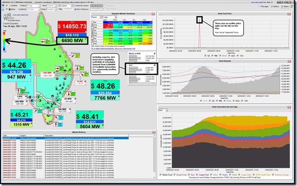
Coincidentally yesterday, we saw the QLD price spike up near the Market Price Cap (to $14,850.73/MWh) at 15:55 – which was captured at the time in NEMwatch v10:
As noted in the image:
Observation #1) The QLD Scheduled Demand (at 6,690MW) was quite modest – i.e. still in the ‘green zone’ when scaled by historical range of incidence; and
Observation #2) Based on the Available Generation data published at the time, there was plenty of ‘spare’ capacity bid available in the market (i.e. 9,806MW – 6,883MW = 2,923MW ‘spare’ capacity bid available at any price, but not dispatched).
… so why did the price spike, we wondered?
(A) Earlier than the ‘normal’ time we’ve become used to seeing price spikes
At the time the price spiked (setting off a couple different types of audible alerts, including my phone buzzing) I was in a conversation with a team member, and noted that this was not the ‘normal’ time I’ve become accustomed to seeing the price spike over recent times.
I’d written back on 14th March (partly on reflection that others might have been thinking that price spikes have evaporated completely) that price spikes have shifted to the sunset edge of the day … a trend that would seem likely to continue as the ‘unpredictability for dispatch of fully Scheduled Generation’ increases.
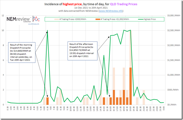
Quickly extracting some data from NEMreview from 1st December 2021 through until yesterday (i.e. close to 5 months of recent history) I put this analysis together:
We see that:
Observation #3) Yesterday morning’s price spike (also seen in NEMwatch above) was also at a less frequent time, and that
Observation #4) Yesterday afternoon’s price spike occurred a couple hours earlier than the more commonly experienced times for the price spiking:
4a) Keeping in mind that this is April whereas most of the data was for summer 2020-21, some of the movement earlier in the day is related to earlier sunset;
4b) However the shift yesterday seemed (at the time) related to other factors, as well.
(B) Rain and Cloud event across northern QLD contributes to the price spike
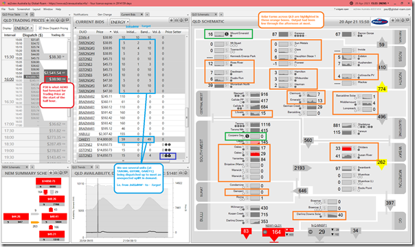
I noticed, at the time, that many of the solar farms in the northern half of Queensland were running low on output that afternoon – which I suspected was due to the rainfall event that had I’d heard was forecast for what’s a fairly large area of our country. With the benefit of ‘Next Day Public’ data in the following window of ez2view, we can see a bit more context:
We see that:
Observation #5) The significant number of large solar farms above Gladstone were all seeing outputs significantly suppressed through the afternoon:
5a) That’s over 1,000km distance wise
5b) There were some brighter spots (literally and figuratively) further south … in Wide Bay and also in South-West
5c) Note that Warwick SF, Brigalow SF and Gangarri SF each have their own challenges.
Observation #6) Coincidentally in this instance, the 2 Wind Farms we have in QLD (highlighted in green) were also both on low output.
Observation #7) In the ‘Current Bids’ widget (highlighted light blue) we see many dispatchable units dispatched up to meet the afternoon climb in demand (which we can see in the chart underneath that widget).
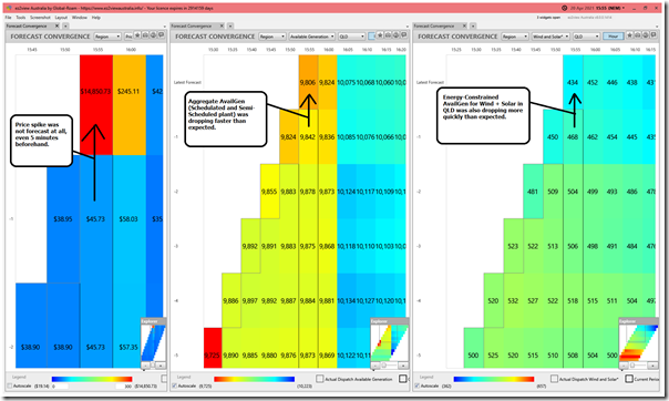
Adding in a second window from ez2view (this one containing 3 different copies of ‘Forecast Convergence’ widget highlighted on different QLD data) we see a number of additional things:
Observation #8) We see that the price spike occurred unexpectedly in the AEMO market data (and I’ve already noted above I was not thinking about seeing this until later in the day, with the sunsetting)
Observation #9) We see a faster-than-forecast drop in Available Generation across all Scheduled and Semi-Scheduled plant in QLD
Observation #10) Unfortunately we can’t yet see what was the case for the Scheduled plant (because of AEMO’s later than ‘Next-Day’ publication of that data set – something that we’d really like to see changed in conjunction with 5MS) …
Observation #11) But we can see that the forecast (energy-constrained) Available Generation for Semi-Scheduled plant in QLD (i.e. all the Solar Farms + the two Wind Farms) is dropping faster than expected, and by the same rate.
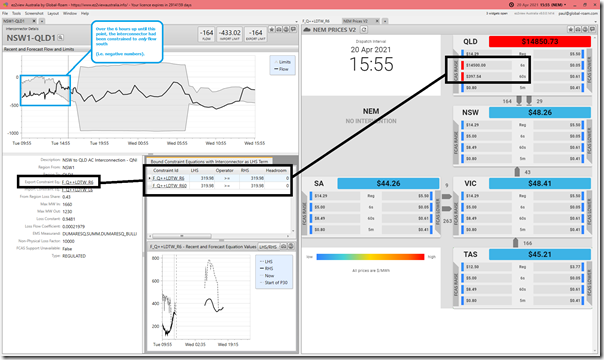
We need to keep in mind that interconnector capabilities are almost always a factor in price spikes, when they occur – here’s a view of QNI from from ez2view:
From this we can see:
Observation #12) There were two constraint equations (‘F_Q++LDTW_R6’ and ‘F_Q++LDTW_R60’) that were limiting the export flow capability (i.e. on what would ordinarily be the NSW-to-QLD direction) of QNI such that it could not flow north, but had to flow south instead.
Observation #13) We see that these constraints also had the impact of delivering a price spike to both the R6 and R60 Contingency FCAS prices in QLD at the same time.
Observation #14) This makes it clearer how the QLD region was effectively an ‘Economic Island’ for the dispatch interval.
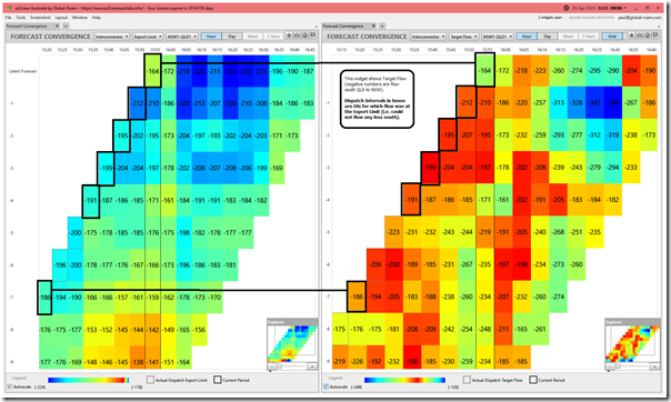
Given the interest in QNI, here’s another ez2view window containing ‘Forecast Convergence’ views for QNI Target flow and also the Export Limit:
From this we can see:
Observation #15) For some dispatch intervals beforehand (the ones which boxes have been drawn around) we see Target Flow = Export Limit, which means the interconnector was flowing at a limit (i.e. could not flow any less south).
Observation #16) We see that the Export Limit had been increased from 15:50 to 15:55 (i.e. 48MW less negative):
16a) This would have been a benefit to the QLD region (i.e. 48MW less draw on its generators to supply NSW);
16a) However it was not enough to prevent the price spike.
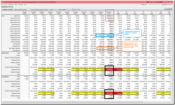
Utilising the ‘Swim Lanes’ widget in ez2view (one that I don’t use too often, but which is used frequently by some of our clients) we can see a number of other things:
Observation #17) From this we see that the Scheduled Demand for the QLD region increased by 157MW (i.e. from 6,533MW to 6,690MW).
Observation #18) We also see that, in conjunction with this, ‘Max Spare Capacity’ dropped by 123MW:
8a) This deficit is lower than the amount by which Scheduled Demand increased;
8b) This is the case because exports from QLD to NSW reduced, as noted above.
… but that still leaves us with the question about why the price spiked – despite there being 2,924MW of spare ‘Available Generation’ capacity in the QLD region?!
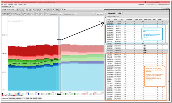
Observation #19) The ‘Current Bids’ widget in the first snapshot from ez2view above gives us some guide:
19a) Most of the ‘spare’ available generation that was actually running at the start of the dispatch interval was ramped up … presumably (I have not checked each) to the limit of their ROCUP rate.
19b) There was other capacity (e.g. BRAEMAR A, BRAEMAR B and YABULU) which is shown as available, but none of which is running (and each of which takes more than 5-minutes to start, based on their T1 values – which are shown in ez2view, but not in the images here).
… there is 802MW in total in that group shown in the image
19c) There is a further 1,989MW available (if I have manually added correctly – across units both running and not) – but priced at and above the $14,850.73/MWh set by the GSTONE5 and GSTONE6 units.
… that’s a lot of capacity relative to total Available Generation (or even to total installed capacity) priced at a high price.
19d) In total that is 2,791MW across both groups …
(i) … meaning only 133MW difference between the 2,791MW figure and the 2,924MW ‘Max Spare Capacity’
(ii) … which I have not added up, but presume is a combination of ramp rate limits, and also co-optimisation for Raise FCAS services.
This is all clearer when using the ‘Bids & Offers’ widget in ez2view as follows:
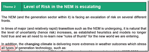
In yesterday’s note about GenInsights21, I referenced one of the things we explored previously in the GRC2018 in terms of ‘the Level of Risk in the NEM is escalating’:
One aspect of this was the reduced volume offered in the ‘green’ bands … with the corollary being the increased volume in both blue and red. This will be something to explore further in GenInsights21…
(C) Thoughts for the future
Given that it is the case that ‘the NEM is becoming increasingly dependent on the weather’ (with yesterday another case in point) wholesale market participants – both direct participants and also those who indirectly participants (including those large industrial energy users we have been serving by facilitating their Demand Response in the NEM for >10 years, and who are puzzled currently with respect to how they will participate in a Five Minute Settlement environment) will need to be thinking through what this means, in terms of how they need to adapt.
This might be something we can explore further in ‘GenInsights21’ including with respect to the ‘unpredictability for dispatch of fully Scheduled Generation’, and how that is changing.
… don’t forget to send in your GenInsights21 pre-order today, as we’ll be continuing to explore the changing nature of the electricity market in this update to the well-received GRC2018.


Leave a comment