The Clean Energy Council’s Wind Industry Forum webinar series starts next week. Following up to our successful presentation at the Large-Scale Solar Forum webinar series back in May, Jonathon Dyson and I are presenting a webinar on Thursday 17th September on “Maximising Profits in the NEM”. We’ll tackle three main questions:
- What do I have to do to be a compliant market participant?
- Where does the money go in and out and how can I increase profits?
- What’s changing and how can I keep up?
One aspect of increasing profits is managing FCAS costs, which we discuss in detail, including case studies of self-forecasting in action at wind farms.
At the solar forum webinar I illustrated the changing distribution of spot prices in Queensland with the increasing penetration of solar PV, showing the increasing incidence of low prices in the middle of the day when solar generation is at its highest. Prices are pushed down as there’s increased cheap supply (large-scale PV) and decreased demand (due to rooftop PV). There are similar effects for wind but not as simple as a time-of-day correlation.
In a preview of one part of next Thursday’s webinar, I’ll compare in this article the relative volume-weighted average spot price revenue received by wind farms across the NEM against their capacity factor, giving a visual comparison of the revenue performance of wind farms. Why a volume-weighted average? Average spot prices in the NEM get a lot of attention in market reports and analysis, but for wind farms this is only part of the story, as what matters is what the price is when the wind farm is generating, not when it’s not. Calculating a volume-weighted average (VWA) on half-hourly quantities as (sum of price times generation) divided by (sum of generation) lets us see what the wind farms are really earning in the spot market.
A couple of complications:
- Generators in the NEM are paid on their generation (sent out) multiplied by regional price multiplied by their Marginal Loss Factor (MLF). Depending on the purpose of the analysis the MLF may be included or excluded from the VWA calculation. I’ve chosen to include it in my graphs below, while in Paul’s articles linked below it’s excluded.
- While all generators receive spot revenue from the spot market, most renewable generators have some form of Power Purchase Agreement (PPA) or other hedging in place with a counterparty, which will mean that the generator’s revenue after hedging will be different to the spot revenue received. These details aren’t public and I won’t explore this here.
For more analysis on VWA on WattClarity:
- Paul McArdle published an article prior to the Vestas forum in July this year exploring in detail the “Volume Weighted Average Price” metric, finding that towards the end of 2019 that wind farms particularly in SA were seeing a drop in VWAP compared to the time-weighted average price.
- Paul also explores the topic of volume-weighted prices (specifically the ratio of this metric to time-weighted average price) here.
We’ll be publishing again the statistics per wind farm in the next Generator Statistical Digest.
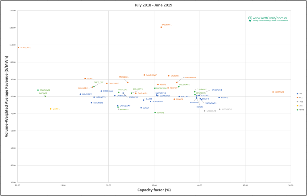
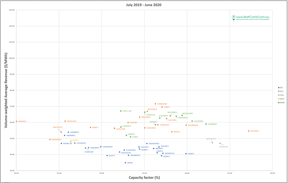
I’ve plotted below the volume-weighted average revenue (incorporating MLF) per MWh of generation against the capacity factor for all the wind farms in the NEM, colour-coded by region. To interpret this as wind farm performance, the X-axis is how much the farm generated in MWh per MW of installed capacity, and the Y-axis is how much it earned in spot revenue for each MWh. Where you want to be is with a high capacity factor (so getting lots of generation from your investment) and high VWA (being paid well for that generation) – but no-one said that was easy!
If all investment decision making (and forecasting!) was perfect, you might expect to see a spread of farms from (low capacity factor, high VWA) to (high capacity factor, lower VWA), given the trade-off between capacity factor and revenue from building in a high-wind location due to coincident generation (from numerous farms attracted to the area) reducing your volume-weighted revenue (the “correlation penalty”). This doesn’t seem to be all that obvious in the plots here, but I’ll point out other interesting features. The graphs are very detailed, so click on them to open a full-sized copy. The generators are labelled by DUID (Dispatchable Unit Identifier) which is the code AEMO uses. AEMO publishes a register of generators – look at the Generators and Scheduled Loads tab in the spreadsheet. You can also see the “Max Capacity” column there which is what I used in the capacity factor calculations.
These are plotted on the same axes. Overall, average revenue has dropped dramatically between 2018/19 and 2019/20, which is understandable as time-weighted average prices in the NEM also declined markedly in this period – from $80-100/MWh across the regions in 2018-19 to $55-75/MWh in 2019-20.
There’s clearly a wide spread of capacity factors for wind farms across the NEM. Some may be explained by improvements in technology (newer sites with bigger blades may better capture the wind), and some by improvements in wind farm layout, but there’s still quite a wide spread with older and newer wind farms represented in both the low (27%-ish) and high (40%-ish) ranges. (Note that the ones to the far left below 25% are newly-commissioned so don’t have a full year of operation). Kiata (in western Victoria) shows a spectacular capacity factor in both financial years. This is a small (31 MW) site that’s distribution connected. Windlab must be pretty proud of that one.
The fall in spot revenue between the years is particularly stark in SA (the blue dots), where they’ve gone from being in the pack of all the NEM wind farms to very clearly below it, and also shifted to the left on the capacity factor scale. A few explanations come to mind for this drop in average revenue and generation in SA:
- Transmission network work on the 500kV lines in VIC in Q3 and Q4 of 2019, with numerous days where the interconnector flow from SA to VIC was constrained, leading to over-supply resulting in lower generation and low prices;
- The long separation of SA from VIC following the 500kV transmission tower collapse on January 31st 2020, which had two effects – a massive over-supply as excess generation couldn’t get out to Victoria, and a leap in FCAS costs, which led many generators to bid out to try to avoid contingency FCAS costs that exceeded their marginal energy revenue. Jonathon will talk more about managing FCAS costs in the webinar next week.
- Continued increase in rooftop PV in SA giving a decrease in operational demand, which would increase the impact of the over-supply of wind.
A further note on SA here, in that the story is worse for the generator than what this shows, as the extreme FCAS costs during the VIC-SA separation in February meant that net revenue was even lower, with many wind farms receiving FCAS bills of hundreds of thousands of dollars in a week.
One speculation from the 2019-2020 graph (which I haven’t investigated in depth) is that a relationship between capacity factor and VWA may be evident in SA. The lower-capacity-factor Lake Bonney wind farms (located well to the east of Adelaide) show a higher VWA than the higher-capacity-factor sites (mostly in SA’s Mid-North). This might be more evident in this plot because there were more periods where over-supply (leading to spilling and lower prices) was occurring and so coincident generation was penalised higher. It could also be that the Lake Bonney farms were more active than many others in bidding away from negative prices (remember that each farm has its own contract position), and also noting that Lake Bonney missed much of low-price-February in being constrained to zero for two weeks during the separation. There are too many factors at play here to come to any conclusion without a lot more analysis.
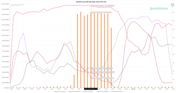
Looking more closely at Bald Hills, which looks like an outlier (or a spectacular investment decision!) in 2018-19, a look at the volume-weighted average by month shows that Bald Hills earned almost $600/MWh on average for its generation in January 2019. The explanation comes on January 24th, where sustained extreme prices occurred, and the first administered price cap for energy in many years. The graph below (created in ez2view, but could also be done in NEMreview v7) shows the generation (as capacity factor) for Bald Hills and a few other wind farms in Victoria on that day, with the orange bars the spot price. Bald Hills is uniquely located to the east of Melbourne while almost all of the other major wind farms are to the west of Melbourne, meaning the wind patterns at Bald Hills would typically be timed differently to the others. On this day it was of great benefit to Bald Hills – as the wind generation dropped off at most wind farms in Victoria, and the load climbed with high temperatures late in the afternoon, Bald Hills powered through the $10,000/MWh+ prices at near full output. Bald Hills collected around $8m in spot revenue on this day alone.
Readers with some knowledge of the different bidding behaviour of wind farms in the NEM may identify with close inspection pairs of wind farms that changed their relative position in the chart (capacity factor and VWA) due to one of them changing its bidding strategy in negative prices during these years. Pop in the comments or email me (marcelle at global-roam.com) with what you find and if you find any other features of interest.
You can register for the webinar here: https://reservations.cleanenergycouncil.org.au/Wind-Industry-Forum-Webinar-Series-2020.


Leave a comment