Paul has posted a couple of timely and succinct pieces analysing NEM events last Friday in Victoria and South Australia, where hot weather in both states saw significant price volatility and some interesting generator dispatch patterns during a brief period of negative dispatch prices.
In this much longer piece (apologies, there’s no test at the end though), I’ll try to wrap up a fuller overview of the day and also take a closer look at some structural and behavioural issues evident on the day that illustrate the complexity and highly dynamic nature of the NEM spot market.
There’ll be a lot of charts here, many drawn from Global Roam’s ez2view market viewer and its companion web-based trend charting engine.
Overview and Leadup
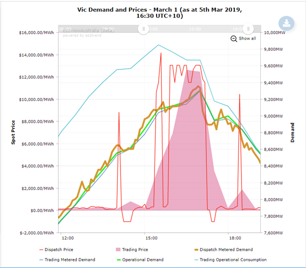
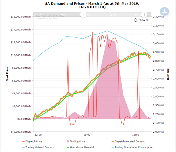
Let’s start with a couple of ez2view trend charts covering the main period of price volatility in the two states:
These look almost identical apart from the shape and scale on the demand lines. In particular the price levels in both states (shown at 5 minute dispatch and 30 minute trading granularity) followed each other through the day, differing only due to the impact of interconnector marginal losses between the regions. On the other hand prices in the other three NEM regions were unremarkable, excepting a couple of brief periods of negative dispatch prices in Tasmania (driven by those negative prices in Vic / SA). So for most intents and purposes the two regions behaved as one larger “economic island” on this day.
There are a few versions of “demand” on these charts (see Paul’s explainer for a very detailed description of the NEM’s many flavours of demand). The thicker brown line is 5 minute dispatch interval demand (labelled “metered” as it derives from actual measured inputs to the system from large scale generators and interconnectors – at system level we always measure demand via inputs to, not withdrawals from, the power grid). The smoother lines are 30-minute measures which average these input values across six dispatch intervals. The higher “operational consumption” lines add in AEMO’s estimates of rooftop solar PV production to indicate total usage. Note how this consumption measure is considerably higher – because of the large rooftop PV capacity installed in both states, over 1,400 MW in Victoria and 1,000 MW in South Australia – and that it peaks much earlier in the afternoon and at a higher level than demand seen on the grid itself.
A consequence of this effect is that although additional rooftop PV installations will continue to reduce grid demand levels through the middle part of the day, from here forward they will have progressively less and less impact on the size and timing of grid demand peaks, which are now occurring at late afternoon / early evening times when rooftop PV is producing only a relatively small fraction of its capacity. On the other hand widespread adoption of battery storage could make significant changes to the character of grid demand peaks.
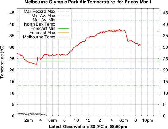
One thing that’s evident in the Victorian 5-minute demand profile are noticeable falls around the time of some of the price spikes, at 14:05 (NEM time – which is AEST, not daylight saving), 15:45, and from 17:05. The last, largest dip measures about 360 MW or roughly 4%. These may be evidence of some demand side response to high spot prices although the last one might also reflect a weak cool change going through Melbourne just after 6pm local time (17:00 NEM time):
More on demand response later.
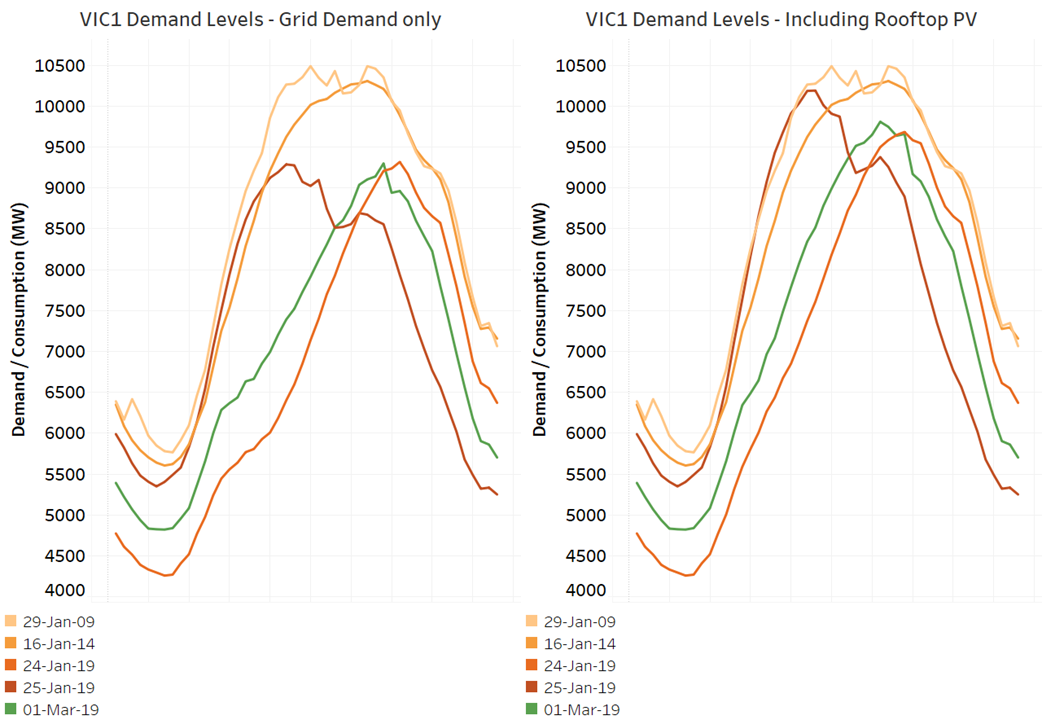
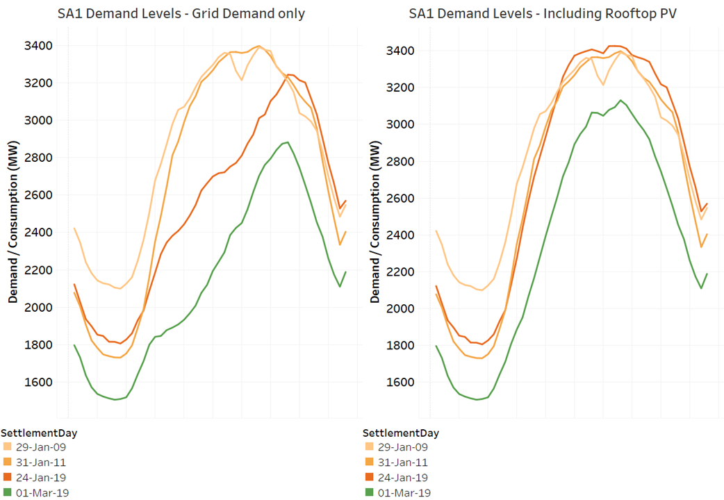
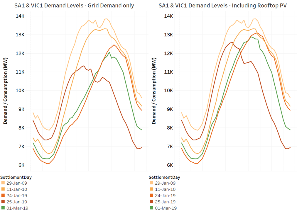
Looking at demand levels in historical context is useful to get a sense of whether the high prices reflect extreme demands or other factors. For comparison in the following charts I’ve picked the two days of highest historical grid demand in each state (going back to 2009 and 2014 for Victoria, 2009 and 2011 for SA), as well as the two days on which load shedding occurred in Victoria this January:
This shows that for Victoria, March 1 was fairly similar to Thursday Jan 24 2019, but well below historical peaks and Friday Jan 25 2019 (where extensive load curtailment / shedding and then an early cool change restricted demand from reaching the much higher levels for which it was clearly headed.
In South Australia March 1 was not as extreme a day as Jan 24 2019 or historical maximum days (Jan 25 is not shown as temperatures in SA were much lower):
Finally looking at combined region demands confirms that March 1 was relatively close to, but slightly more benign than January 24:
Without rehashing the gory details of January 24-25, the principal reason those days saw voluntary load curtailment and forced shedding, accompanied by longer periods of extreme spot price, was the coincidence of outages at multiple brown coal generation units in Victoria, along with higher demands. There were no significant generation outages affecting supply on March 1. So what drove the high prices that occurred, and were they expected?
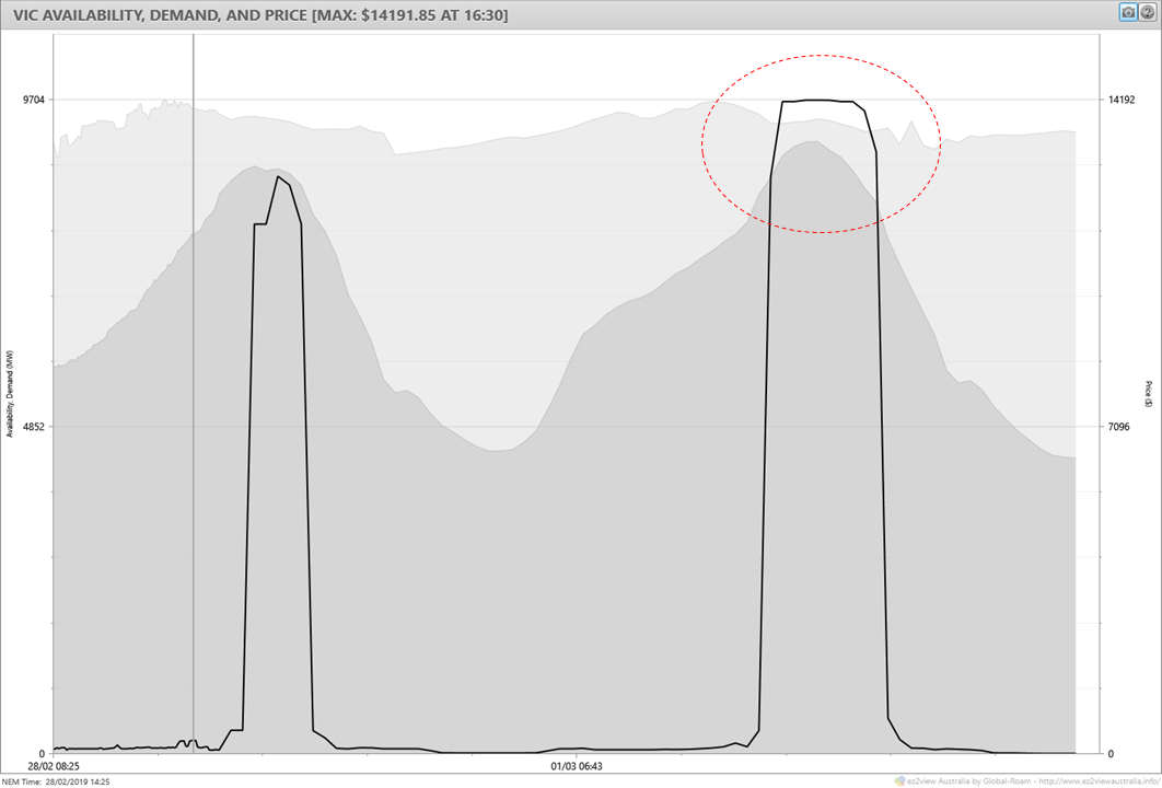
Using ez2view’s time-travel functionality to wind the clock back to the prior Thursday afternoon, we can see AEMO’s “predispatch” forecasts for Victoria showing high demands (dark grey), relatively little spare generation (light grey, noting that this doesn’t include interconnector import capability), and an extended period of forecast extreme prices. But the same forecast was also showing extreme prices for Thursday afternoon, which didn’t eventuate:
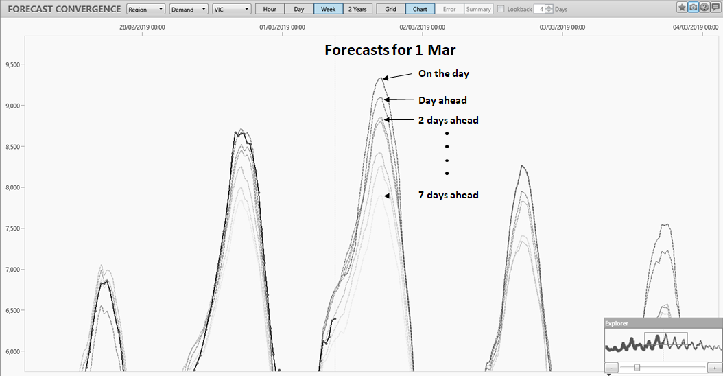
However the demand forecast in this outlook was about 280 MW lower than eventuated. A broader sense of how forecasts evolved leading up to Friday can be gleaned from ez2view’s Forecast Convergence tool, here showing a series of demand forecasts made at 9am on the day and on preceding days of the week:
The corresponding chart for South Australia shows a similar pattern, with peak demand forecasts progressively rising closer to the day.
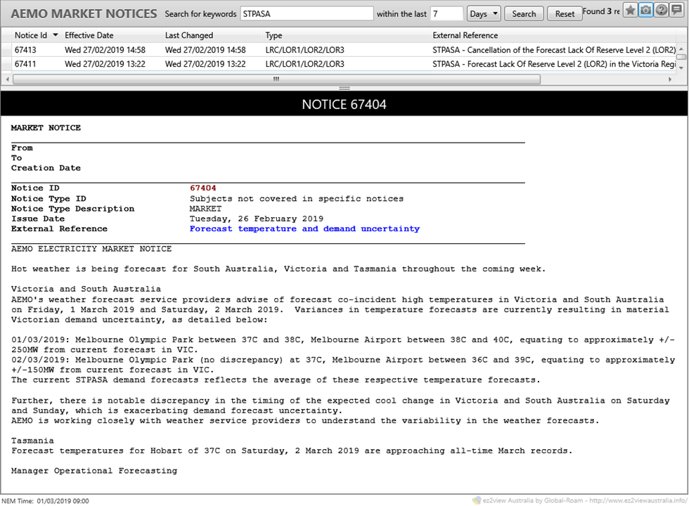
In fact AEMO had previously alerted the market to this uncertainty in forecast weather and demand conditions, via a fairly unusual form of market notice issued on Tuesday afternoon:
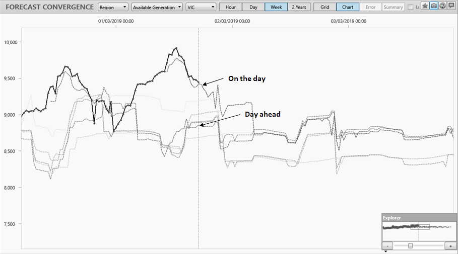
Forecast convergence for available generation is a more mixed picture and a bit harder to interpret because generation forecasts for more than 24 hours ahead in this view do not include an estimate of semi-scheduled generation output (large scale wind and solar):
However the main conclusion is that there were no dramatic changes in available scheduled generation leading up to last Friday.
During days preceding Friday, AEMO did issue some forecast Lack of Reserve (LOR) notices for Victoria, which can be summarised as:
- Wednesday afternoon – forecast LOR2 notice for 16:30-17:00 Friday, cancelled just 90 minutes later
- Thursday afternoon – forecast LOR1 notice (reserve 81 MW below threshold) for 16:00-18:00 Friday
- Friday – minor updates to forecast LOR1 condition; actual LOR1 declared 16:30-17:00.
As LOR1 means that the system is still two contingencies (eg loss of two large generating units) away from falling into an “insecure state”, potentially requiring forced load shedding, the conclusion from these notices is that the physical supply position remained relatively robust, although with less headroom than usual, throughout Friday. This contrasts with the events of January 24-25 where actual LOR3 conditions (load being shed) occurred on both days.
Supply Contributions by Source Type
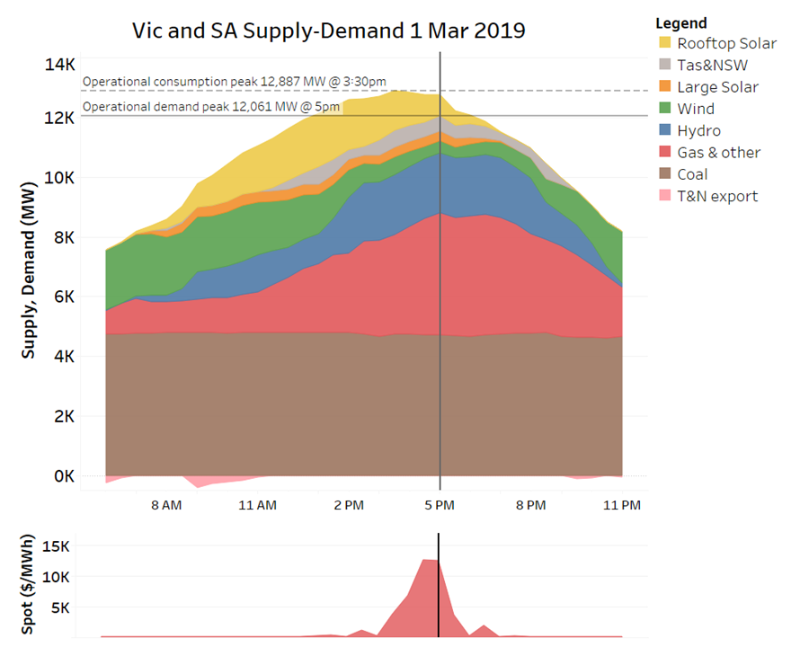
To give an overview of how different generation sources, demand, and interconnector flows played out across the two states on March 1, the following chart summarises demand, supply, and price for the two states combined:
This shows steady output from brown coal generation, while gas (here including liquid fuels) and hydro plants together with imports from Tasmania and NSW provided the swing to cover rising demand and decreases in wind generation through the day as well as falling rooftop PV output in the afternoon/evening period.
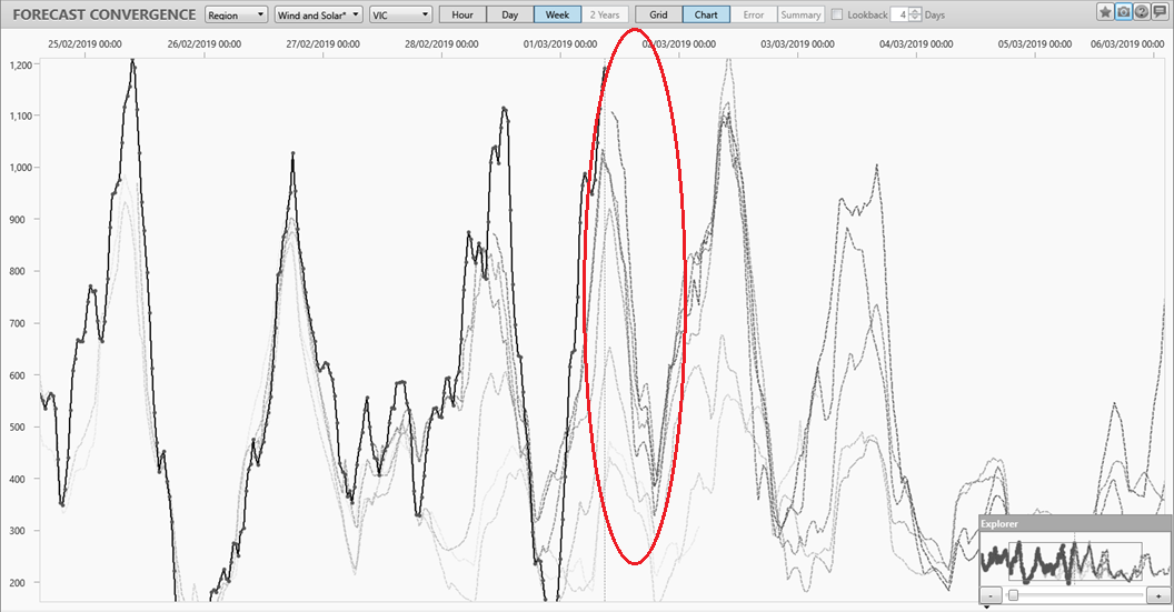
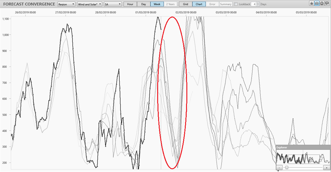
The large decrease in wind generation through the day is not uncommon on hot summer days, and was pretty well captured in AEMO’s forecasts over the preceding week, shown in this Forecast Convergence view (this also includes large scale solar, but the numbers are currently dominated by wind capacity):
For South Australia the picture is very similar:
While people on one end of Paul’s Emotion-o-meter would paint this falling wind output as a villain of the piece in tightening supply-demand balance last Friday and contributing to the chance of higher prices, others would point to its relative predictability, at least in this instance (better than the demand forecast uncertainties shown earlier), and to the fact that reliability assessments or price forecasts should never assume that wind will supply anything like its nominal capacity at times of system stress – unlike dispatchable sources, this was never intended to be one of its functions in the supply system.
To summarise so far, March 1 had high but not extreme demands, and an adequate supply position – despite decreasing wind and solar output through the afternoon. Where next to look for high price drivers? Participant bids.
Bidding Behaviour
Bidding behaviour in the NEM is by design highly dynamic, with participants able to continually adjust (rebid) volumes offered across ten price bands for each generating unit in near-real time up to a few minutes before dispatch (the price levels for those bands having been locked in day-ahead). Ez2view provides the capability to visualise and drill into the many thousands of offers and rebids made on any day in full detail, interval by interval and unit by unit. I’ll focus here on an overview and pick out a couple of examples of rebidding.
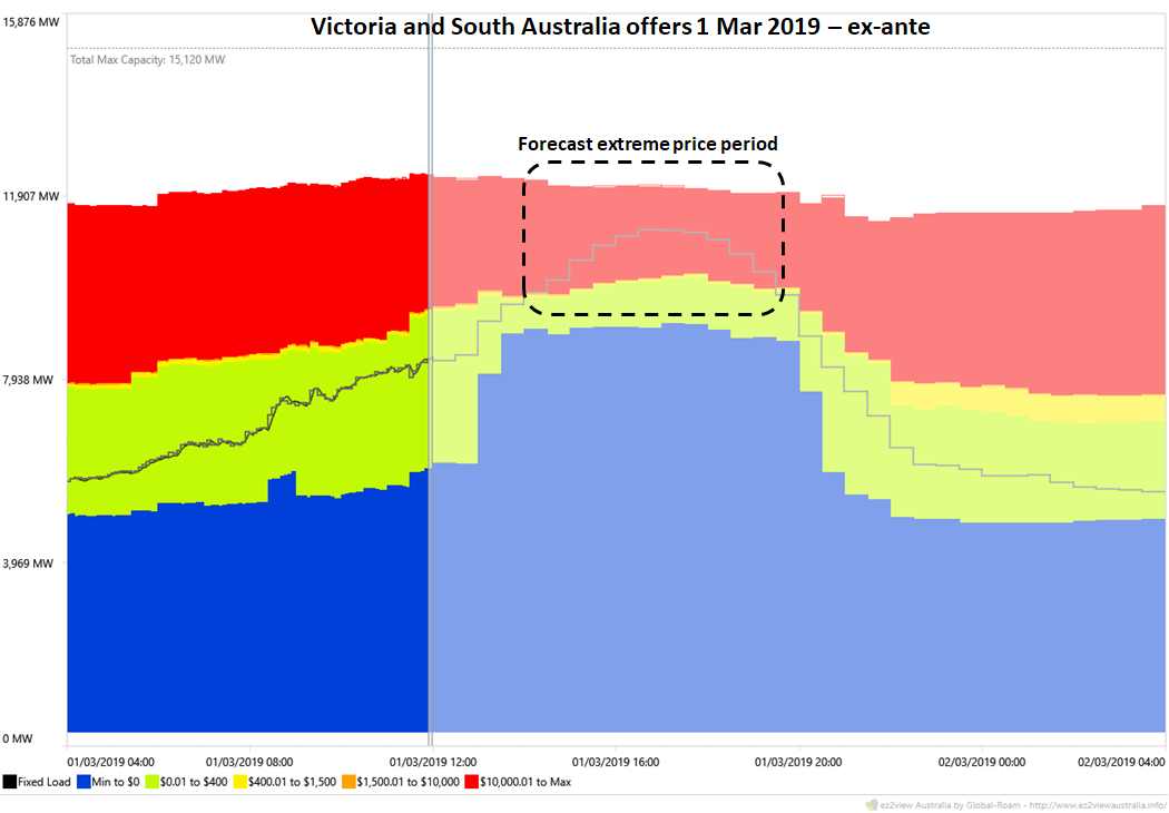
We start with an aggregated overview of offers from thermal and hydro generators across Vic and SA captured at 12:00 on Friday, just ahead of the period of price volatility. This shows lots of volume offered at or below $0/MWh (blue area) and a significant volume – around 2,000 MW – offered at 5-digit prices (red area). The period of forecast extreme prices (as per the earlier predispatch chart) corresponds to the region on this chart where the grey dispatch line falls into the red area:
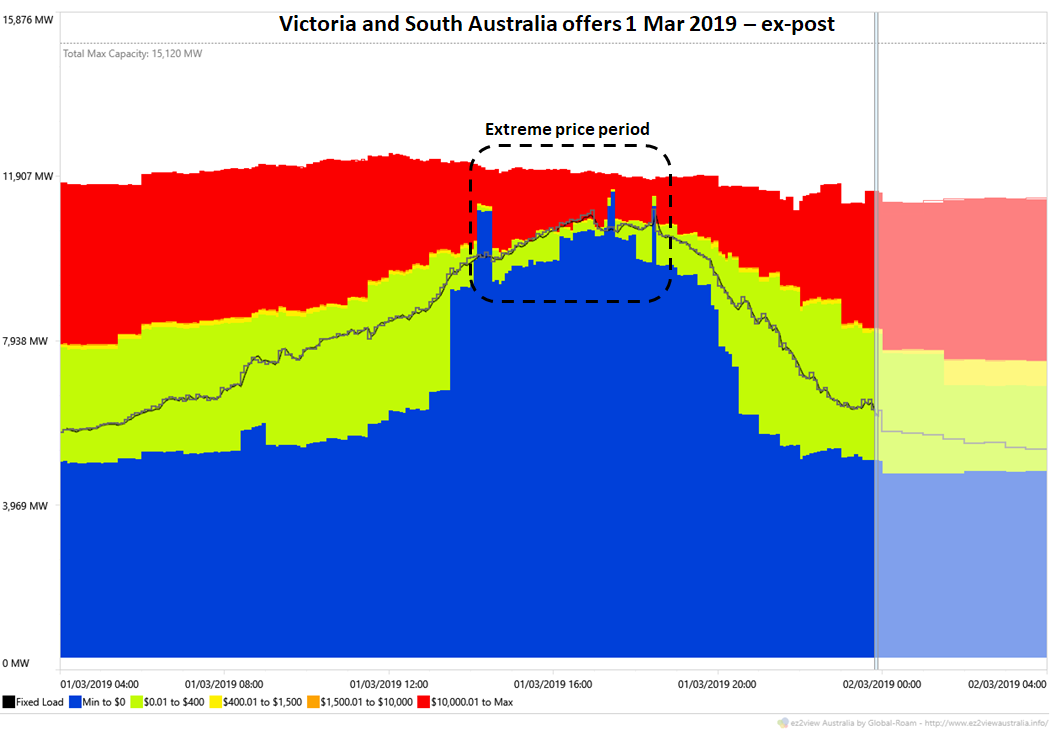
After the event taking into account all rebids made across the day the corresponding view shows:
This shows that as events unfolded, participants rebid more volume down to market floor price levels (negative $1,000/MWh) in order to maximise their dispatch, but also left material volumes – around 1,000 to 1,400 MW – offered at 5-digit price levels. In intervals where these offer bands were required to be dispatched to meet demand, extreme spot prices ensued.
This reinforces the point that extreme prices eventuated not because of physical supply shortfall – with over 1,000 MW of available supply mostly undispatched – but because that remaining supply was only offered at very high price levels.
Also seen in the ex-post chart are a few short periods where significantly higher volumes were suddenly and briefly rebid down to low price levels – these rebids were responsible for the negative dispatch prices seen a couple of times in the afternoon and were driven by the so-called “5/30 effect” which we’ve previously analysed extensively on this site (eg here and here ).
Interconnectors
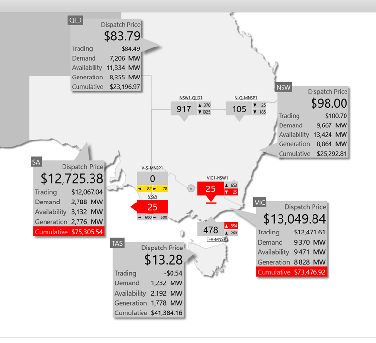
Given the relatively low prices in adjoining NEM regions, you’d assume that flows on interconnectors from those regions into Victoria (and indirectly into South Australia) were at maximum levels during the period of volatility – here’s an ez2view NEM overview snapshot for the 17:00 dispatch interval:
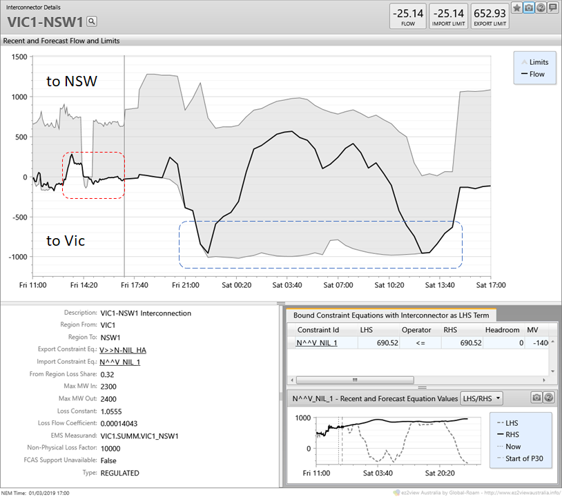
The Basslink interconnector from Tasmania is indeed flowing at its current maximum capacity of 478 MW, which it did throughout the afternoon, but looking closely one might wonder why the interconnection from NSW is carrying only 25 MW into Victoria – surely it has a higher capacity than that? In fact an ez2view time series view of flows and limits on this interconnection is fascinating:
We can see that at times during Friday afternoon, despite high demand and high prices in Victoria, flows were actually being forced northward into NSW, and at no time were significant southward flows permitted by the limits on the interconnection. Contrast this with the situation later overnight and through Saturday where the interconnection could carry around 1,000 MW southwards into Victoria. What’s going on?
The full answer is very complicated but in short there are two main factors at work:
- There is a complex “voltage stability limit” on southward flows across this interconnection which at times – such as Friday afternoon – restricts its use to securely carry power out of NSW. The limit is really nothing to do with the physical (“thermal”) capacity of the relevant transmission lines, but is required to ensure overall system security and stability would be maintained in the event of a major disturbance causing rapidly increased southwards flows – such as would occur on the sudden trip of a large Victorian generator. This is represented as the “N^^V_NIL_1” constraint shown in the bottom right quarter. No time to decode this one further here though.
- When generation from Snowy Hydro’s Murray power stations and AGL’s hydro stations in north-east Victoria is high and flowing southwards to meet high Victorian demand, as it was on Friday, there may be very little spare thermal capacity left on the transmission lines carrying this flow to also carry additional imports from NSW, particularly in hot weather which reduces these lines’ physical capacity (this limitation was particularly relevant back on January 24-25).
In situations like last Friday, one or other of these limitations can dramatically reduce the capability of the NEM’s northern states to supply more power into Victoria and South Australia – just when they could do with more.
Resolving constraints like these – and the economics of doing so – are complex engineering and analytical questions but no doubt on the radar of AEMO and transmission providers, especially in the context of Snowy 2.0. It may well be though that the more economic answer in the short term at least is simply more dispatchable capacity (generation, storage, or demand response) located in Victoria and / or South Australia.
Some Miscellaneous Observations
In the remainder of this post, I’ll focus on a couple of detailed aspects of outcomes from last Friday, given they garnered a bit of discussion in the immediate aftermath.
Demand Response
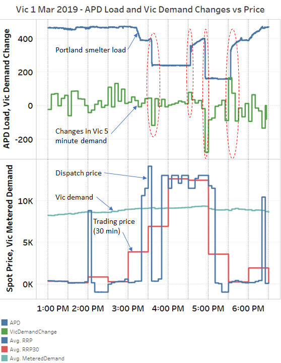
Near the top of this post I promised to discuss the apparent demand response seen in Victoria. This would be worth post in itself but given time constraints I’m going to leave you with one chart which I’ve assembled from AEMO’s extraordinarily granular (and large) 4-second dataset:
The 4-second dataset happens to provide data for Victoria’s Portland Aluminium Smelter (“APD”), and it clearly shows that a lot – although not all – of the significant step changes in Victorian demand last Friday corresponded to changes in the smelter’s load. It would appear that there are contractual / financial arrangements or incentives for the smelter to reduce its load at times of high spot price, which we can see happening from the 15:00 – 15:30 trading interval onwards.
It’s a little surprising to see the smelter load increase just after 16:30 while prices are still at extreme levels, before its load drops again just before 17:00. However there are technical restrictions on how long supply reductions to individual smelter potlines can be sustained, and it’s possible that the increase shown was part of managing that process.
No doubt there were other demand response actions happening across this day (eg those evident around the very first price spike at 14:05), but this appears to have been the largest one.
What did batteries do?
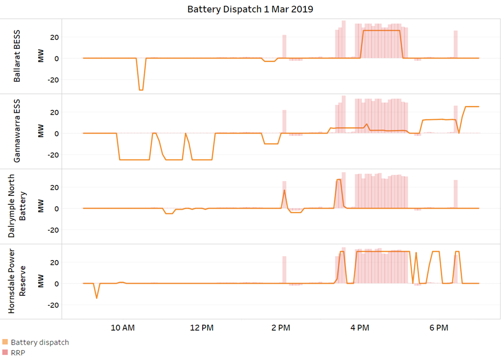
While still only a small part of the system, it’s worth looking at responses of the four large-scale batteries now installed and operational in Victoria and South Australia:
I haven’t had the opportunity to look too closely at why, but only the Hornsdale (Tesla) battery in South Australia and to a lesser extent the Ballarat battery in Victoria supplied power into most of the periods of extreme price (pink areas). The Gannawarra facility shares its transmission connection with the adjacent large-scale solar farm and its ability to supply was probably constrained down significantly because the solar farm was producing at near full capacity in these periods. Note that 1 hour of just 20 MW supply constraint represents foregone revenue of nearly $300,000. In the case of the Dalrymple North battery, no real idea about the absence of supply from 4pm although given the absence of any charging activity I wonder if it was flat by then!
Generation Response to Negative Prices
Paul has posted on this issue already but has asked me to look a little deeper.
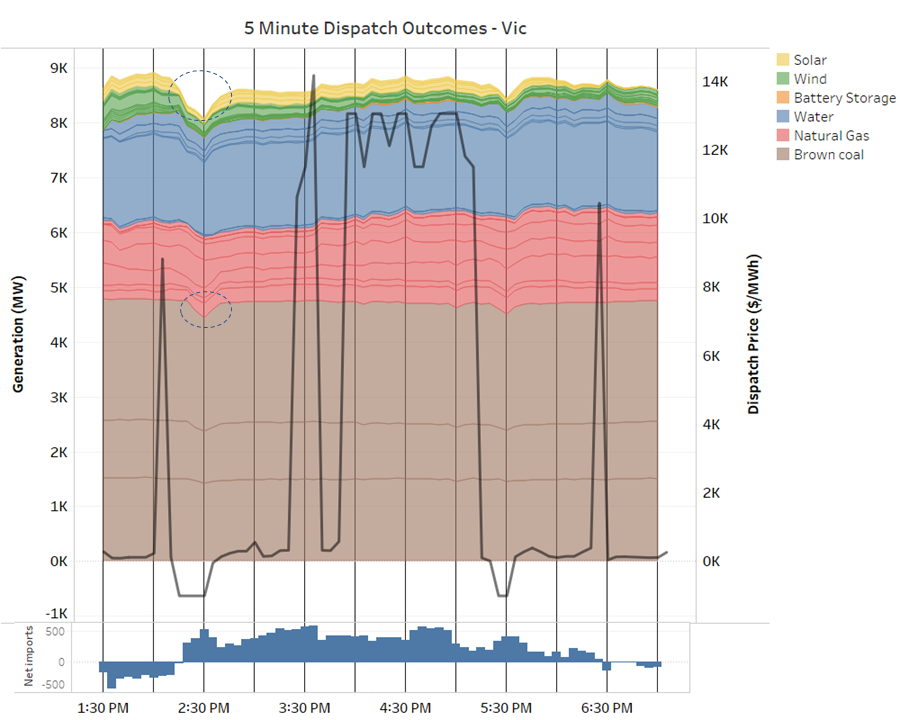
This chart of 5 minute generation, price and net interconnector flows for Victoria across the period of price volatility shows generally steady generation levels in that region, with gas and hydro dispatch rising steadily across the afternoon, falling wind as previously discussed, and net interconnector flows (on the lower panel) switching from export to import as Victorian demand rose. However there are some clear dips in brown coal generation and large scale solar associated with the negative dispatch prices at the back end of the 30 minute trading intervals ending at 14:30 (highlighted), where we also see an abrupt shift from net interconnector exports to imports, and at 17:30:
Seen at this granularity these generation dips are not surprising – with the dispatch price set at -$1,000/MWh in Victoria, even generators with volumes offered down at this lowest possible price level are competing against one another for dispatch and might expect to see volumes reduced. Generators with higher bids should expect to see no volumes at all allocated to them in these intervals (except that ramp rate constraints and other complex factors can prevent them being turned off completely).
But what is quite surprising is the increase in imports into Victoria while prices are at this lowest possible level. Why should more power be flowing into a region where the market price is the minimum possible?
Looking at the corresponding picture for South Australia further questions emerge:
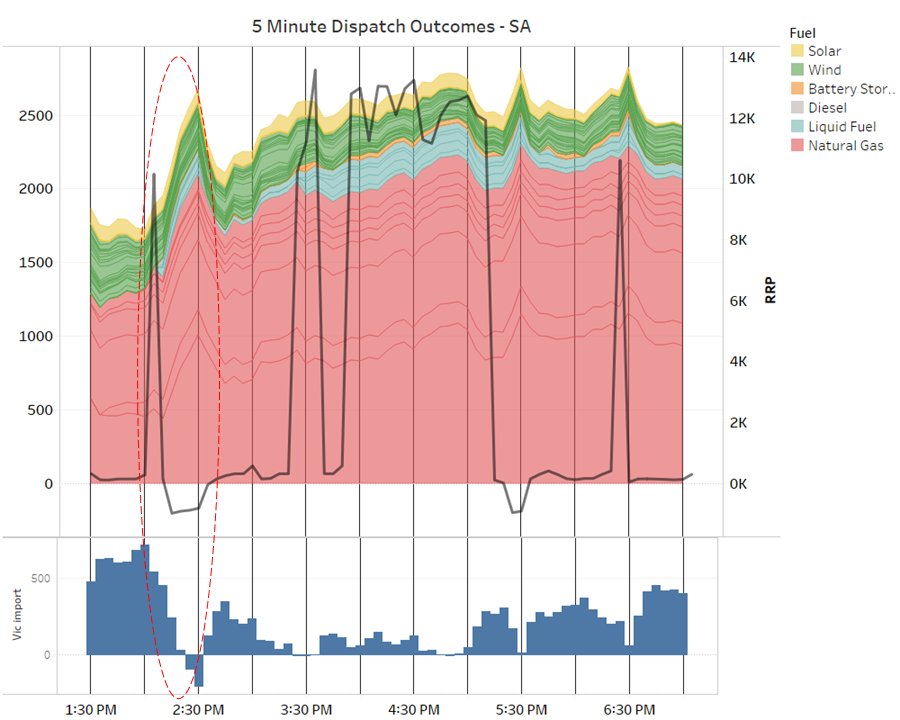
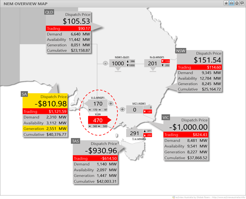
Look at the 14:00-14:30 trading interval highlighted. After the price spike in the first 5 minutes of this interval, generators in both South Australia and Victoria rebid volumes down to -$1,000/MWh to maximise dispatch (the 5/30 effect). We saw above that Victorian generators lost volume despite this, and here we can see that the reason was that the NEM dispatch algorithm chose to dispatch way more gas- and liquid-fuelled generation in South Australia, reversing flows on the interconnectors to Victoria from net imports of over 700 MW to net exports of about 200 MW, and forcing down generation in Victoria (and also Tasmania, not shown).
But prices in SA at -$800/MWh to -$900/MWh were above prices in Victoria at -$1,000/MWh, so it seems this change in flows was uneconomic – increasing output in the higher price region and decreasing it in the lower price region. And anyway, why weren’t prices in SA set at -$1,000/MWh given that’s where most volume was being bid?? Even stranger, flows on one link of the Victoria-SA interconnection – Murraylink – were going one way and flows on the Heywood interconnector were in the reverse direction. And while all this was happening there were zero flows out of Victoria into NSW despite the hugely cheaper Victorian dispatch price (remember that generators offering at negative $1,000/MWh are essentially willing to give away dollars along with their megawatts!):
The puzzle about zero flows into NSW is relatively simple (for the NEM), resulting from a so-called “negative residue management constraint” (OK, that doesn’t sound simple). Despite 5-minute prices being low in Victoria, the price spike at 14:05 meant that the half hourly price in Victoria was almost certain to exceed that in NSW, so net flows northward, which are settled on half-hourly prices, would have been a losing proposition. In these circumstances, a clamp is often applied to prevent 5-minute interconnector flows which appear economic from causing half hourly “negative settlement residues” – a fancy term for financial losses on transmission between regions.
As to the rest of the puzzle about increases in SA generation at the expense of Victoria, despite the spot price differential being the other way, I’m far from sure about this but a possible answer may lie in the intricacies of the dispatch algorithm’s economic objective, which would seek to maximise the total combined output from generators offering at prices of -$1,000/MWh. It’s possible that in order to do this, the algorithm found a dispatch solution which maximised transmission losses across the two Victoria – SA interconnectors, thus maximising overall generation levels! For reasons that are a bit lengthy to cover here, such a solution could also explain why the dispatch price in South Australia was set above that in Victoria. This still sounds perverse and I haven’t had the time to investigate further, so if anyone has a better explanation, I’d be happy to hear it!
——————————————-
About our Guest Author
 |
Allan O’Neil has worked in Australia’s wholesale energy markets since their creation in the mid-1990’s, in trading, risk management, forecasting and analytical roles with major NEM electricity and gas retail and generation companies.
He is now an independent energy markets consultant, working with clients on projects across a spectrum of wholesale, retail, electricity and gas issues. You can view Allan’s LinkedIn profile here. Allan will be sporadically reviewing market events here on WattClarity Allan has also begun providing an on-site educational service covering how spot prices are set in the NEM, and other important aspects of the physical electricity market – further details here. |


Hi Alan, do you have any insights on negative pricing in SA in the last 24hrs (30/4/2019 – 1/5/3019)?
Hi Ben; I haven’t looked in any great detail but the quick answer is high wind generation in SA, modest grid demand, plus significant restrictions on exports to Victoria due to transmission works on the Heywood interconnection. SA prices were probably being set by negative offers at one or more windfarms. Cheers, Allan.
Thanks Allan. Apologies if these are dumb questions, but how does a negative bid from a wind farm still sit on top of the bid stack to set the price, and why would a wind farm bid negative anyway?
Are the ‘forced on’ gas turbines exposed to the negative wholesale price?
Appreciate your insights, thanks in advance!
Ben, good questions, not dumb at all. Answer to the first is that a negative offer can still sit on top of the *dispatched* subset of offers and thus set the spot price if there is enough volume to nearly satisfy demand (including exports) bid at even lower negative prices.
Answer to the second (in short) is that when a generator is directed to run by AEMO, that generator subsequently receives compensation for the difference between its costs and the spot revenue received (or paid out in the case of a negative spot price).
Allan