
Tuesday this week saw a short outbreak of spot price volatility in South Australia, after a few relatively quiet weeks in the physical electricity market (if not in the energy policy debate – but that’s a subject for another day!)
As the chart below from ez2view’s summary Trends widget for SA shows, there were six price spikes to levels between $3,000/MWh and $13,999/MWh (one dollar below the Market Price Cap) between 10:30am and 1pm (NEM time, or 11am – 1:30pm Adelaide daylight saving time). After four of these spike, prices fell to or close to the Market Price Floor of –$1,000/MWh.
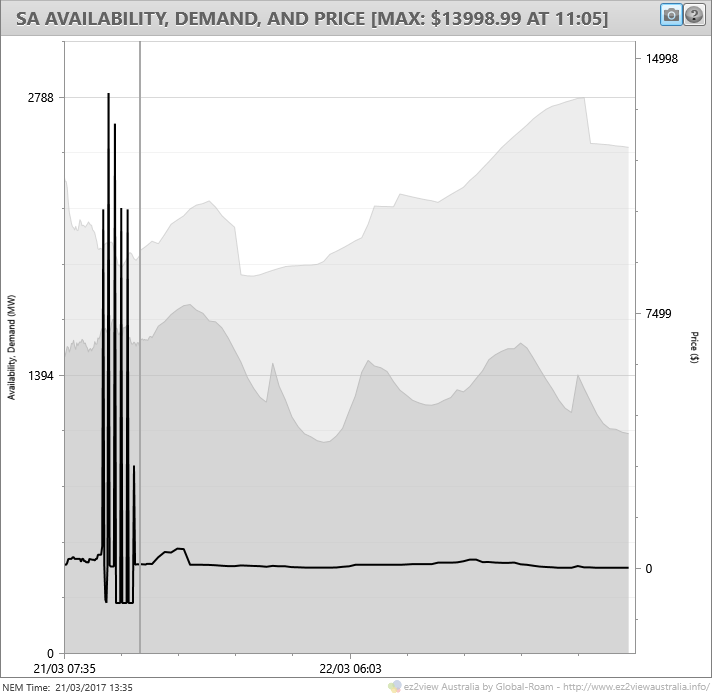
A close look at the chart shows a small bump in scheduled demand and an equally small drop in generation availability leading into the volatility. There were no major generation events or changes in interconnector status during the volatility period itself, so what lay behind these spikes?
Winding back ez2view’s SA Schematic and Trends widgets in time travel mode to 09:00 NEM time, whilst there are no price spikes showing yet on the predispatch price forecast, we can pick up a couple of features:
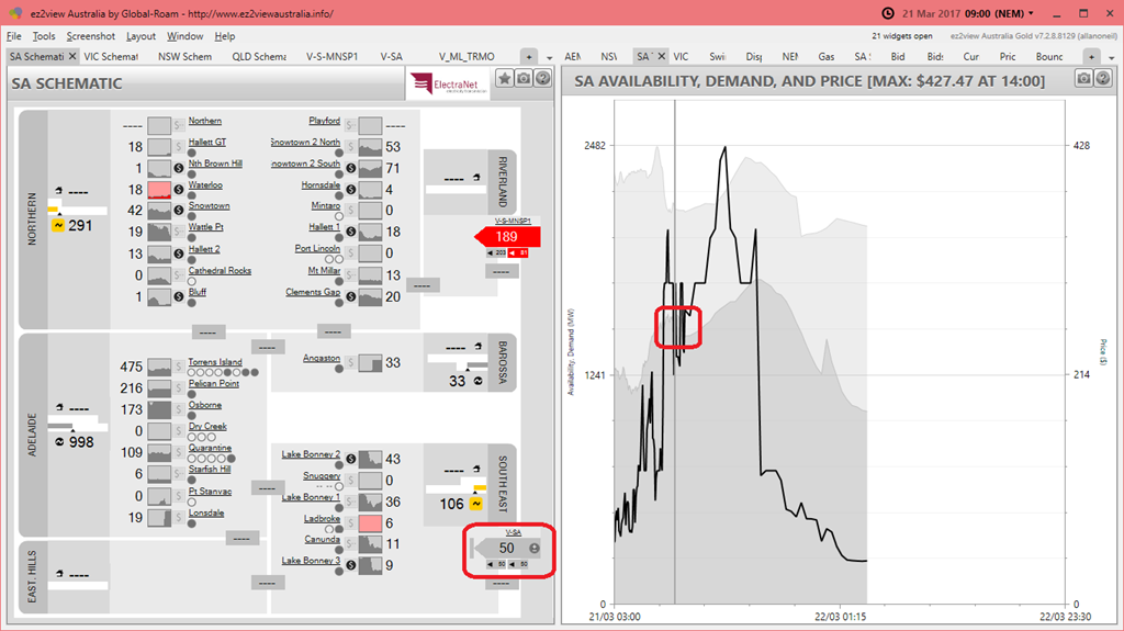
The Heywood Interconnector (“V-SA”, highlighted on the Schematic widget) was limited to only 50 MW of imports vs its nominal maximum capacity of 650 MW. I couldn’t find an AEMO Market Notice explicitly explaining the reason for this very low limit, but a hunt though the set of network constraints operating at the time shows that there was a significant transmission line outage on the 500kV Victorian network side of the interconnector, which is normally fed by two 500kV circuits. Previously under similar outage conditions, flows on the interconnector have been limited to about 250 MW.
That previous ~250 MW limit was set at a level such that if the interconnector unexpectedly tripped due to a fault on the remaining 500kV Victorian circuit, leaving South Australia “islanded”, then supply-demand balance in South Australia could be maintained – avoiding another system black event – but only through the operation of Automated Underfrequency Load Shedding (AUFLS). In the event of an interconnector trip and falling system frequency, this scheme rapidly trips enough customer load in SA – a partial blackout – to compensate for loss of imports, leaving enough time for generation in the state to then ramp up, allowing the tripped load to be restored. In this recent WattClarity article, Paul highlighted an example of how the risk of exactly this sort of outage was previously managed and communicated.
It appears that in the wake of recent events, the preparedness of either the South Australian government, or AEMO, or (most likely) both, to risk further load shedding of any description is minimal, and that when there is a single-contingency risk of South Australia separating from the rest of the NEM, the limit on interconnector flows has now been reduced to a level whose loss can be managed without relying on AUFLS.
Of course this restriction requires more generation to be running in South Australia than would be the case with a higher import limit and raises the risks of spot price volatility, even with demand levels as modest as they were on Tuesday – not much above half of SA’s summer maximum level. (A further side effect is the impact on the cost of extra Frequency Control Ancillary Services procured in South Australia and on that subject I’d refer you to Jonathon Dyson’s WattClarity article published today.)
The second aspect highlighted on the Trends widget in the above chart is a little more subtle but it shows actual demand (the dark grey area series to the left of the vertical line representing the current Dispatch Interval) running above AEMO’s predispatch forecast demand (to the right of the line). This tends to suggest there is price risk on the upside.
Finally, we can also see from the Schematic that total wind generation in the Northern and South Eastern regions of SA is relatively low at a bit under 400 MW, with most generation being gas or diesel-fired plant, principally Torrens Island, Pelican Point, Osborne and Quarantine unit 5. With Torrens Island running only three units (each of 200 MW capacity) and one Pelican Point GT out of service except under exceptional conditions, this means that most remaining “spare” generation capacity in SA was peaking plant – open-cycle gas (or diesel-fired) turbines. It’s the bidding setup of those peaking plants that drove the volatility seen over the next several hours, and I’ll focus on that issue from here.
It would take far too long to do this individually, so I’ll take the “1 picture = 1000 words” approach and try to summarise events in one (complex) chart, drawing together and summarising a range of market data:
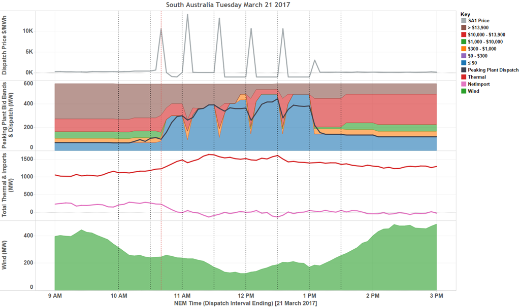
Briefly, there are four panels here, showing
- the 5-minute SA dispatch price – notice how except for the first price spike in Dispatch Interval (DI) ending 10:40, the others all occur on the half hour at DIs ending 11:05, 11:35, 12:05, 12:35, and 13:05
- Summarised bid bands and output (“dispatch”) from peaking plants (basically the various open-cycle gas turbine and liquid fuelled plant located around SA) – I’ll come back to this
- Total Thermal plant output and net imports
- Total Wind generation – it’s pretty clear that the period of price volatility coincided with a lull in wind output from above 400 MW (about 25% of installed capacity in SA), to under 200 MW
The pattern of price spikes in the first 5 minutes of each half hour followed by immediate drops to low levels – negative $1,000/MWh in many cases – for the remainder of the half hour is a classic illustration of the 5/30 effect I’ve discussed several times before in this series (eg in this first piece back in January). Under current NEM rules – which many stakeholders want to see changed, and many others do not (!) – 5-minute dispatch prices are averaged into half hourly settlement prices on which generators are actually paid, so once a high dispatch price occurs, there is a strong incentive to “pile in” with more generation for the balance of each half hour, which is exactly what we see happening here.
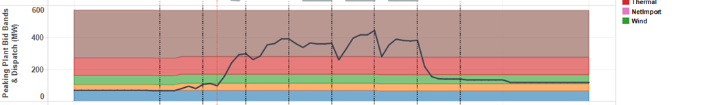
The way that this “piling in” is achieved is by rebidding generation offers to move volume from high-price to low price bands. In the second panel above I’ve grouped the peaking plants’ bids (struck at a variety of price levels for each individual unit) into six broad bands:
- < $0/MWh (often offered at –$1,000/MWh) – this is where generators bid volumes they want to see dispatched almost regardless of current dispatch price
- $0 – $300/MWh – this range would cover marginal running (fuel) costs for most generators – interestingly none of the SA peakers had any volume bid here
- $300–$1,000/MWh – generally above cost, but well below maximum levels
- $1,000 – $10,000/MWh – surprisingly little volume offered here
- $10,000 – $13,900/MWh – typical range for “promoting volatility”
- >$13,900 (but no more than $14,000 being the Market Price Cap) – peaking generators will often “park” capacity at these maximum levels if they think they are unlikely to run, in order to avoid being called to start up for very short non-economic runs
The pattern of volumes offered in each band through the period of volatility clearly shows that at the beginning of each of the “spike” half hours, the majority of this generation was offered at over $10,000/MWh, but after each spike large volumes were rebid into the <$0/MWh range, seeking to maximise dispatched volume (and switching net interconnector flows from import to export in the process).
Finally, one question readers may have is whether those bid “notches” at the start of each half hour, with less volume offered at low prices and more at very high levels – which effectively drove the price spikes – were achieved via explicit rebids moving volume from low to high prices – which might look like a very obvious “gaming” strategy?
The answer is largely “no”, since prior to the volatility outbreak, bids for these peakers were as follows (shown as at 10am):
In other words the underlying setup of the peakers’ bids for the whole day was to have most volume offered at high prices. Looking in detail at the rebids made (eg by using ez2view’s Bids and Offers tool) it turns out that most of the relevant rebids moved volumes around for the current half hour settlement period, and left the distribution of volumes for future settlement periods unchanged until and unless there was a five minute price spike prompting a “dive for volume”.
This would be a fairly normal bid setup for such plant on a moderate demand day, the difference on Tuesday being that tight import restrictions due the Victorian transmission outage and possibly the lull in wind generation came together to promote the chance of volatile prices.
About our Guest Author
 |
Allan O’Neil has worked in Australia’s wholesale energy markets since their creation in the mid-1990’s, in trading, risk management, forecasting and analytical roles with major NEM electricity and gas retail and generation companies. He is now an independent energy markets consultant, working with clients on projects across a spectrum of wholesale, retail, electricity and gas issues.
You can view Allan’s LinkedIn profile here. Allan will be regularly reviewing market events here on WattClarity. Allan has also begun providing an on-site educational service covering how spot prices are set in the NEM, and other important aspects of the physical electricity market – further details here. |
Leave a comment