
As noted on the summer 2006-2007 overview, there was a temperature-driven spike in demand across the NEM later in the week beginning Sunday 7th January – culminating in the summer’s first demand peak above 30,000MW (on Thursday 11th January).
On this occasion, the spot price spiked above $1000/MWh in Queensland, NSW, Snowy and Victoria, as seen in the following chart:
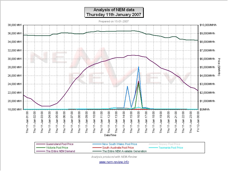
From the chart it can be seen that:
1) At its lowest point, the reserve plant margin across the NEM was still above 18%, which was a healthy level of reserves. This implies that more localised issues contributed to the spikes.
2) The fact that the spike did not occur in South Australia and Tasmania (and only occurred in Victoria for the one half-hour (ending 16:00 NEM time)) implies that transmission constraints were a major contributing factor.
To look closer at the underlying causes of these price spikes (on this day), we have completed the following analysis:
(a) Weather conditions
The following snapshot (taken from a BETA of NEM-Watch version 7) highlights a point late in the afternoon when dispatch prices were above $5000/MWh in Queensland, NSW, Snowy and Victoria:
Please click on the image for a better view
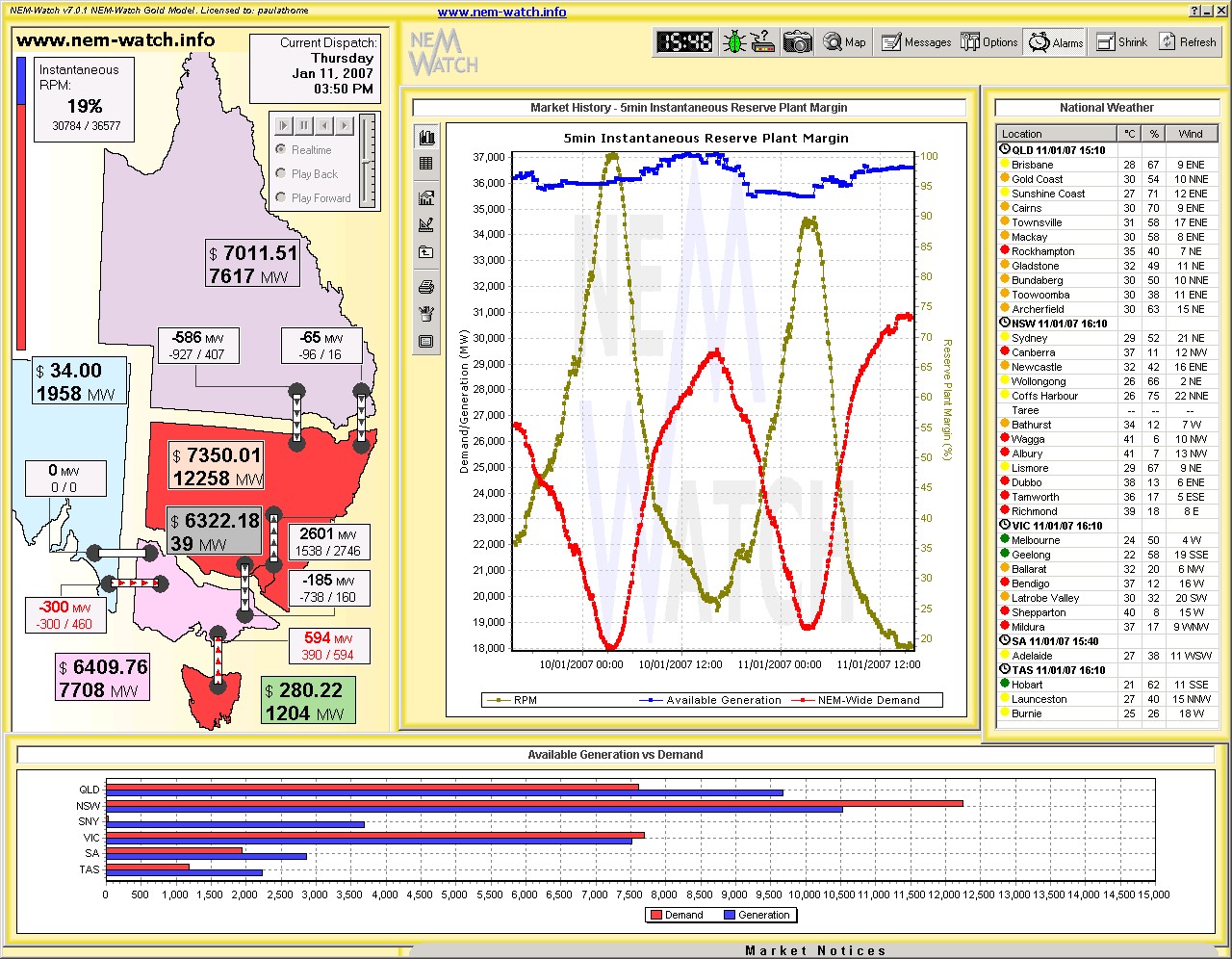
On this NEM-Watch snapshot, you can see:
1) Temperatures of in excess of 30 degrees across most of the NEM, and in excess of 35 degrees
in many inland centers;2) Transmission flows constrained on Heywood (from SA) and Basslink (out of Tasmania) – with
Murraylink not running.
The effect of these transmission constraints is further analysed below
(b) The effect of transmission constraints
The following chart (extracted from a BETA of NEM-Watch version 7) highlights the effect of transmission constraints (by comparing the trading prices across key interconnectors over the day:
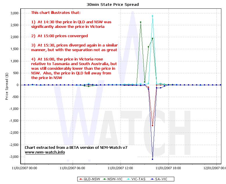
With data extracted from NEM-Review, we have performed the following analysis of 4 key time periods. The results of this analysis are presented in tabular fasion below:

As can be seen in the table above, even taking into account the effect of transmission constraints in the three half-hours indicated (specifically, the fact that there was no more capability of supplies into the high-priced regions from the low-priced regions), a healthy level of available reserves was still seen.
It is evident in the prices experienced that these reserves (though available) were certainly expensively priced!
(c) The effect of generator bidding behaviour
Given that the price spike occurred in QLD, NSW, Snowy and Victoria, we will concentrate on how the various generation portfolios in those regions were operating at the time (though it should be noted that generators in South Australia and Tasmania would presumably have been doing everything that they could to secure some of these higher prices in their own regions).
The following charts illustrate the behaviour of each participant over the day:
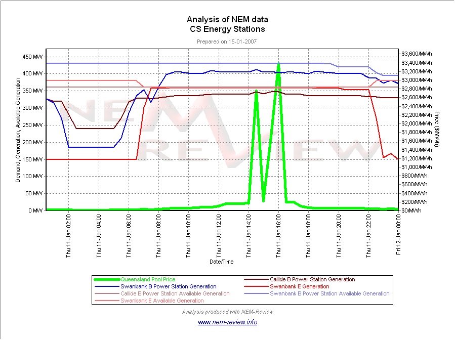
|
CS Energy |
This charts shows that the CS Energy portfolio was operating steadily through the spike in price: 1) The Swanbank B coal-fired plant is shown to operate almost uniformly over the period (further analysis in NEM-Review of individual unit output shows that units 2, 3 and 4 were together producing 7MW less at the 16:00 (higher) price spike than in the (earlier) 14:30 price spike); 2) Output at the Swanbank E gas-fired plant was steady throughout daylight hours. 3) Callide B unit 2 was offline for the day, but unit 1 is shown to be producing at close to maximum load for most of the day (with a slight increase in output at the times of peak price). |
|
|
|
|
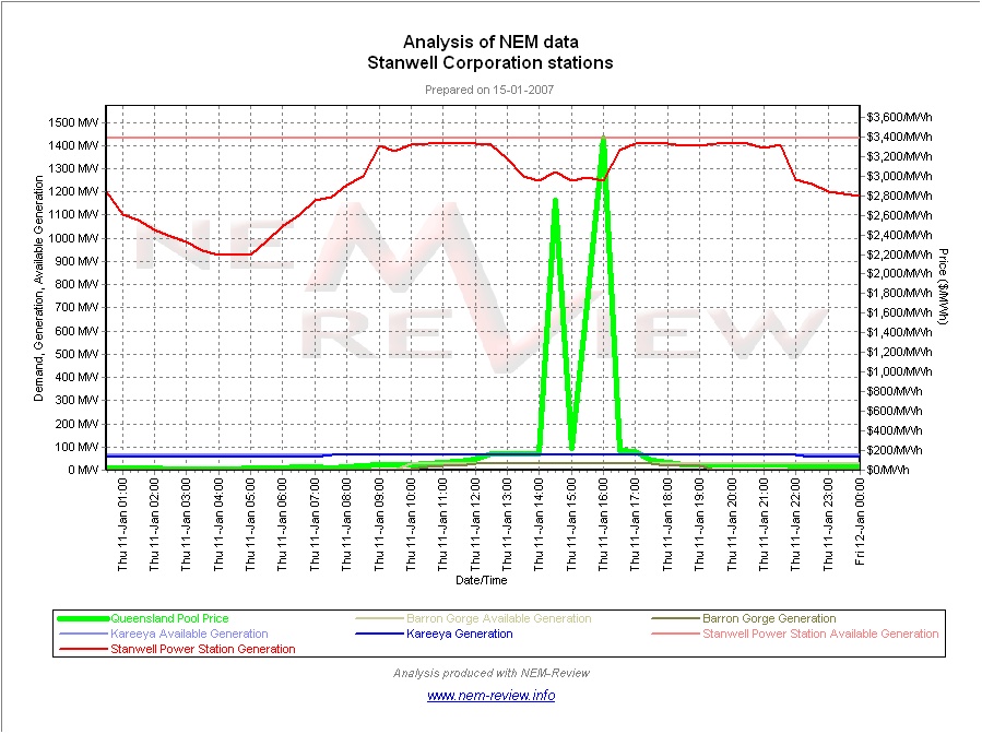
Stanwell Corporation |
Output at the two northern hydro plants is shown to be a minor factor in the overall supply/demand balance. The Stanwell coal-fired plant is shown to be backing off production by 200MW or so across 4 units at the time of the spike in prices. Further analysis reveals this reduction to be evenly shared across all 4 units. |
|
|
|
|
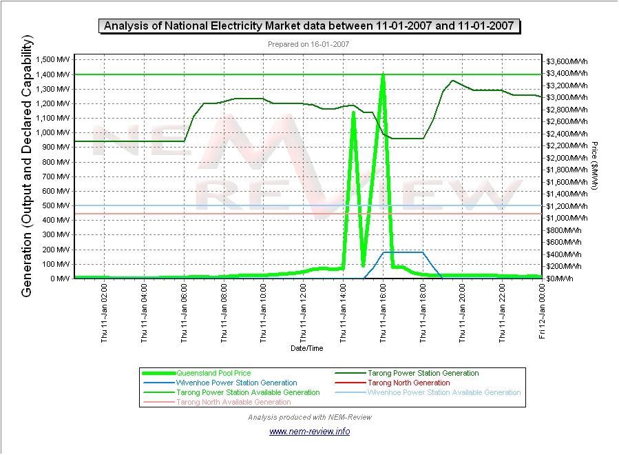
Tarong Energy |
As can be seen in this chart, output at the jointly owned Tarong North unit was flat throughout the day. In contrast, output at Tarong power station varied in two important ways: 1) In the low-priced, early-hours of the day, it can be seen how Tarong has started to reduce output order to conserve dwindling water supplies, sourced in part from Wivenhoe dam:
2) Towards the end of the spike in prices it can be seen that Tarong reduced its output, but that this reduction was offset by an increase in production at the Wivenhoe pumped-storage hydro plant. Again, this would have saved slightly on water consumption. |
|
|
|
|
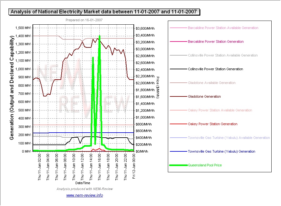
Enertrade |
As can be seen in this chart: 1) The Gladstone plant was running at close to full load at the time of the price spike (with 1 unit offline during the day); 2) The Yabulu CCGT plant was running continuously throughout the day; 3) The Collinsville coal plant in North Queensland was, likewise, running at full load at the time of the price spikes; 4) The smaller Barcaldine CCGT plant was unavailable the whole day; 5) The Oakey plant was called on to generate a small amount at the time of peak price. |
|
|
|
|
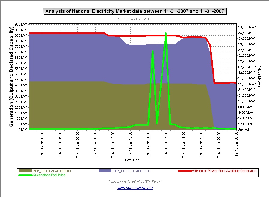
Millmerran Power |
As can be seen from this chart: 1) Millmerran Unit 1 reduced output during the middle of the day for about 6 hours (including the time of the price spike); 2) Millmerran Unit 2 ran steadily through the price spike but then came offline in the evening (apparently for some maintenance – the plant only returned to service on Monday 15th). |
|
|
|
|
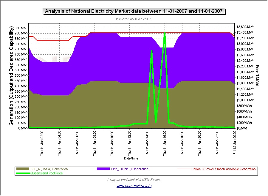
Callide Power |
As can be seen in this chart, the output of both units ofCallide C was reduced in the afternoon, and particularly around the time of That the available capacity did not reduce implies that Callide Power Trading |
|
|
|
|
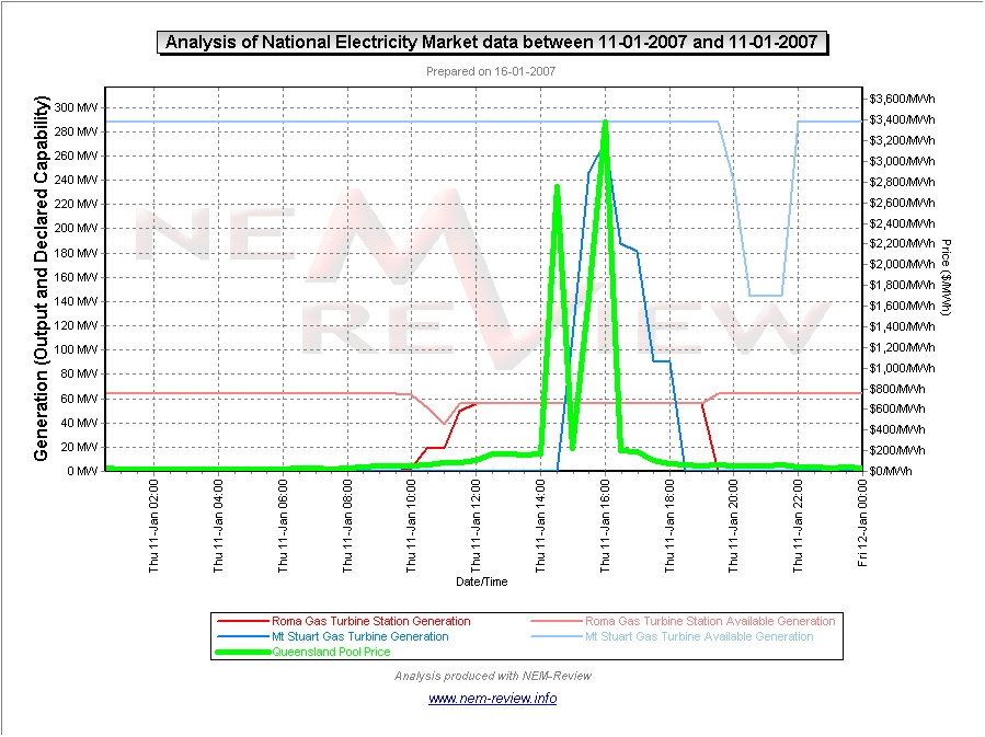
Origin Energy |
From January, Origin has full control of the Mt Stuart plant. This chart illustrates how Origin chose to operate this plant in this situation, with output ramping up towards full-load around the time of the price spike. It is worth comparing this operational pattern to that of the Oakey plant, which Additionally from this chart, we can see that the Roma plant was ramped up to generate at |
|
|
|
|
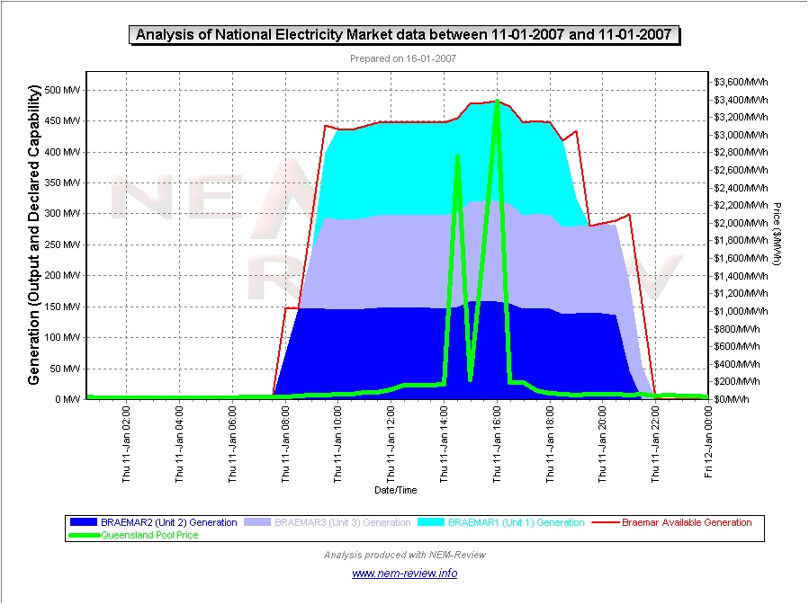
NewGen power |
The Wambo plant was only commissioned in mid 2006. As can be seen from this chart, all 3 units were up and running at full |
|
|
|
|
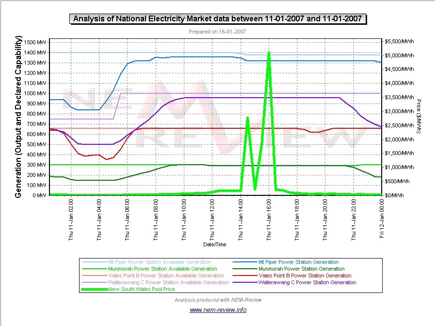
Delta Electricity |
As can be seen in this chart, all 4 Delta stations are seen to be running at (or close to) maximum capacity throughout the period of the price spike. |
|
|
|
|
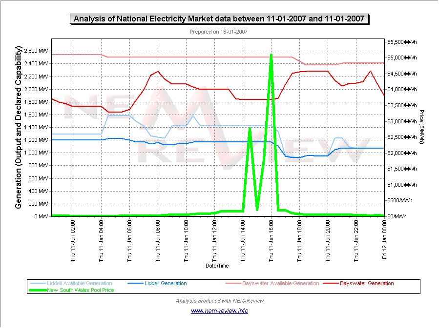
Macquarie Generation |
As can be seen in this chart, both Bayswater and Liddell had significant surplus capacity at the time of the spike in price that was offered Indeed, it can be seen that the output at the Bayswater plant decreased at the same time that the spot price jumped – hence implying that Macquarie Generation engaged in some “economic withholding of capacity” on this occasion. |
|
|
|
|
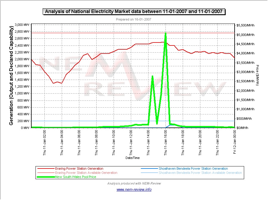
Eraring Energy |
This chart illustrates that the Eraring station increased its output over the period of the spike in price (though the level of load was still 250MW lower than maximum capability of the plant, which implies that Eraring still had some capacity bid into higher price bands). Interestingly, the small amount of production shown for the Shoalhaven hydro plant is seen to be after the spike in price had subsided to a level of “only” $200/MWh. |
|
|
|
|
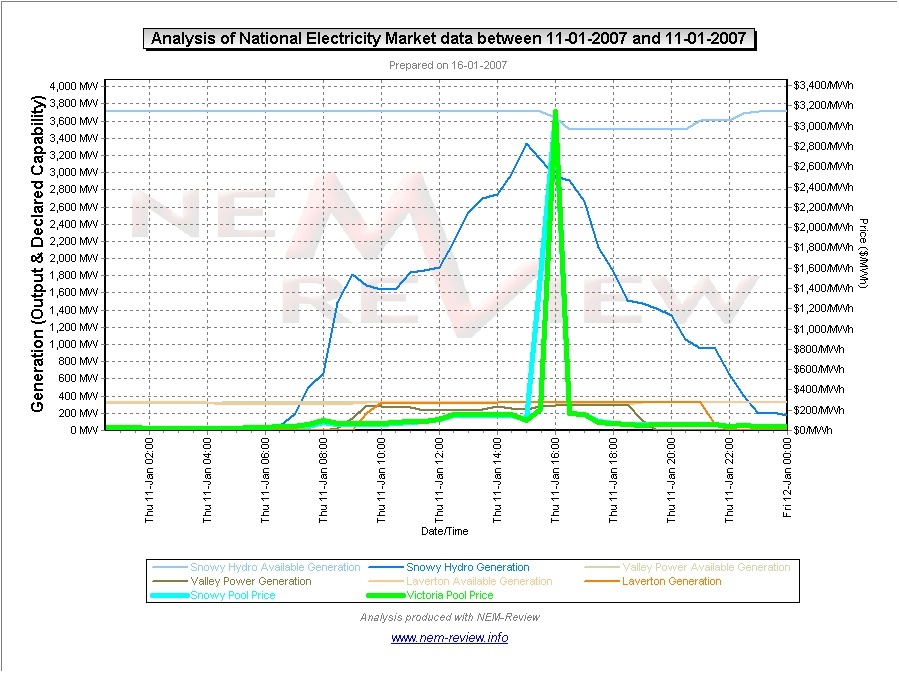
Snowy Hydro |
As can be seen from this chart: 1) Production at the hydro-electric plants was high throughout much of the daylight hours in the day (reflecting the high level of demand experienced) but actually decreased by about 380MW between 15:00 and 16:00 (whilst over the same period the price in the Snowy region had risen by more than $3,000/MWh). 2) In Victoria, Snowy Hydro’s two gas-fired peakers operated at (or near) close to full load over the afternoon. Production levels at the newer Laverton plant were actually in line with maximum capability, whereas the Valley Power plants still had a small amount of spare capability available and unutilised. |
|
|
|
|
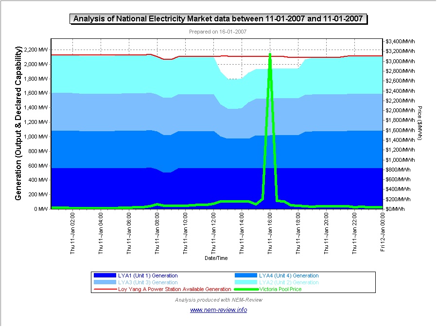
LYMMCO |
From this chart it would appear that LYMMCO has engaged in the “economic withholding of capacity” that first came to prominence in the market in winter 2002 (summarised here). In this case, it can be seen that unit 1 generated consistently through the afternoon |
|
|
|
|
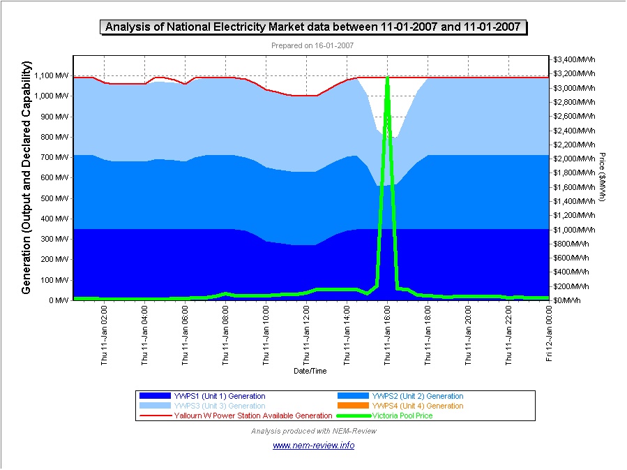
TRU Energy |
As was the case for Loy Yang A above, we can infer similar practices at work in TRUenergy from the chart for Yallourn. Specifically: 1) Unit 1 is seen to be operating continuously throughout the afternoon, after a dip in output around lunch. Units 2 and 3 are seen to reduce output around the period of the spike in price. The total reduction in output across the 2 units is seen to be approximately 300MW. Unit 4 was unavailable throughout the day. |
|
|
|
|
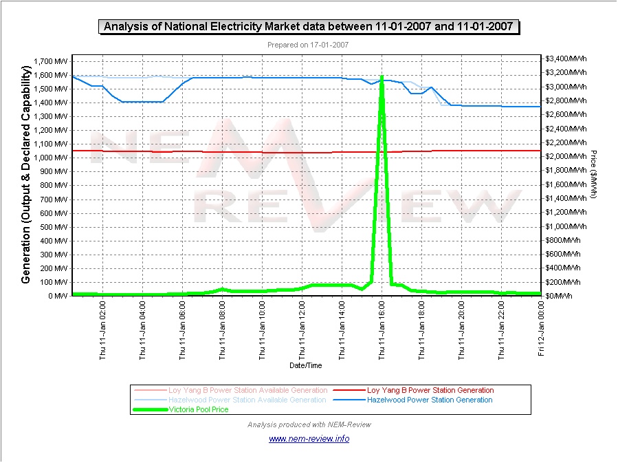
Internationalpower |
From this chart it can be seen that: 1) The Loy Yang B plant was running consistently at base-load, reflecting the nature of the power purchase agreement thought to be in place; and 2) The Hazelwood plant was likewise running fully loaded for most of the day – however it is seen that the output did drop a little just before the price spike occurred in Victoria, so it is appears that some changes to bids were made around that time. |
|
|
|
|
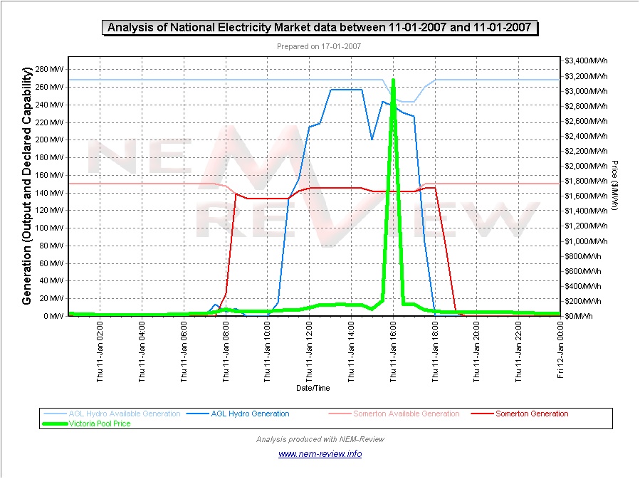
AGL |
Finally, we have included a chart for the AGL plants in Victoria – both the hydro plants (purchased from Southern Hydro) and the Somerton gas-fired peaking plant. 1) From the illustration it can be seen that the Southern Hydro plants were run heavily for much of the afternoon. However:
2) The Somerton plant is seen to be running heavily loaded over the afternoon period, though the output (AND capability) did decrease slightly at the time of peak price. |
Be the first to comment on "11th January 2007 – first spike in demand above 30,000MW"