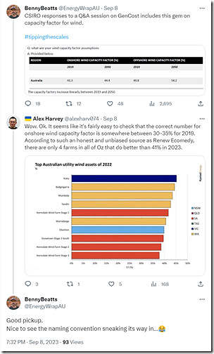
In recent times I’ve seen a few discussions circulating on social media with respect to capacity factors of wind farms across the NEM. This exchange started by Benny Beatts on Twitter was just one of them:
There’s two things that are worth noting here:
(A) Using Capacity Factor to identify ‘top performing’
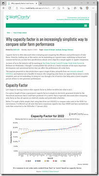
Noting that Alex Harvey points to a report by Rystad that ranks Wind Farms by capacity factor through calendar 2022 reminds me of how Dan Lee wrote in March about ‘Why capacity factor is an increasingly simplistic way to compare solar farm performance’:
The same argument also applies to comparing (and ranking) wind farm performance as well.
(B) Long term stats for Aggregate Wind Farm output, and Capacity Factor
I’m not entirely sure where to locate the CSIRO response that Benny references at the top of the thread above, nor of the CSIRO’s context* in providing those answers (if someone could drop a URL in a comment below, that would be appreciated) but it does appear that 41.3% (in 2019) and 44.4% (in 2050) does seem overly optimistic in terms of actual wind farm capacity factors being achieved across-the-board in wind farms across the NEM.
*… for instance, a capacity factor would need to be assumed in calculating LCOE** (Levelised Cost of Energy)….
(1) a higher capacity factor assumption will give a lower LCOE, all else being equal (and vice-versa).
(2) ** as confused, abused and misused as a metric LCOE might be (as Allan reminded us back in 2017).
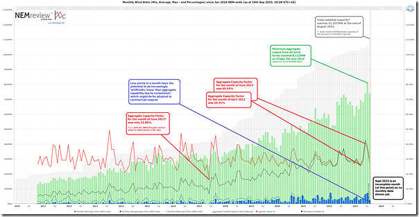
Let’s when you look at the following longer term trend based on what’s actually been happening across the NEM:
Reader Notes:
1) Readers can click on the chart to open a larger screen view.
2) This chart has been produced with NEMreview v7, and readers who have a licence can open their own copy of this trend via this link here.
With respect to this chart, there’s a few points that are worth reinforcing here:
B1) How to measure capacity factor?
At a high level, a Capacity Factor is a pretty simple measure …
(a) the numerator is the actual output (measured in MWh, remembering this is a volume) and
(b) the denominator is the theoretical maximum output (again measured in MWh, but extrapolating installed capacity over the same time period).
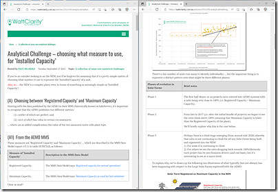
However there’s a level of complexity under the covers – for instance even just in choosing what measure to use, as ‘Installed Capacity’:
In the trend above we have chosen to use the registered Maximum Capacity of all wind farms across the NEM as the measure of installed capacity.
B2) The highest points
There’s a series of articles that have been written over time on this site about new all-time maximum instantaneous aggregate output levels, with the latest being with respect to the new record (at 8,132MW) on Friday evening 7th July 2023.
I would not expect it will be too long till we see it ratchet further … indeed we’re keeping an eye on this dashboard trend and note that 7th September 2023 we reached 7,869MW.
B3) About the ‘artificial’ suppression of low points
A further note should be made (as noted on the chart) that the low points each month have increasing potential to seem ‘artificially’ suppressed as a result of curtailment of unutilised wind farm capability … i.e. when the wind resource was there and the plant was technically capable of delivering, but was suppressed for a range of reasons, including two big ones:
(a) Commercial curtailment
… such as when spot prices are below ‘negative LGC’ or
(b) Transmission (or other) constraints.
… and Ryan demonstrated how significant these are, in terms of market outcomes.
Back in June 2020 Marcelle wrote how it’s ‘not as simple as it appears – estimating curtailment of renewable generation’, and more recently there was discussion from others such as by Tristan in May 2023 (‘Australia’s Renewable Energy Boom – The Good, The Bad and the Downright Ugly’) and then Allan in May (‘Renewable curtailment – forced and not quite so forced’) and then also by myself in June 2023 (‘Increasing curtailment of Wind and Solar across the NEM’) referencing GenInsights Quarterly Updates .
The key take-aways here are that:
(a) The low points are real data, in terms of being the lowest aggregate output experienced at some point across each of the months in the trend;
(b) However other readers might be more interested in the minimum theoretical capability for output (i.e. assuming the curtailment had not happened) … which is deliberately not what is shown in this trend.
B4) Trended Capacity Factor
So that brings us to the capacity factor. Somewhat arbitrarily starting at January 2020 we see that the extreme points were:
(a) Highest aggregate monthly capacity factor of 40.93% for June 2023
… with the next highest being 37.18% in September 2020.
(b) Lowest aggregate monthly capacity factor of 23.64% for April 2021
… with the next lowest being 24.27% in July 2020
… and the lowest since January 2023 being 25.41% in April 2023 (noting April 2022 was also at the low end as well).
Of course it should be noted that these capacity factors reflect actual output – which has been suppressed in some cases by economic and or constraint-related curtailment (as noted above).
So, if the intent the CSIRO assumptions were to provide LCOE estimates for wind farm costs (feeding into the GenCost report), then their assumptions of >40% Capacity Factor for onshore wind would seem to be overly optimistic…


Over 40% capacity factor certainly seems optimistic even for latest-technology onshore wind.
That said, analysis like this based on NEM market data is going to yield an “apples vs pears” comparison for several reasons:
– the existing fleet is up to 20+ years old (with its underlying design parameters even older) so we would obviously not expect that fleet to deliver to new-build levels, not even closely. Today’s electric cars probably perform a lot better than whatever you could buy five or even three years ago. I’m not an engineer but understand that there have been numerous improvements to turbine technology and windfarm modelling / layout methods, as well as in site selection, that should yield better performance under the same wind regime.
– registered fleet capacity always runs ahead of actual achievable maximum output while there are farms being built, commissioned, and extended. To allow for this you need to go through the data and manually back out farms (or adjust maximum capacities) for those still in the commissioning / ramping up stages.
– economic offloading and constraint-driven curtailment will drop fleet capacity factor a bit if the measure is based on actual output; availability is a better numerator if the aim is to compare technical performance before these impacts
Finally, I very much doubt that curtailment or offloading would materially affect minimum coincident output levels across any significant group of farms let alone the whole NEM fleet – minimums will be driven by widespread still conditions in which case curtailment / offloading are almost certainly going to be neglible. On the other hand maximum output levels will almost certainly by affected by these factors.
Thanks for picking up on some shortcomings in my quick explanations, Allan … as always.
It’s a valid and worthwhile analysis Paul, and you’re aware of the caveats, but just pointing out for other readers why its results can’t be directly compared with new build capacity factor estimates.
Who cares about monthly wind capacity factors anyway. A monthly figure totally hides one/two/three-day wind lulls where capacity factors are absolutely abysmal (<500 MW total NEM wind gen over evening peaks) and we're faced with actual LOR2 conditions. A purported high capacity factor month can completely hide severe price spike days that took place over that time period due to very low wind gen.
@Allan O'Neil
The bulk of the NEM wind farms are already located in the best wind resource locations in the NEM which is the VIC/SA border. Are the technological breakthroughs in wind the same ones where we just build bigger blades without any conception of their longevity and maintenance costs?
Alfred Hill makes a good point about averages, it is the low points that cause the problems.
Also the best sites are taken and if Germany is any indicator the capacity factor falls away over time due to ageing machines, best spots taken and interference by overcrowding.
You can access the CSIRO data here.
https://data.csiro.au/collection/csiro%3A44228v10
the select “files” tab at the top – then select final 22/23 xls.
CF is detailed on sheet “Apx Table B.8&9”
you can access the capacity factor discussion by searching for “D.2.1” in the 2022/23 Gencost report