Global-Roam and Greenview Strategic Consulting have recently released the Generator Statistical Digest 2020, which provides a 10-year review of the performance of all DUIDs that were operating in the NEM in at least part of calendar year 2020. One of the difficult-to-summarise features of the NEM is the bidding behaviour. The GSD2020 visualises historical bidding behaviour in the colourful Volume Bid in Price Bands graphs on the “A” pages and summarises the outcomes in the RRP Energy Harvest on the “B” pages.
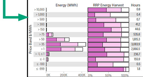
In this article I’m looking at what can be learned from the RRP Energy Harvest graph which is at the bottom of the “B” page for each generator. This graph shows where across the range of regional prices a generator is more likely to be generating. By comparing the graphs across generators of different types we see very different operating patterns and business models. I won’t claim that these are revolutionary insights, but they do give a strong visual appreciation from real data of how different types of generators operate in practice.
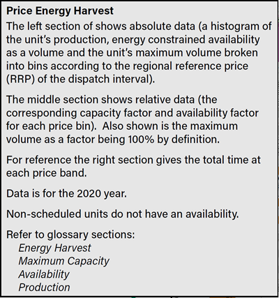
First, to understand what the graph is showing. There’s an explanation in the 24-page Glossary section of the GSD2020:
and further details in the Guide to Statistics section:
A note on the details: The graph uses buckets of the regional price in each 5-minute dispatch interval, not the half-hour trading interval that AEMO uses for settlement. Some generators change their output during half-hour trading intervals with volatile prices, so this graph doesn’t precisely show the revenue capture of each generator. That won’t matter in this discussion.
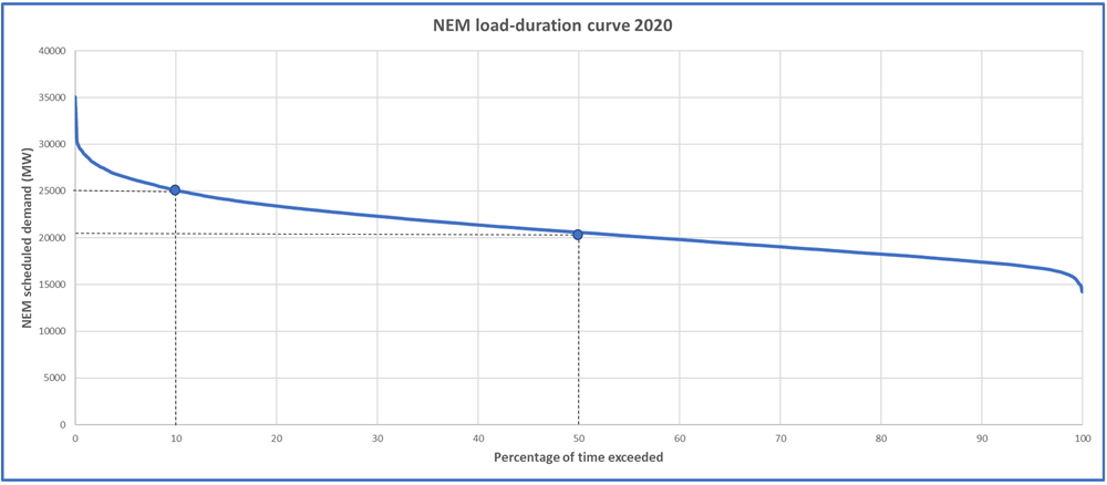
Next, a little bit of electricity market theory. The load on the network, and therefore the amount of generation needed, varies across the day, season, and year. This can be plotted as a load-duration curve.
This plot from 2020 shows that while half the time 20 GW of scheduled and semi-scheduled generation suffices, it’s only 10% of the time that 25 GW or more is needed (plus reserves). Some generators (such as coal plants, the “baseload”) have large capital costs, but once built the fuel costs are relatively low so it makes economic sense to run these a lot. At the other end are “peaking” generators such as open-cycle gas turbine plants that are cheap to build but cost a lot to run, so you don’t want to run them often. The theory goes that there’s an optimal mix of installed generation plant that balances these fixed and variable costs, and so we see both “baseload” plants and “peaking” plants in a power system. Renewables change the story a bit, which I won’t explore here.
Let’s have a look at some examples from the GSD2020.
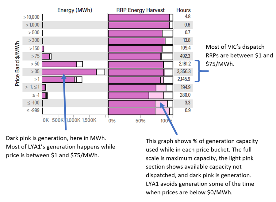
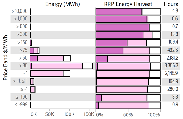
A baseload plant – Loy Yang A unit 1 – Brown Coal plant in VIC
Loy Yang A typically operates across a large range of prices, given its low fuel cost and slow ramping time.
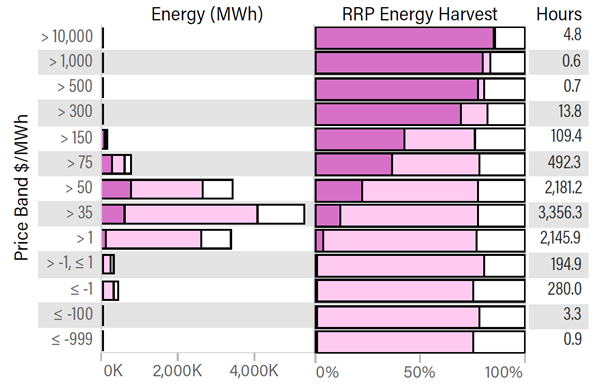
A peaking plant – Bairnsdale – an open-cycle natural-gas plant in VIC
This is quite a contrast to Loy Yang A! While much of its capacity is available most of the time (shown in light pink) it generally won’t come on until prices are above $75/MWh. The total generation for the year (shown by the dark pink on the left graph, and check the scale too) is much lower than Loy Yang A. Its capacity factor is 8% in 2020, compared to Loy Yang A’s 83%.
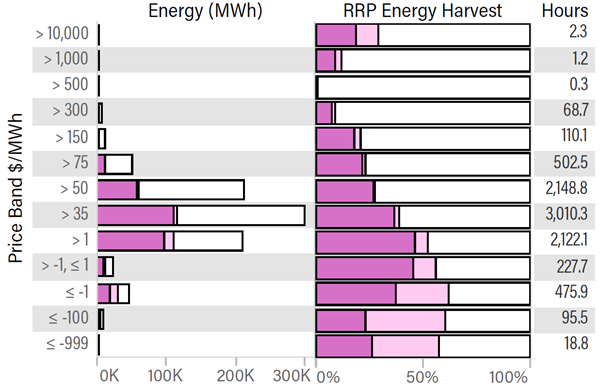
A hydro plant – Murray – in VIC
Hydro plants are “energy constrained” by how much water is in the reservoir, so put a price on the scarcity value of the water and can ramp up quickly to capture good prices. From this graph we can see that Murray is more likely than not to generate when the price is above $75/MWh, but still generates some of the time when the price is lower. As the lower prices are more common, much of the generation (looking at the left graph) happens between $35 and $75/MWh.
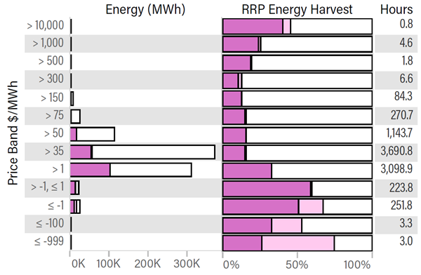
A wind farm – Snowtown 1 in SA
A large part of the lifetime cost of a wind farm is in its initial construction, with the ongoing costs per MWh quite low, or effectively negative if the value of renewable energy certificates (LGCs) is considered. The graph from this wind farm in SA shows how higher available capacity correlates with lower prices. For the coal, gas, and hydro plants above the available capacity is roughly the same regardless of the price, with the proportion that gets dispatched varying. For the wind farm, the available capacity (which depends on the wind conditions) also varies strongly with price – on average higher when the prices are lower (or to look at causation, the prices tend to be lower when it’s windy across the region). Most of the energy dispatched by this wind farm is between $1 and $50/MWh. We can also see the avoidance of some negative prices.
A solar farm – Clare in QLD
This solar farm in QLD similarly shows a bias towards low prices during high availability, and avoidance of negative prices. Most of the energy is dispatched between $1 and $50/MWh, with more between $1 and $35 than $35 and $50/MWh.
Further information in the GSD2020
With your copy of the GSD2020 you can also look further into comparisons between different generation types – including:
- Volume-weighted average price captured (higher for peaking plants than baseload); and
- How they bid (peaking plants offer at much higher prices on average than baseload); and
- How often they are influential in setting the regional price.


I have just been exposed to WattClarity and I can see I now have a new best friend in the Australian Energy Space – great articles, awesome raw and analysed data and a treasure trove of information. Thank you.
Thanks for the kind words, Barry