Someone made the comment this morning about mainland hydro units running heavily in recent weeks (i.e. because of volatility), so I thought I would have a quick look.
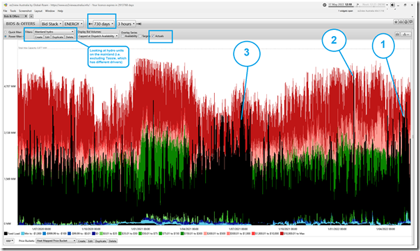
Here’s a view of the ‘Bids & Offers’ widget in ez2view looking back the past 730 days (i.e. 2 years) to highlight a number of things:
With respect to the numbering on the image, please note the following:
0) Not numbered on the image, but highlighted, note that:
(a) I’ve chosen to exclude Tassie hydro in this case, as it operates with different drivers given the nature of the TAS region … hence this trend is just ‘mainland hydro’
(b) I’ve also selected to show every 5-minute ‘Actual’ output as the black line … which gets a bit busy over such a longer time range, but can help illustrate operational patterns
1) We can see the recent growth in output patterns, particularly in May 2022.
2) I’ve highlighted the short-lived spike in output on Monday evening 31st January 2022 … a day Allan analysed soon afterwards here.
3) Apart from that short-lived spike, we see that the current ‘block of black’ for May 2022 is easily the heaviest utilisation of hydro on the mainland since July 2021. Keen-eyed readers will see that hydro generation in May 2022 appears to be running somewhat more heavily than in May 2021.
Nothing further, at this point.


Since we are low on coal capacity lately I thought that the experience during low-wind periods would be interesting. Gas probably picked up some of the slack but I expected that hydro would be the cheaper option and it seemed to be the case looking at the Aneroid Energy plots. Maybe crude compared with the analysis here but there was clearly a difference in hydro from month to month, expressed as a larger number of spikes over 60% capacity for all hydro. I appreciate the analysis is better without Tasmania.
For some time I have wondered how long hydro would last if it is required to fill a serious gap in supply.