I’m back at work after a couple weeks off, and (apart from wading through all the follow-ups required given all the events of late last week in the hope of returning my attention to our Generator Report Card 2018), curiosity is getting the better of me about what happened whilst I was somewhat disconnected from the NEM.
Hence I will post some notes here today, and then (if time permits) follow up with more later. Readers should also keep in mind that I was able to have this first peek at the end of Thursday 24th January.
Each of the three charts provided below have been developed with our NEMreview v7 software product:
(A) A view across the whole of the NEM
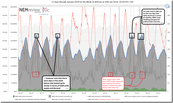
Starting at the top and working in, I have trended the supply and demand balance on a NEM-wide basis from Monday 14th January:
With respect to the chart above, there are a number of observations I’d like to make:
Observation #1) Starting from the macro and working our way in is a good way of ensuring that we retain some perspective in terms of what’s going on.
Observation #2) Included on the chart are three different measures that the AEMO uses for demand, aggregated to NEM-wide (TOTAL DEMAND, DEMAND and NON-SCHED GEN, and OPERATIONAL DEMAND).
2a) Note that they are different – hence readers should be aware of which measure is being used at different times.
2b) See the gory details about aspects of demand measurement here.
2c) A key point is that the demand peaked above 33,000MW on 5 separate days over this date range (by all 3 measures) – which is somewhat remarkable given that this was before the end of school holidays hence without the additional consumption inherent in the education system and the complementary additional consumption that will come from the end of the parent’s holiday, including mine.
2d) That level is still >2,000MW off the all-time record set back in January 2009 – however the intervening 10 year period has seen significant decline in demand for various reasons.
Observation #3) I’ve noted on this chart how prices will almost never spike when IRPM (Instantaneous Reserve Plant Margin) is high – but won’t necessarily spike when IRPM is low. Hence it is an important non-price indicator of the balance between supply and demand, and possible use of market power:
3a) I moved this metric to real time more than a decade ago to include in an earlier version of NEMwatch (and it’s been included since that time). RPM has been used in the electricity sector beforehand – but moreso in a forward planning sense.
3b) It’s calculated as the excess of Available Generation over Demand
3c) Important to note that it can’t be calculated with measures of Demand that include Non-Scheduled Generation, as the level of Available Generation for those technology types is not accessible to, or published by, the AEMO. Hence it is still calculated with Scheduled Demand (i.e. TOTAL DEMAND).
Observation #4) Most importantly, we know that Thursday 24th and Friday 25th January were particularly critical for the NEM in a number of different ways (sustained high prices, load shedding, Reserve Trader and so on).
4a) However at a macro level we see that there were days in the week prior where the underlying situation NEM-wide was quite similar (e.g. 15th and 17th January):
(i) Similar levels of demand (above 33,000MW on 5 days in the range above),
(ii) Similar levels of available generation, and
(iii) Similar level of IRPM (below 20% on Thu 24th and Fri 25th – but also on other days as well)
– all NEM-wide.
4b) This is a timely reminder that local circumstances, and constraints, are critical to market outcomes – not just down at a regional level, but also within regions down to individual zones as well. Transmission congestion, the local nuances of weather patterns, and generator outage rates all played a key role in making Thursday and Friday quite different than a week prior. This is something that should be kept in mind when considering both:
(i) operational decisions (e.g. what might happen this week and next); but also
(ii) strategic decisions as well – such as:
Case 1 = for business developers seeking in invest considerable funds (whether theirs or others) in the construction of new generation assets, whatever the type.
Case 2 = more broadly, for those completing, promoting, or just using the growing number of strategic planning studies (including 100% renewables studies).
Does your modelling correctly account for the nature of transmission congestion, do you take due care in modelling a significant number of plausible weather scenarios, and are you running monte-carlo simulations on generator outage patterns – or are these critical considerations that all just waved away by some magic wand (and hence becoming an unwitting victim of Villain no 4)?
Now that we have started with the NEM-wide perspective, we’ll drill in a little more.
(B) A view for Victoria
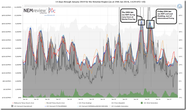
Here’s a similar 2-week view for the Victorian region:
Standing out across the two-week period are the two days in question – Thursday 24th and Friday 25th January:
Observation #5) We see that Victorian demand (all three measures) rose above 9,000MW on both of those days – considerably higher than any other day shown in this period. However readers should remember that this was still more than 1,000MW below the all-time maximum (10,496MW in Victoria for TOTAL DEMAND, as shown in NEMwatch – though this was achieved in January 2009, well prior to the closure of Hazelwood).
Observation #6) I’d also draw particular attention to the much higher temperature in Morwell on Friday 25th compared to Thursday 24th. As a reasonable representation of the ambient temperatures that the Latrobe Valley gas and coal power stations would have seen, one would have expected to see maximum capabilities more affected on Friday than on Thursday.
Observation #7) I have not marked it on the chart as it is already busy, but it’s worth flagging how 300MW of capacity at Yallourn unit 3 was removed from the market from 23:05 on Thursday 24th January due to a tube leak, and that this was one of the major reasons why there was load shedding required on Friday whilst not on Thursday:
7a) I missed this in my update late on Thursday evening last week as I’d time-traveled those particular widgets to 21:00 in order to provide focus on Thursday’s activity.
7b) In our our Generator Report Card 2018 we’re having a detailed look for each generator individually at their reliability patterns. To what extent are they seasonal, and how are they trending over time (particularly how quickly are they getting worse, if that is the case).
Observation #8) The demand shape for Friday 25th January is much “choppier” than for the other days, which seems to me to be due (at least in part) to the unnatural effect of the load shedding enforced onto Victorian consumers (small and large).
(C) A view for South Australia
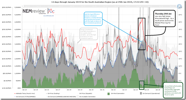
Finally in this post we include a similar view for South Australia:
Adding to the list above we see:
Observation #9) That the differences between the various measures of demand in the South Australia can be particularly pronounced – following on from Observation #2 above:
9a) This tweet on Thursday 24th January at 18:07 NEM time captured a time when Operational Demand was well up in the red zone for the South Australian region (via our ECA-sponsored Electricity Consumption widget) – quite close to the all-time record, despite the demand response operating via RERT and also via more general spot-exposure.
9b) However Scheduled Demand barely scraped over 3,000MW – meaning it was 400MW or so off the all-time record via that measure, set in January 2011.
Observation #10) Unfortunately (though perhaps not unexpectedly, as it is a recurring pattern) we see that wind output dropped substantially at the time of peak pricing:
10a) In much the same way that Scheduled generators shifting volume to higher-priced bid bands (shown for Loy Yang here, and discussed on other sites), this physical withdrawal of capacity due to energy constraints also has a major effect on increasing the spot price.
10b) This has double-whammy effect – not only is wind significantly hobbled as a supply option, but the removal of the cooling effect of the wind leads to higher demand (to stretch further other supplies);
10c) This has become particularly expected in South Australia, which is part of the reason describe this as a “wind correlation penalty”;
10d) What this means is that wind farm operators in South Australia earn significantly lower volume-weighted average spot revenue than other types of plant:
(i) I can understand how investors in generation infrastructure (particularly foreign investors looking at new assets) might be particularly keen to understand the extent to which generators have missed revenue opportunities as a result of siting decisions made at project commencement.
(ii) In our Generator Report Card 2018 we are taking a closer look at what this has been for every single generator, and how this is trending over time – e.g. is the spread getting worse over time?
———————
That’s all for now, folks, but perhaps more later as time permits (though I really should be focused on our Generator Report Card 2018 and other promises for clients).


Paul, is there any room in your work to look forwards and consider this scenario occurring in 5yrs time? There is another 2100 MW of wind committed for VIC in the AEMO generator register, which will be in addition to the existing 1050 MW of wind. Back of the envelope calcs tell me that if existing wind capacity was delivering 400 MW (Thu) and 650 MW (Fri) during peak demand, then a total of 3000 MW wind would have delivered around 1200 MW and 1950 MW for the same wind conditions.
This additional wind capacity is already being planned, and if > 42 degC is about a one-in-three year event we can expect similar conditions to happen again.
Ben.
You have to consider that the wind farms in place now are at the best locations.
The more wind farms we install the worse the actual output will be because they are going to be located in even more subprime locations.
You also have to consider that while the average output (20-25%) is useful indicator, the system is only as strong as its weakest link which means the numerous periods where we have 24 hours or more at less than 10% output need to be the focus point.
Just look at Victoria wind output for 21, 22, 26, 28 and 29 January. It is way lower than output on the 24th.
Bear in mind that Victoria has 1740MW of wind farm nameplate capacity:
The period from 8:15am-12:15pm on 21st the maximum wind output in Victoria was just 40MW
The period from 6am-10:40am on 22nd the maximum wind output in Victoria was just 23.8MW
The period from 9am-12pm on 26th the maximum wind output in victoria was just 20MW.
https://anero.id/energy/wind-energy/2019/january/21
https://anero.id/energy/wind-energy/2019/january/22
https://anero.id/energy/wind-energy/2019/january/26
https://anero.id/energy/wind-energy/2019/january/28
https://anero.id/energy/wind-energy/2019/january/29
Batterys, and heaps of solar and heaps more wind will fix it. How any one makes money from it, does not matter, because the bigger picture is that the world will be saved from catching fire, even though the sea will be so high everything will be covered with water.
An observation. The price for the NEM electricity grid is very volatile, for a number of well documented reasons.
It may be comparing apples to oranges in some ways, but the Western Australian stand alone grid is much much more price stable.
Paul do you have information and data about the WA electricity grid ?.
I understand you are very busy, but the differences may be of interest.
I noticed that on those hot days where Victoria was struggling, there were a few occurrences of NEGRES CONSTRAINT on the interconnector between NSW and VIC. I don’t quite understand what that means, but from the little bit of reading I did at the AEMO web site I get the impression that flow from one region to the other is intentionally reduced because of some sort of accounting consideration even if a region really really needs the electricity to be flowing on the interconnector. Did this cause VIC to be under-supplied on the 25th of January?
I guess another reason for the low flow from NSW to VIC on that day might have been the fact that MURRAY power station was going hell for leather, and that meant that there wasn’t enough capacity on the NSW to VIC interconnector(s) for NSW to export to VIC?
Perhaps you can write a brief article that helps us to understand why NSW wasn’t exporting to VIC at VIC’s time of need?
The big change over the next year will be an increase in solar into the Victorian market. Over the last few days large-scale solar has produced 200-250 MW until 5:30 pm, and there is another 500 MW under construction in addition to rooftop solar. Add to this another ~200 MW nearly complete in South Australia (Bungala 2 and Tailem Bend), which would be able to help out Victoria if there is capacity on the interconnector (which there usually is around 5:30 pm).
Utility solar cracked 250 MW once in the last 7 days, typical is about 170 MW peak. You are correct though, that more solar will help the grid for 6hrs between 9am and 3pm. And of course rooftop solar will continue to increase, with around 900 MW peak now. And solar is relatively predictable, much more than wind.
And wind is the big problem for the grid, in my opinion. Another 2000 MW committed for Victoria, eroding competition when its windy and rarely available for peak demand.
I wish people would stop talking about batteries when discussing bulk power delivery. Batteries are good for small power islands, short duration low capacity backup and frequency stability services.
And even 10,000 homes with a 5 kW battery is only 50 MW total, and only short duration, so even time shifting loads or peak shaving is a drop in the ocean compared to Vic peak demand of 8,000 MW.
Too bad demand during the 24 and 25 January peaked until well into the evening so solar won’t do squat to help that.