I’ve appreciated the opportunity to attend the Energy Networks 2018 conference in Sydney over the past two days:
Coincident with this, I tweeted earlier about the LOR2 notice issued by AEMO for the NSW region, and notification of intention to trigger the RERT. That’s food for another post, at some other time….
Today it was a comment made by one of the speakers from TransGrid (I am not sure as there were several speakers) that had me power up NEMreview v7 this evening to have a quick look at some numbers on an annual average basis for demand in each region. The comment made was that demand in NSW has been increasing the past four years, and yet the AEMO’s forecasts are that the demand will continue to decline – hence there is a mismatch between expectation and reality.
PS – Worth highlighting some feedback provided to me elsewhere that the AEMO forecasts for annual energy (i.e. the equivalent of average demand) show increases in NSW. I have not had time to check, but presume this means the TransGrid comment must have been with respect to peak demand perhaps?
Given that I’d felt like one of the earlier ones to start noting that demand was declining in the NEM (which we saw in 2011 was occurring for reasons such as these), I felt it important that I update my perspective – and share this here on WattClarity – lest we continue (again) with out-dated thinking. See here for the gory details of the different measures of demand shown, and about how it is even measured.
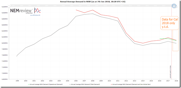
I’ve other things to do this evening, so just have time to throw the following charts together, starting with NSW:
These trends highlight what the speaker from TransGrid had noted – that there has been an increase the past couple years, albeit not at the same rate as the decline over the preceding period (or the incline of a decade ago).
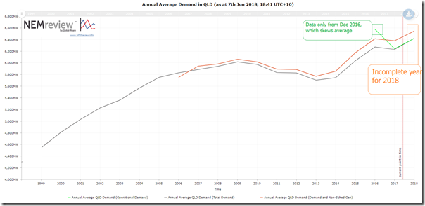
Moving north to Queensland, I was much more aware of how demand has grown in recent years, mainly on the back of up-stream compression of CSG for the LNG export trains:
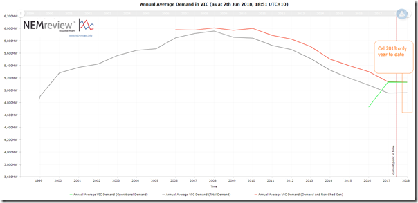
Further south, we note that Victorian demand appears to still be declining (unlike growth in NSW and QLD):
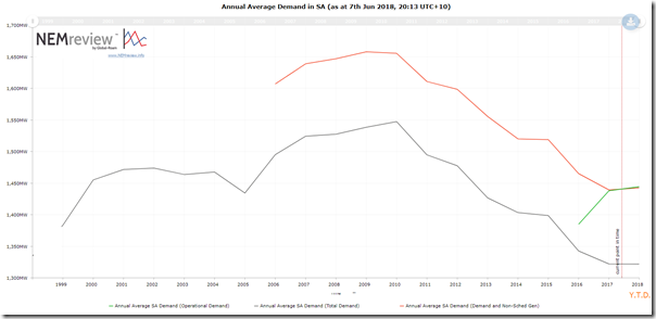
This also appears to be the case in South Australia (noting also a bigger relative difference between the different measures of demand):
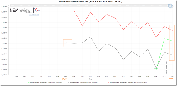
Down in Tasmania, there seems to be a more variable pattern (even taking into account the depressed demand experienced due to the prolonged Bassslink outage through 2016 and hence unwanted demand response):
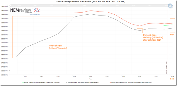
Summing it all together, we see a picture that (NEM-wide, on an annual average basis) electricity demand stopped declining after calendar 2014, even taking into account the continuing rise of rooftop solar PV production which acts to reduce these measures of demand:
Worth noting!


As prices rose to pay for decentralised renewables and their delivery the low hanging fruit of consumer demand was plucked with energy saving appliances, lighting, judicious RC aircon use, etc and now the hard yards of increased population and concomitant inelastic demand begins in earnest. With our thermal generators wearing out due to freeriding renewables we not only have to pay for more wind farms and solar panels but the elephant in the room- storage. We live in interesting times now.
When doing this sort of thing it is valuable to normalise at least for customer number. Having done so we see steep declines throughout the NEM except in Qld, where CSG compression has swapped demand contraction.
Thanks Bruce
Normalising (e.g. by customer number) would provide useful additional details. That would be food for another post at some time.
The numbers in aggregate (as in this article) provide a useful measure in their own right – such as, in my case, helping to identify that in aggregate average demand per region had stopped declining in NSW.
This will have implications for the future in a number of respects.
Paul
Paul
When you do the sums on a financial year basis, the growth in demand in NSW has increased by only 100 MW over the past four years supporting the view that Bruce M makes
The only real growth that has occurred is the addition of the CSG compression in Qld
Thanks David
I did try to make it clear in the article that the growth rate in NSW was very modest. Sorry if that was not as clear as I meant it to be.
What my main point of surprise was, and is the thrust of the article, was that the decline in demand had stopped in NSW.
As you know, I have a particular focus on QLD and have noted many times on Wattclarity about the impact of CSG compression. My assumption had been that the decline was continuing in VIC and SA (true still), along with NSW (not true for the past 4 years, which is embarrassing for me).
Paul
Might be interesting to put these numbers against economic activity in the respective states and also compare total energy consumption by state. Given the recent national statistics, there may well be a simple explanation – that we should all be happy about. People forget that at a high level, domestic energy consumption is only about 35% of total energy but causes over 50% of maximum demand. The NEM was well protected during the last economic cycle by a large over supply of generation. Retirements in the last 5 years have removed that. This next cycle might be more interesting on days when the wind isn’t blowing. First sign will be forward pricing on industrial bilaterals. Might be interesting to watch from a distance in WA !
the only measure from an electrical system point of view is the “native demand” which is the underlying demand and energy consumption or the total of the demand and energy consumed by customers. In this case, for the NEM connected customers. It must by definition be a sum of the NEM generation plus embedded generation plus behind the meter generation. On this basis, the energy consumption of the NEM is increasing. To measure it in any other manner for system security and planning purposes is to ignore a large growing segment and an action that will lead quickly to reduced reliability and higher pricing.
I find this article really fascinating given all the talk and evidence of rooftop solar booming nationally. How is that we get so much generation from solar yet NEM demand increases. Where would we be without solar and other renewables…probably all living with constant blackouts, shortages etc. So much for the current government line…