We’ve rolled into 2015, and you now have only 8 days (counting today) to email your entry in to win a portable BBQ in Competition #4 (peak VIC demand this summer), one of 7 separated, but similar, competitions we’re running this summer to celebrate 15 years of service.
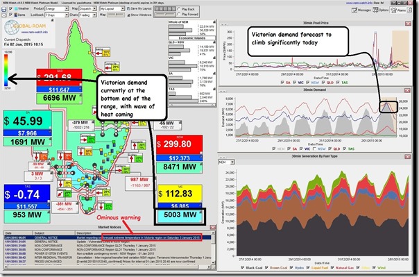
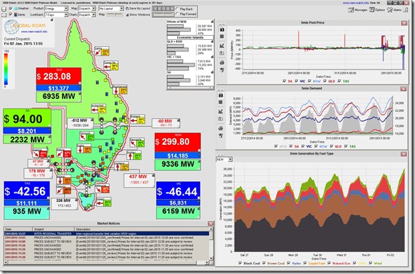
In the process of writing this analysis, we can’t avoid noticing the forecasts for extreme weather in Victoria today and tomorrow, with the state of the market this morning captured in the following NEM-Watch snapshot:
The following analysis could prove useful for those still contemplating their remaining 8 entries (remembering that you can enter once each day – in Competition #4 – till Friday 9th January with this one). This analysis will also prove useful in a more general context to some of our readers on WattClarity.
1) Specific prior peaks in Victoria
Victorians won’t easily forget the scorching heat that preceded the Black Saturday bushfires of early 2009, which also meant a new all-time record Victorian demand peak of 10,496MW was set on the same day as when a yet-to-be-broken all-time maximum was set for NEM-wide demand.
Last summer’s extreme demand event in Victoria was close to eclipsing that prior peak and will, likewise, be hard to forget for Victorians.
Given the current holiday season, it’s not expected that the current spell of hot weather will deliver anything like those prior demand peaks – what remains to be seen is what will occur in summer 2014-15, if VIC experiences extreme weather conditions at a time when business is back at work, and schools back at school.
2) Updating long-term trends
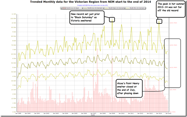
Powering up NEM-Review provides us the ability to update the insights already gleaned (above) from prior analysis. First we attached a trend of the key monthly stats for Victorian demand:
This chart puts the two peaks mentioned above in the context of all other monthly peaks experienced in the Victorian region. We can also see that (perhaps minus such extremes of heat) demand peaks in the intervening four summers (09-10, 10-11, 11-12 and 12-13) were significantly below those two points, with summer 2011-12 being particularly benign.
Also highlighted is the timing of the closure of Point Henry smelter, which will have an impact on all three demand measures moving forward (see these prior notes about Point Henry by one of our guest authors about how production volumes – hence electricity demand – had been declining for several years).
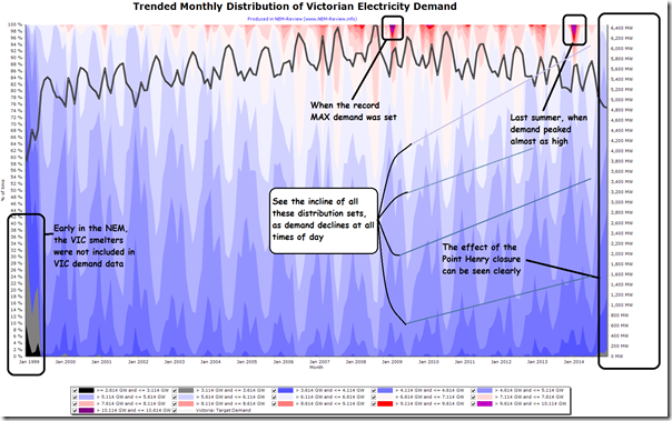
Delving further into historical demand data in NEM-Review we generate this trended distribution chart, to highlight other interesting developments:
The inclines of each of the distribution buckets shown seem to reinforce how it’s been for a variety of reasons* that demand has been declining across all hours of the day. This is seen in the declining average demand shown in both charts.
* Three years ago we published this combination of factors contributing to the decline in demand. Over time the influence of various factors has changed, but the fact remains that it’s for a combination of a range of different reasons that demand patterns are changing.
Somewhat (but not fully) independent from this overall pattern has been the (relatively rare) extremes in demand that occurred most significantly in summer 2008-09 and summer 2013-14.
In the trended distribution chart, for instance, it’s not as easy to draw approximate “lines of best fit” through the distributions at the top end of the demand scale (i.e. coloured a shade of red or – at the extreme – purple). What this means, in essence, is that the peak demand this summer will be more difficult to predict than what the average demand would be (part of our reason to focus on this in our competition #4).
3) So far this summer
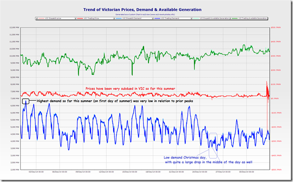
Producing a Custom Chart in ez2view for the first period of summer enables us to highlight what the highest demand has been, thus far this summer (this was actually a demand of only 6,878MW on the first day of summer (dispatch demand target, same as shown in NEM-Watch at the 15:45 dispatch interval on Monday 1st December 2014):
Updating today’s demand at 13:55 NEM time as the south-eastern mainland swelters, we see that it has not yet even reached 6,200MW – but is climbing rapidly (food for another post, perhaps, is the up-and-down pricing outcomes shown here):
Whatever the weather holds for January, February and March, we are very confident that Victoria will see considerably higher demand periods in the weeks to follow…
4) What the AEMO forecast for VIC this summer
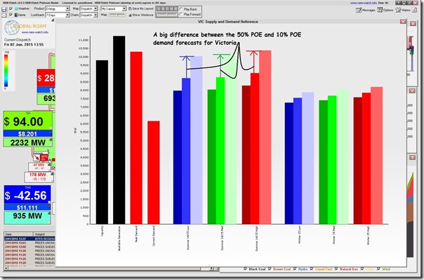
Using the method outlined here for context-setting with NEM-Watch, we can drill into AEMO’s peak demand forecasts for this summer as published in its Electricity Statement of Opportunities during 2014 (i.e. only a few months ago).
As can be understood with reference to the earlier charts of historical demand patterns above, AEMO has indicated a significant difference between the 50% POE (i.e normal weather) and the 10% POE (i.e. extreme weather) demand shape. Given current talk about this being a long, hot summer (with more bushfires like we’re seeing in Victoria today) it seems likely the actual peak demand will land at the upper end of this range.
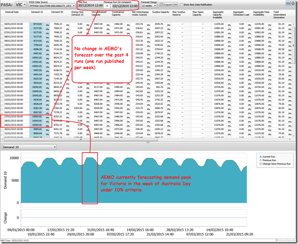
For those who really want to understand more, there is the added option of using ez2viewAustralia to compare and contrast AEMO’s MT PASA demand forecasts – which are updated once each week to focus on peak regional demand forecast. From the table shown below, I have selected the 10% POE demand forecast (i.e. what is currently expected to happen extreme temperature) and trended this.
Also note that there’s not been a change in these forecasts in the past 4 weeks. Now there’s some big hints!
5) An update on today
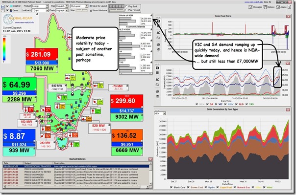
Finally, as this is being published I checked NEM-Watch again to see that the VIC region demand is now standing at 6,669MW (at 14:40) in the heat. Though it is increasing quickly, it is still almost 4,000MW below the all-time record:
After considering all of the above, you can now email your forecast for peak VIC demand this summer to have your chance to win win the “Ziegler & Brown Portable Grill” from Barbeques Galore.


Leave a comment