I wasn’t working yesterday – but could not help but notice the persistent stream of SMS alerts about volatility in the South Australian region on Friday 26th August 2022.
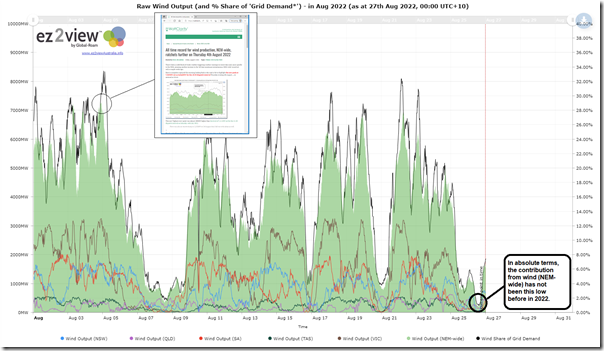
I had a quick look at the end of the day, and noted there how low wind and constrained imports were two of the big factors contributing to the outcomes through the day. The wind has picked up more today, but curiosity got the better of me today – prompting me to look at the contribution from wind NEM-wide yesterday:
For those with a licence to the ez2view software, you can open your own copy of this live updating trend dashboard here.
In a month that has already given us a new record for NEM-wide wind production (7,305MW on Thursday 4th August 2022), we see in the chart above another reminder of the inherent yin-and-yang of electricity production from wind (recorded here in September 2015).
Also highlighted on the chart above was what was quite a low point for NEM-wide wind production yesterday afternoon – being:
1) Just 204MW in aggregate from all wind farms across the NEM (aggregate InitialMW for the 14:15 dispatch interval … so metered at ~14:10);
2) Which represented just 0.98% of Grid Demand at that point in time.
In essence this makes it clear that (with respect to yesterday), if imports had not been constrained from VIC into SA yesterday, that:
1) The volatility might not have occurred;
2) But it certainly would not have been wind supplies elsewhere knocking off the more expensive supplies in South Australia.
(A) Lowest production level since 15th September 2021
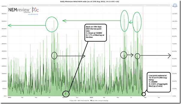
Curious what the low point meant in historical terms, I used the NEMreview v7 analytical tool (also available in ez2view) to have a look at daily minimum levels of production – shown in the following chart:
Also highlighted on this chart are some impressive high points for minimum contribution through calendar day … some spots representing a minimum capacity factor through the day above 50% on a NEM-wide basis!
However the focus of this particular article are the low points:
(A1) Measured in absolute terms
With any commodity in which the underlying supply source has been increasing over time, it’s obvious that it will be easy to find lower points of instantaneous aggregate contribution by looking back far enough.
Turns out in this case we need to look back to Wednesday 15th September 2021 when the aggregate contribution from wind farms hit a low point of 163MW.
(A2) Measured relative to installed capacity
Where it gets more interesting is to look at the contribution measured on an instantaneous capacity factor basis (i.e. dividing by the installed capacity). On Friday the low point was 2.04% on instantaneous Capacity Factor basis (i.e. with aggregate MaxCap for wind farms across the NEM at 9,996MW).
1) As it happens, Wednesday 15th September 2021 was also the closest point historically where the number (1.7%) was lower than it was on Friday 26th August 2022.
2) Looking back further into the past I can see times when the instantaneous capacity factor was down around only 1%:
(a) such as 05:15 on 19th April 2020 with only 76MW and 1.01% of the installed capacity at the time.
(b) this is not shown here, but the prior low points are visible in earlier articles, like this one till May 2022.
(A3) Measured relative to grid demand
Given that the first chart above included a view of instantaneous contribution to grid demand for NEM-wide wind production some readers will wonder if we have also looked at this metric (the answer is no, not at this point).
(B) Causes of the low wind production on Friday 26th August 2022
Worth a quick think about the potential causes of low aggregate instantaneous production from wind … which broadly fall into two buckets:
Cause #1) Of course, there are the underlying low wind conditions … which, over longer timeframes, represent a ‘wind drought’;
Cause #2) There are several other factors that could have been contributing to the low wind harvest yesterday – which would seem to fall into three sub-categories, broadly speaking:
(a) There might have been plant technical problems at various sites;
(b) It might have been uneconomic to run:
i. such as with spot prices being below the ‘negative LGC price’ that an increasing number of wind farms are using to establish their bidding
ii. hence the plant might have been ‘dispatched down’
iii. however with the volatility in SA suggests that this was not a cause for that region at least.
(c) Thirdly, there might have also been network constraints that caused the plant to be ‘constrained down’.
Remembering Marcelle’s caution that estimating curtailment is not as simple as it might appear, I thought I might have a quick look using the Time-Travel feature in ez2view as follows:
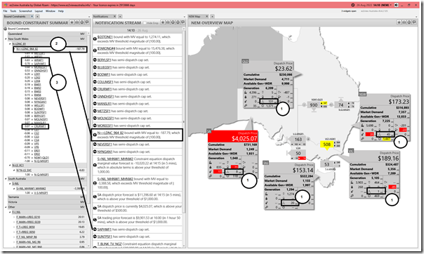
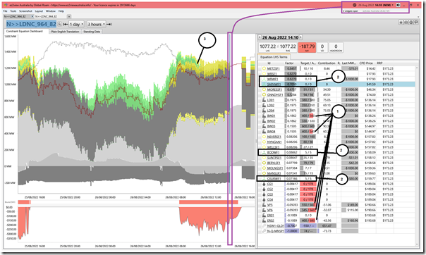
I’ve time-travelled here to 14:10 on Friday 26th August in order to show the rest of the market conditions relevant to that dispatch interval.
With respect to this image, note the following:
(B1) Windier in Queensland
As highlighted on the ‘NEM Map’ widget, there was almost no contribution from wind in SA, VIC and TAS … and also quite low in NSW as well.
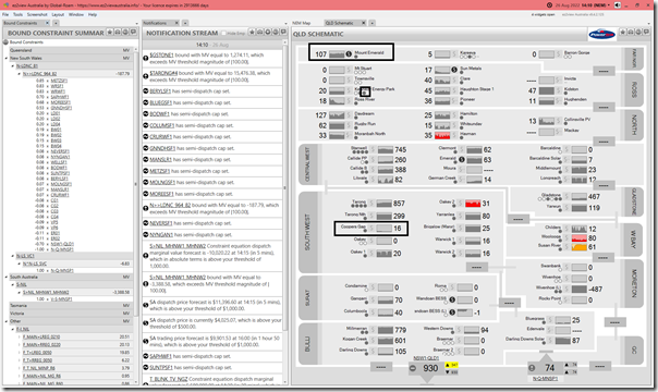
But the contribution in the QLD region (131MW) was reasonably health. Drilling into the QLD region via the hyperlink there, we see that the vast majority of this contribution was from the Mt Emerald Wind Farm in far north Queensland – whereas Coopers Gap in the south-west area was also becalmed.
This is an illustration of how diversity of wind farm locations has helped to ensure that the aggregate production of wind was not so much lower than the low point seen across the NEM at this time (but remember that diversity is not a magic wand – as we showed in Appendix 27 within GenInsights21).
(B2) Positive prices everywhere
Whilst the dispatch price in South Australia ($4,025.07/MWh) was in a league of its own on this day … and through much of the day … the positive prices in the other 4 regions suggest no real reason why these plant should be ‘dispatched down’ due to it being uneconomic to run. So let’s rule this one out.
(B3) Constrained down?
Also highlighted on the image above is that the ‘N>>LDNC_964_82’ constraint equation was bound.
1) This constraint equation relates to an outage on the Liddell to Newcastle (81) line and is a member of the ‘N-LDNC_81’ constraint set.
2) The outage was scheduled to extend out until 14th September 2022.
3) I’ve highlighted how there are four different wind farms (SAPHWF1, WRWF1, BODWF1 and CRURWF1) that are terms on the LHS of the constraint with a positive factor … hence potentially being ‘constrained down’ by the action of the constraint equation.
To view how this constraint operated through this period, here’s a drilled in version of the ‘Constraint Dashboard’ widget focused at the same point of time:
This image shows the version of the widget deployed with ez2view v9.4.2.125 … there’s a new version coming soon with v9.5
Following the annotations on the image:
1) It’s the coal units that have sacrificed volume at least in part due to the constraint;
2) None of the wind farms highlighted are shown to have spare capacity, according to NEMDE:
(a) Both SAPHWF1 and WRWF1 are shown to have targets of 0MW … due to zero wind availability;
(b) Both BODWF1 and CRURWF1 are shown to have single digit targets … again, the wind capability is low.
3) In the trended stacked chart, the contributions of each of the LHS terms (DUIDs and Interconnectors) is trended over the past 24 hours. We see earlier in the morning when the contribution from wind (i.e. coloured in 4 x shades of green) disappeared almost completely.
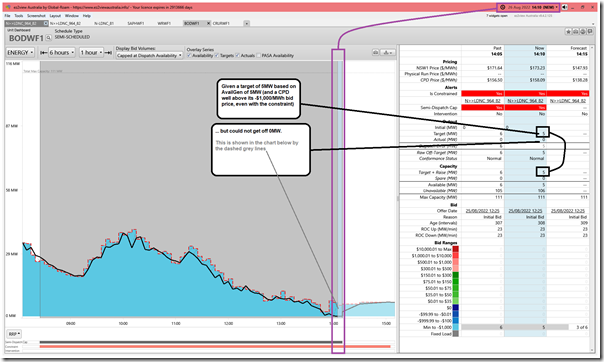
Not apparent in the above, but for those who are more curious I had a look at each of those 4 x wind farms and note that for BODWF1 the unit was given a small target (i.e. 5MW target of 5MW availability, as shown above) but could not manage any output in reality (i.e. FinalMW = 0MW). This we can see in the ‘Unit Dashboard’ widget below:
The CRURWF1 also slightly underperformed with respect to its own 5MW target.
Hence we conclude that:
1) Yesterday saw low wind conditions in SA as one of the main contributors to the run of high prices that drove the Cumulative Price in South Australia more than half way to the Cumulative Price Threshold;
2) South Australia was not the only location becalmed … NEM-wide the instantaneous contribution from wind dropped to a low of 204MW (metered at 14:10)
3) This was the lowest instantaneous contribution from wind in aggregate terms across the NEM for 11 months;
4) It was also the lowest contribution in instantaneous capacity factor terms (at 2.04%) since 15th September 2021;
5) This low aggregate contribution was mainly due to low wind conditions spread across all but one (i.e. MEWF1) or two (i.e. KEPWF1) of the wind farms in the NEM … constraints and economics appear to have played zero role;
6) without the 107MW contribution from one wind farm (MEWF1 in far north QLD), the aggregate contribution would have been very poor indeed (i.e. only 97MW)!
That’s all for now…
——————-
PS discussion elsewhere (added Monday 29th Aug)
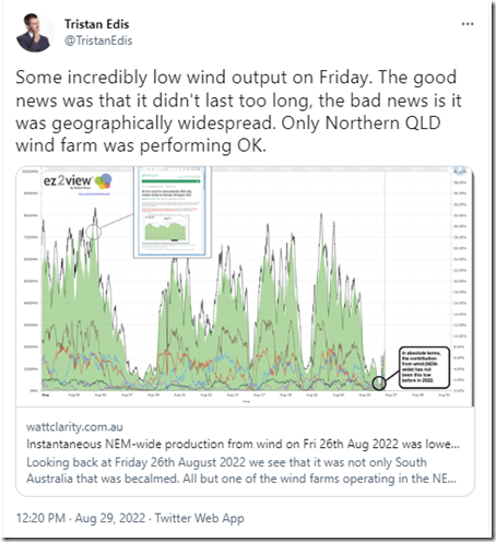
There’s a number of comments collecting below … in addition to these, readers might note Tristan Edis has kicked off this discussion here on Twitter:
A conversation might also continue here in LinkedIn.


What is the definition of a wind “drought” ie how many days constitute a wind drought?
Not sure if there’s a (widely accepted) ‘official’ definition … but would think it would need to be over a longer period than what happened on Friday 26th August.
Something like what happened in June 2017, for instance:
https://wattclarity.com.au/articles/2017/06/wheres-the-wind-gone-nem-wide-wind-farm-operation-lowest-in-5-years-maybe-ever-on-like-for-like-basis/
It is rare for all regions outside of FNQ to have very low wind conditions, but it does happen. It really does highlight the poor progress with wind development in QLD compared to other regions. While additional capacity in SE QLD wouldn’t have helped this time, certainly more in FNQ, NQ and to a lesser extent central QLD would have helped.
Paul,
surely you must know why the output was so low on that day, surely!
Having keep all the data now for more than seven years, I saw pretty early on why these low power times happen, due to those large High Pressure weather systems hovering over Southern Australia.
Here’s my own article for that day, posted the morning after it happened. (https://papundits.wordpress.com/2022/08/27/australian-daily-wind-power-generation-data-friday-26-august-2022/)
Here you have almost two thirds of total wind Capacity in the one area, South East South Australia, and Central Western Victoria, and every time those Large High Pressure weather systems come across, the bottom falls out of wind generation as they hover over that area. You only need note the synoptic chart, which I might add is always shown at the Aneroid site, so you can quite easily see it as it happens, and even as they approach,, you can tell when it’s going to be low.
And umm, it’s not just an isolated thing.
TWO YEARS ago now, I researched the matter, for the earlier time frame of 800 days, so a little less than three years, and in those 800 days, there were 270 times when wind generation failed. All of that information is shown at the following link. (https://papundits.wordpress.com/2020/11/30/wind-power-generation-intermittency-its-worse-than-you-think-it-is-introduction/)
Maybe this looks like I’m linking to my own Posts to drum up readers. Nothing could be further from the truth as this is from two years back now.
Perhaps this may be of some assistance to you.
Anton Lang.
Paul Miskelly published a paper in the scientific literature in 2012 describing the prolonged periods of very low wind that occur across the whole NEM when high pressure systems linger. It was hoped that a wider spread of windmills would even out the supply but Morgan found the same thing some years later and Mike O’Ceirin looked at a decade of date up to 2021 and found the same thing.
Complete failure of due diligence on the wind supply.
Disaster looms.
https://spectator.com.au/2022/07/energy-policy-where-parallel-universes-are-set-to-collide/
Have a look at Britain and Germany.
We need more Battery’s or bigger Battery’s.