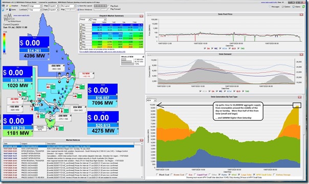
Worth a quick note that the NEM exceeded* 10GW in aggregate supply from renewable generation today.
* Using the APVI’s estimates for rooftop PV output (discussed below at **) we see the peak in aggregate supply being just above 10,275MW at 11:40 on the day.
Here’s a snapshot from our NEMwatch v10 foyer-and-Executive-Office dashboard at the 11:00 dispatch interval showing the aggregate supply from Hydro, Wind and Solar (Large and Small) climbing up close to 10,000MW prior to the middle of the day:
1) Aggregate production from wind ramped up in the evening of Friday 17th July and has been fairly consistent since that time. A quick scan sees it not quite reaching 4,000MW through the day thus far
2) In aggregate, solar production is roughly 5,500MW – split roughly 60% rooftop PV** and 40% Large Solar in the middle of the day, though we’d expect the rooftop PV contribution to decline more quickly in the afternoon due to the fixed inclination and lack of tracking.
** For several reasons, we built NEMwatch (and the RenewEconomy-sponsored NEMwatch Widget) to use the forecast production from rooftop PV developed by the APVI.
(a) I’ve previously written about some differences between this forecast and the forecast developed by the AEMO, which arrived on the scene later and are of 30-minute cadence.
(b) Since that article, the APVI have upgraded the data feed they supply us, but there are still differences in the numbers between APVI and AEMO that are especially noticeable on days like today.
(c) Using the AEMO estimates instead of the APVI estimates would imply total supply from renewables in excess of 11,000MW.
(d) Once again – which estimate for rooftop PV production is closer to the ‘actual’ level?
3) There’s a comparatively small contribution from hydro that has ramped down this morning as the solar has ramped up. Why would you run, with prices like this!
Understandably, given the lower Underlying Demand* levels on a Sunday we see that levels of Scheduled Demand*** have plunged below 18,000MW, hence the blue colours of each region (quite low in QLD given the rampant injection of rooftop PV behind the meter dragging Scheduled Demand down further on a sunny winters day)
*** for the gory details of all the different ways in which demand is measured, remember this explanation.
No wonder that dispatch prices have fallen to zero in all regions in the 11:00 dispatch interval (one of a number of dispatch intervals like this on the day).
… and also something an increasing number of people are wondering whether is the ‘new normal’.


Leave a comment