An ‘Accelerated Accidental Experiment’ was thrust on the South Australian region of the NEM, and all involved in that, as a result of the damaged transmission network in western Victoria that occurred on the afternoon of Friday 31st January 2020.
In my article on Sunday 2nd February, I deliberately used that term to highlight the opportunity this represents for us to collectively learn more about the challenges that we’re going to face in future as the energy transition continues to roll through the Australian energy sector, and similarly around the world. In this vein, I’ve tried to sneak a bit of time over the past week or so to peel a few more layers of the onion to see what I could see…
(A) Key dates in the timeline
My sense is that there are several key dates (and date ranges) – and also that it’s best to be clear about which data range one is referring to in discussing what’s gone on…
| Date, or Date Range | Brief Description |
| Prelude to the islanding
Thursday 30th and Friday 31st January |
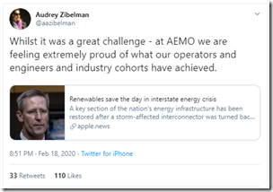
Leading into the transmission line outage, we had seen extremes in temperature drive NEM-wide demand to levels not seen since as far back as 2009. On Thursday 30th January, we had seen NEM-wide scheduled demand reach 34,257MW and LOR2 notices issued for both VIC and SA. Thursday’s events were further explored here by guest author, Allan O’Neil. That evening, looking forward into Friday 31st January, I noted that the NEM-wide scheduled demand was forecast to climb further to 34,627MW. Come Friday morning the expectation was higher still at 34,940MW – and it ended up reaching 35,169MW at 17:00 that day. Even apart from the islanding (next row), it would have been a momentous day! The one-in-ten-year demand level achieved by virtue of the simultaneous extremes in temperature across VIC and NSW (a relatively rare event) was only the start of the story, with the articles linked above exploring just some of the other factors. Understandably, later that Friday evening many expressed relief about some major challenges that had been navigated through the day, and also through Thursday as well – including Audrey Zibelman here: |
| Trigger
13:24:30 (NEM time) on Friday 31st January |
The AEMO noted (Market Notice 73172) that the SA region separated from the VIC region at 13:24. In the immediate aftermath of any event like this, there would always be some incredibly nervous moments with the frequency bouncing around and automated responses tried to bring this back under control: 2) Allan’s quick-but-thorough initial review revealed a number of actions that, in combination, helped to keep the system from cascading towards another ‘System Black’ event: 3) And (thanks to some data quickly provided by Solar Analytics) we were able to establish that some rooftop solar systems tripped in South Australia, which would have had a beneficial effect. Some also tripped in Victoria, which would not have been so good. 4) Not explicitly noted in these articles was the outcome that, whilst there were (necessary) reductions in output at scheduled plant in South Australia, these plant did not trip – which was also a good thing, as their ongoing operations would have been required to continue assisting the South Australian island in various aspects of system security. There is much more that could be explored in relation to the immediate preconditions, and response immediately after the event – however we’re limited in what we can do in this space by a number of factors (including lack of access to high-speed data). Hence we will have to wait for the AEMO, and possibly other bodies, to release their more considered analysis when the dust has settled…. |
| First Interim Period 31st Jan 2019 to 17th Feb 2020 (approx 17 days)representing the ‘accelerated accidental experiment’. |
… Once the frequency had stabilised around 50Hz again, different concerns and questions come to the fore (and hence there are additional lessons to be learnt from ‘stead state’ operations without reliance on support from VIC). It’s this intervening 17-day period, in particular, as I see as particularly useful for us to explore as the ‘accelerated accidental experiment’ as I had noted here. This period contained of what it might really tell us of the challenges that are in store for the future. For instance, on Monday 17th February (as this period was drawing to a close) guest author Allan O’Neil took a first step in exploring what happened subsequently with FCAS prices in the islanded SA grid (coincident with Jonathon Dyson’s exploration of FCAS matters through CAL 2019 from the Generator Statistical Digest 2019). This interim period came to an end with the reconnection in the afternoon of Monday 17th February (next row in the table), which was a few days later than was initially envisaged, but still a great effort. Once there were many people who (quite understandably) expressed relief, and also a feeling of pride at what had been achieved when adversity had been thrust on them – including Audrey Zibelman once again: There were quite a number of comments I heard first hand, or saw in various places, along the lines of ‘we’ve dodged a bullet’ as the period drew to a close. However before we are tempted to ‘close that chapter and move on’, I would reiterate that: |
| Temporary fix
16:05 (NEM time) on Monday 17th February |
The AEMO noted (Market Notice 74208) that the VIC and SA regions were re-synchronised at 16:05 on Monday 17th February 2020. It’s not specifically the topic of this article, but I would expect that there are additional lessons learnt in the resynchronisation process that can be shared more broadly.
|
| Second Interim period (something like 6-8 months?)
SA now interconnected (but still with a temporary link) |
It’s important that we all keep in mind that the “fix” we have now is a temporary one erected using special purpose equipment designed for quick deployment in cases just like this, but which is not intended as the permanent transmission line. Rather it will buy time for the (months-long) process of establishing a permanent replacement. Here’s some discussion and pictures of these structures in The Standard on 2nd February, and some images from Geelong Advertiser. My understanding is that: In layperson’s terms, whilst we’re certainly in better shape than we were over the prior 17 days, we’re not completely out of the woods yet. Prophetic words, perhaps*, that I had written prior to this follow-on islanding on Monday 2nd March – two weeks after the ‘temporary fix’ was put into service…. * noting the cause is not yet confirmed. About this temporary transmission fix: Worth noting also in relation to this temporary fix is that I’ve seen (on social media) a number of comments from energy-sector stakeholders who have made comments along the lines of: “they got these lines back into service in 17 days, why can’t they quickly fix the problems of constrained solar output out in West Murray and around the ‘rhombus of regret’?” … with some also layering on their own conspiracy theories for good measure. There are some key differences here that those stakeholders should be aware of, including that: In the months ahead, it might be that we have more to write about events that transpire over this period (if storms roll in again). |
|
Permanent fix … at some date currently unknown |
I am guessing that the permanent replacement of the damaged towers might take 6 months or more – I am certainly hoping (as are others, no doubt) that it is all done before the heat and stress of the next summer rolls around again… |
So, now that we have the above context out of the way, let’s move on to exploring the 17-day islanded period (no, no Tom Hanks) where there are lessons which could have implications for a NEM with a higher percentage penetration of non-synchronous generation than is currently the case.
(B) Headline stats, through the Islanded 17 Days
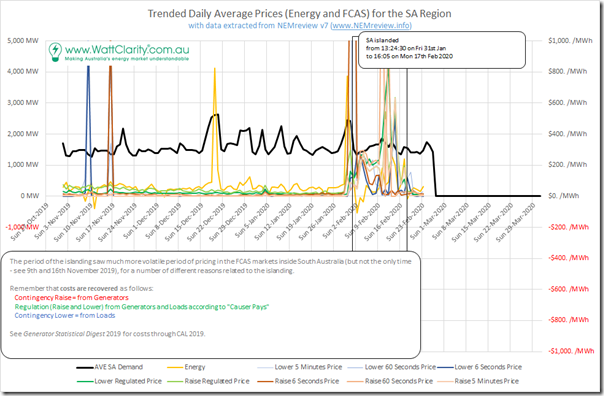
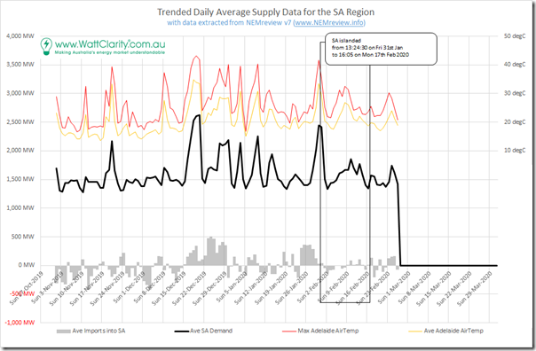
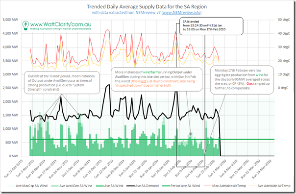
Let’s start by framing the 17-day islanded period in the context of what happened in the South Australian region over the summer period (up until a few days ago) in this chart using data extracted from NEMreview v7:
In this trend (and most that follow) I have used daily average levels for the metrics charted – which have the advantage of making broader themes more clearly discernible.
However readers need to keep in mind that aggregating like this will also mask certain characteristics occurring at the level of discrete dispatch intervals that might also be important). There’s not space for dispatch interval analysis on this occasion.
With respect to this initial trend:
Observation #1) It all starts with Demand
As we noted at the commencement of the GRC2018, the only purpose for which the electricity market exists is that the downstream energy consumers extract some useful purpose from the electricity delivered to them (no matter what colour the fuel source is). In other words, electrons are only a means to an end for any energy user. So once again we commence our analysis with a view of what the overall level of demand was for energy in the South Australian grid.
Observation #2) … and we need to measure Demand properly!
But even getting to that starting point is not as easy as it might initially seem …
To get to the starting point, we need to remember some of the gory details about how demand is actually measured. With this in mind, we constructed our own time series of what a layperson’s might think of as “Demand (i.e. rate of aggregate consumption) supplied from ALL sources of electricity”, on a daily average basis across the period. Hence, it includes net imports from VIC (subtracting any exports) and also supply from different types of generators:
2a) Scheduled generators in SA
2b) Semi-scheduled generators in SA
2c) Non-scheduled generators in SA for which AEMO publishes data; and
2d) Gross Rooftop solar PV production, using AEMO’s estimates in this case.
… but it’s important to note that there is a non-trivial amount of other non-scheduled generation supply in any region (including South Australia) that is unable to be included in this number because it is not “seen” by AEMO or anyone else, in an aggregate sense. This would include, for instance:
(i) some scattered back-up and embedded gensets inside industrial and commercial processes across the state (which may well have been operating different patterns than prior weeks, given the differences in prices and the heightened risk to security of supply); and
(ii) larger embedded solar rooftop arrays that have not been identified via the STC creation mechanism, hence would be invisible in the AEMO’s estimate created by ‘sample and extrapolation’ logic that relies on aggregate STC volumes as the scaling factor.
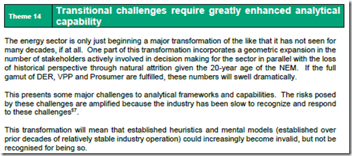
>> >> This is just one more reminder that ‘the transitional challenges require greatly enhanced analytical capability’ as we noted in Theme 14 within Part 2 of the 180-page analytical component in the Generator Report Card 2018 (a challenge which is only becoming more significant):
At least by ensuring we take account of the demand supplied by rooftop PV (to the extent that it is picked up in the AEMO forecasts of rooftop PV) we get closer to a correct view of ‘rate of native consumption’.
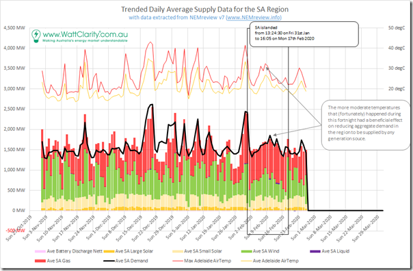
Observation #3) Weather (and hence demand) was relatively moderate over the islanding period… fortunately!
During the 17 full days that mostly reflect the period of the islanding (i.e. 1st February to 17th February) we see that the average level of demand was 1,566MW with days ranging from a low of 1,331MW (Sunday 2nd Feb) to a high of 1,859MW (Monday 10th February).
This compares to the equivalent stats over the entire date range shown of:
3a) An average demand level over the entire range of dates shown only 40MW higher (at 1,606MW),
3b) A minimum level of demand (1,278MW on Sunday 10th November) only 53MW, but
3c) A peak level of daily average demand (2,624MW on Friday 20th December) 765MW higher, a massive jump (in relative terms).
To those who understand the inherently ‘peaky’ nature of the demand shape in the South Australian region (driven by extremes in temperature, and also the relatively small percentage share of commercial and industrial energy use) this variability should not really be a surprise.
What’s much more important would be to ascertained what would have happened had South Australia experienced a heat wave coincident with the islanding (we can clearly see several periods of much higher demand earlier that summer) – remembering the inherent challenges of doing this. To not do this would seem to have been a massive opportunity wasted to understand what actually needs to happen in order to ensure that this transition succeeds.
My sense is that this is probably the most significant factor that helped the South Australian region deal with the challenges presented during the islanding period.
Observation #4) Price outcomes were very unusual (for energy and FCAS)
In the chart above, we can see how daily average prices for energy and for each FCAS commodity were anything but ‘normal’ during the period of the islanding. These abnormal outcomes will certainly have influenced behaviours that occurred at different points during the 17 days (we know of specific examples, for instance, but are unable to share them here).
On 17th February, Allan O’Neil wrote his very timely reminder ‘Don’t forget about FCAS!’ highlighting some aspects of what was
Also worth flagging is the interactions that have occurred out of Jonathon Dyson’s coincident reminder ‘FCAS Matters – More than ever’ (including over here on LinkedIn).
Observation #5) But that’s not the only time FCAS prices have spiked!
However, also highlighted on the chart above are other occasions where FCAS prices spiked – clearly seen on this chart were two other days (Saturday 9th and Saturday 16th November) when some FCAS prices were very high. Worth pondering on the coincidence that these were both Saturday periods with low demand levels (readers can perform their own investigations to understand the extent to which these low demand levels were a factor).
Main point is that readers should not be lulled into thinking that FCAS prices are inconsequential at every other time. They are mattering, more than ever!
Over the same time range, here’s a supply stack showing relative contributions from each of the different fuel types combining to supply the electricity demanded by South Australian electricity consumers:
For the avoidance of doubt:
1) days with net imports can be seen where the coloured bars stack below the black ‘demand’ line, and
2) days with net exports can be seen where the coloured bars poke above the black ‘demand’ line.
… though note that this should not be taken to imply that it’s the electricity produced from gas-fired generation that was exported!
With respect to this chart, there are a few more observations that can be made.
Observation #6) There’s a mix of colours
It should not need stating, as it is clearly evident in the chart above – there were a mix of colours involved in supplying electricity to meet demand through each-and-every day throughout summer. This was especially the case through the period of the islanding (because imports and exports largely could not function through the period, apart from smaller transfers across Murraylink).
Unfortunately, when we move from the pretty coloured chart above out into the real world (especially one layered with the context of the Emotion-o-meter) we unfortunately find that what’s so obvious in the above seems to be much more difficult to grasp in the mind. There even seems to be willful obfuscation going on, with claims (and counter-claims) that “[MY FAVOURITE COLOUR] saved the day!” – almost like it’s some kind of magic wand – which, for me, are becoming a little tiring.
Observation #7) There’s a shift in the mix of colours during the period of the islanding.
We’ll dig into some specifics further below, but there clearly was a shift in the mix of colours specifically through the islanding period, which seem to be able to be summed up by two points:
7a) There’s greater consistency, less extremes in variability, in the “total renewables” production across that 17 day period than can be observed through the entire range shown above.
7b) There’s a larger and more consistent red colour through that period – as gas-fired generation was relied upon to provide system security services through the period in the absence of the ability to leverage what was available in Victoria.
One of the points of confusion I have seen has evolved out of the apparent contradiction – how can there still be imports and exports and yet South Australia be islanded?
In the chart above, we have calculated imports and exports using the ‘Metered Flow’ values for both Heywood and Murraylink to ensure that what’s counted for imports and exports are what’s actually flowed in and out of South Australia (and, by extension, that the demand measure we use represents consumption within South Australia itself. These same numbers are shown below in grey bars:
This chart should help to clarify some observations:
Observation #8) Imports and Exports reduced significantly, but did not stop
Whilst the complete flow path from Adelaide into Melbourne was cut, it was still possible for electricity to be transferred into western Victoria (i.e. around Portland) and in the other direction. Whilst Origin’s Mortlake gas-fired plant was operating to deliver the lion’s share of the power requirement in that local part of the grid, small transfers did occur across the VIC to SA border.
In addition, the Murraylink DC link was still operational, and also used to transfer small amounts of energy in either direction.
In aggregate, we see that average daily transfers were lower than through many other days over summer.
Observation #9) The larger flow path, and the frequency/reserve sharing link, was cut
Because of the physical line break in western Victoria with South Australia, there was no way of tying the frequencies together and, as such, South Australia formed its own ‘frequency island’.
Readers will understand that Tasmania operates as its own frequency island all the time, with the only link to the mainland being a DC link. Basslink can do more than Murraylink can (especially important in this experience) in that it can synthetically transfer FCAS across the link – whereas Murraylink can’t. Hence FCAS services had to be sourced locally in South Australia, and the prices diverged.
In broader terms, with the ‘Heywood interconnector’ represents the main flow path from the VIC Regional Reference Node to the SA Regional Reference Node. This was cut, so (when Murraylink was also constrained) any pricing dynamics at the VIC RRN could not flow through to the SA RRN – hence Energy prices separated. This happened frequently through the period.
With these basics behind us, we can move on to look at some interesting developments on a fuel type basis.
(C) Fuel Type contributions, through the Islanded 17 Days
Readers should remember that Fuel Type is not the only dimension through which the supply mix in South Australia could be viewed through this period. It’s just the one I’ve chosen to focus on in this article today – and we might come back and look at other dimensions when time permits in future … (or someone else could offer to do it for us!)
(C1) What happened to Battery Production during those 17 days?
With articles with dramatic titles like ‘AEMO takes control of S.A. big batteries to help manage isolated grid’ on 4th February 2020, I wonder how many energy sector observers out there developed mental images of an army of AEMO engineers with military uniforms and boots marching into the site of each of the batteries in South Australia to forcibly seize control?
Reality was a bit more boring – and more normal – than that!
——————————
All that happened was that AEMO followed standard procedures that enable them to do both of the following:
Procedure #1) Invoke constraints
In every single dispatch interval, the AEMO invokes* constraints that reflect (in the NEMDE mathematical model) the state of the physical network, and sometimes also commercial constraints like the Inter-Regional Settlements Residue fund balances.
* Note that ‘invokes’ being just the fancy NEM-lingo term for ‘uses’
Being a ‘long skinny’ transmission grid, there are always a significant number of constraint equations used.
Given the fact that the network was in more pieces during this Islanded Period, AEMO’s job became more difficult through this period – as a result of which more constraints were invoked (indeed, some constraint equations were written specifically for this particular situation). Most of these were invoked through the ‘SA_ESTN_ISLE’ Constraint Set, which:
(a) Was probably* invoked from 13:35 on 31st January 2020; and
(b) Lasted until 17:15 on Monday 17th February 2020 (and, incidentally, was invoked again on Monday 2nd March due to the follow-on islanding).
* note, with respect to the ‘probably’ that we cannot be 100% sure because of a slightly shortcoming in AEMO’s structure of the MMS Data Model, which overwrites some of the parameters of the scheduled invocation of constraint sets. In this case, AEMO modified the schedule on 17:09 on the 17th February and, whilst we might presume that this was just to change the end date (with the link coming back into service) the data record is insufficiently precise to know that this is the only thing that changed. One of the many things on our ‘things to do’ listing to improve via ez2view !
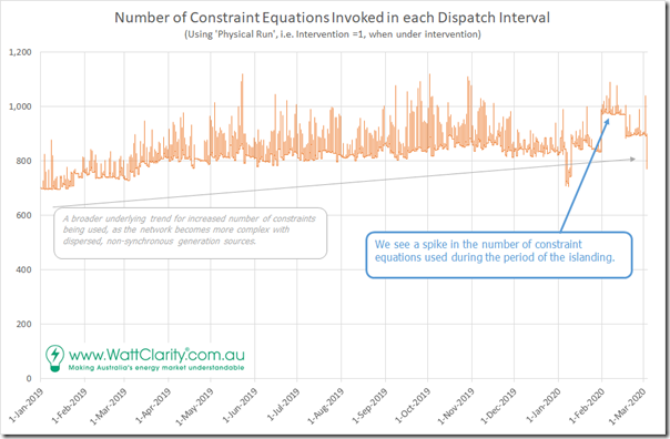
We can see the change in the following trend:
The chart here shows the total number of constraint equations invoked in each discrete dispatch interval over the period from 1st December 2019 through until the end of February (i.e. summer 2019-20). Note that (apart some core sets of ‘System Normal’ constraint equations) there are a varying set of outage-related, and other transient constraint sets used reflecting changes to the network over time.
Through the 15 month period we see an upward trend in the number of constraint equations invoked through the year – which, without investigating in detail, would seem to be related to the increasing complexity of the network with new non-synchronous generators connecting in more remote locations.
Specifically with respect to the separation event, we can see that there was a jump of more than 100 constraint equations invoked from 31st January – which subsided somewhat (but not fully) when the two parts of the NEM were reconnected on 17th February. Those not so familiar with the MMS and NEMDE should take note that it is visible and significant, but not paradigm-shifting changes made by AEMO that was used in this case.
Procedure #2) Issue directions to participants
Ordinarily, the market would deliver electricity with the required technical parameters in every dispatch interval (with the use of the constraint equations invoked above).
However sometimes that is not the case, which means that (unless AEMO took some action) the ‘security of supply’ is threatened (in real time) or looks likely to be threatened (looking forward some way into predispatch). In these cases, in which case AEMO has powers to direct participants to take certain actions – such as to make plant available:
A topical example here is how AEMO needed to direct Snowy Hydro to make capacity at Colongra available again on 1st February, because of the LOR2 condition that was created when Colongra was withdrawn from the market.
For instance, we explored (as an ‘Emerging Challenge’ in Theme 9 within Part 2 of the 180-page Analytical Component inside our Generator Report Card 2018 how the number of interventions in the market had jumped markedly from CAL 2016 to CAL 2017 and (particularly) to CAL 2018 – at least in part because of the declining level of inertia and system strength in the South Australia, and more recently Victorian regions.
When intervenes in the market by issuing directions, the dispatch process changes slightly. Importantly for participants operating in the market, two dispatch runs are completed (with different price outcomes in each). So its important to ensure that you’re looking at the correct data – each has its purpose.
In our ez2view software we are progressively rolling out greater visibility and clarity of what happens under interventions through a variety of widgets.
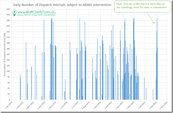
In the chart above we plot (for each day from 1st January 2019) the total number of dispatch intervals in which the AEMO was intervening in some way. Remember that there are 288 dispatch intervals in every day. From this we can see that interventions are not uncommon in the market – they occur for a number of different reasons.
We can see a few days at the start of the islanding period (i.e. 31st January to 4th February) where most dispatch intervals were in intervention. However looking back over the 15 month history, this period does not seem too unusual.
… so we conclude that a combination of constraints, and directions/interventions were used to manage the system during this first islanded period (and no jack boots!). Nothing really different than normal – just a few more particular network situations for the AEMO to manage (albeit stressful at some times).
——————————
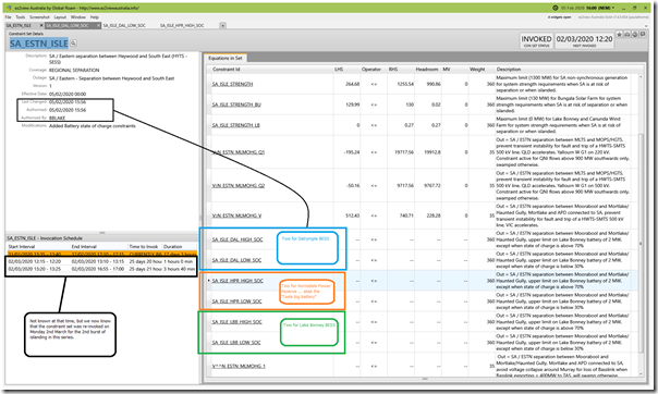
With particular respect to the batteries, the constraint set ‘SA_ESTN_ISLE’ was modified at 15:56 on Wednesday 5th February (i.e. a few days after the islanding started) to include a pairing of constraint equations each for the three batteries in South Australia – Hornsdale Power Reserve, Dalrymple BESS and Lake Bonney BESS. This can be seen in the ‘Constraint Set’ widget from ez2view, Time-Travelled back to 16:00 on Wednesday 5th February:
Without going into detail, these constraint equations basically said that the battery in question could not output to supply in the ENERGY market (or charge, if on the pumping side) unless their state of charge was ample to enable it to also provide a short bust of ‘adrenalin in the artery’ if the situation were to arise where the SA pulse grew wobbly.
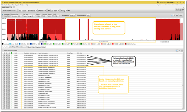
As a result of this approach, the Hornsdale Power Reserve stopped offering capacity into the ENERGY market at any price through much of the period 5th February through until 16th February. We see this in the ‘Bids & Offers’ widget from ez2view, Time-Travelled a little further forward, to 20:00 on Thursday 20th February:
… a layperson might interpret this simply as ‘well, you won’t let me operate so there is no point in offering capacity’.
In this image, we can also see that it’s possible the automated bidder in use by Telsa/Neoen was switched off from 3rd February and that bids and rebids were submitted manually, given the added level of complexity of management of operations. Nice to that they would also have been classified as ‘Well Formed’ in our automated classification used to parse the form of bids for our Generator Statistical Digest 2019 – in the ‘B’ Pages!
Note that this started on 5th February (i.e. 5 days after the islanding). The Rebid Reasons for HPRG1 provide a clue to what went on before that, with the Tesla/Neoen bidder – on the 4th February, we see a number of rebids reference ‘Direction to maintain State of Charge’ which is what AEMO probably did in the period prior to the SOC limitations working their way into the formal constraint equations.
(C2) What happened with the Wind Production during the islanded period?
I was not really surprised to see the perspective that ‘Wind and batteries saved the day when storm cut South Australia adrift’ on RenewEconomy on Friday 14th February, a few days before reconnection happened – but I was more surprised (as was Giles) to see a similar line run in the Australian by David Penberthy on 18th February under the heading ‘Renewables save the day in interstate energy crisis’.
David’s article in the Australian seems have struck a chord (certainly a ‘not normal’ headline for something in the Oz), and I have seen it mentioned in numerous places across social media.
So let’s move on to exploring what happened with wind production over this 17 day period:
It might help readers to understand that not all wind farms were the same, in terms of the way they responded through the period of the islanding – for several reasons, not just geography and network location.
(C2a) Basic geographical/network groupings
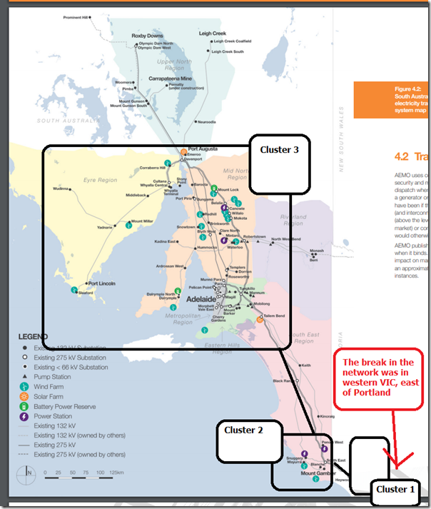
From the perspective of the 17 islanded days, there were essentially three clusters of wind farms affected – each in various ways.
I’ve grabbed the page above from the Electranet’s 2019 Annual Planning Report and (in rough terms) identified where, geographically, each of the clusters sit:
| Cluster of Wind Farms | Brief Description |
| Cluster #1
Western Victoria |
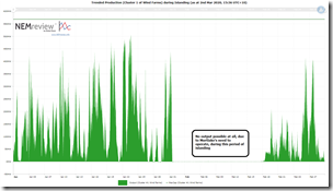
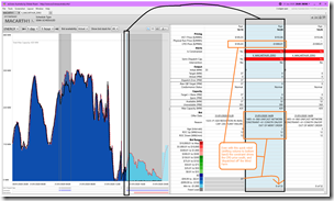
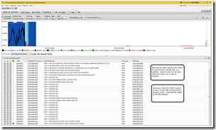
On the western side of the break in western VIC were both: 1) The Macarthur Wind Farm (Semi-Scheduled); and 2) Pacific Hydro’s Portland group of Wind Farms (Non-Scheduled) … along with the Mortlake gas-fired power station.This cluster (in the VIC region, not in SA) comprises 625MW of capacity (using Max Capacity) for wind farms that the AEMO has visibility of in the real time SCADA data set.Because the Mortlake power station had to run, to supply power to the Portland Aluminium smelter, there essentially was not room for the wind farms to operate.Using this trend query in NEMreview v7, we see trended output for this Orphaned Cluster of wind farms as follows: During this period, Macarthur (being Semi-Scheduled) was able to be controlled via constraint equations, so Constraint Set ‘V-MACARTHUR_ZERO’ was invoked at 14:20 on Friday 31st January as a result of the trip. This set had just one Constraint Equation as a member of it, which was ‘V_MACARTHUR_ZERO’ with a very simple structure, which was: Left Hand Side (LHS) ≤ Right Hand Side (RHS)… which is the typical form of most non-FCAS constraints, and more specifically… We see here in the ‘Unit Dashboard’ widget from ez2view that the Constraint Equation bound, driving the CPD Price down to –$1,000.01/MWh, which is a price that just could not be matched (with the Market Price Floor being –$1000/MWh). As a result, we see that AGL Energy took a similar approach to Tesla/Neoen (i.e. given they knew they would have no chance to run until the line was fixed) that they stopped offering volume into the NEM as seen in the ‘Bids & Offers’ widget from ez2view, Time-Travelled a little further forward, to 20:00 on Thursday 20th February: As Portland is a Non-Scheduled generator, it can’t be affected by Constraint Equations, but the AEMO has other methods (used less often) of controlling the output of this station. |
| Cluster #2
South-Eastern South Australia |
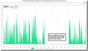
In the south-east corner of South Australia, we have 4 wind farms: 1) Lake Bonney 1 Wind Farm (Non-Scheduled) 2) Lake Bonney 2 Wind Farm (Semi-Scheduled) 3) Lake Bonney 3 Wind Farm (Semi-Scheduled); and 4) Canunda Wind Farm (Non-Scheduled)These cluster comprises 325MW of capacity (using Max Capacity) for wind farms that the AEMO has visibility of in the real time SCADA data set.Note here that Lake Bonney 1 and Canunda are Non-Scheduled wind farms so are not affected by constraint equations (AEMO can modify their operations, in rarer occasions, but it needs another mechanism).Using this second trend query in NEMreview v7, we see trended output for this SESA Cluster of wind farms as follows: In the case of Lake Bonney 2 and Lake Bonney 3, it was the Constraint Equation ‘SA_ISLE_STRENGTH_LB’ in Constraint Set ‘SA_ESTN_ISLE’ that was used, setting both to 0MW output. As for Portland WF, so for Lake Bonney 1 and Canunda WF. |
| Cluster #3
The Main part of South Australia |
Most of the wind farms connected into South Australia fall into the 3rd cluster, as shown on the map above.
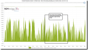
These cluster comprises 1,813MW of capacity (using Max Capacity) for wind farms that the AEMO has visibility of in the real time SCADA data set. Using this third trend query in NEMreview v7, we see trended output for this Main Cluster of wind farms as follows: The approach taken with this group was more complex, so will expand below… |
(C2b) Operating Cluster #3 of Wind Farms through the Islanded period
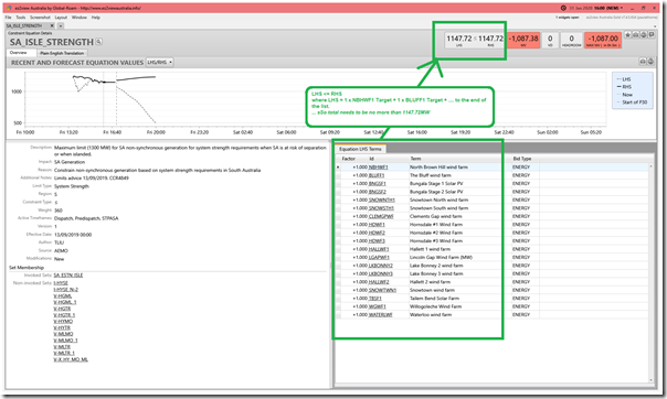
As noted above, the Constraint Set ‘SA_ESTN_ISLE’ was invoked for much of the islanded period. Amongst the other Constraint Equations as members of this set – some noted above – one of the main ones was the constraint equation ‘SA_ISLE_STRENGTH’
Here’s a view of the ‘Constraint Details’ widget in ez2view Time-Travelled back to 16:00 on the day of the islanding – we see that the constraint is bound (i.e. LHS=RHS and non-zero Marginal Value) as a result of which it is winding down the output of all of the DUIDs on the LHS …. subject to both:
1) The factors (which are all 1 in this case, hence equal effect, subject to …)
2) How each DUID was bid for this dispatch interval (i.e. those who bid ‘more expensive’ are wound down first).
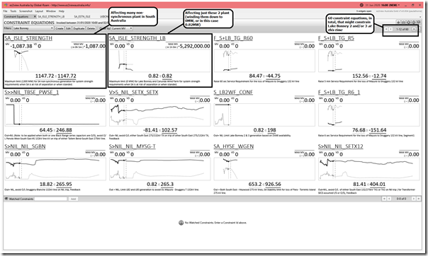
Note that Lake Bonney 2 and Lake Bonney 3 are also included in this Constraint Equation – however the impact of Constraint Equation ‘SA_ISLE_STRENGTH_LB’ was more significant on their output (i.e. not just constraining them down, but limiting them to 0MW) so overrode this more general constraint equation. An example of why it’s important to look at more than one constraint equation to what might be affecting your output.
The ‘Constraint Equations’ widget in ez2view makes this easy. Here are the 60 constraint equations that were invoked, and scheduled to be invoked (each of which could impact on Lake Bonney at the time)
At this particular point in time it’s only(!) 2 that are acting to constrain the output – but it’s important to note that the other 58 could also be important at different points in time, and that this list can change from one dispatch interval to the next…
There’s more we could dig into, just for wind, but we need to move on…
(C3) What happened with Solar Production during those 17 days?
For solar PV, there are essentially two bundles of contribution – one from the three Semi-Scheduled ‘Large’ Solar Farms operating in South Australia currently, and a second from the masses of rooftop solar PV systems scattered across the state. Let’s look at each separately.
(C3a) Large Solar Farms
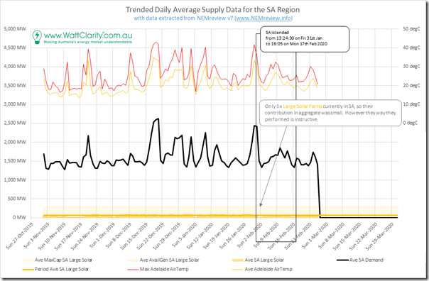
Here’s the equivalent summary trend for Large Solar in South Australia:
In absolute terms, the contribution of Large Solar in South Australia is quite small (it’s only 3 solar farms, with one not yet operating fully). However it is informative to have a quick closer look….
As noted above, the Constraint Set ‘SA_ESTN_ISLE’ was invoked for much of the islanded period:
1) Constraints on Tailem Bend Solar Farm
The ‘SA_ISLE_STRENGTH’ Constraint Equation discussed above also includes the Dispatch Target of Tailem Bend Solar Farm on the LHS. Hence this was affected in the same way as for all of the Semi-Scheduled Wind Farms in the 3rd cluster.
2) Constraints on Bungala 1 & 2 Solar Farm
Another constraint equation in this set is the ‘SA_ISLE_STRENGTH_BU’ which in the MMS describes the impact as ‘Maximum limit (130 MW) for Bungala Solar Farm for system strength requirements when SA is at risk of separation or when islanded.’ Hence (whilst the overall impact is small on the scale shown above) note that the output of these two solar farms was impacted during the islanding period.
(C3b) Small Solar Farms
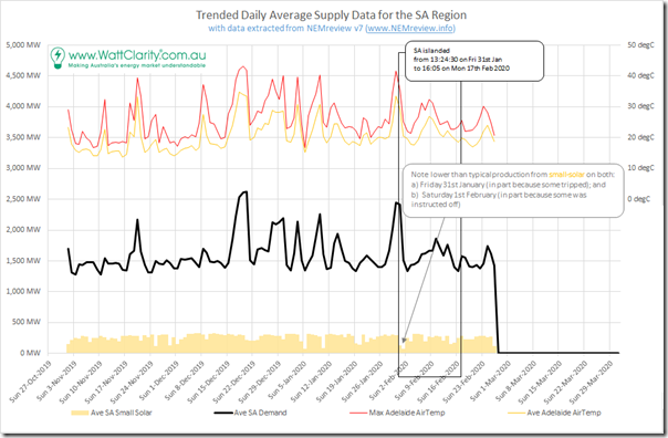
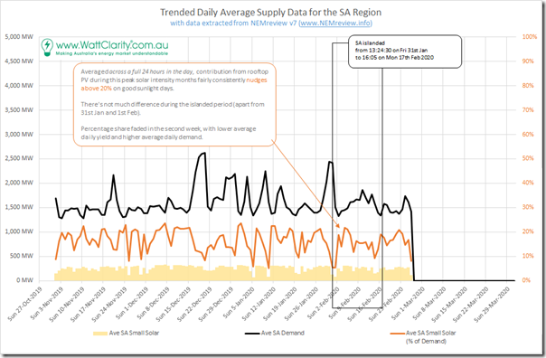
Separating out the contributions from rooftop PV during the period (remembering that we’re using the AEMO estimate this time, not the APVI one) we see the following trend:
In David Penberthy’s article in the Australian on 18th February there is a paragraph that does not seem to match what we see in our data when viewed in the chart above. He wrote:
“The state was producing so much consistent and reliable power from the sun this month that it fuelled itself chiefly through rooftop solar, even turning off its wind farms for fear that the surplus energy being produced would overload and crash the system.”
– so we tried to contact David (via several means) to ask him to clarify what he was meaning here. Unfortunately we have not, as yet, heard back.
In order to drill in further, I’ve modified the chart above to include rooftop solar supply as a percentage of daily demand level – so we can clearly see that the good days of solar production see solar nudging above 20% of the total consumption in South Australia on the day (some days as high as 24%, but also some considerably lower). Averaging over the 17 days of the islanding, this means only 15% on average – which takes into account low levels delivered on Saturday 1st February (at least in part because some rooftop solar systems were instructed offline to preserve system security).
However more fundamentally, I grappled with what David had meant when seeming to imply much more than 50% of aggregate consumption had been fuelled by rooftop solar PV (when this is clearly not the case in the numbers presented here). And whilst some of our readers might be shouting at their screens at how dumb I must be, just bear with me whilst I explore…
Question #1) Was this due to some different definition of demand?
As noted above, there are a number of different metrics used to represent ‘demand’ for different purposes – and in this analysis I have selected the one that (I believe) is truest to the analysis being delivered here. With this level of demand we see that the islanded period saw roughly only 15% of total demand supplied by rooftop solar PV.
I wondered initially how the number would look if I only used ‘Scheduled Demand’ for instance (which is a lower MW number because it only looks at what is being directly scheduled by AEMO in the market) – however even with this lower number on the denominator, the percentage only rises to 19% over the period – still considerably below the >50% implied.
Question #2) Was David (or his Source) looking at just discrete points in time?
I had already written the bit above about how daily aggregate/averages might ‘also mask certain characteristics occurring at the level of discrete dispatch intervals that might also be important’, but have to admit I did not immediately twig that David (or, more specifically, whoever his Source was) might have been looking selectively at only some time points to come to perspective that SA had “fuelled itself chiefly through rooftop solar” through the month (which I take to mean what had elapsed of February at the time he published the article – which also coincides with the islanded period).
Doh!
So the most obvious way that this selective sampling might have been done would have been to focus only on daylight hours, say. However, even if this was the case that this was what David was meaning in that sentence above, in his article he also stated:
But in a promising sign for renewables, it has emerged South Australia — which had been off the national grid for the past three weeks — was able to meet the bulk of its energy needs during that time through solar power, with the system augmented by the minimum requirement of gas.
… but that is just incorrect!
Noting that this sentence does not contain any clarification that the author is talking about only daylight hours, or certain days (perhaps David was not even told this by his Source?), what some readers might mistakenly infer from the wording of this article was both:
1) that electricity supply from gas was lower than normal through the period of the islanding; but also that
2) the contribution from gas was lower, in aggregate, than the contribution from rooftop solar.
South Australia did NOT meet “the bulk” of its energy needs from solar during the period of the islanding.
… nor did it meet “the bulk” of its energy needs from Solar + Wind (as can be seen above – mathematically it was approx 45% of the total consumption over the period). That is NOT to state that the contribution wasn’t very necessary! Just a little over-egged…
Somewhere along the line, the message has become garbled – whether that was in what David’s source told him, or in how David translated that message into words in the article. Whatever the case, it’s just plain wrong.
Unfortunately this is likely to have contributed to too many people walking away from this incident with a ‘(just) renewables saved the day’ belief, which is just not the case (much in all as we might wish for that to be the case):
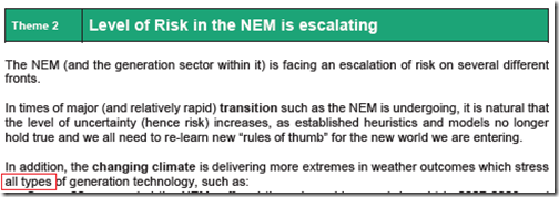
To me, this is just one more reminder (in a seemingly endless stream) that the current quality of our analysis and media reporting is running behind what we actually require to make this energy transition succeed. This is what we were thinking of in exploring Theme 14 within Part 2 of the 180-page analytical component in the Generator Report Card 2018:
One would hope that we’d be getting better at this, as a whole – but …
(C4) What happened to Gas-Fired Production during those 17 days?
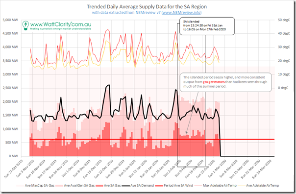
Here’s the equivalent chart for gas-fired production through the islanded period, which clearly shows a large contribution from gas:
For clarity this shows production from gas just in South Australia itself – so excludes the contribution made by Mortlake just over the border, now running heavily to supply to the Portland smelter.
In simple terms, the share of contribution to aggregate demand across South Australia through the days of the islanding was higher for gas than it was for rooftop solar. Similarly, the contribution from gas was notably higher and more consistent than in prior weeks.
With the ‘red team’ (like another parochial football team) not shy of its own set of boosters, I also noted a different group of people joining the party to claim that gas-fired generation ‘saved the day’. My sense is that these people falling into the same trap of also its grasping for their own magic wands, as it’s not like renewables did not also contribute to keeping the lights on!
Because the overall quality of our analysis and understanding is letting us down (and we’re generally not even understanding that), the level of risk we’re facing in this energy transition is increasing beyond where it should actually be:
Surely we can do better than this. We need to!
(C5) What happened to Liquid-Fuelled Production during those 17 days?
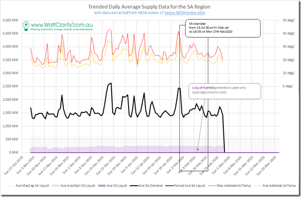
Finally, I’ve attached a trend of the production from the liquid-fuelled peakers available during the period of the islanding:
We can see here that they did barely run (which makes sense, as they are expensive!), though did contribute a few necessary spurts from time to time.
———————————
And that’s all I have time for on this occasion, folks!



Overall I think this is an excellent blog and provides some much needed balance on several issues.
However I was a little disappointed in the analysis of which energy source “saved the day”. In my view the coverage there is a little unhelpful as it merely seems to be a criticism of the various claims from “competing “teams”. But surely in analysis of an event like this it is important to determine which energy source you would like to have more of at your disposal. This for instance might allow energy planners to determine which source of energy might require more incentives than can be achieved by the current operation of the NEM.
As implied by this blog, you probably can’t determine what this energy source is by looking at the actual contributions. But it would be a useful “what if” analysis. For example at any given time, what energy source would have been called on if the load had been 10%/20% higher (or what generators might have been cut if the load had fallen by 10%/20%). It is probably that this answer would vary across the analysis, giving each of the various “camps” a win, but it is also likely that one energy source might be identified as the “preferred” across the majority of the period.
Thanks, Paul, for your excellent review of the SA islanding in February. As I understand, only a single 500 kV circuit has been restored west of Moorabool and as a consequence there are stricter export/import limits on the Heywood interconnector as pointed out by Allan O’Neill in his post yesterday. During the islanding there was a period when the normal dispatch outcomes for gas peakers appeared to be disrupted. Osborne was absent, possibly for maintenance. Barker Inlet and Ladbroke Grove also seemed be reduced in output, whereas diesel generators were contributing to greater extent than usual. Daytime energy spot prices of $300 were not uncommon in this period. This may have been a consequence of the greater FCAS requirements that were imposed in SA.
Whatever saved the day as The Advertiser reported-
“Electricity consumers will be charged a combined $93 million to cover the cost of stabilising SA’s power system while we were cut off from the national grid last month”
At last count SA had a population of 1.743 million but how that converts to the number of electricity meters and bill payers is not easy to find for some reason.
The SA Power Networks Distribution Annual Planning Report 2019/20 to 2023/24 on page 23 states the number of customers is around 900,000.