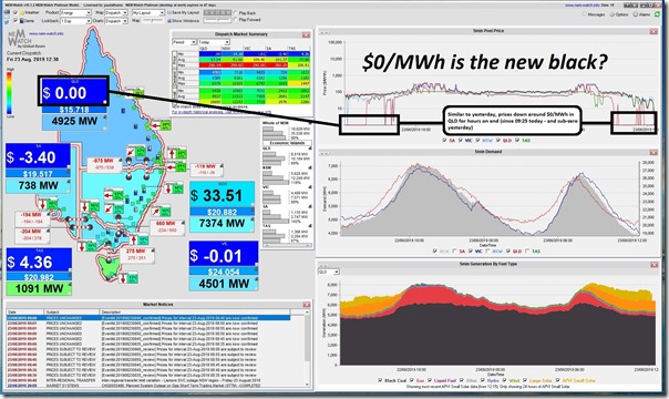
On Friday last week I posted this short comment here on LinkedIn about how we could start a new meme about “0/MWh being the new Black” when confronted with what seems to be an increasing number of instances where prices in the Queensland region have been at $0/MWh or below. On that occasion I included this snapshot from our NEMwatch v10 entry-level dashboard:
That tongue-in-cheek comment seemed to strike a chord with a number of people – including with Josef Tadich at Telsa who echoed the new tagline here.
There have been a number of other articles and comments I have noticed about this seemingly increased trend of zero and negative prices (hey, even the economists at the AEMC got into the act with this brief note). So I thought I might have more of a statistical look …
(A) Level of risk in the NEM is escalating
In our Generator Report Card 2018 we did place considerable emphasis on a number of different aspects of changing price patterns – with these emerging patterns being one manifestation of the changing nature of risk in the NEM. We discussed several of the underlying causes for this change in risk in Theme 2 within Part 2 of the 170-page analytical component.
We also previously pointed at some of this in our WattClarity article of 9th August following some media references:
We’re sad to see that one outcome of this increased risk being investor’s money disappear in smoke – but are realistic that this was an inevitable outcome where investors were lured to the NEM on the seemingly simplicity of “anytime/anywhere energy” that is quite removed from reality.
We noticed the recent decision made by developer/investor John Laing to suspend further investments into the NEM (as reported in PV magazine, and on RenewEconomy) and expect that it won’t be the last.
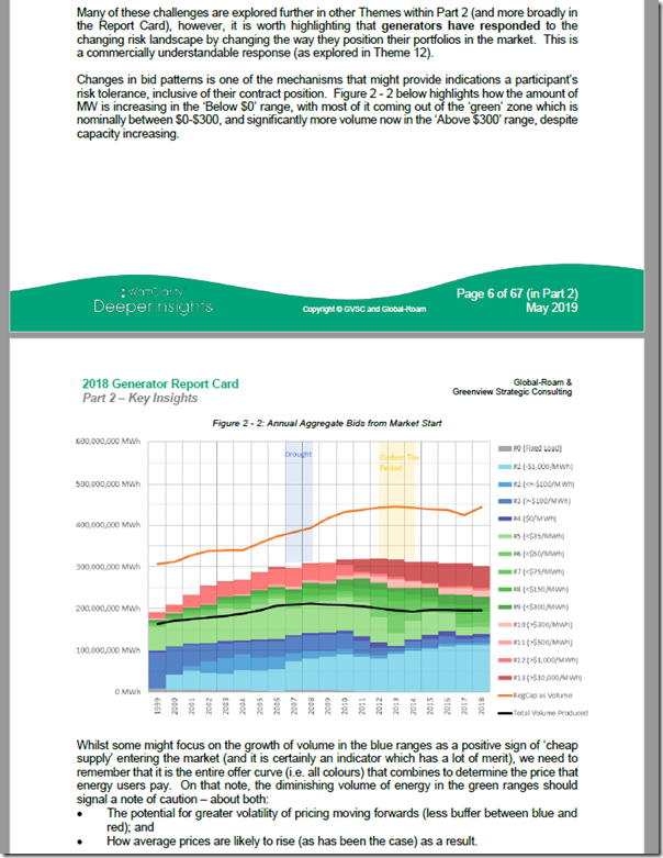
In that Theme within the Report Card itself, we discussed how one of the harbingers of that increased risk can be clearly seen in Figure 2-2 within the Generator Report Card. This figure, has been copied into this article today. It shows (for each year of the past 20 years in the NEM) total energy-constrained energy offered in every year of the 20 years of NEM operation to the end of 31st December 2018, aggregated into analysis-ready bid price ranges over three core colour groupings:
There are two main points that WattClarity readers here need to recognise in the trend attached:
Observation #1) Whilst Registered Capacity of plant in the NEM in 2018 (see “RegCap as Volume” above) is largely the same as the capacity installed in the NEM in 2012, the volume that this can physically produce is significantly lower. This is another reminder that we really should be avoiding the ‘beginner’s mistake’ of focusing too much on installed capacities, and not enough on volumes.
See the Report Card (Theme 14 within Part 2 of the 170-page analytical component) to understand why it is essential that bids are analysed on a dispatch interval basis as dispatched and taking account of energy constraints that apply in the market.
Sadly in our experience not doing this are mistakes that are commonly made, leading to erroneous conclusions and business/policy decisions being made. Poor analysis (including all-to-common mistakes like this) are just one other aspect of risk in the NEM!
Observation #2) Even amongst this (reduced volume of) energy-constrained available energy, there has been a massive hollowing out of energy-constrained volumes of capacity offered in the ‘normal’ green price ranges:
2a) To make this macro change clear, we use three principal colour ranges in this trend:
(i) blue being $0/MWh and below,
(ii) green being between $0/MWh and $300/MWh, and
(iii) red being anywhere above $300/MWh up to the Market Price Cap, as it applied at the time).
2b) There has been an increase in volume offered at $0/MWh and below (not just from wind farms and solar farms), and an increase in volume offered above $300/MWh (e.g. at least in part because liquid-burning peaking generators might now be facing SRMC above $300/MWh on occasions). That has come at the expense of volumes offered in the green ranges.
2c) In simple terms, this means that is delivers a greater likelihood of more volatile price outcomes moving forwards – with a steeper bid stack, it only takes a relatively small change (e.g. demand change, unit trip, wind to die, constraint to trigger etc) to drive the price sky high.
2d) We need to keep in mind that this has happened even before 5 minute settlement has begun (something that will drive volatility further still).
(B) Trended incidence of (high and low) extremes
Given the underlying changes on the supply side noted above, and a more volatile demand shape as well (i.e. lower load factor, with more uncertainty driven by several different weather-related variables and prices themselves) it seems entirely logical to expect that we would be seeing increased incidence of price extremes in the market.
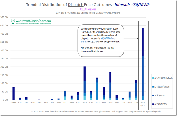
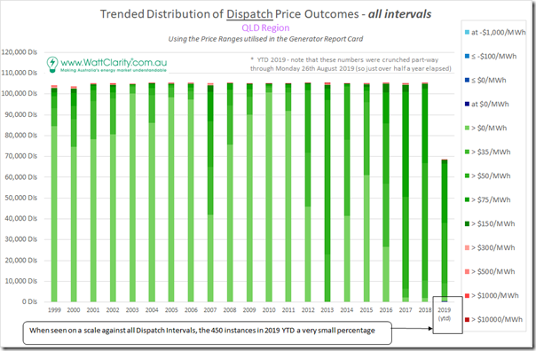
Given our own particular focus on Queensland, and because negative prices have seemed to be a very rare occasion in the past up here, it came as no surprise to us that the level of incidence of dispatch prices settling at $0/MWh or below has increased markedly through 2019 compared with all prior years (note that these numbers were crunched on Monday 26th August – so the YTD results for 2019 are already too low given what’s happened through this week):
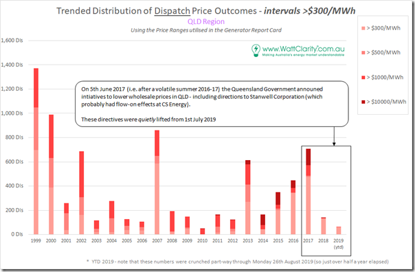
Sticking to Queensland but looking at the other end of the scale we see that the incidence of high prices in 2019 YTD has been much lower through 2019 thus far compared to the heights reached in CAL 2017:
Note that the incidence of all prices above $300/MWh were shown here – but pay particular attention to the incidence of prices above $10,000/MWh which peaked in CAL 2017 (mainly due to a volatile summer 2016-17):
(1) That volatile summer following prior ones led to QLD Government directions on the Queensland generation sector (ironically trumpeted as a ‘win’ for government ownership despite the fact that common government ownership enabled the 3-into-2 merger in the first place that removed competitive tension);
(2) Whilst the direction was specifically on Stanwell Corporation its effect will also have been felt at CS Energy – and hence washed through the whole region;
(3) We note that these same directions were much more quietly removed from the generators from 1st July 2019, so we will have to see what effect this has – particularly in the tighter supply/demand period in the coming summer;
(4) Keep in mind that the other factor at play here is the formation of CleanCo as a third Government Owned Corporation operational from October 2019 (a politically palatable de-merger of sorts with Wivenhoe, Barron, Kareeya and Swanbank E being shifted into the new corporation).
The (very) non-normal distribution of price outcomes in the NEM makes it essential to keep an eye on extreme price outcomes in the NEM (historically just on the high-side, but much more in future also on the low-side) it is important to recognise that the majority of price outcomes remain in the green price ranges – as shown here for each of the 105,000 (approx) dispatch intervals in each of the years for the QLD region since the start of the NEM:
Within these green ranges, we can also see a marked shift (beginning from 2015) towards significant increase in median prices across all dispatch intervals in the NEM (this was the same phenomenon observed with respect to Q2 2016, Q2 2017 (the “off the charts” results caused a stir) and Q2 2018 – did not have time to update for Q2 2019 sorry).
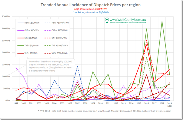
Stretching the focus beyond just Queensland and narrowing back in on the extremes again we see a more complex picture across all 5 regions:
Here we can see that QLD has a long way to go to reach the incidences of low pricing seen regularly in both TAS and SA over a number of years now – though it would not surprise us if QLD reaches (and even surpasses those levels) fairly quickly, given the scale of the development pipeline of solar farms on the go…



This is what happens when industry shuts down because of the worlds highest energy prices,and renewables make so much money in subsidies they just bid in the negatives to ensure they are in the bid stack.
The graphs in section A and B showing the increasing volume of $0/MWh bids is very interesting.
Would you consider doing the same trend separately for day-time periods and night-time periods to more directly observe the influence of increasing rooftop PV on bidding behaviour?