Triggered by our annual competition, and our ongoing analysis of how (and why) demand patterns are changing in the NEM, we have been pondering about the extent to which a change in diversity of demand might be responsible for changing patterns we have observed on a NEM-Wide basis.
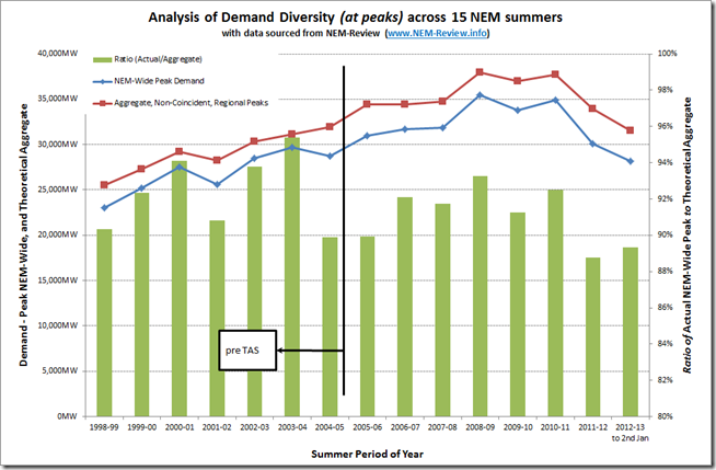
Hence, we extracted peak summer demand across the NEM, and for each region, from NEM-Review, and prepared the following trend:
To clarify:
1) The blue line (in the chart above) shows the trend of the highest NEM-Wide demand (when measured on a Trading Target basis) for the December-January-February summer period each year. Hence it represents an actual Scheduled Demand figure
2) The red line (in the chart above) shows the trend of a hypothetical construct, which is the aggregate of the non-coincident regional peak demand periods across those same summers.
3) The ratio (blue divided by red) is shown in the green bars, and represents one measure of demand diversity (there are a number).
It does appear that the level of demand diversity has increased over the years, especially coincident with the entry of Tasmania into the NEM. In simple terms, this means that peak demand patterns (which are significantly driven by weather) have become less aligned.
What has been the effect of Tasmania’s entry into the NEM?
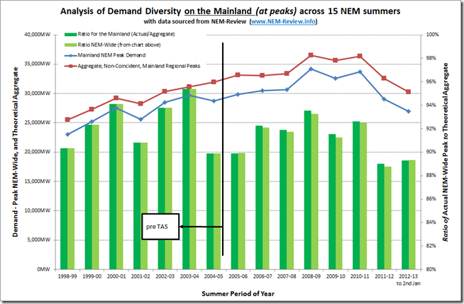
The easiest way to assess this, in the end, was to subtract (out of the NEM-wide demand peak for summers from 2005-06) the Tasmanian demand at the time of peak NEM-Wide demand and then repeat the analysis, to ensure an “apples-to-apples” comparison for all 15 years.
The following chart is a result:
As can be seen, the entry of Tasmania into the NEM does not account for the increased diversity of demand seen in more recent years.


Be the first to comment on "How has Demand Diversity changed, over 15 summers?"